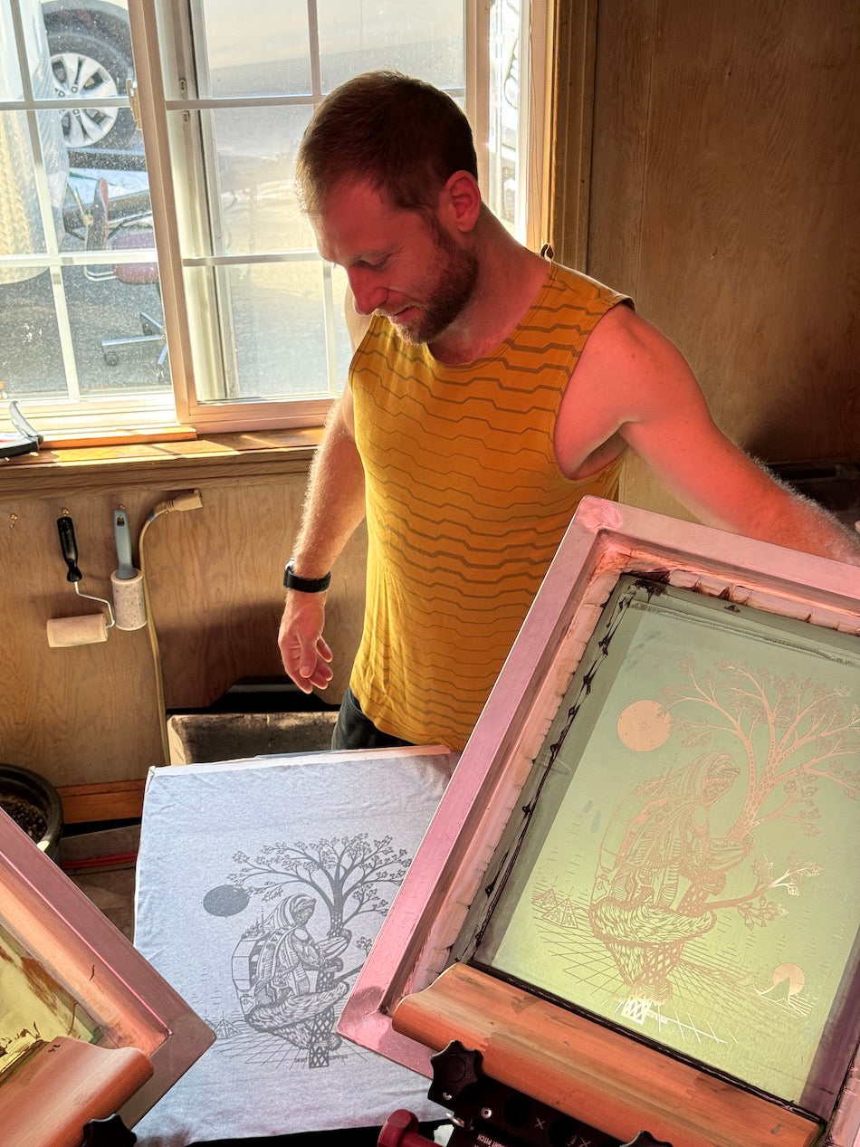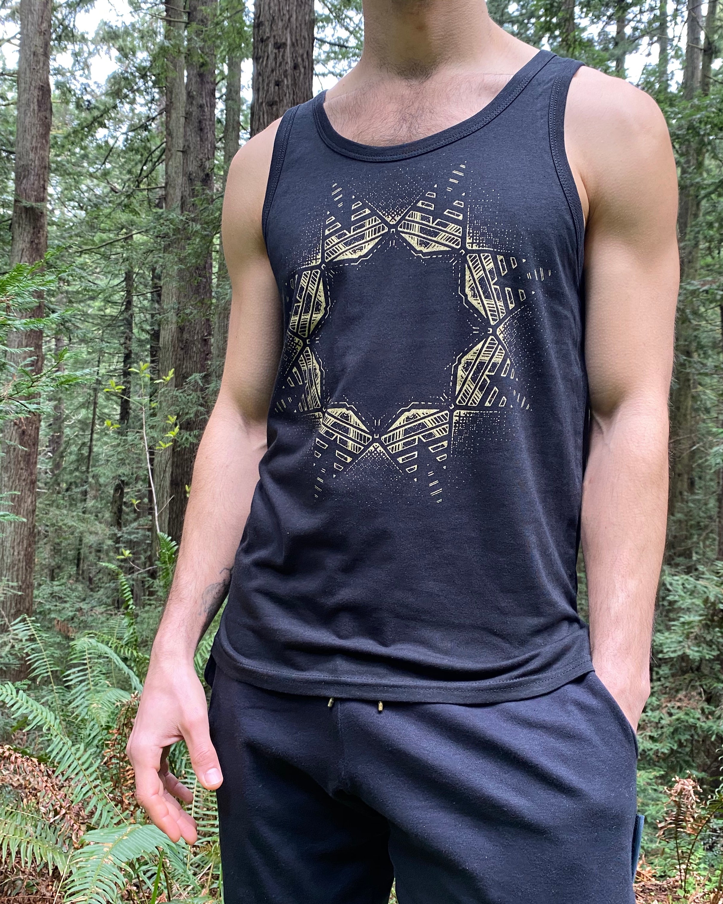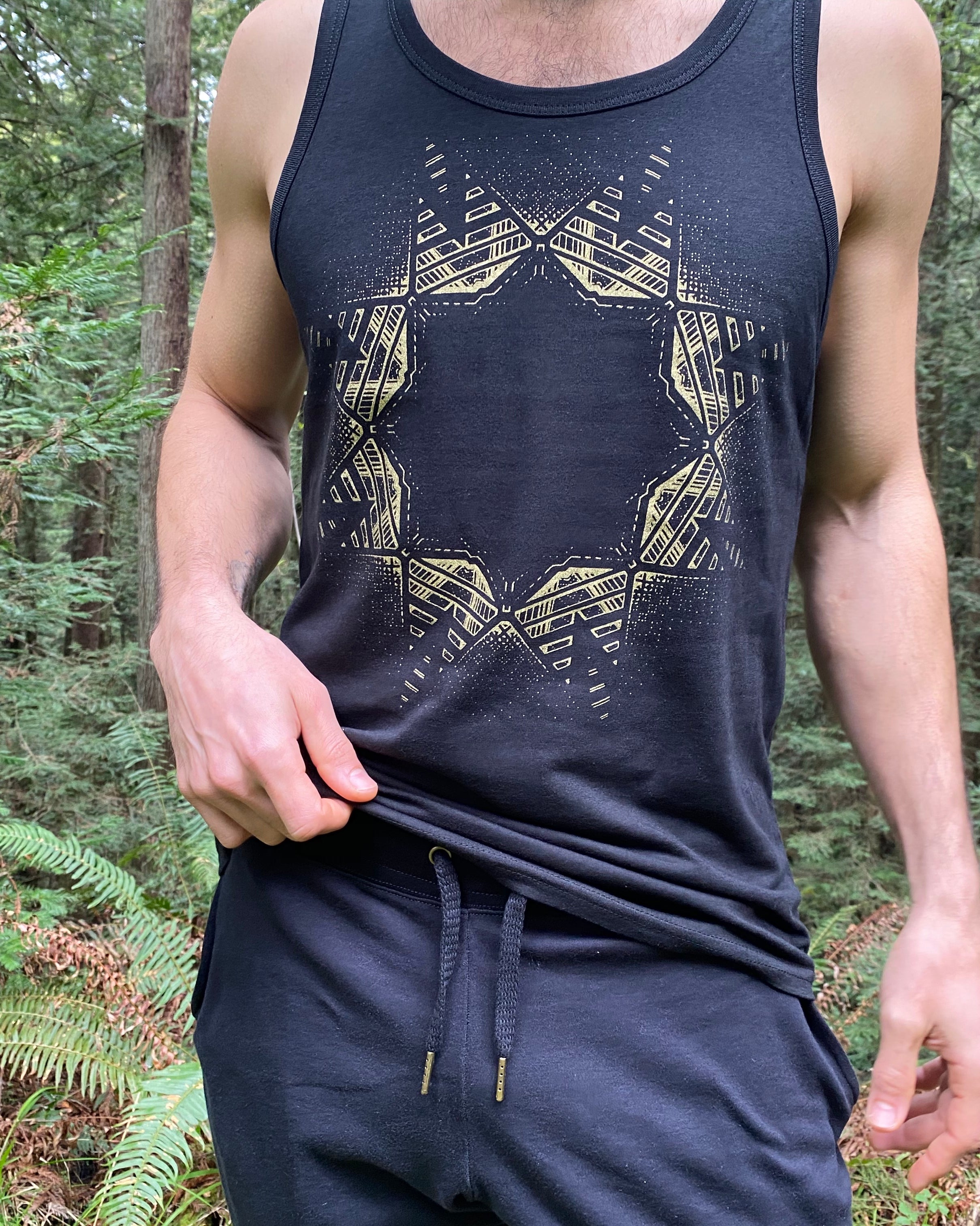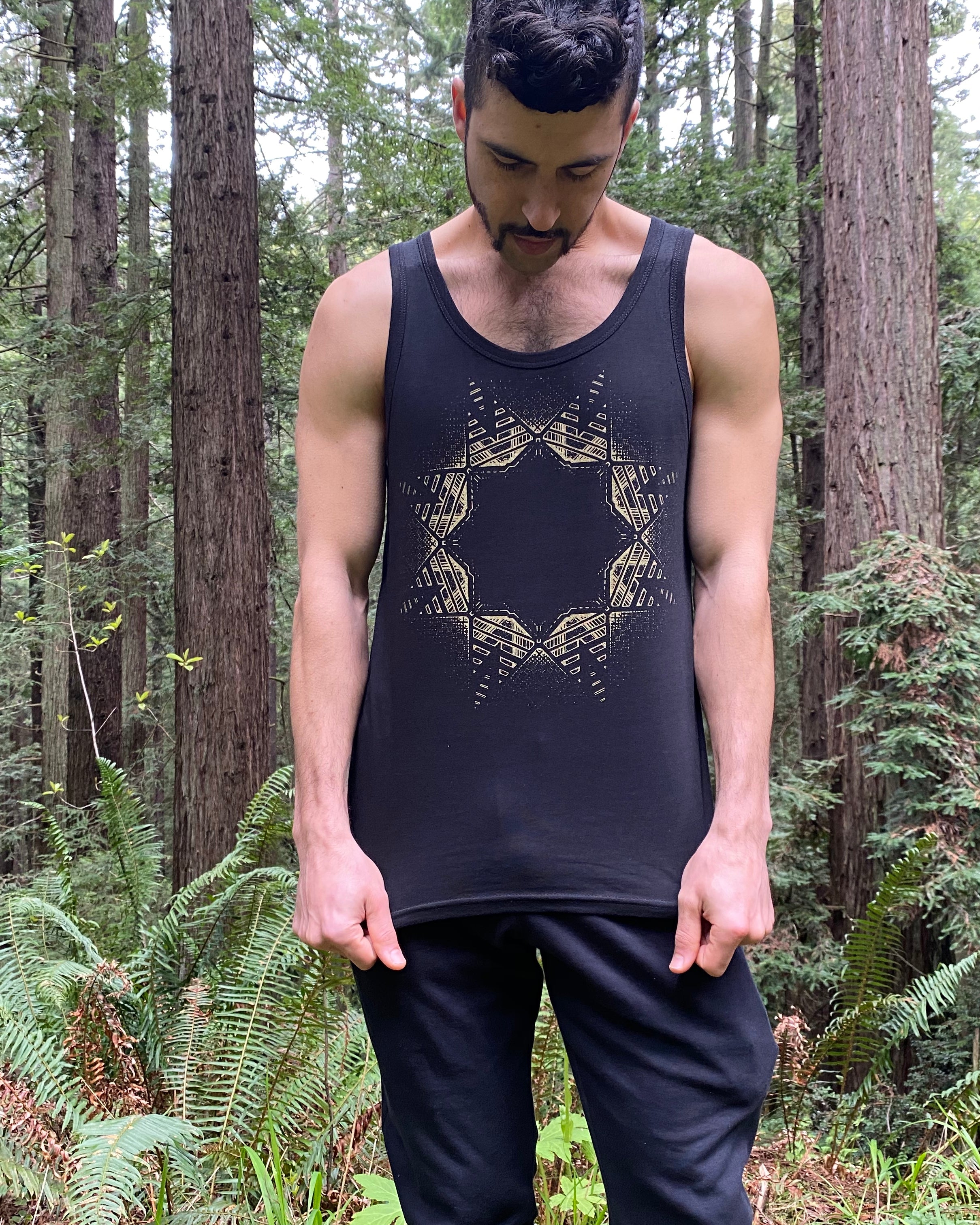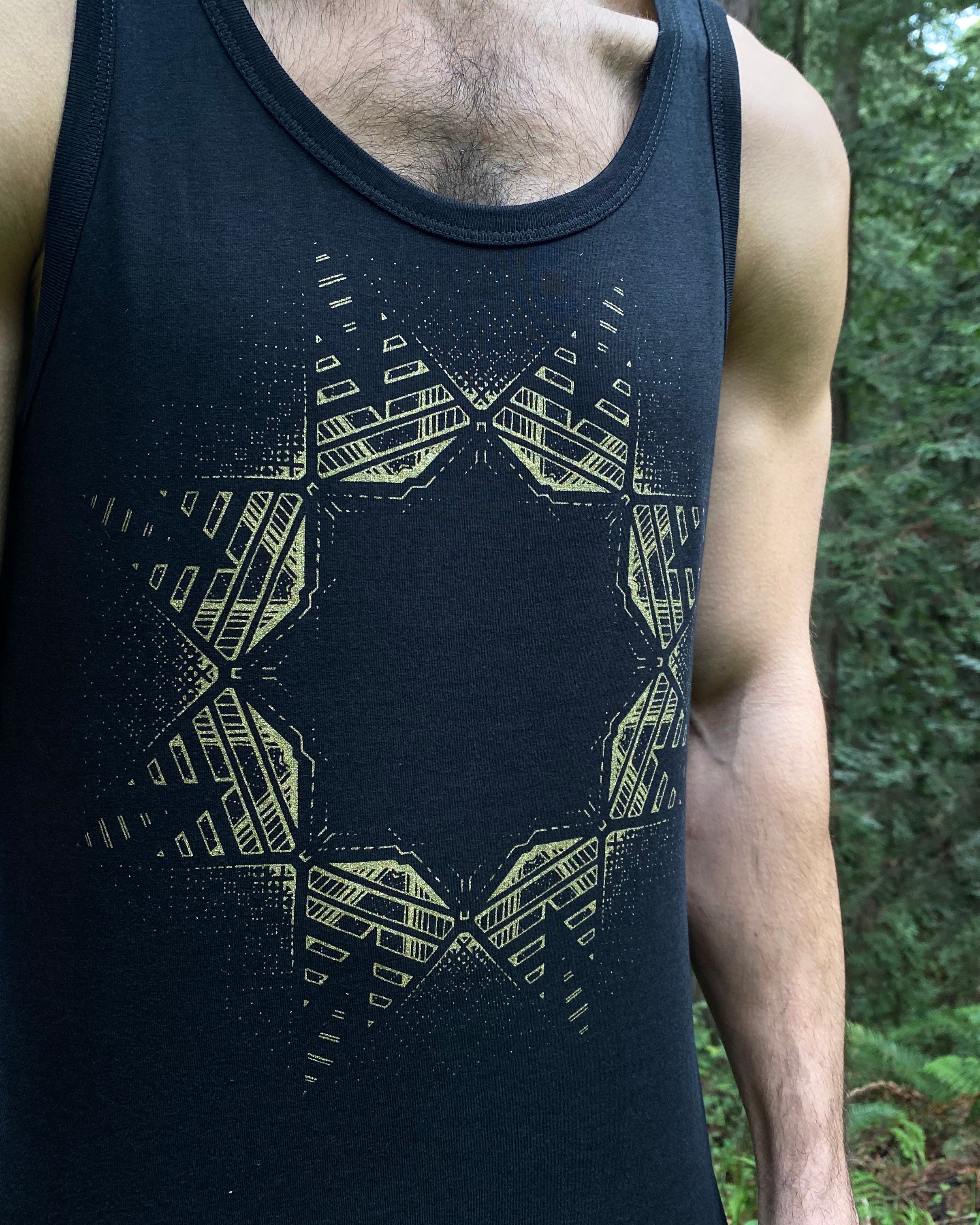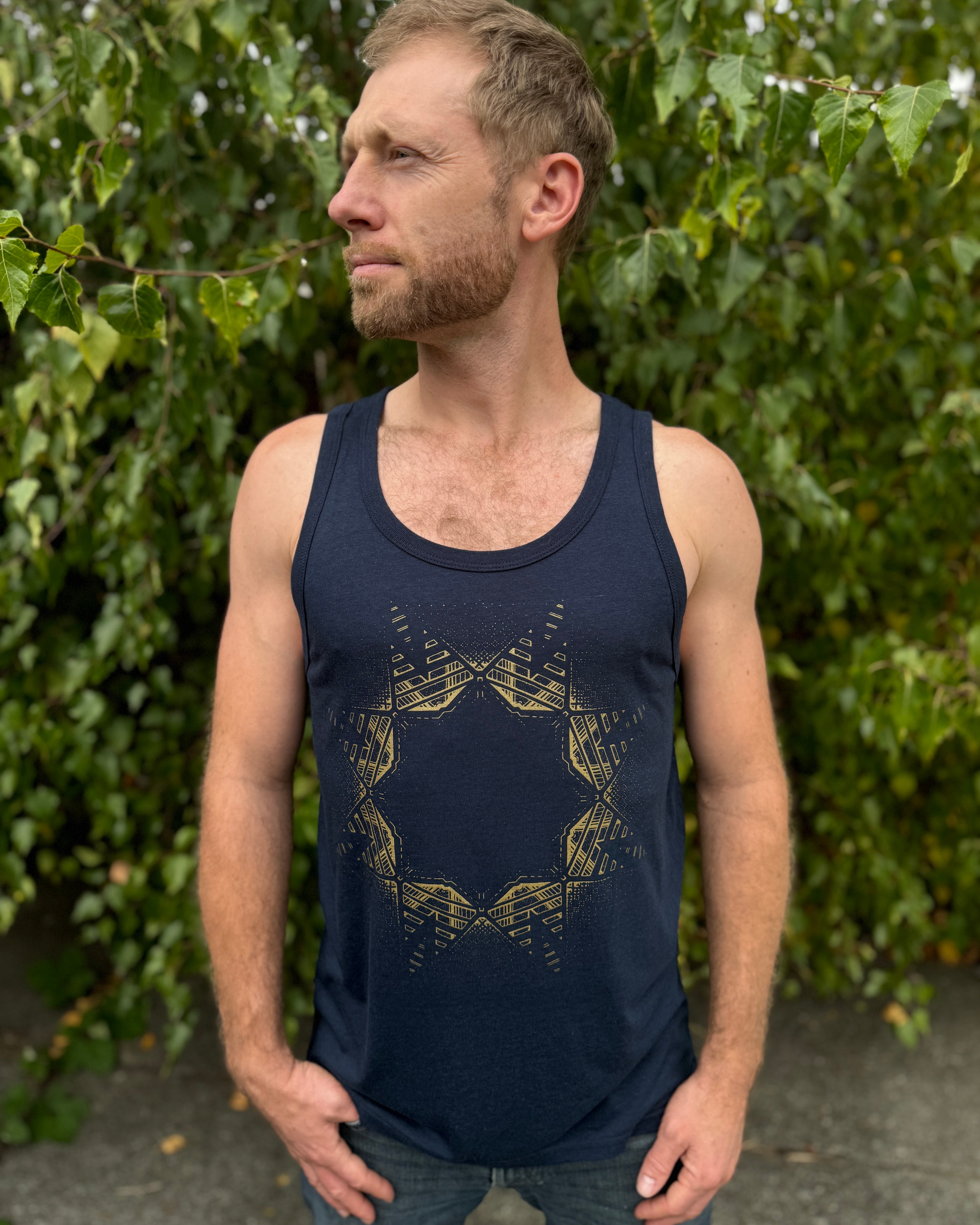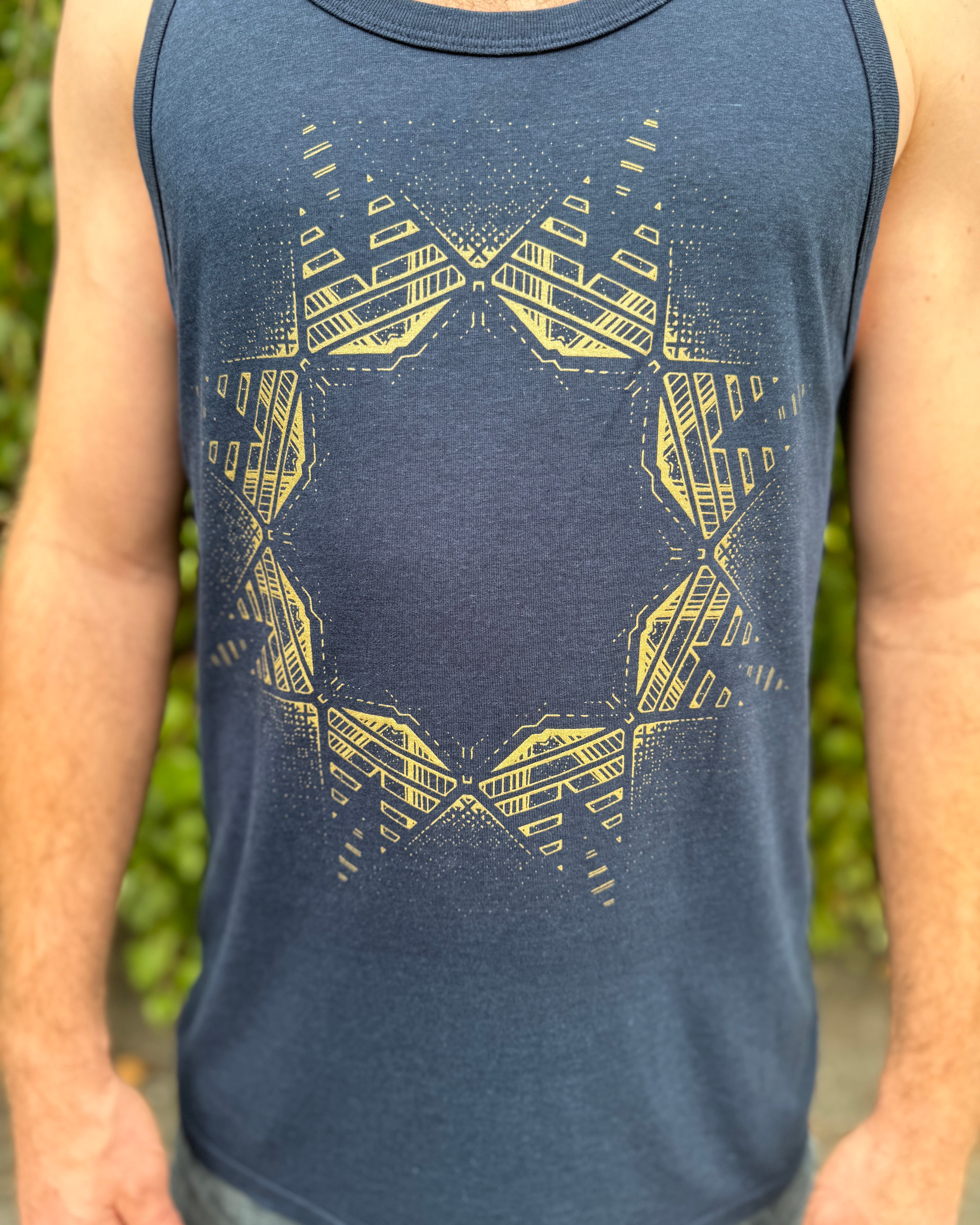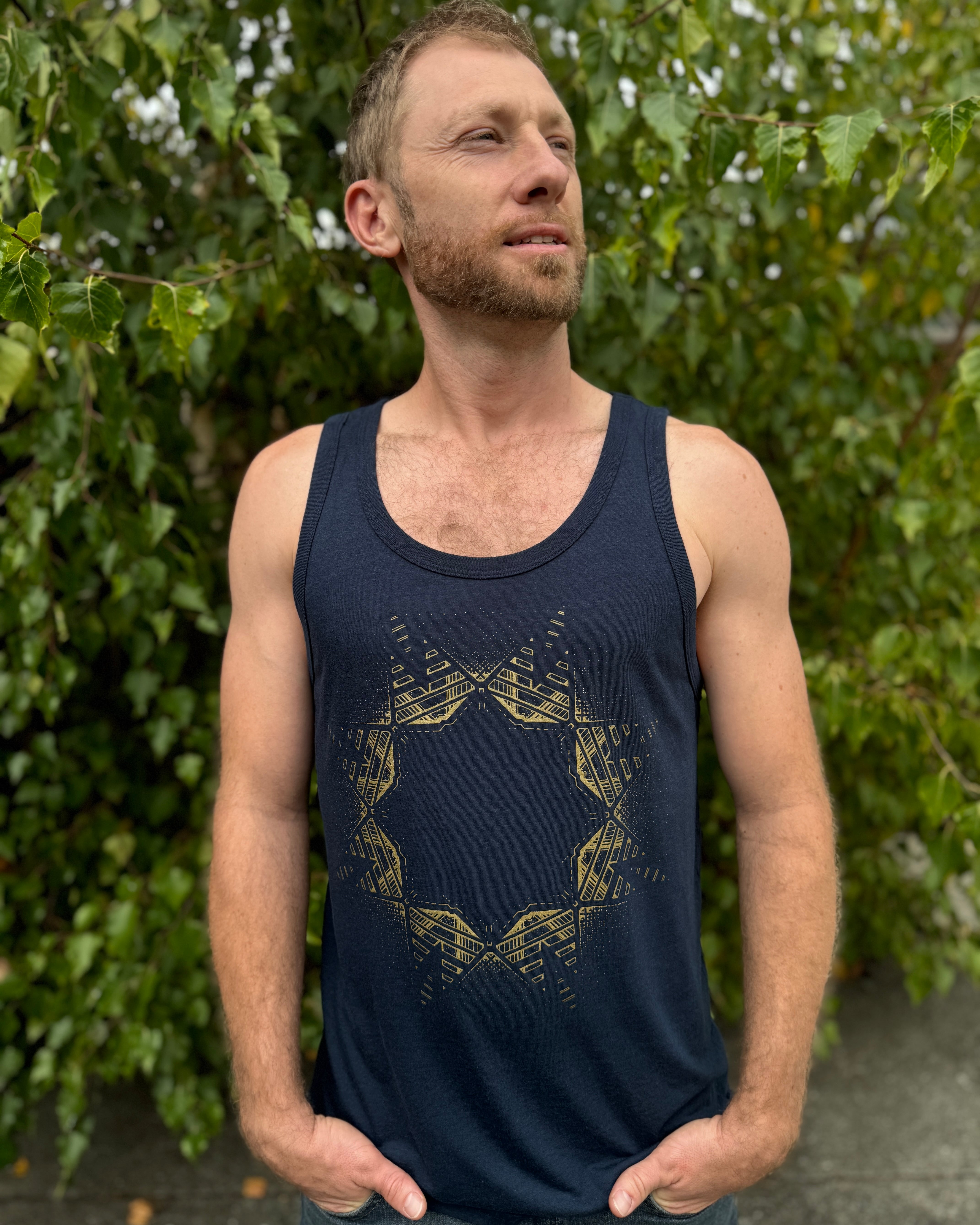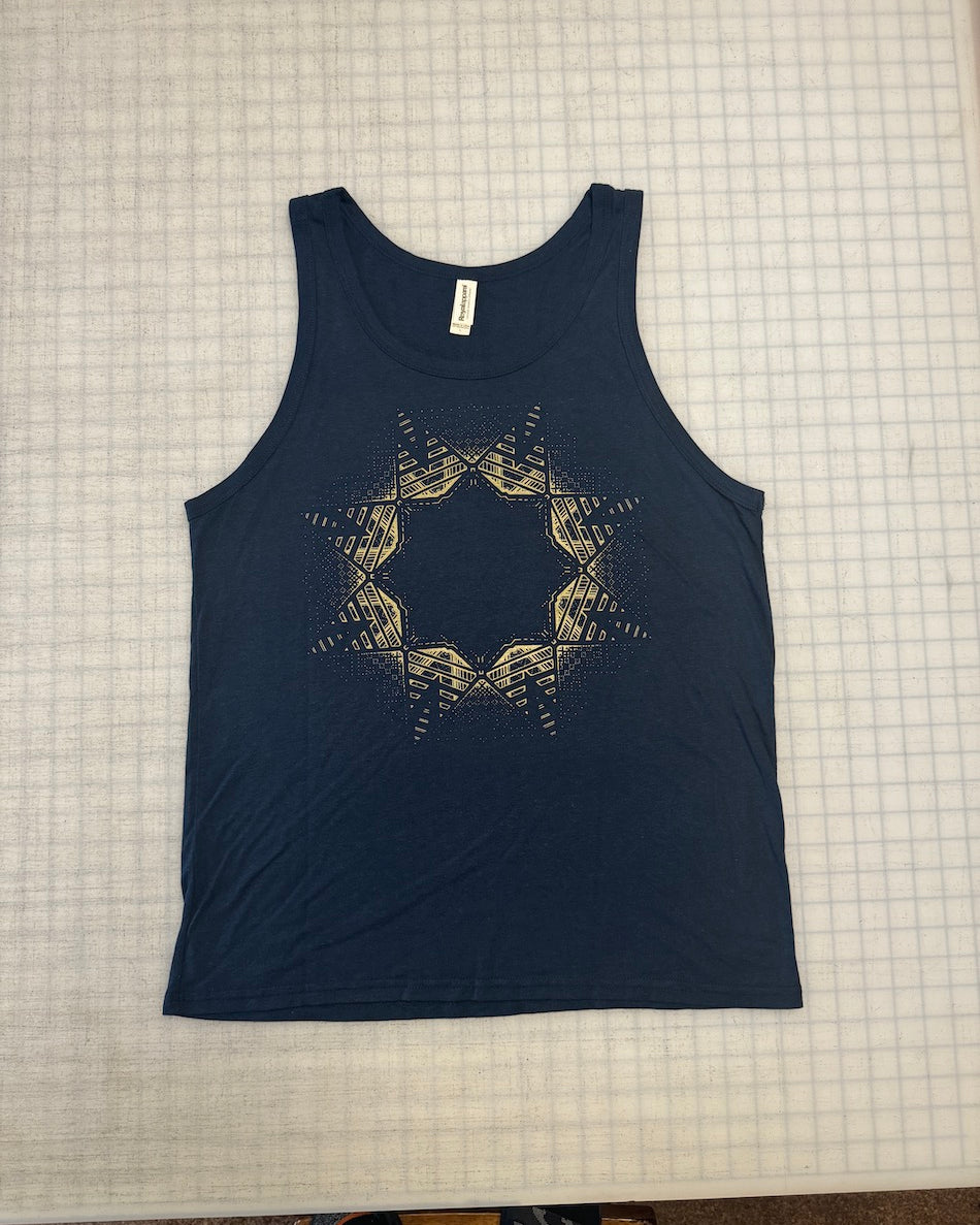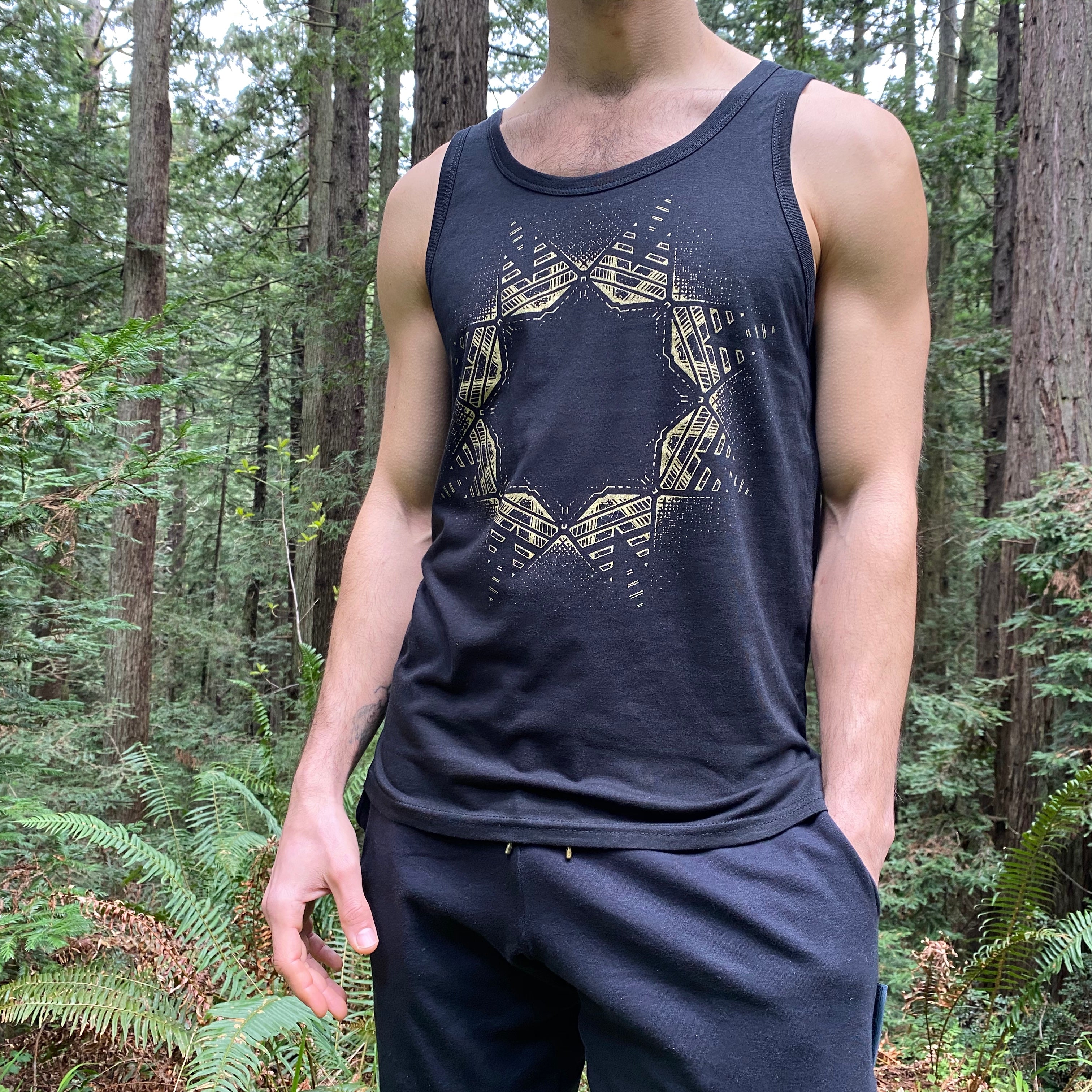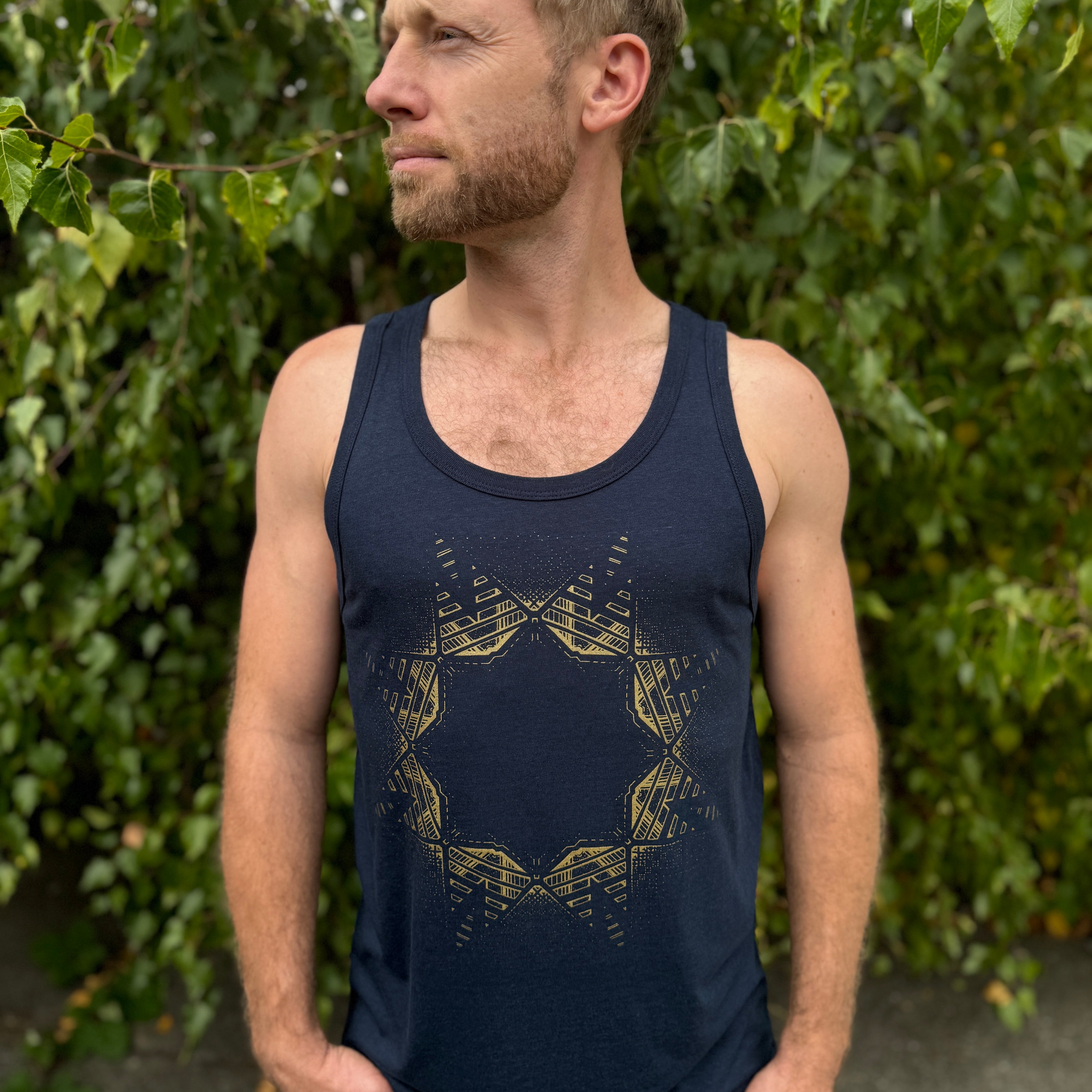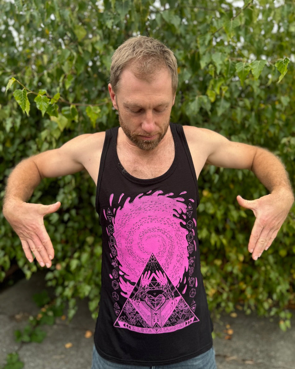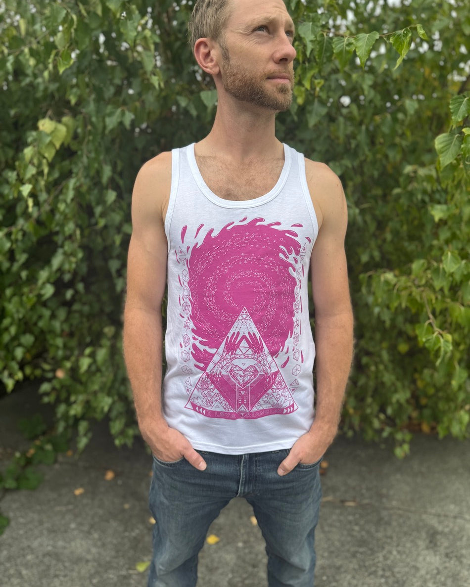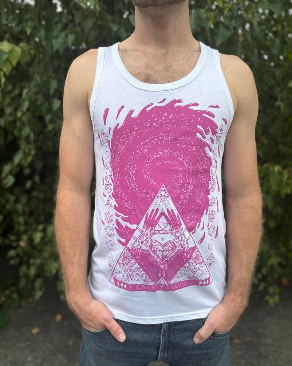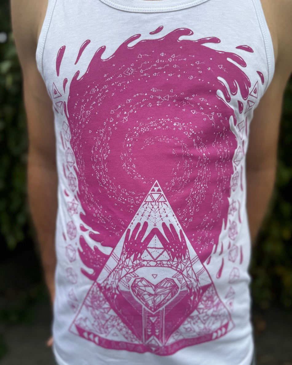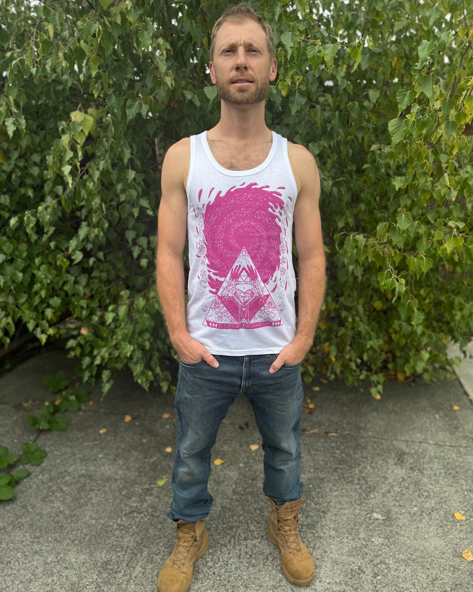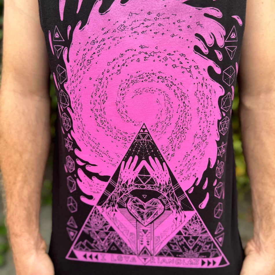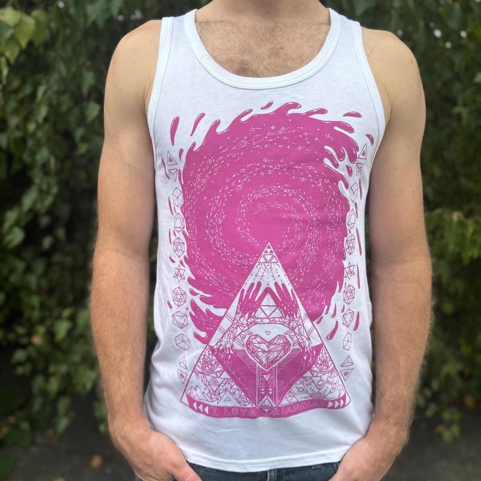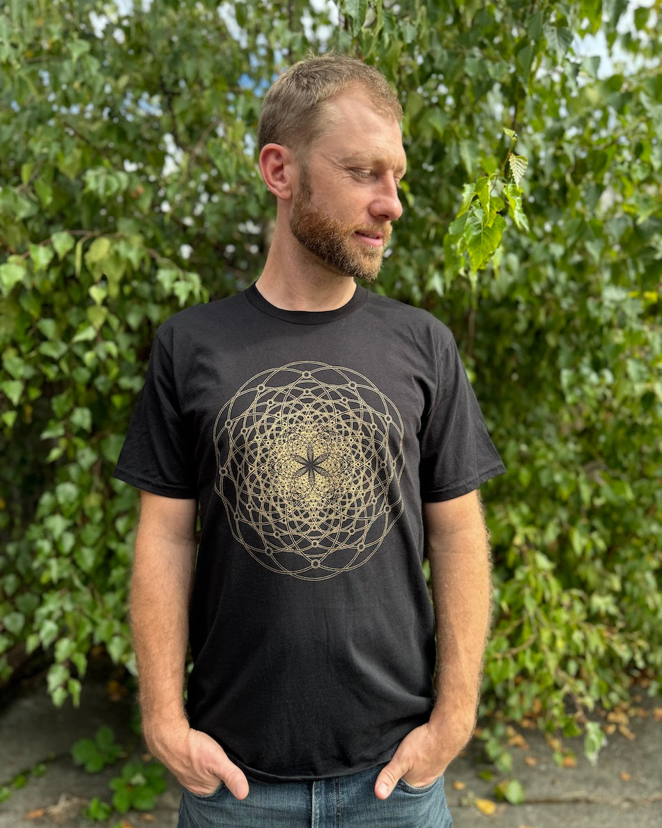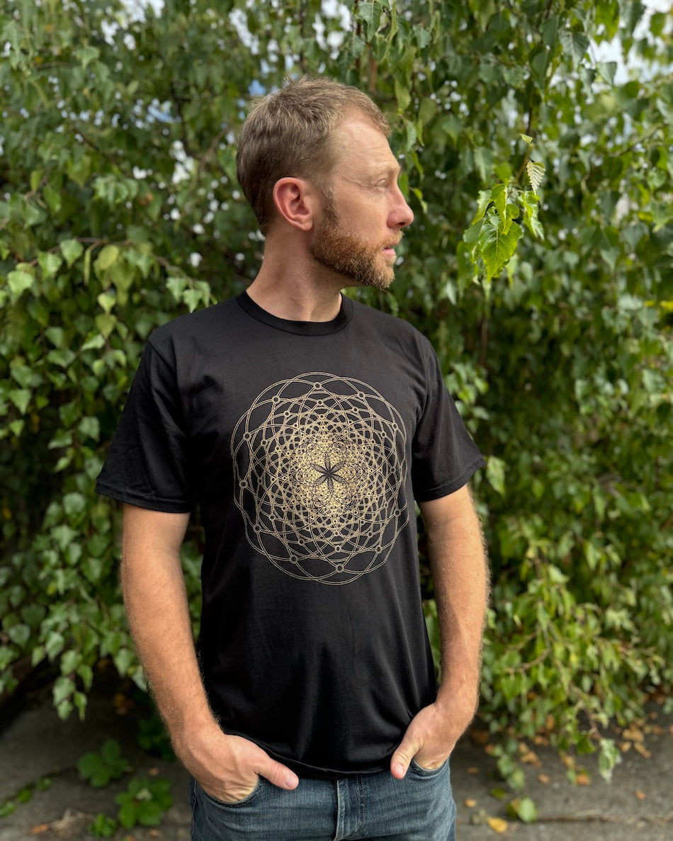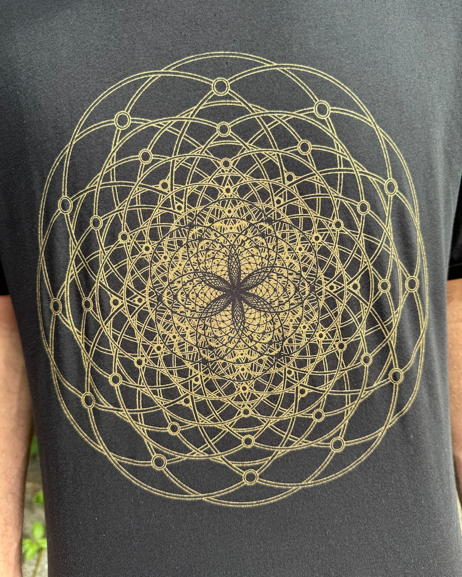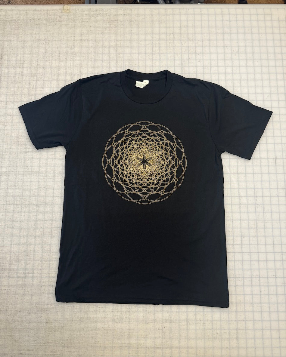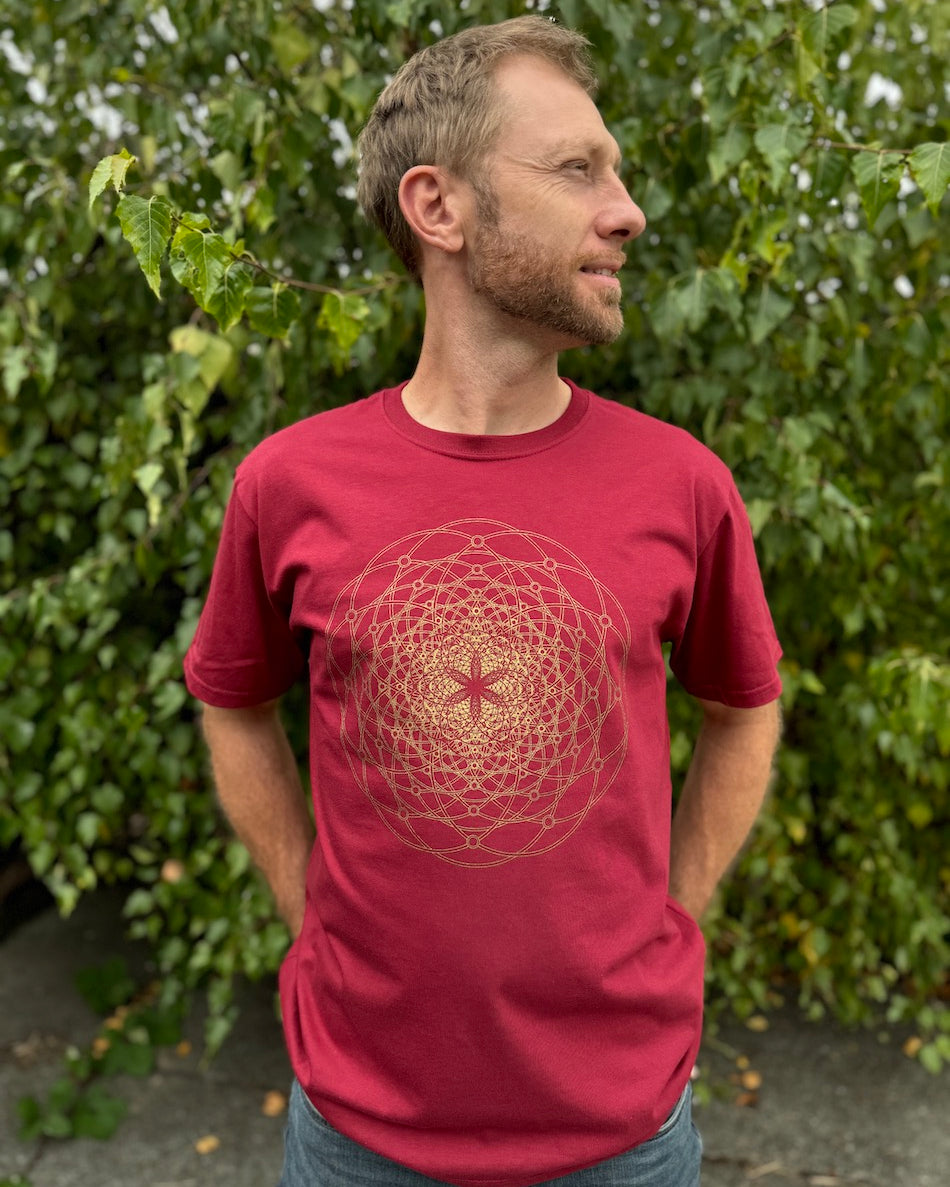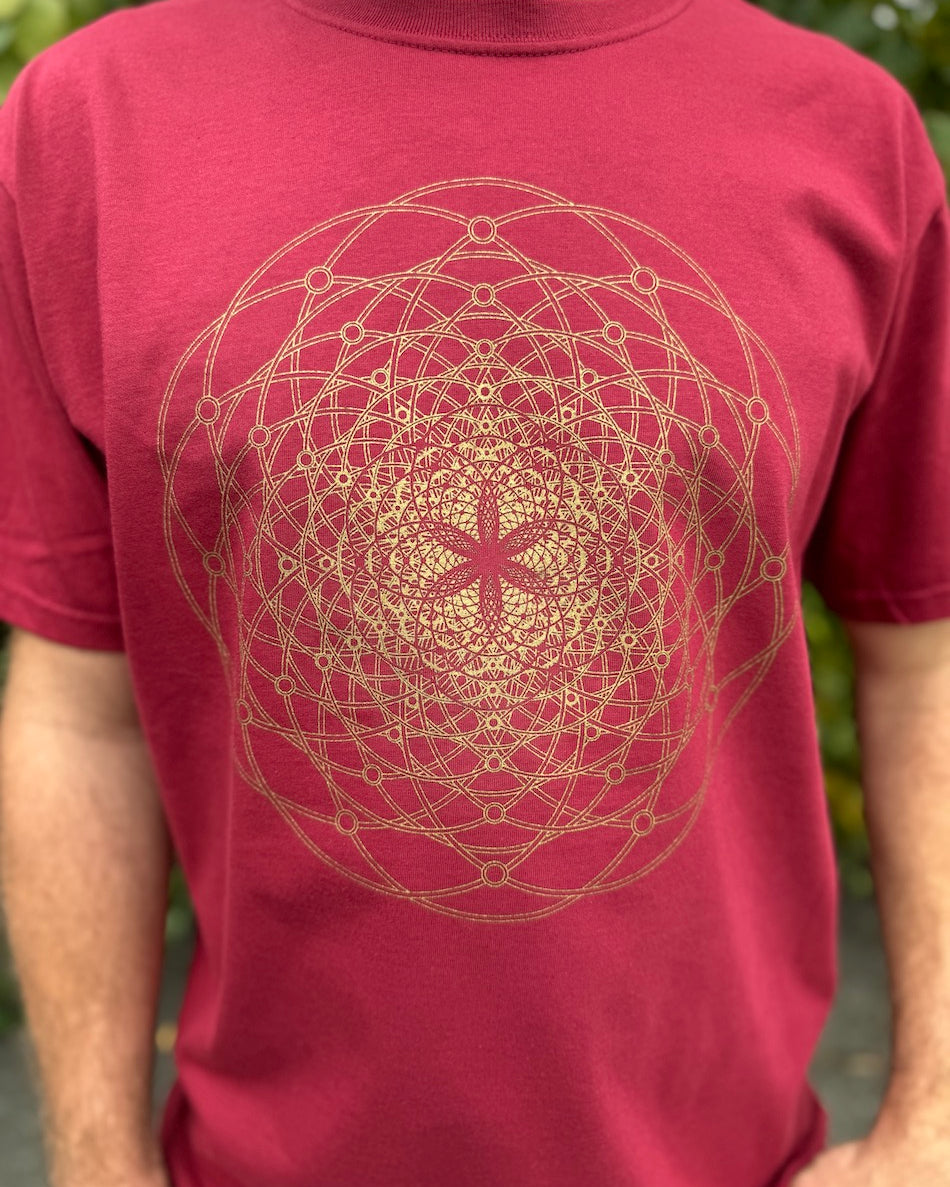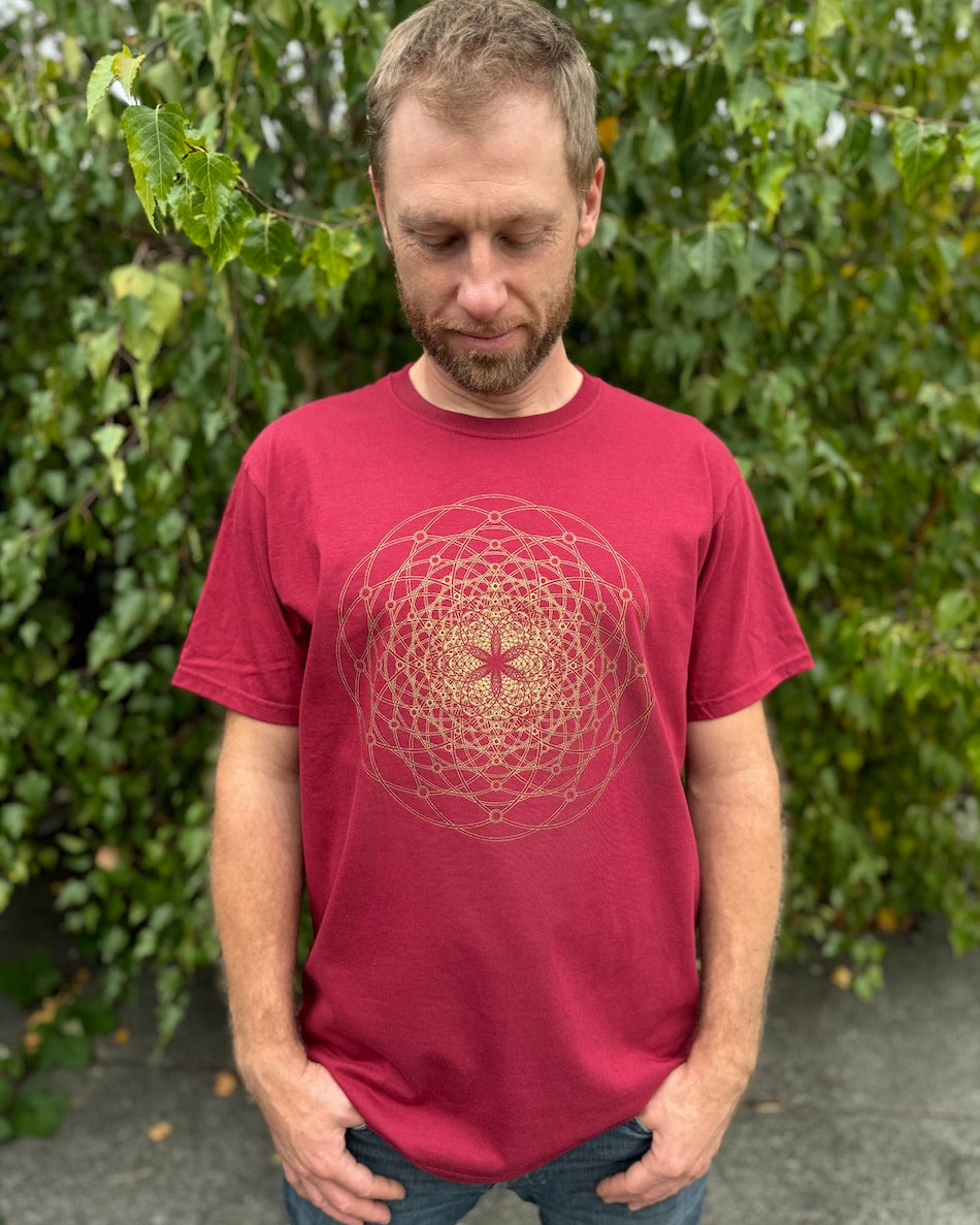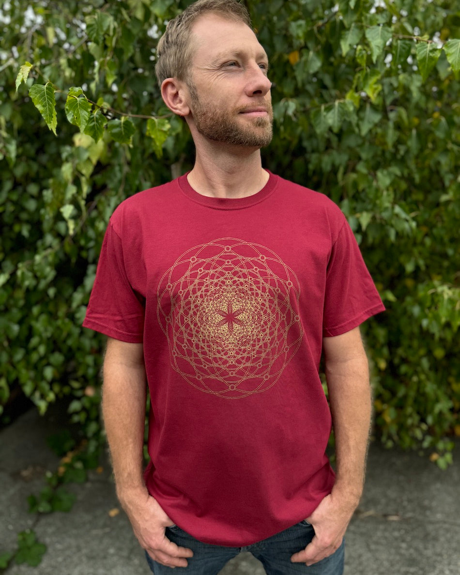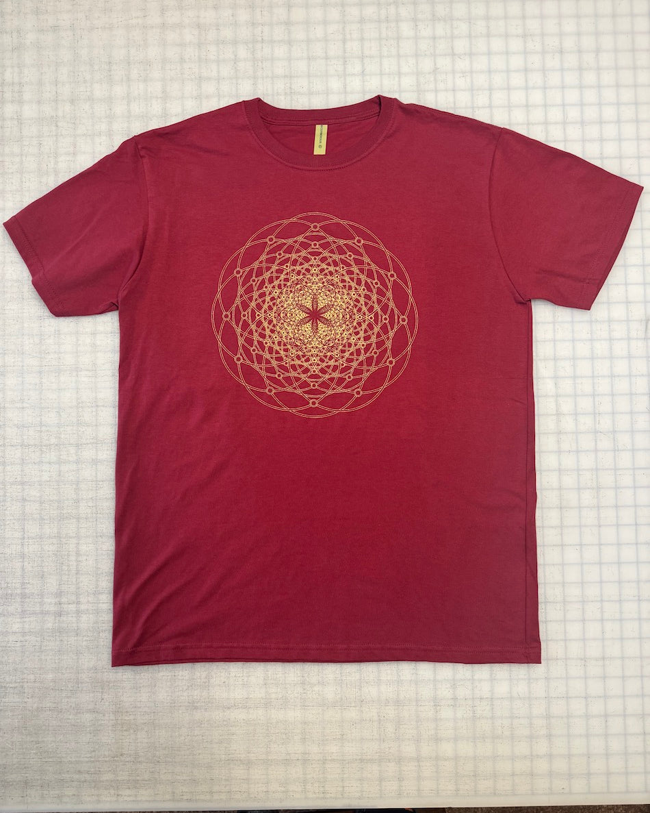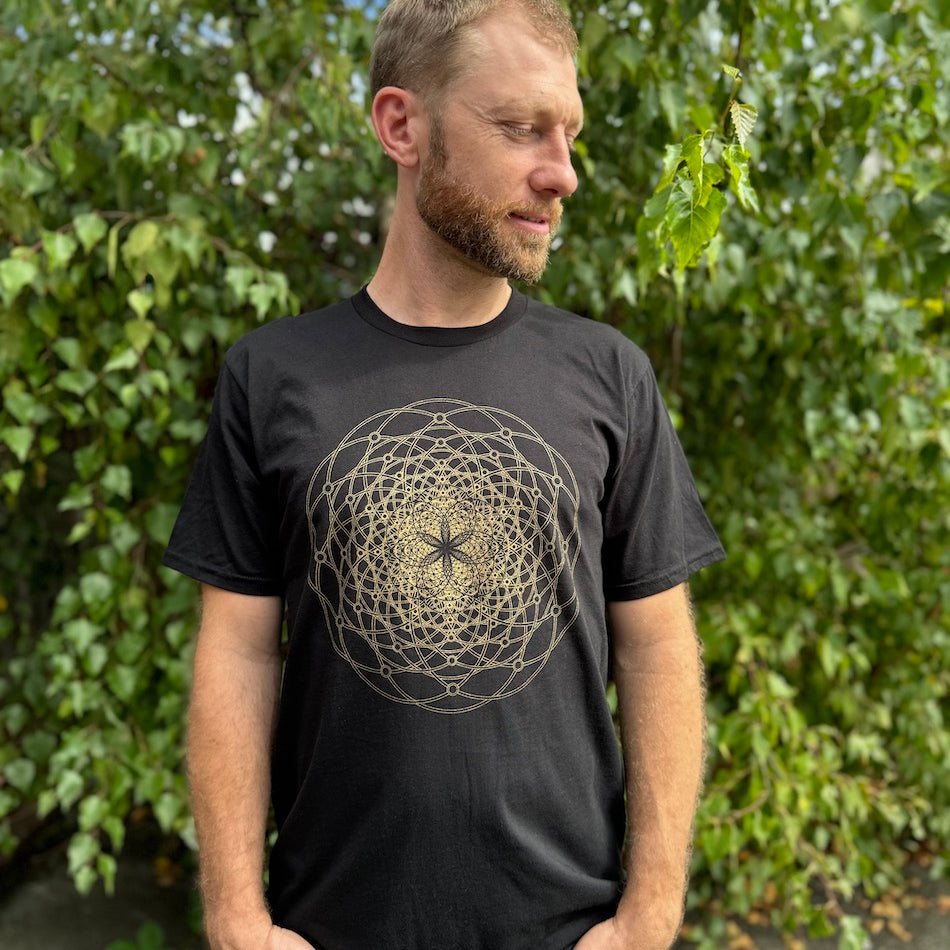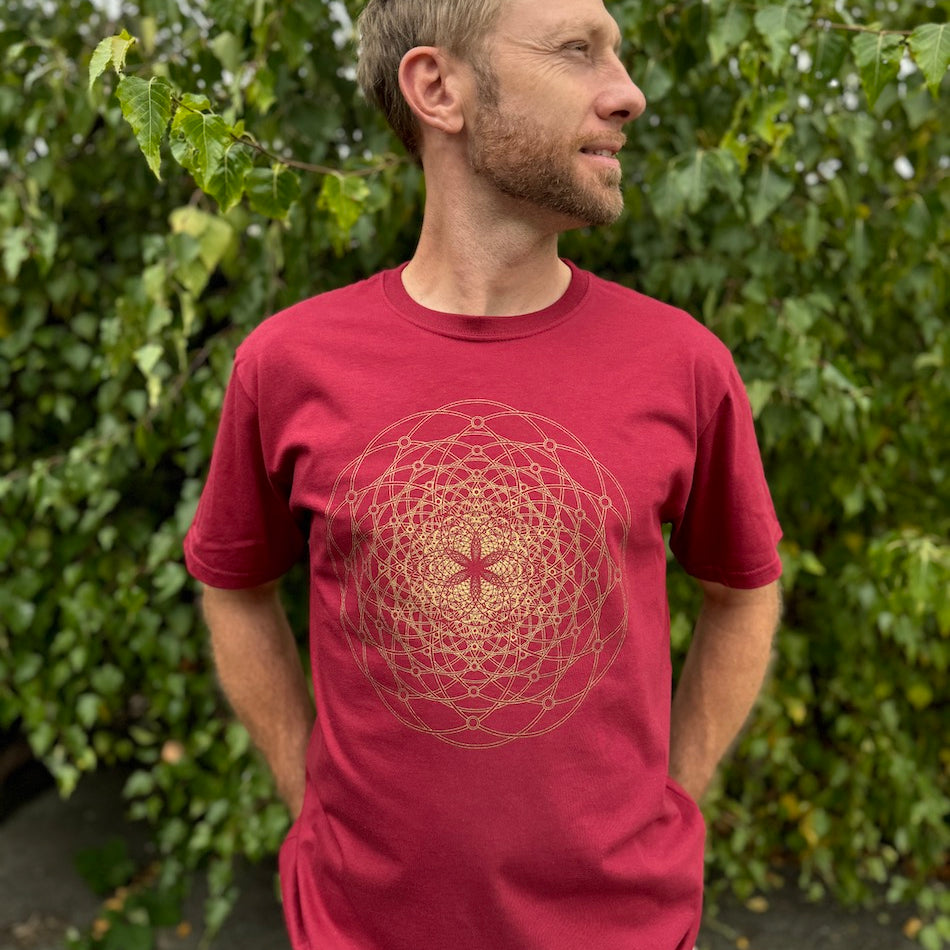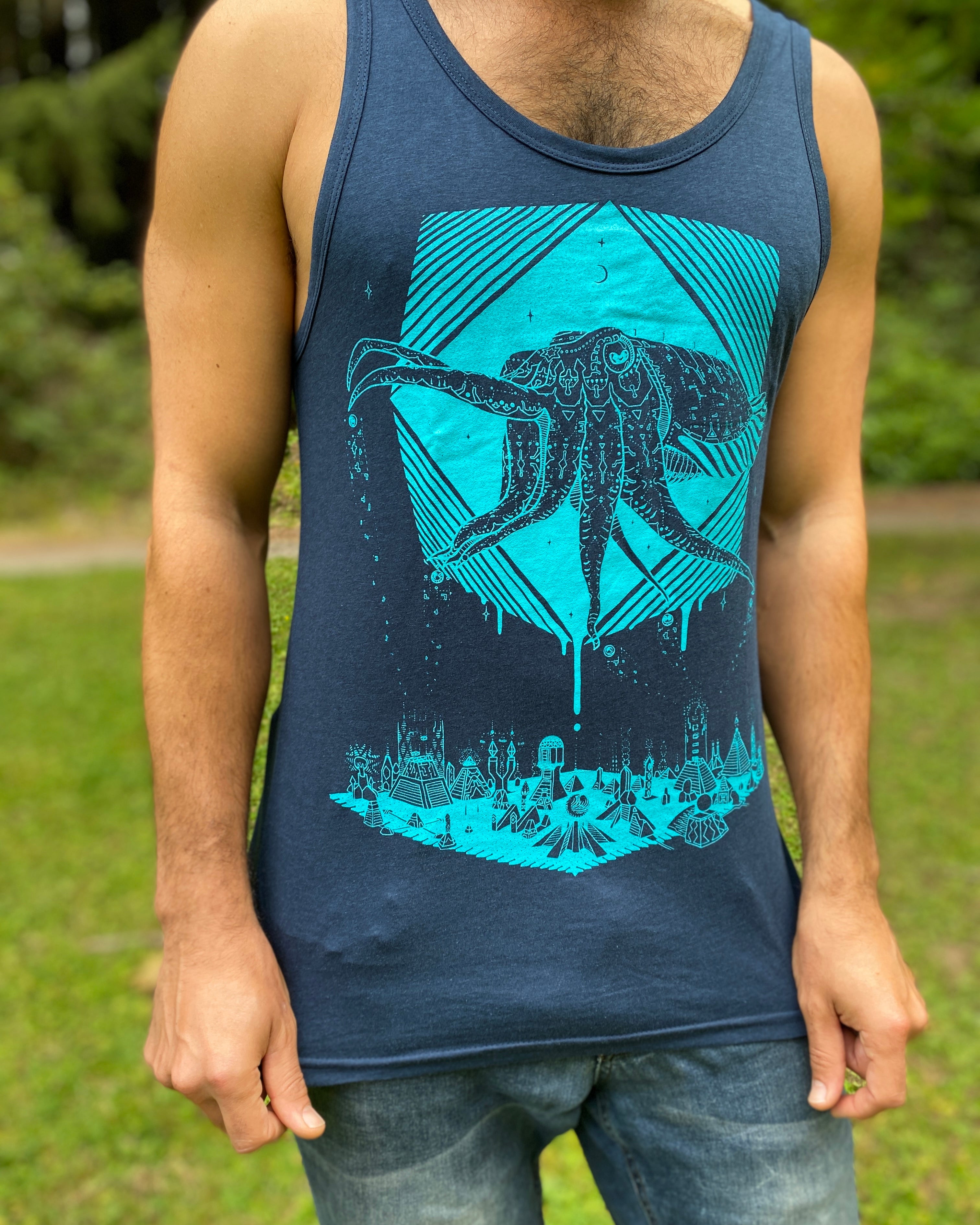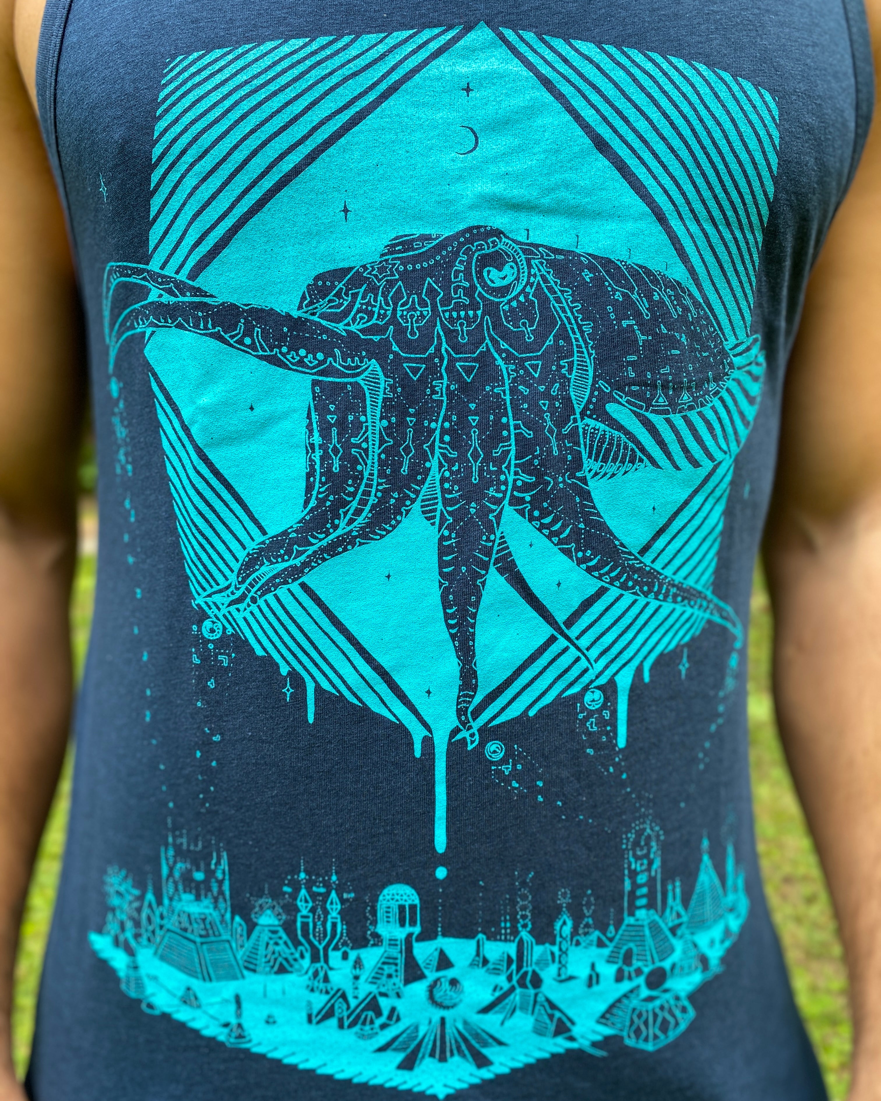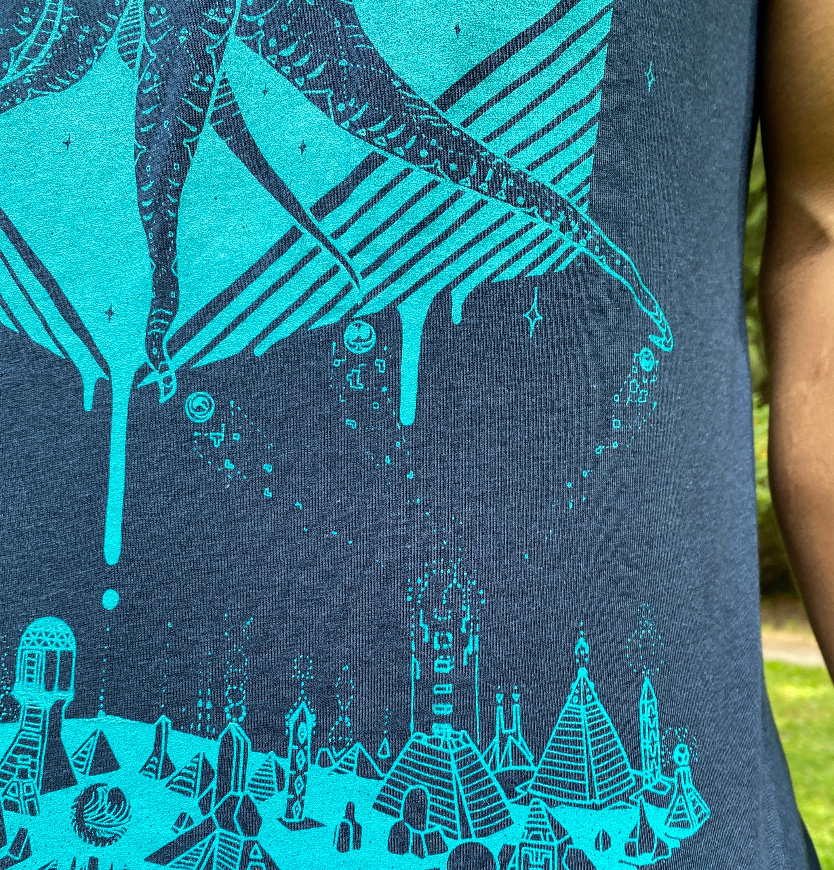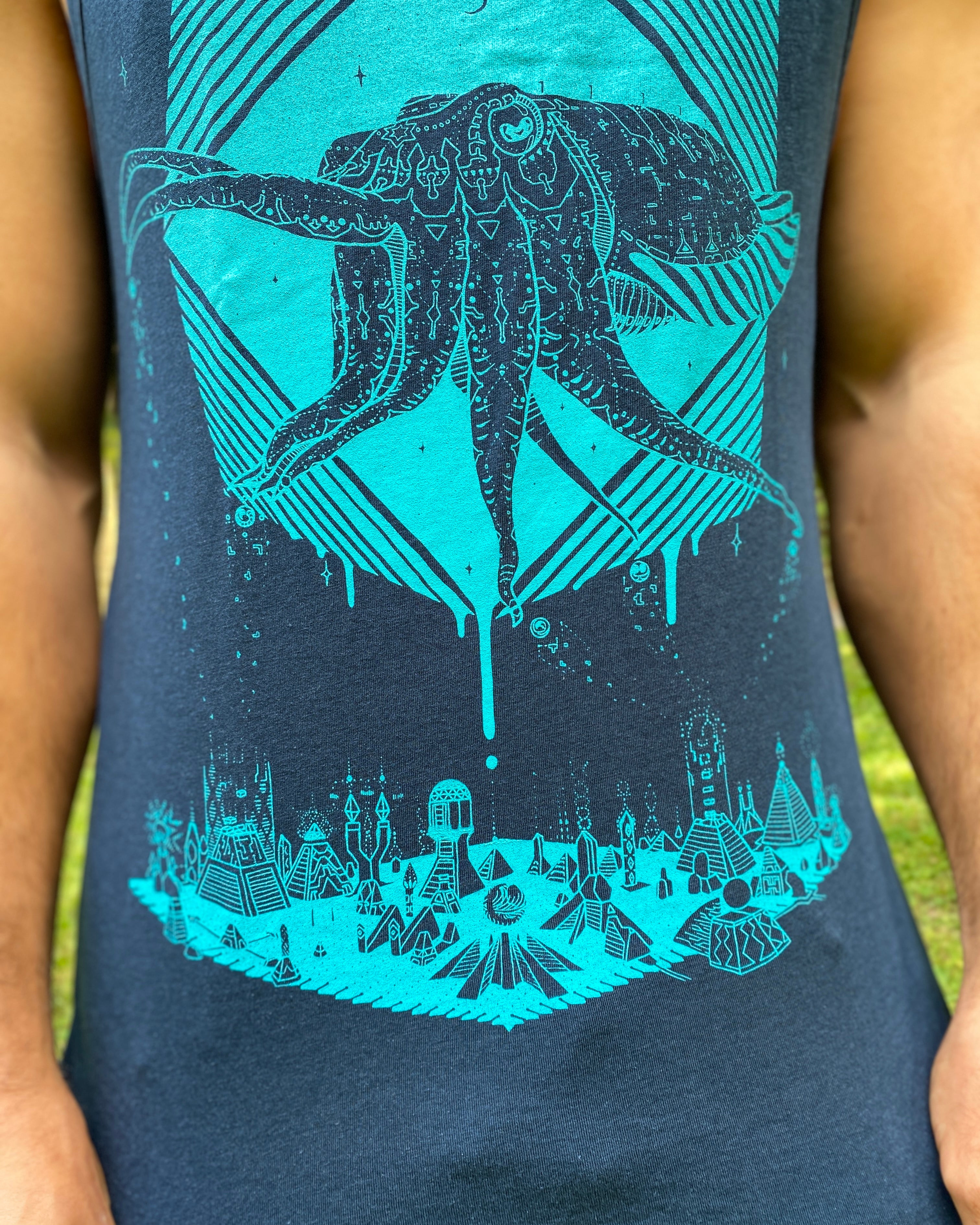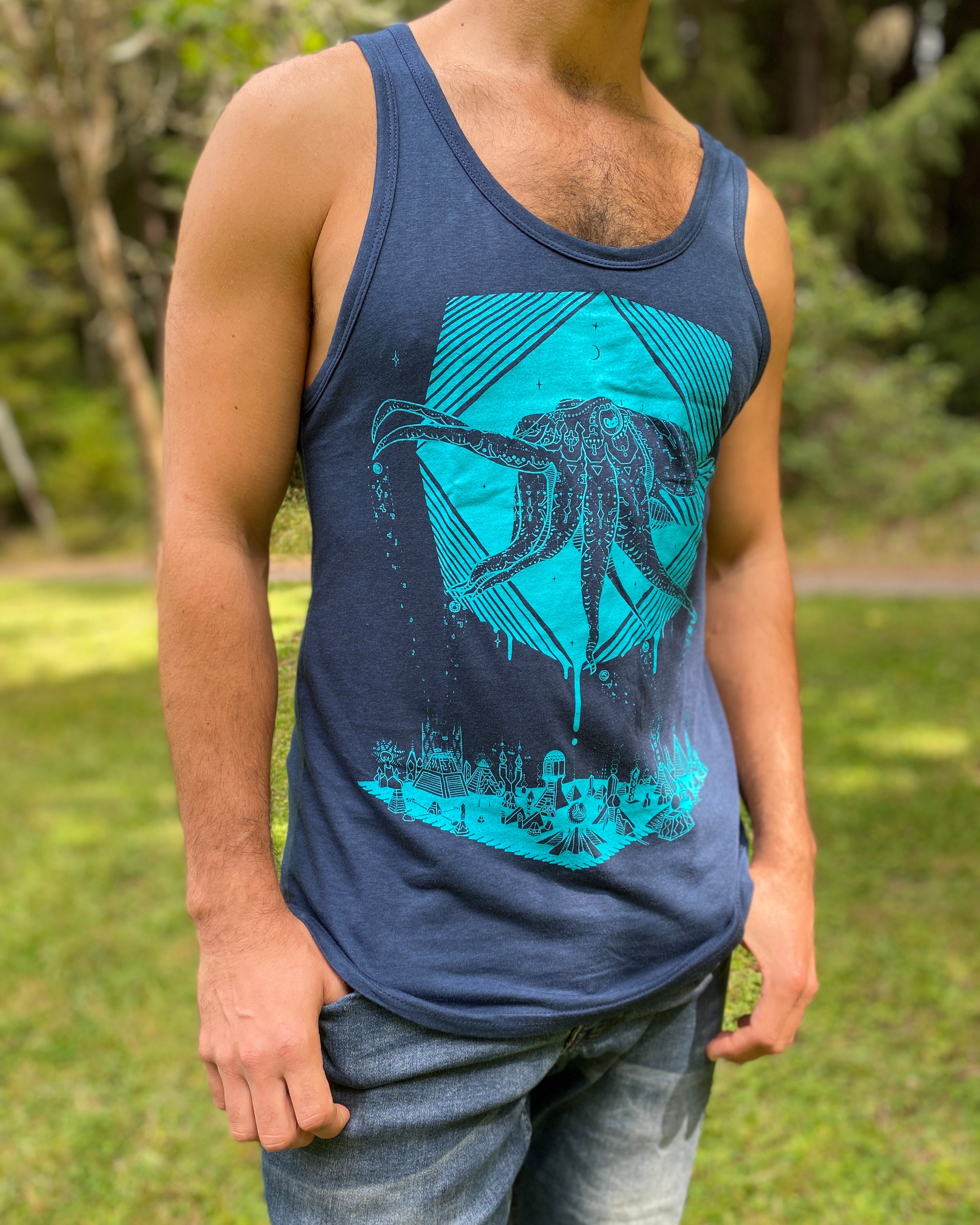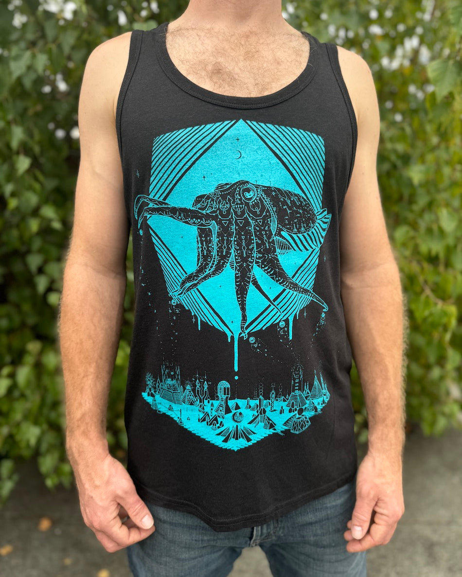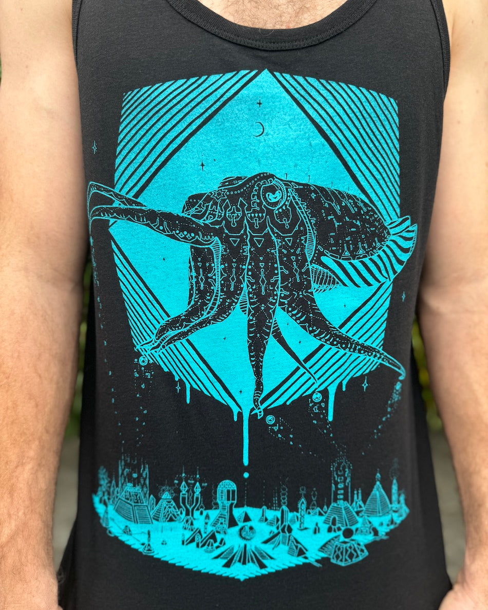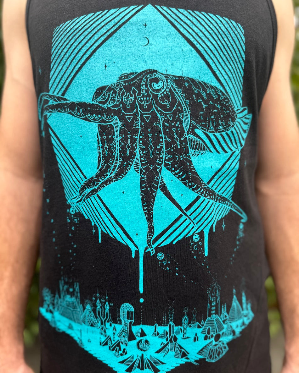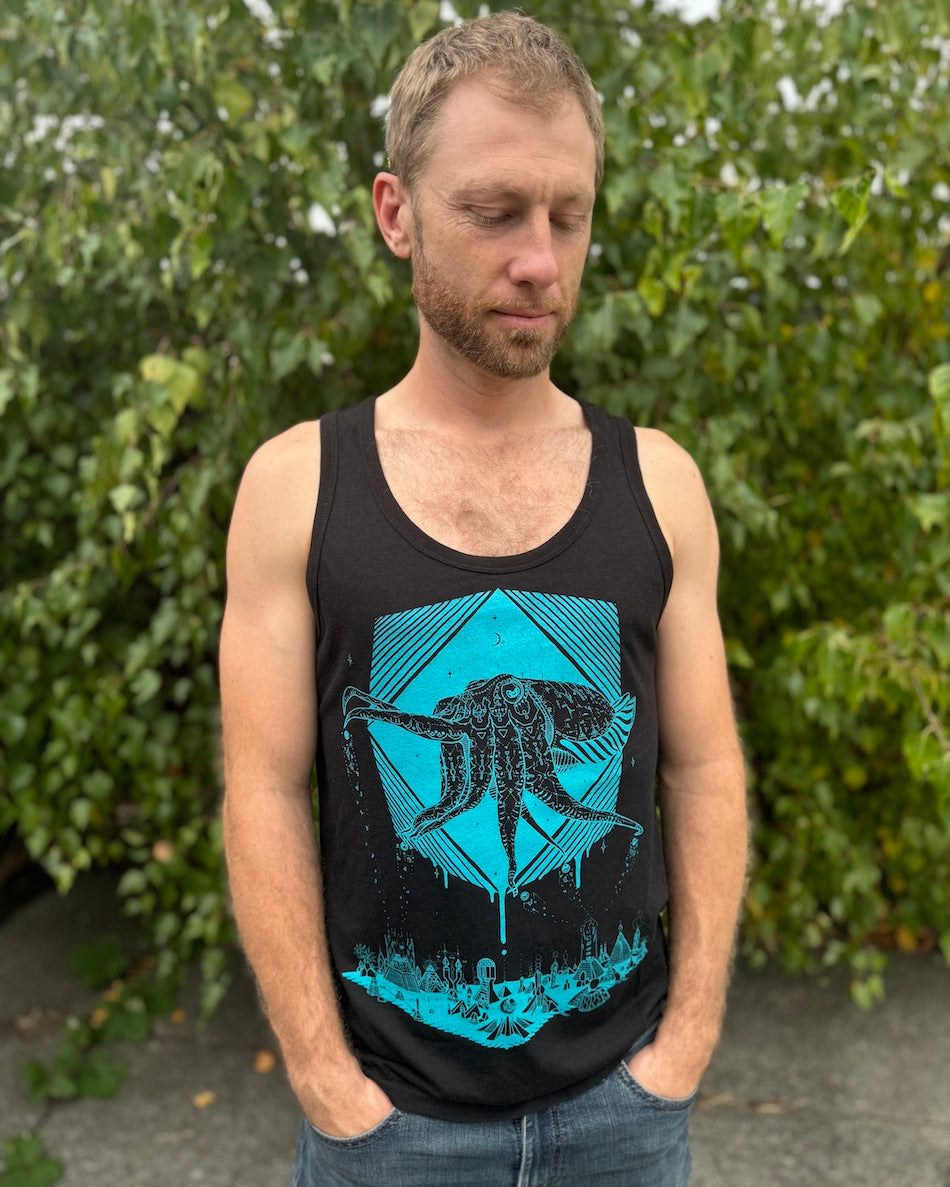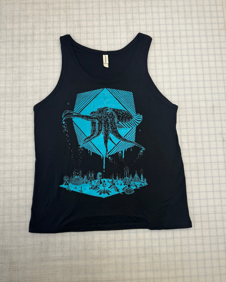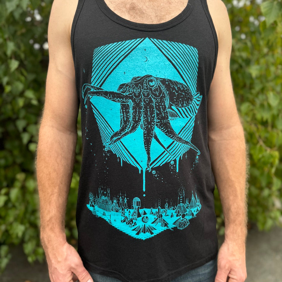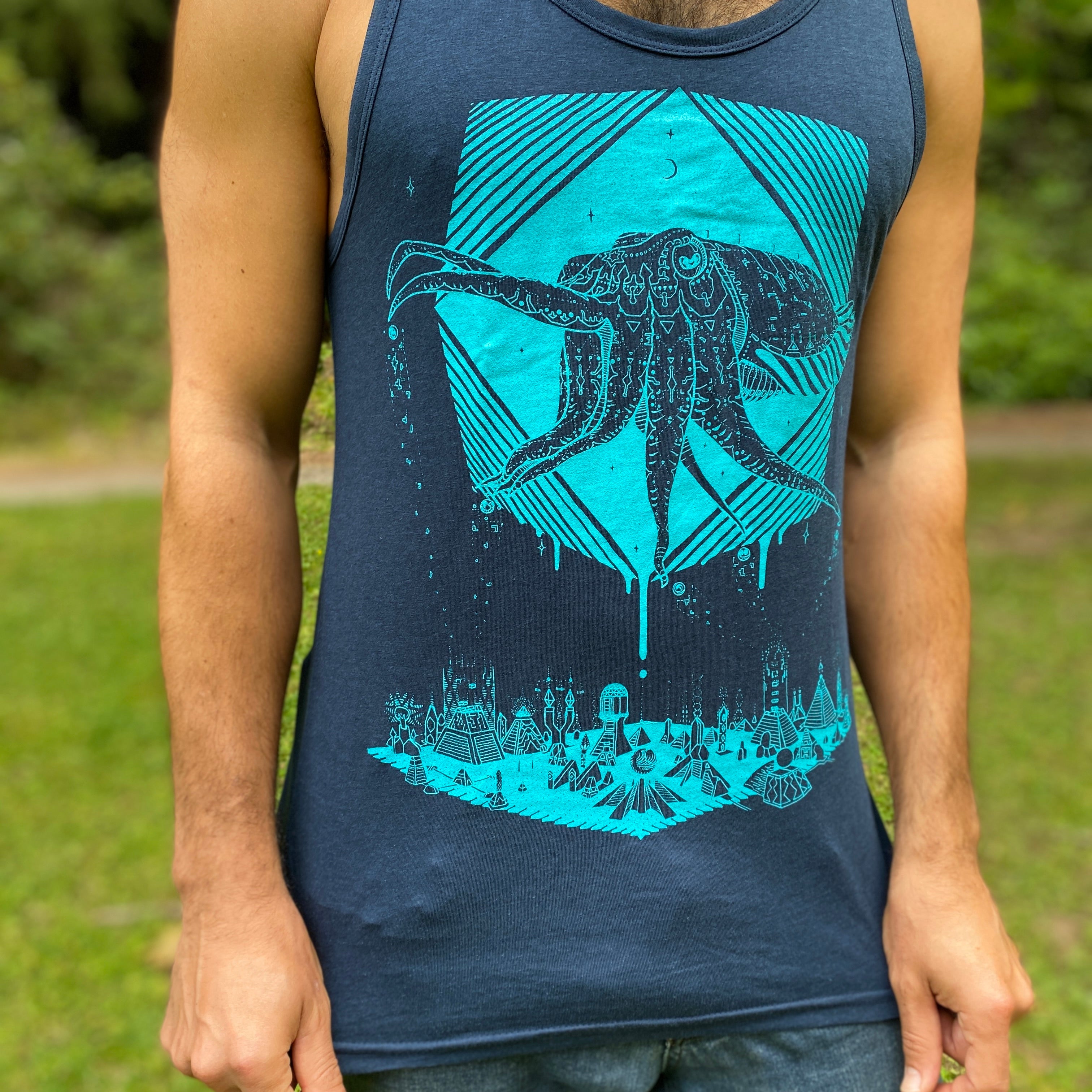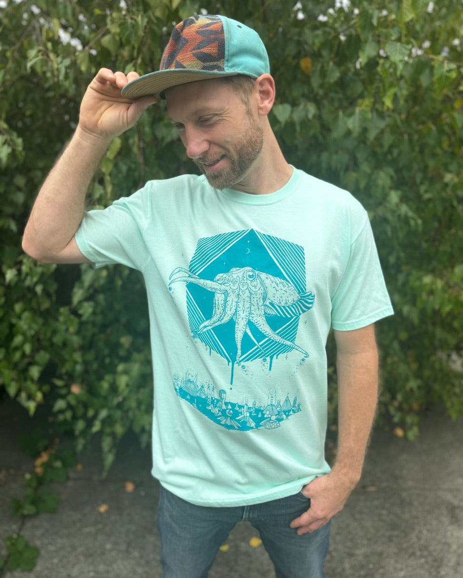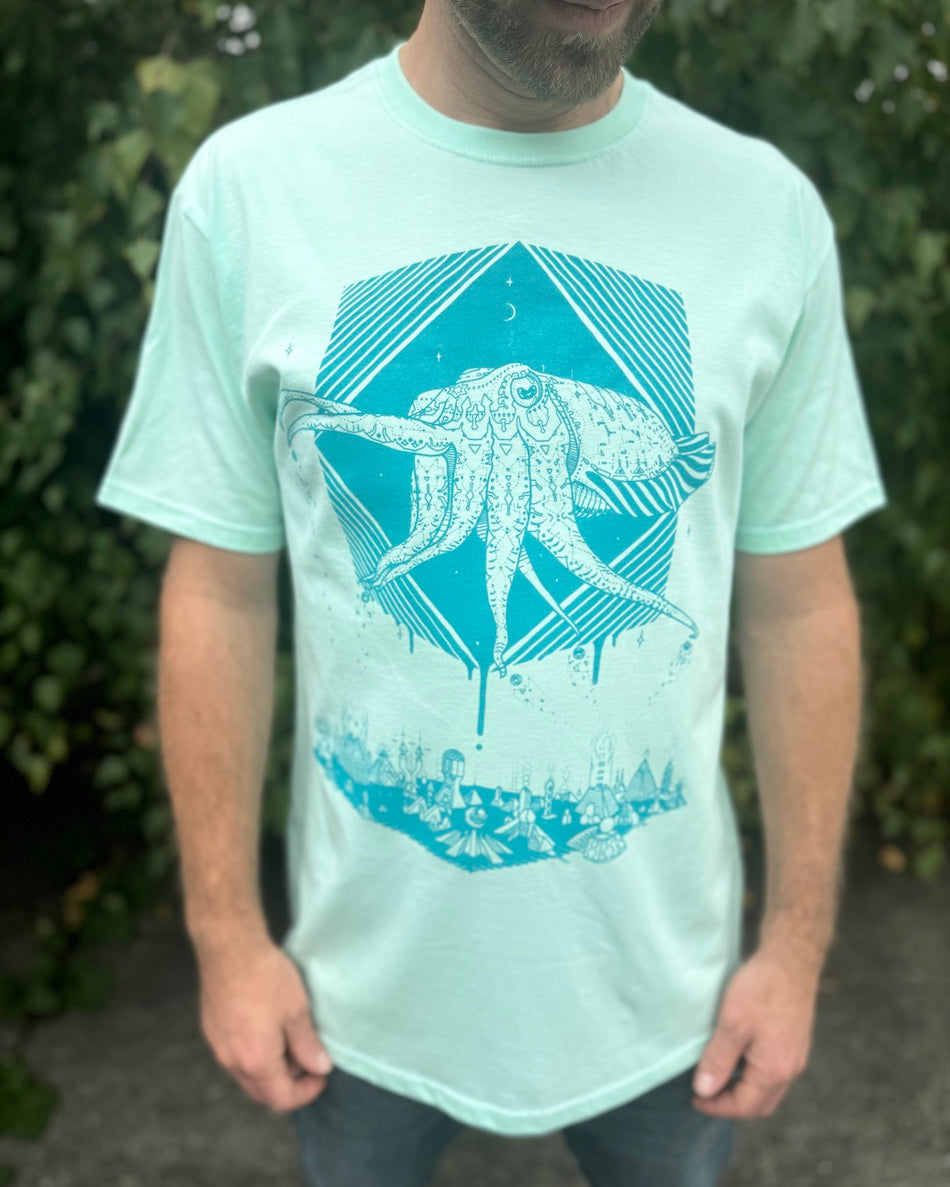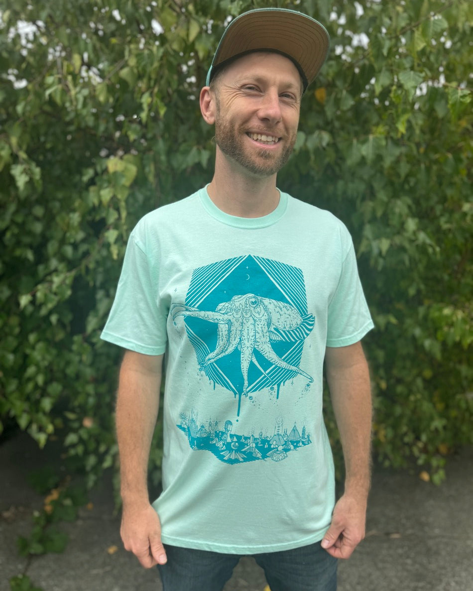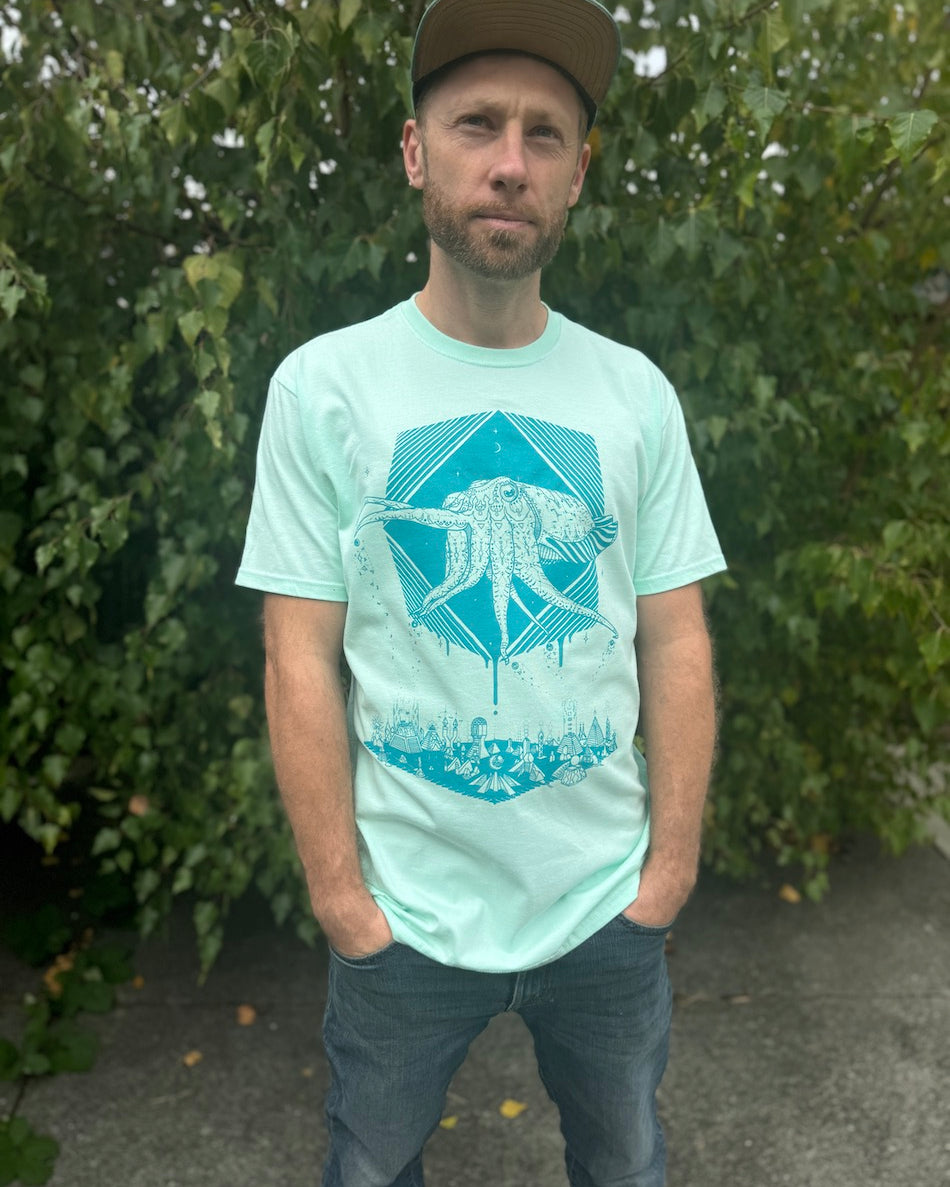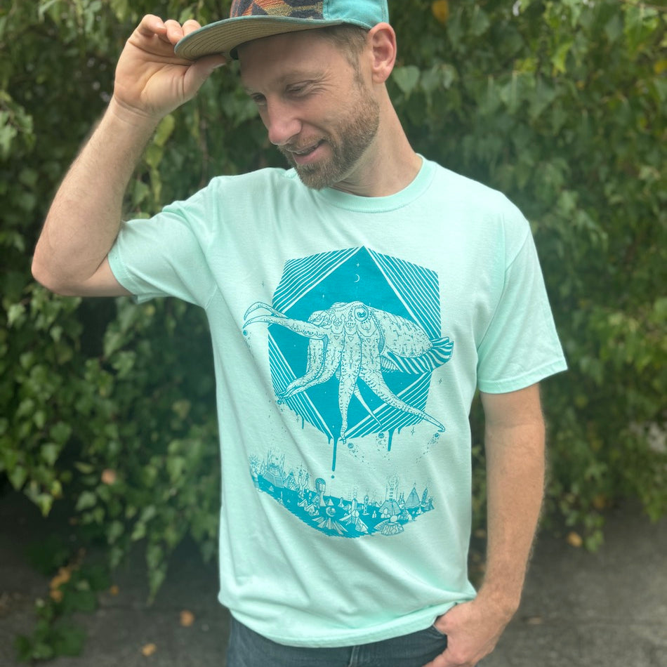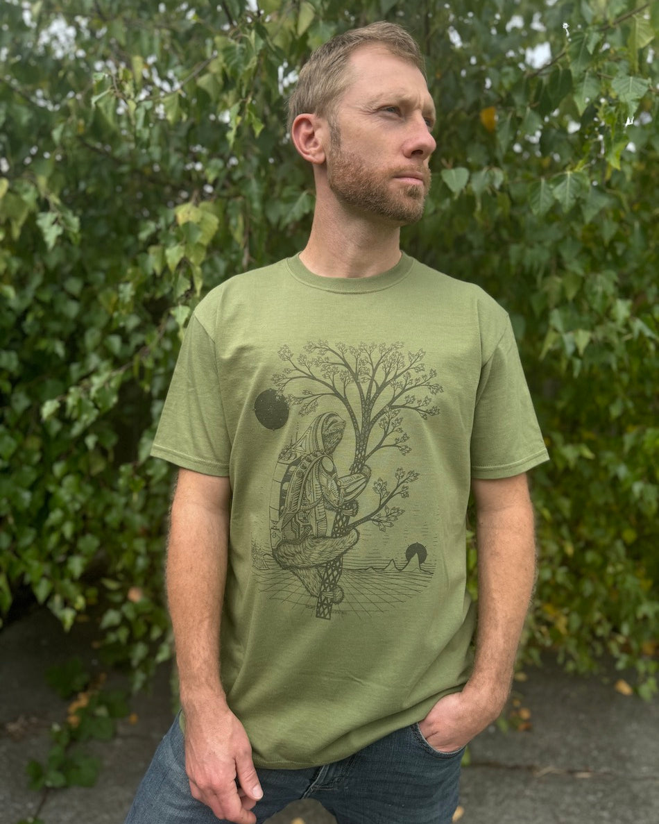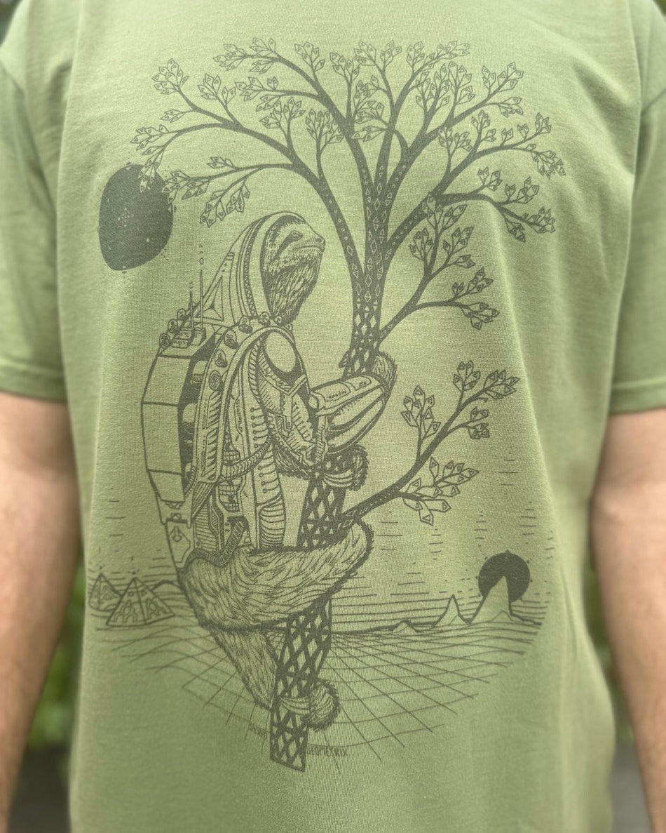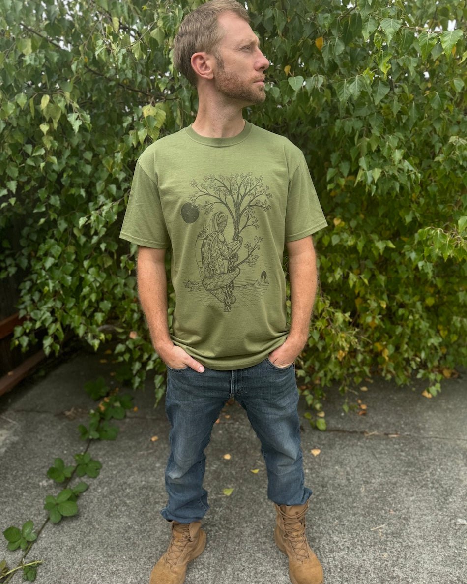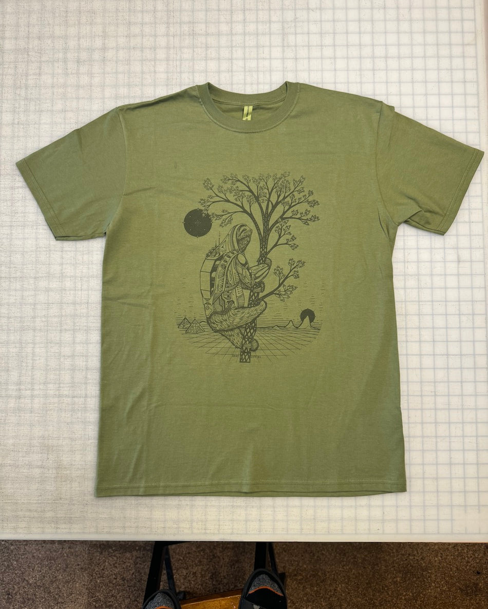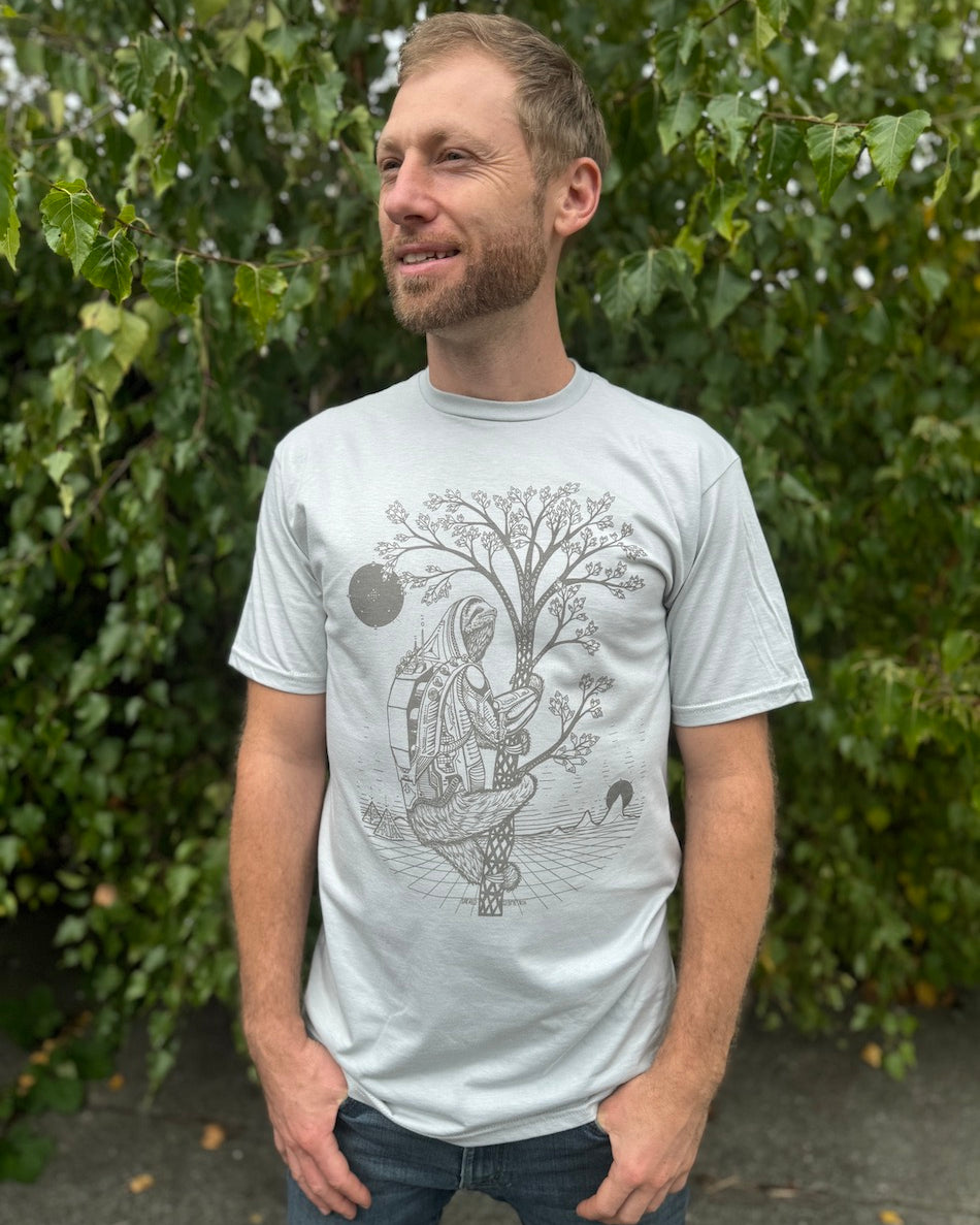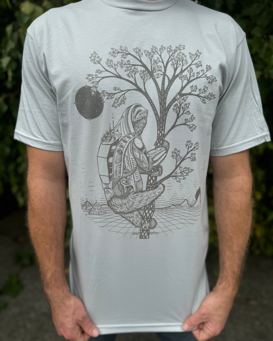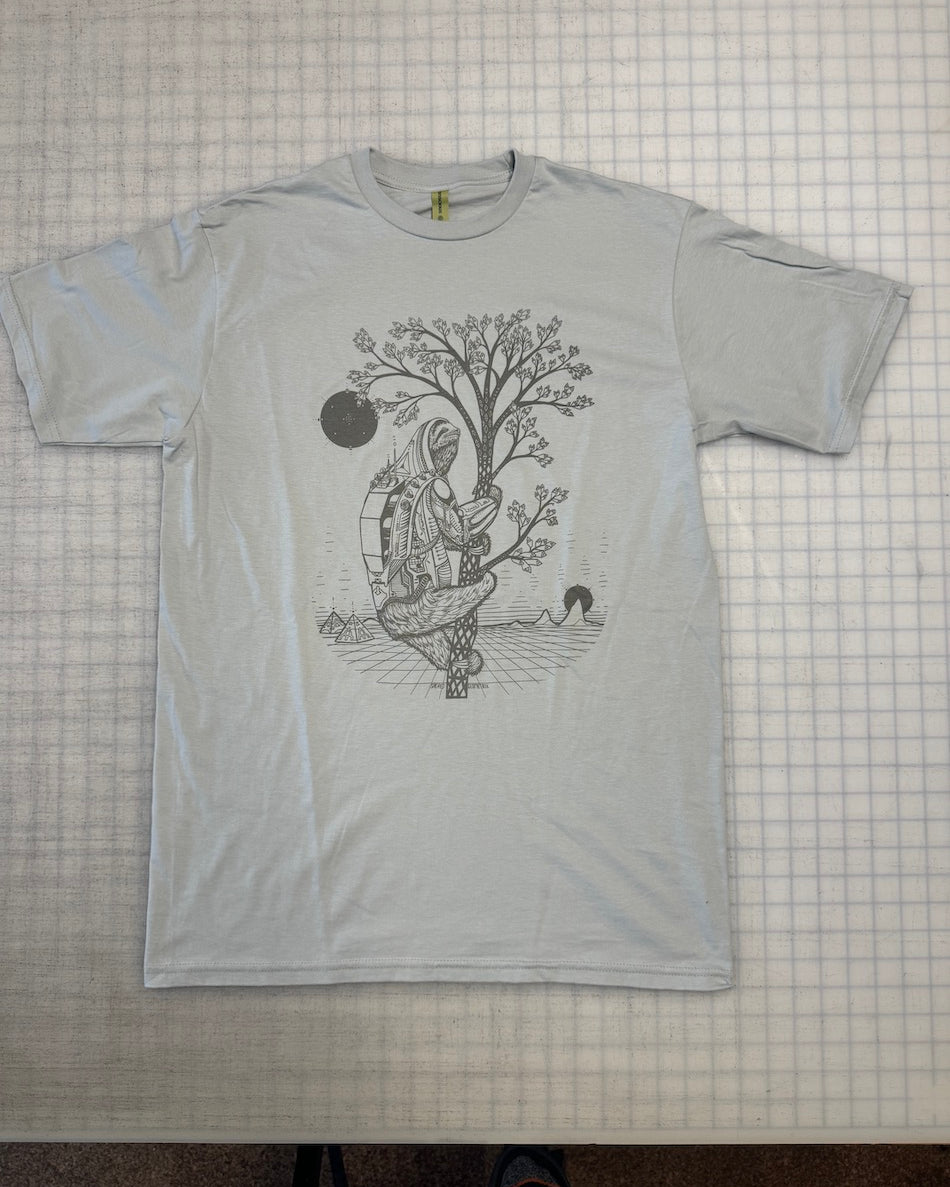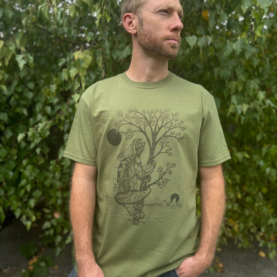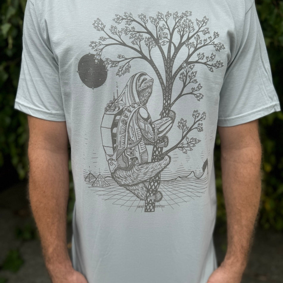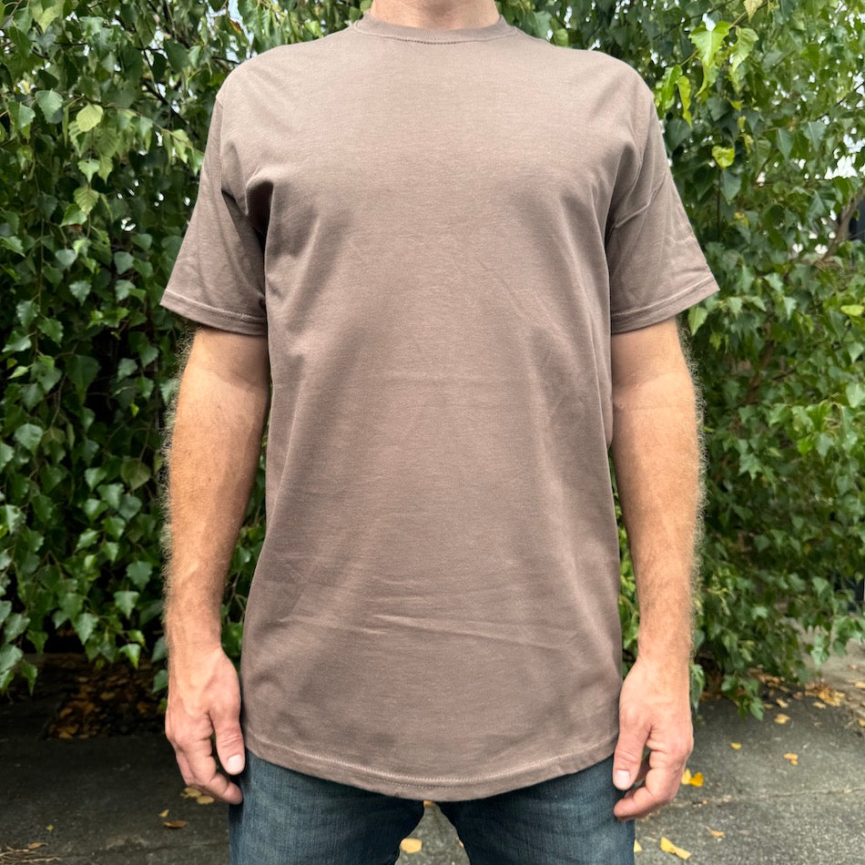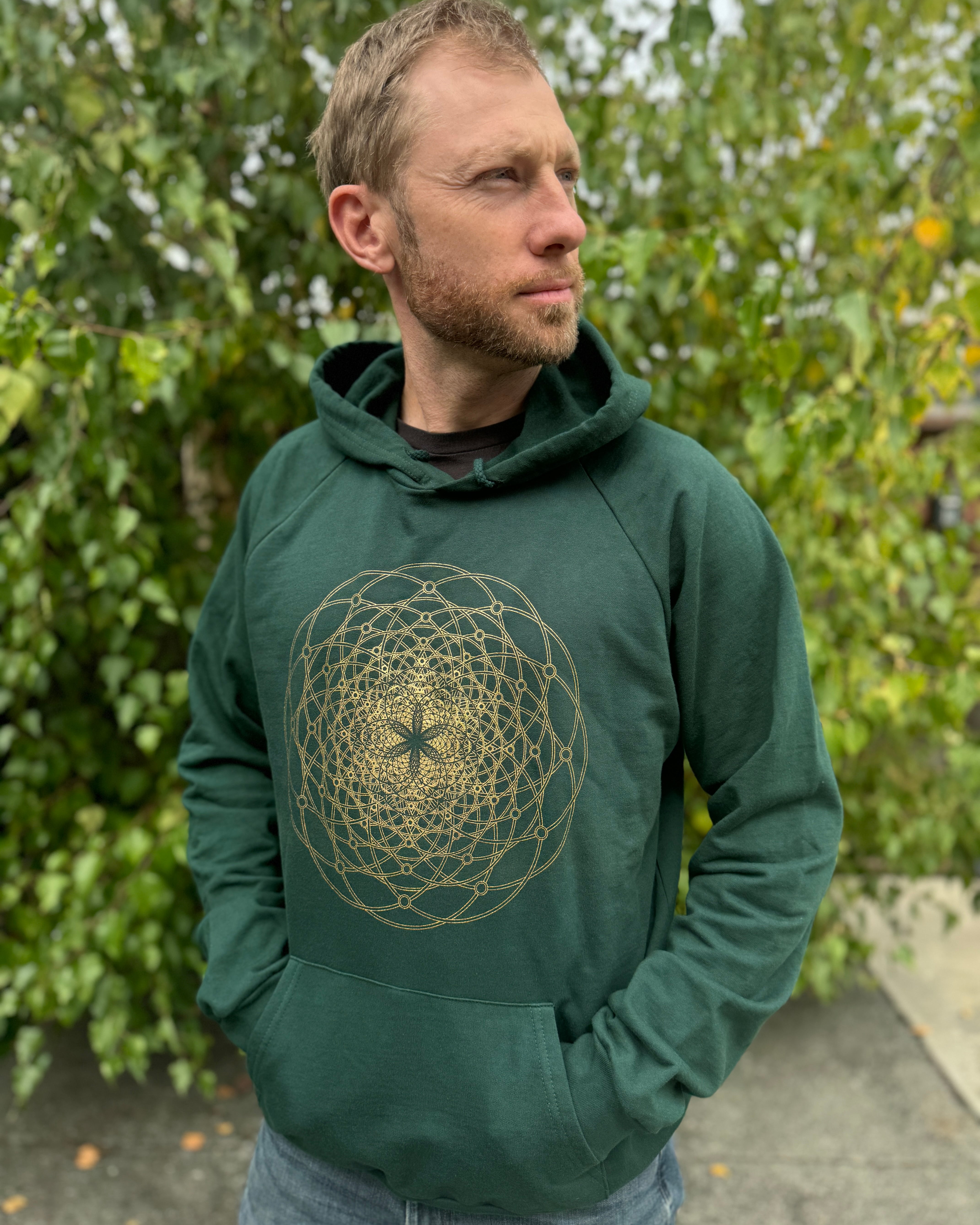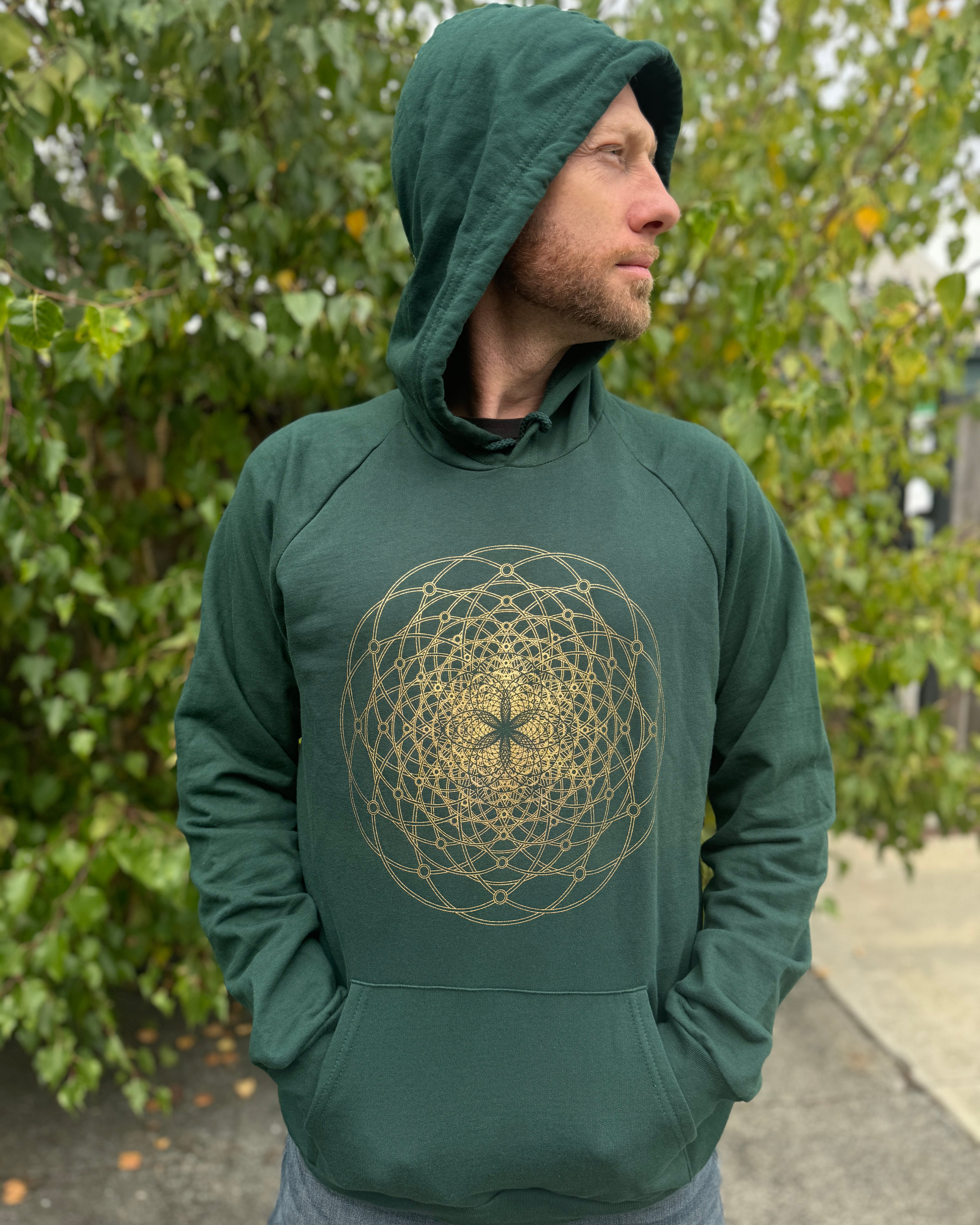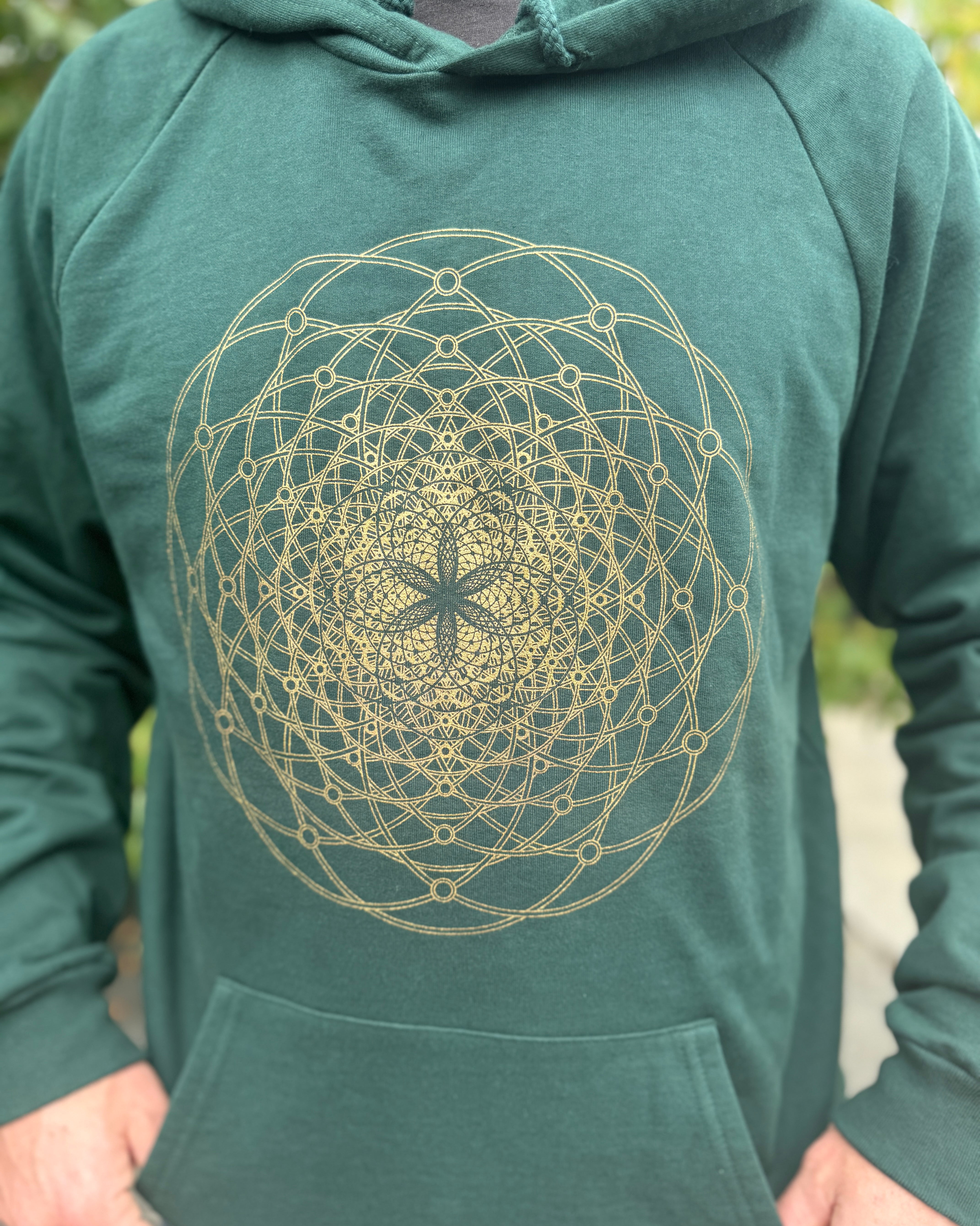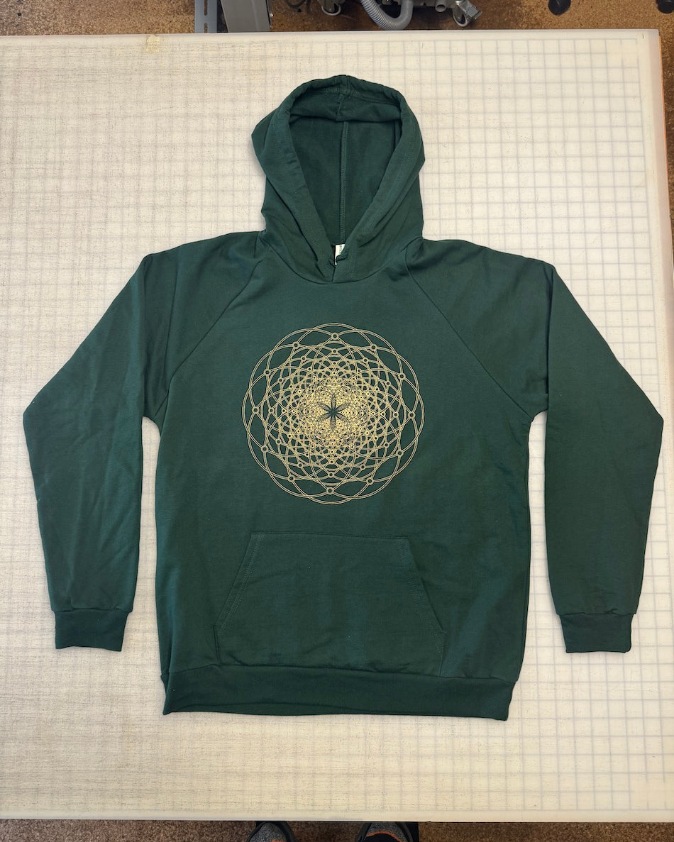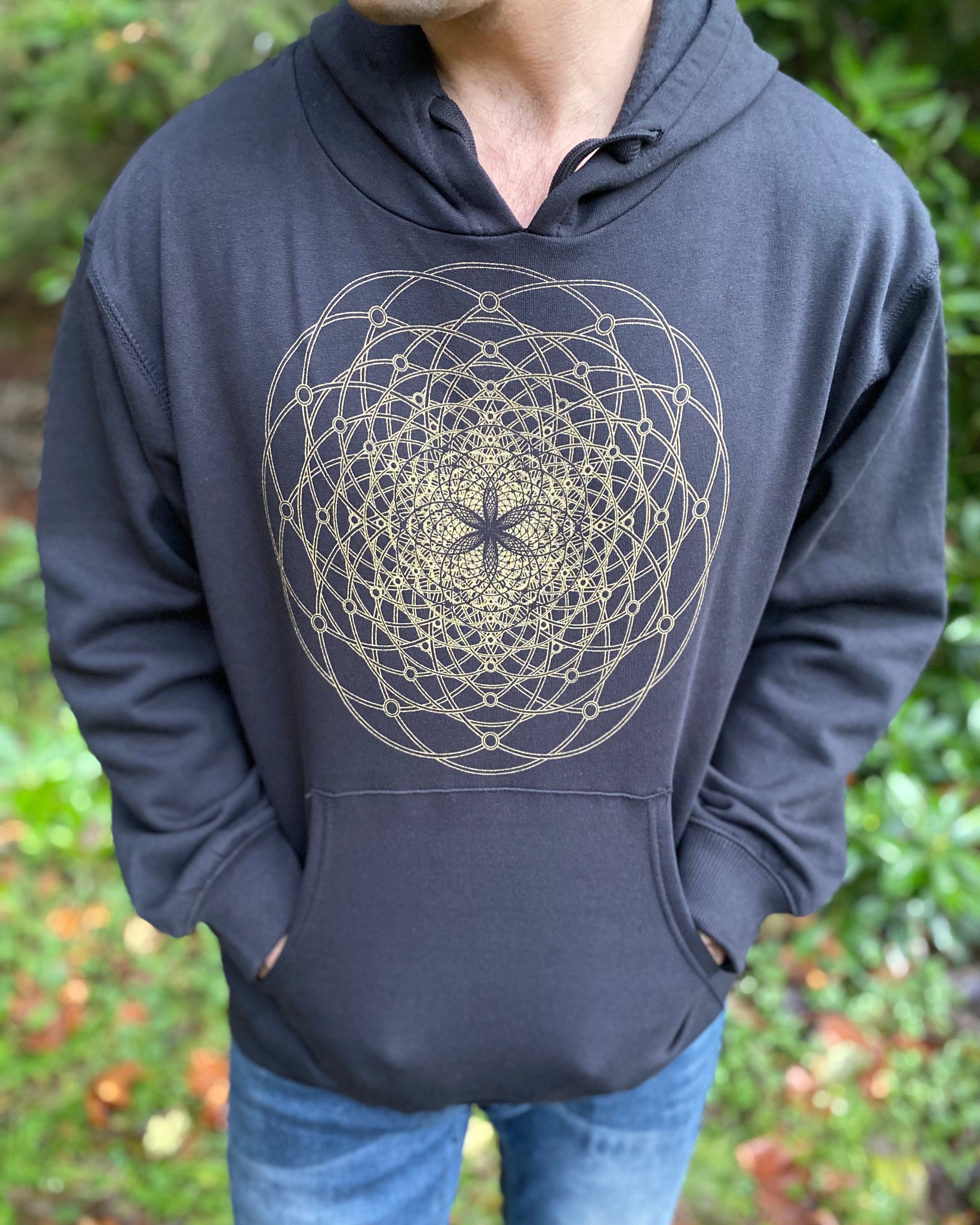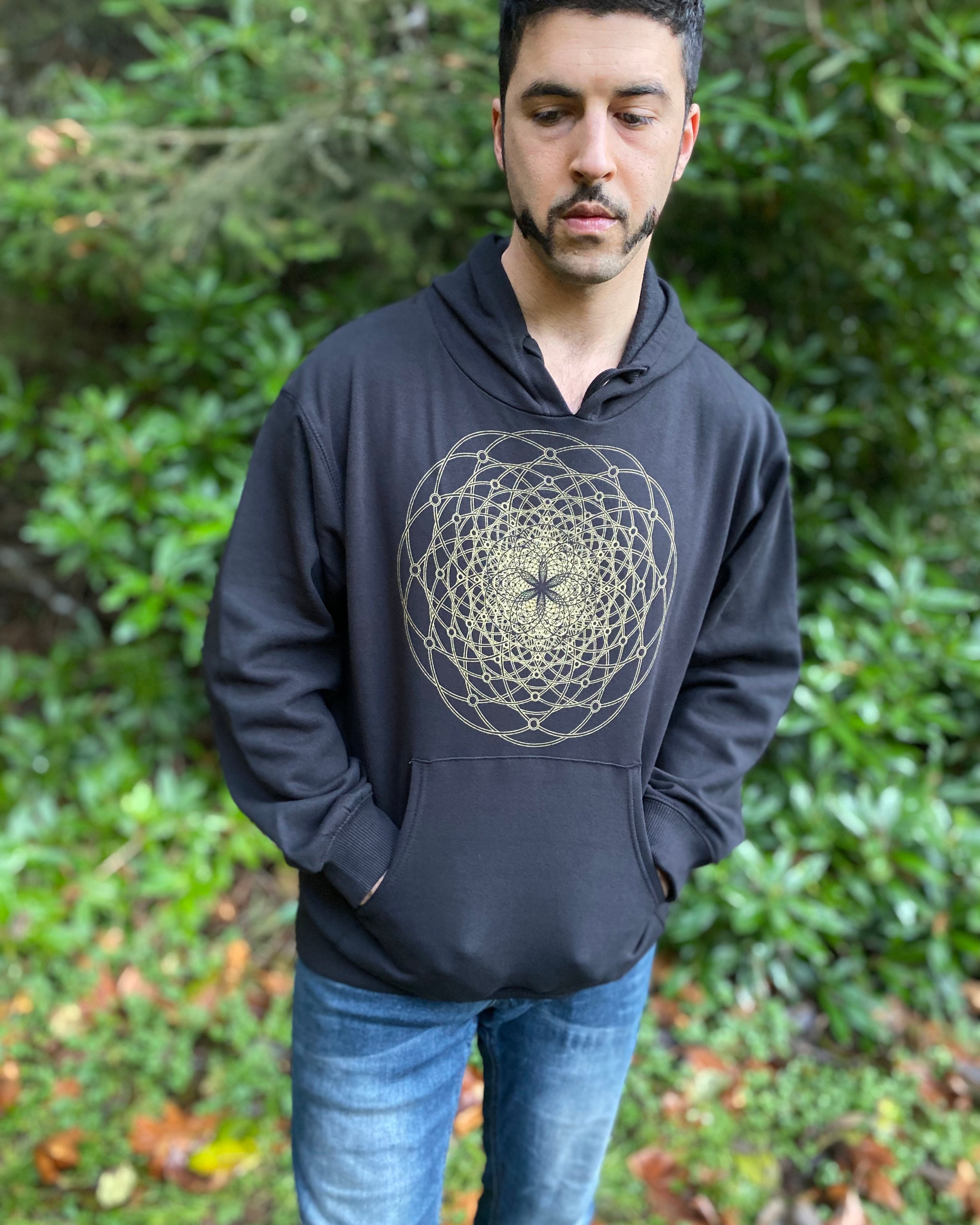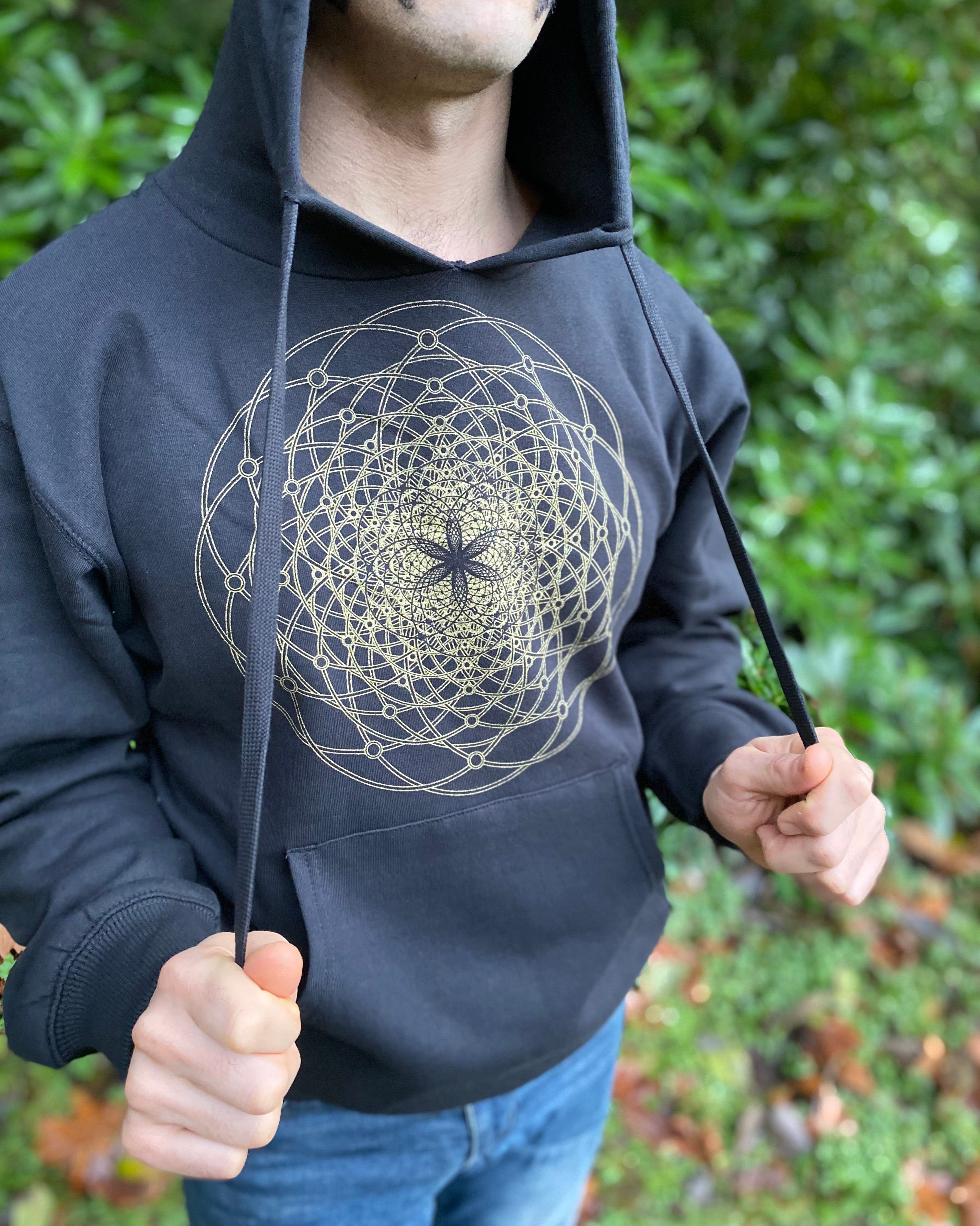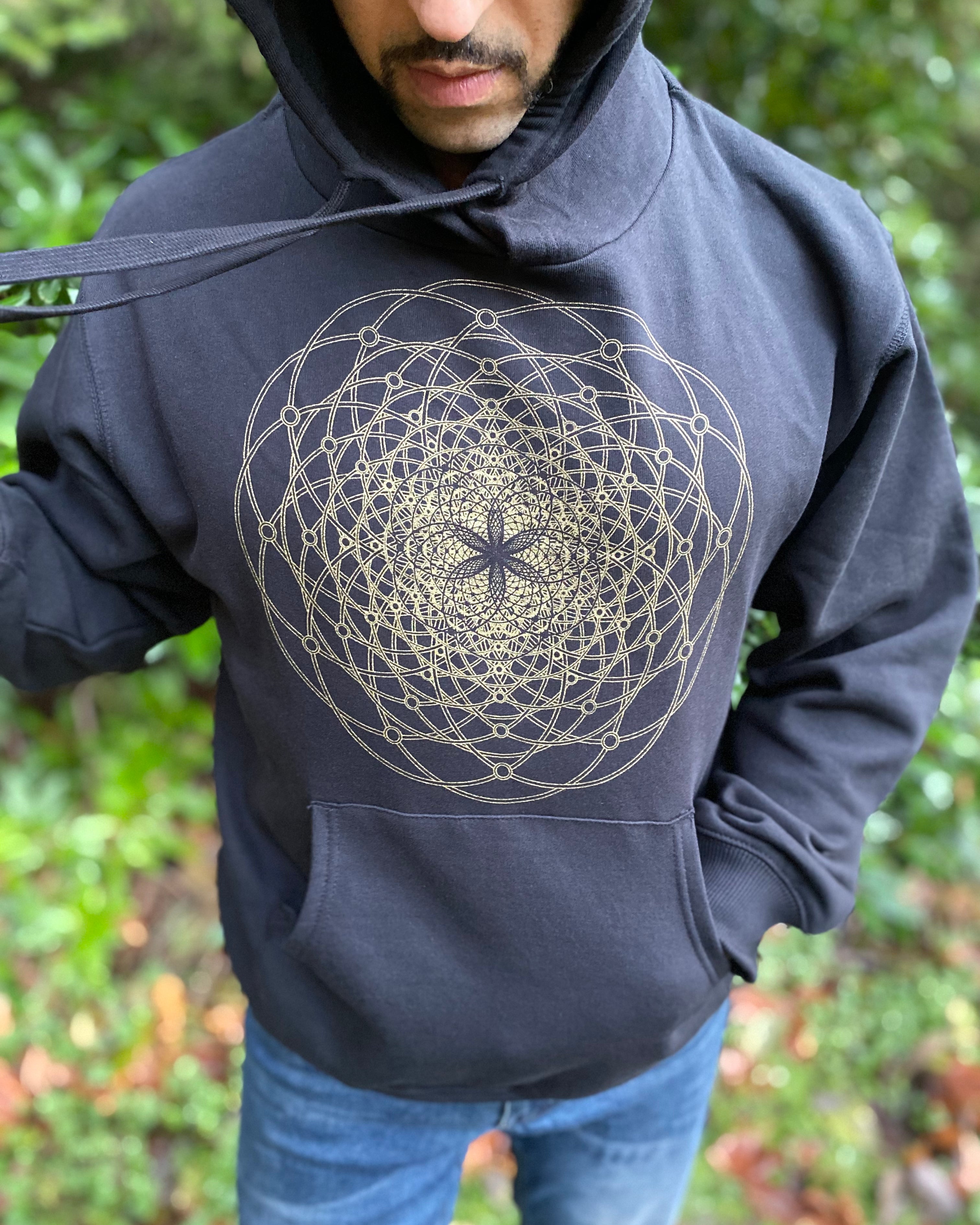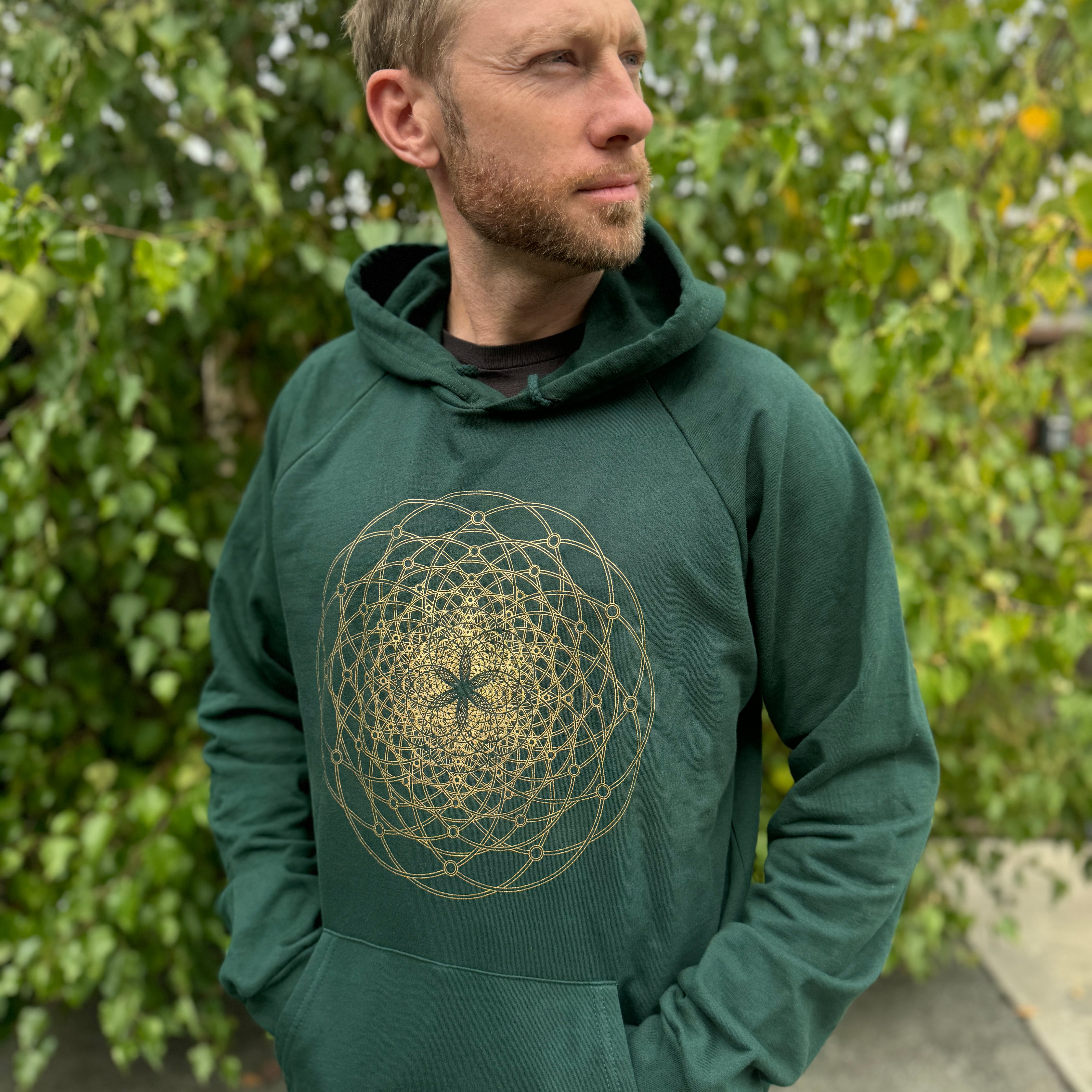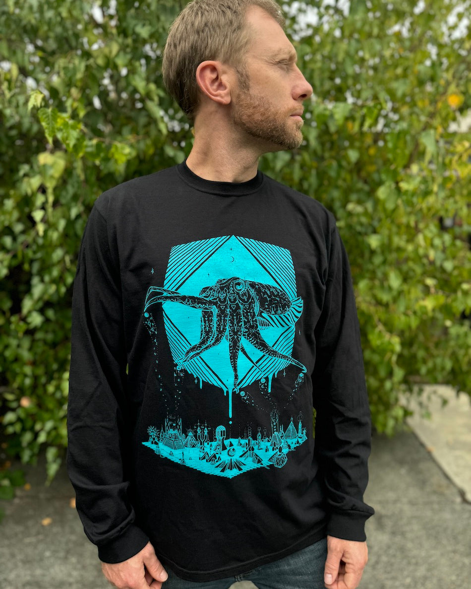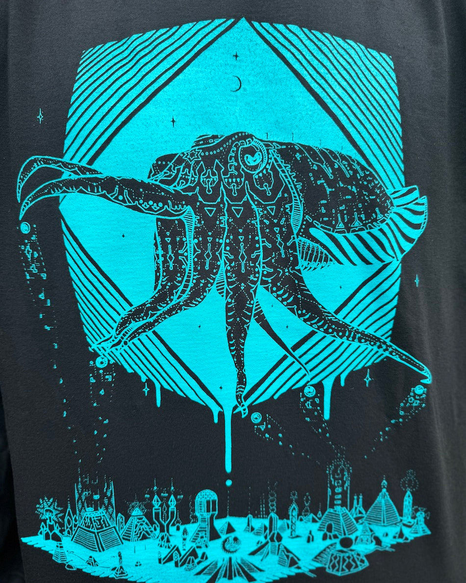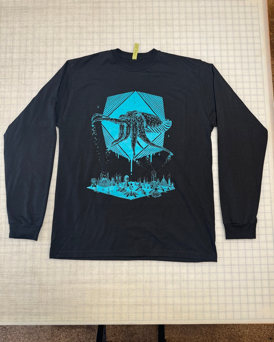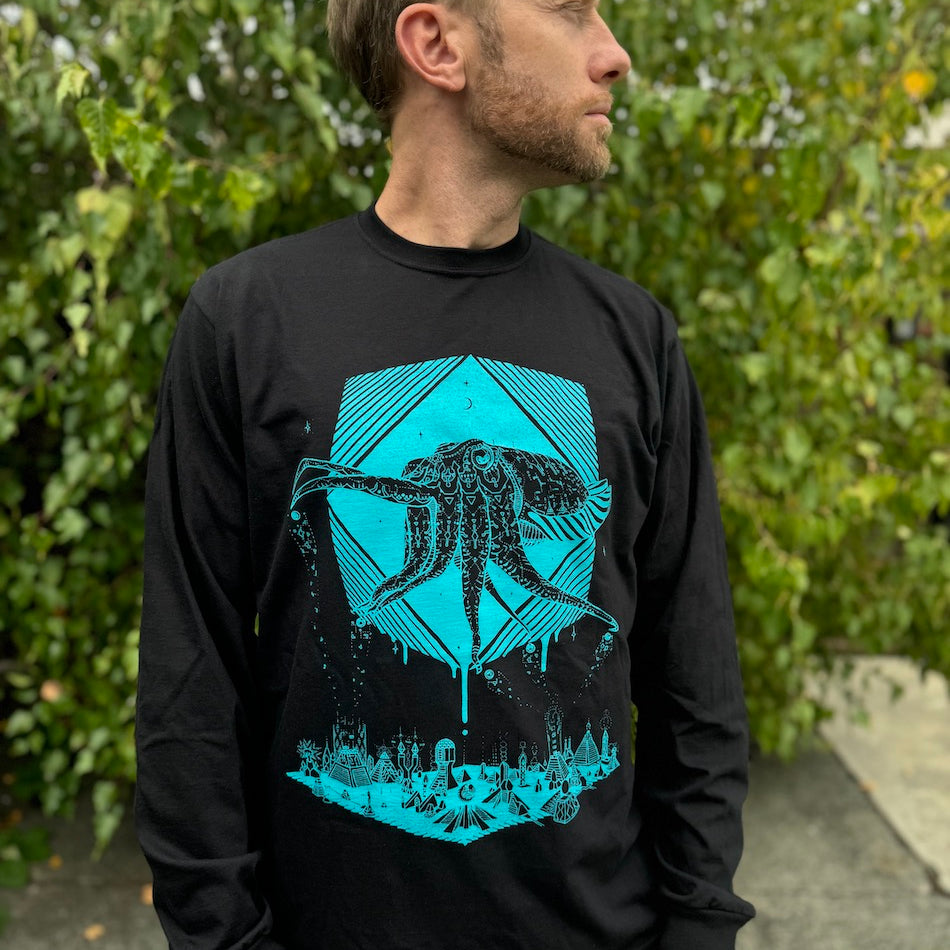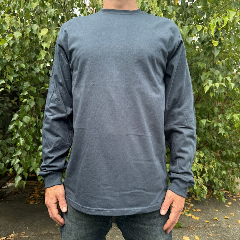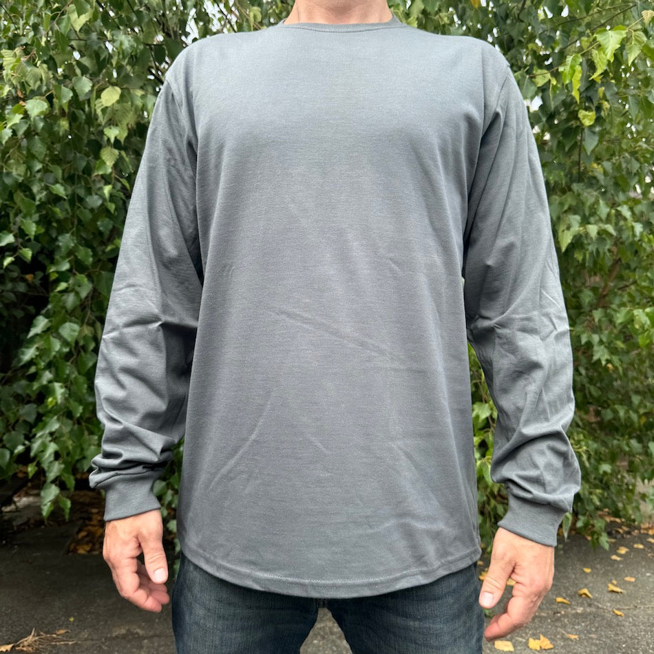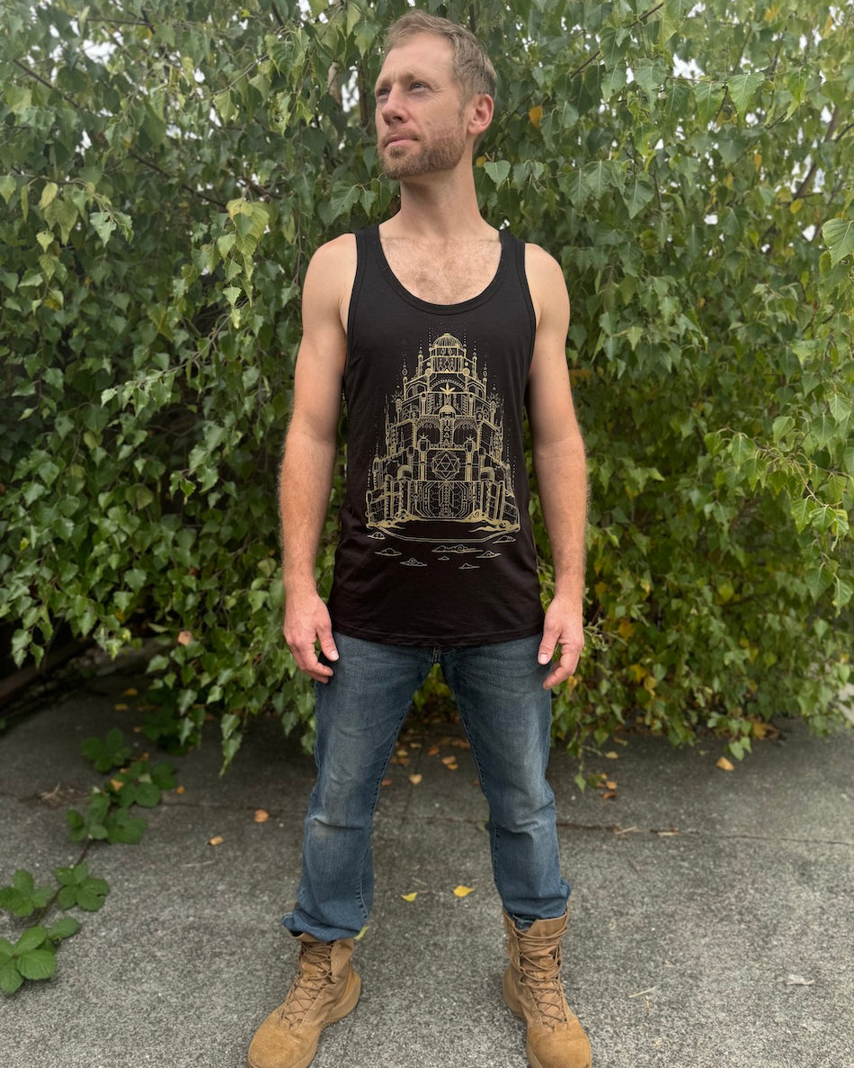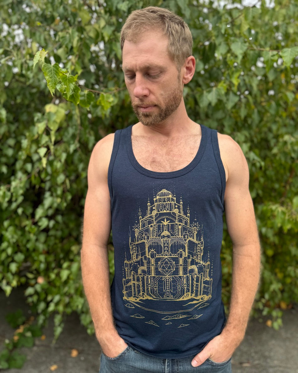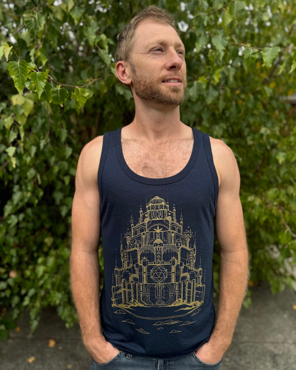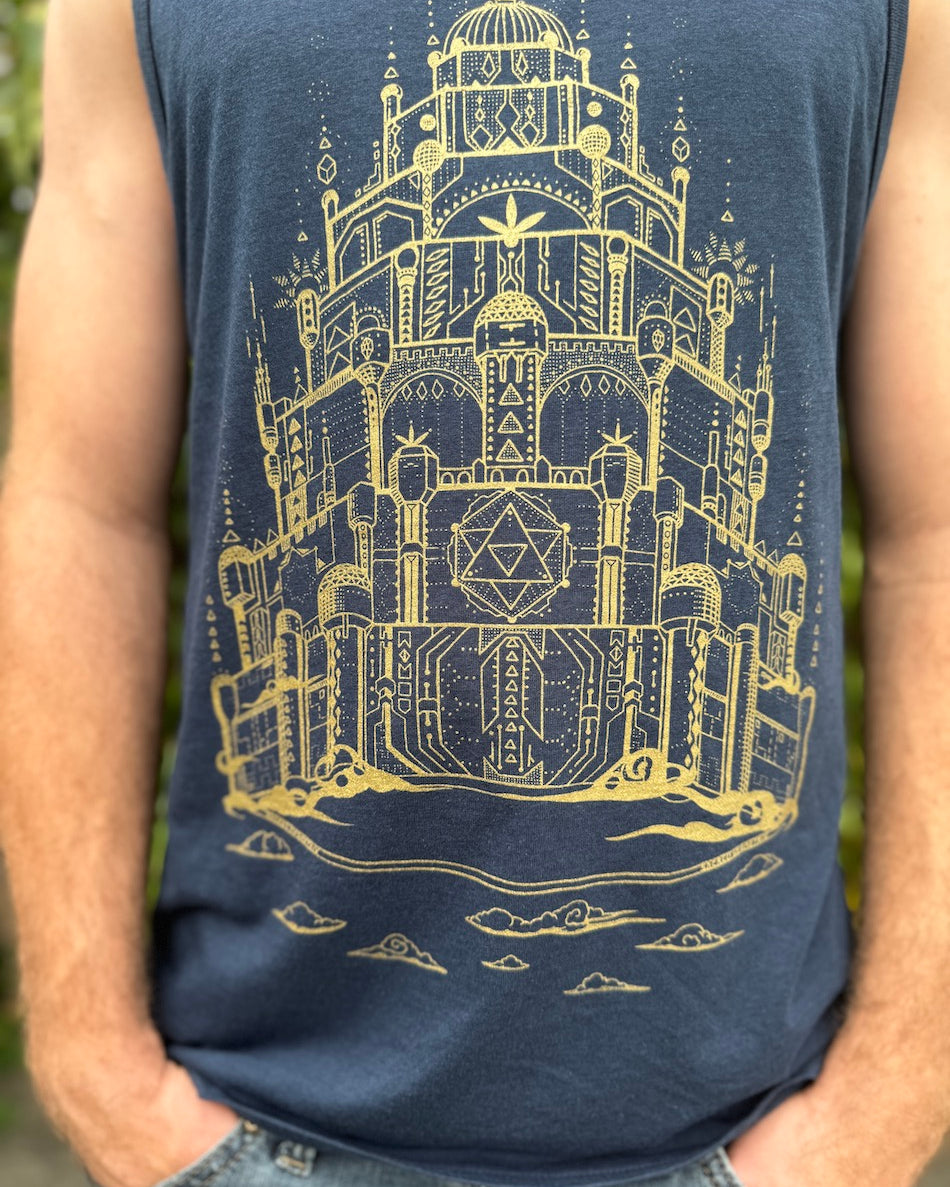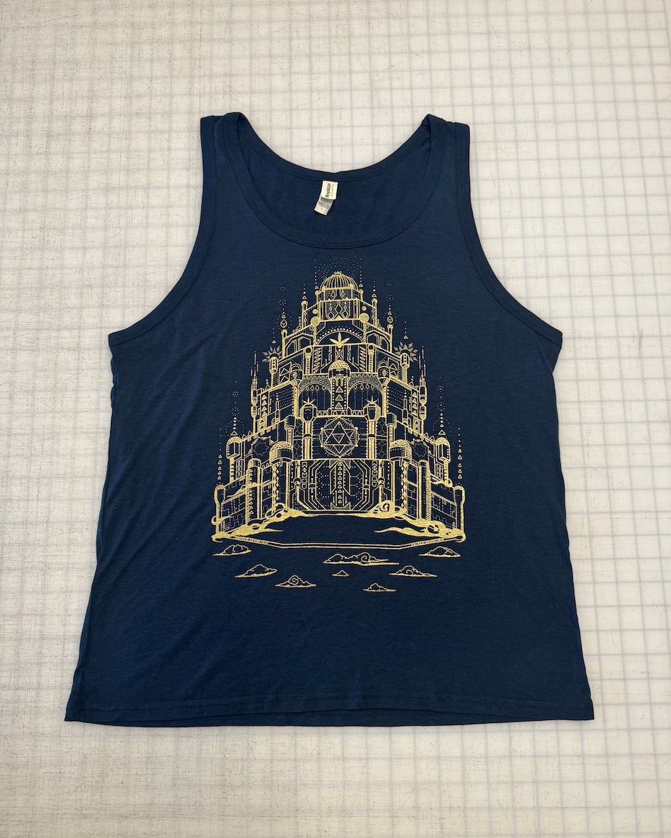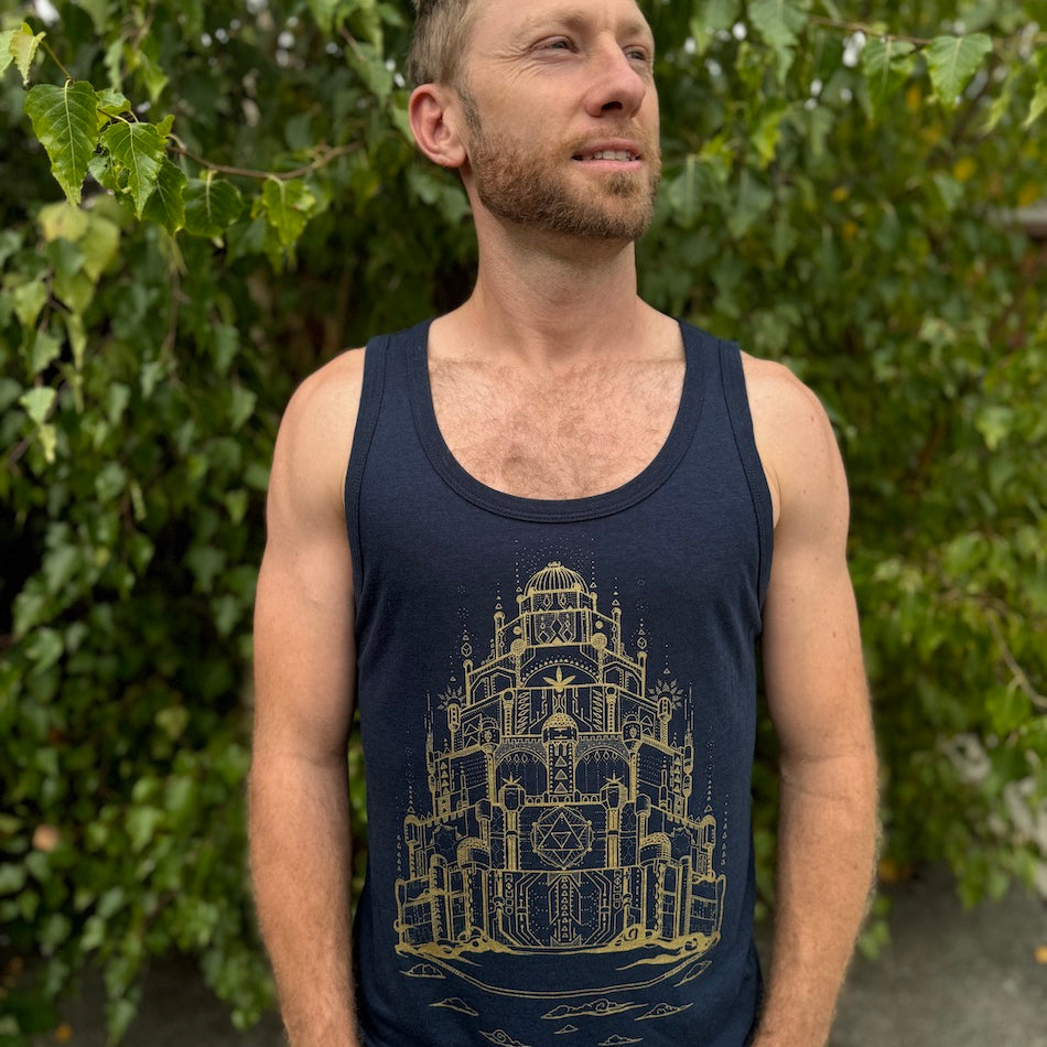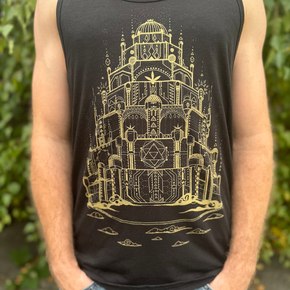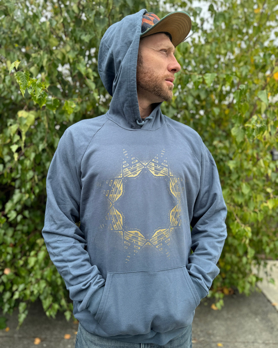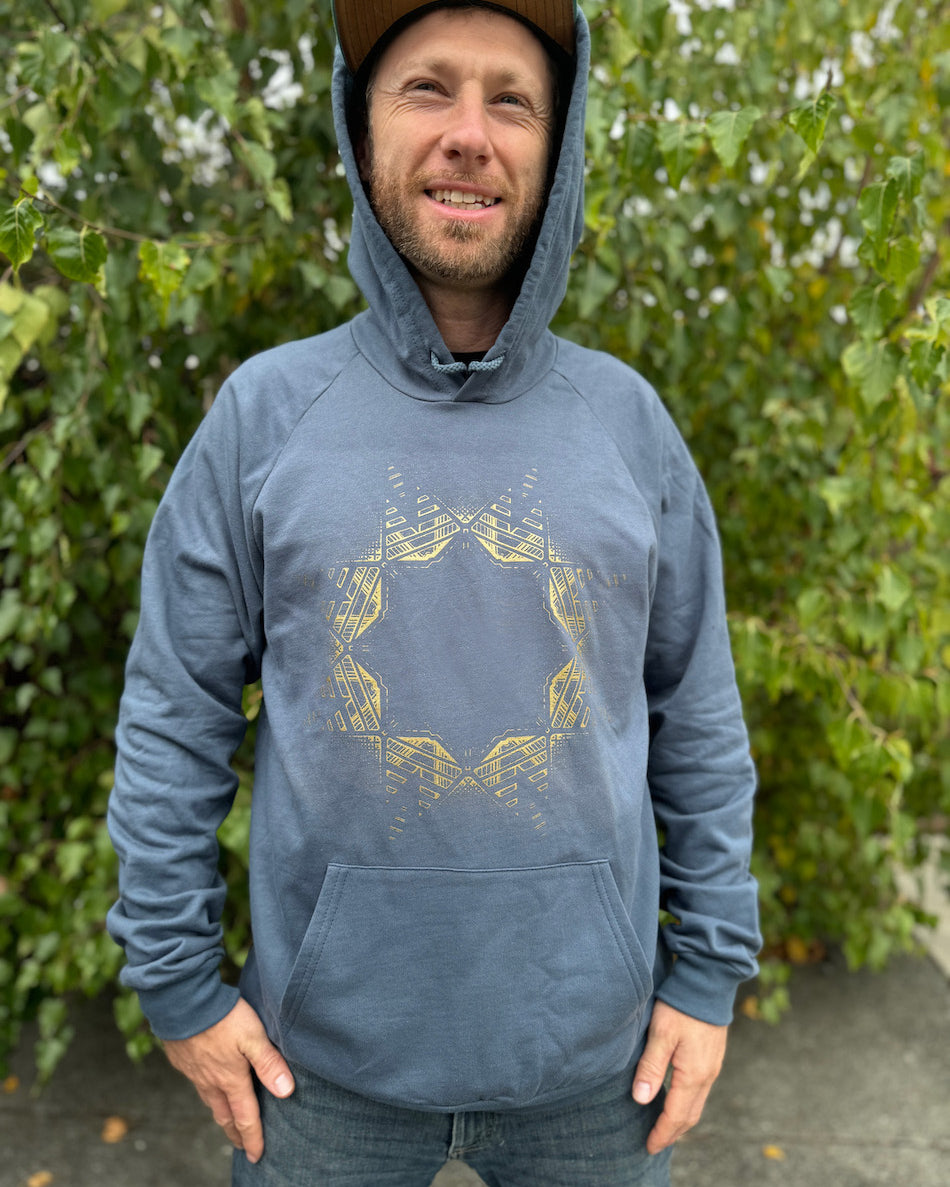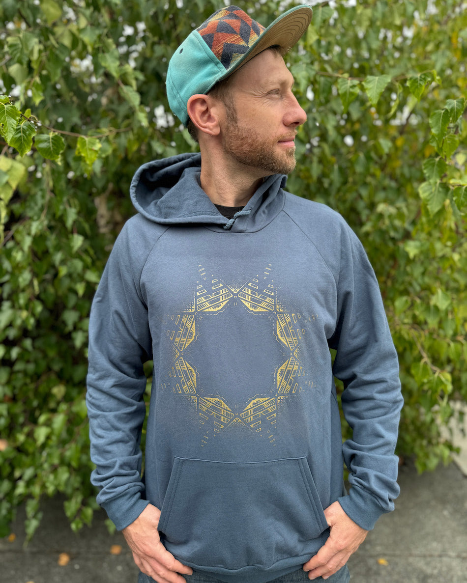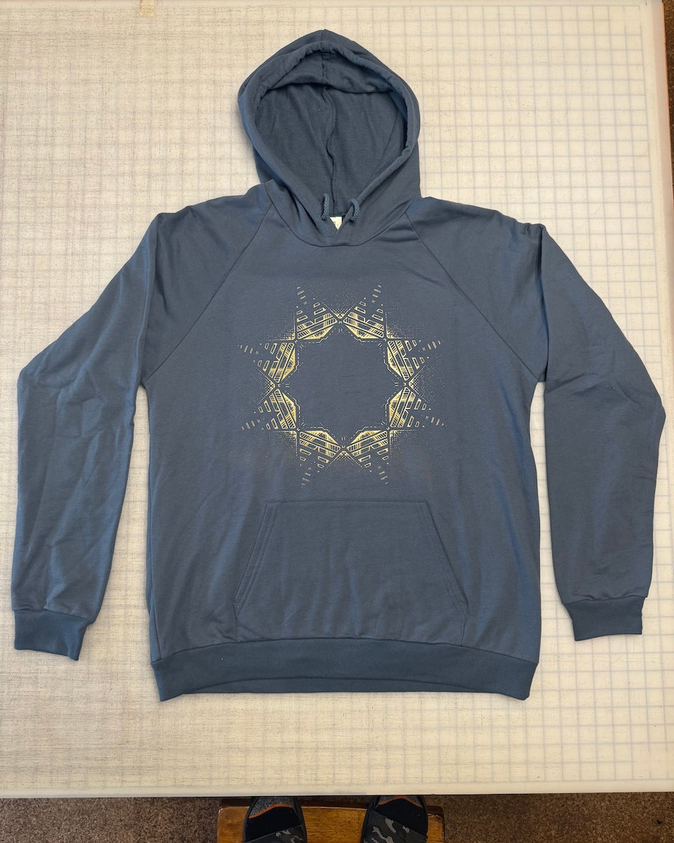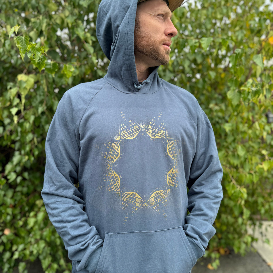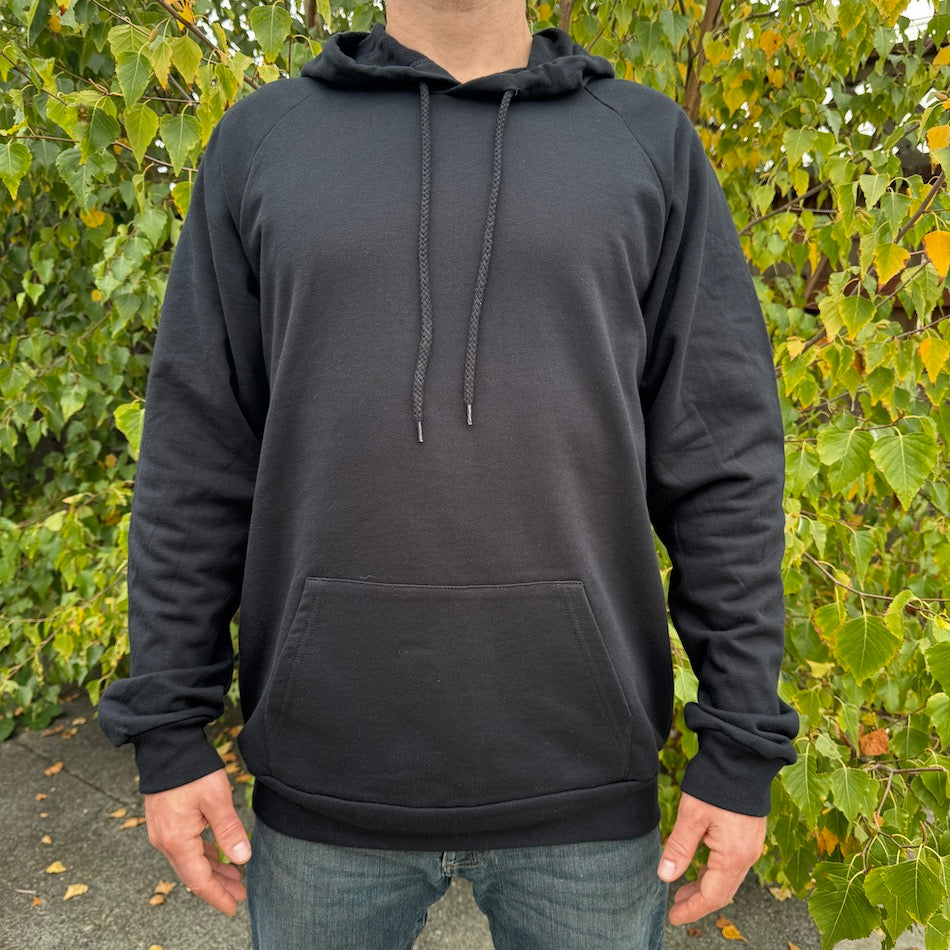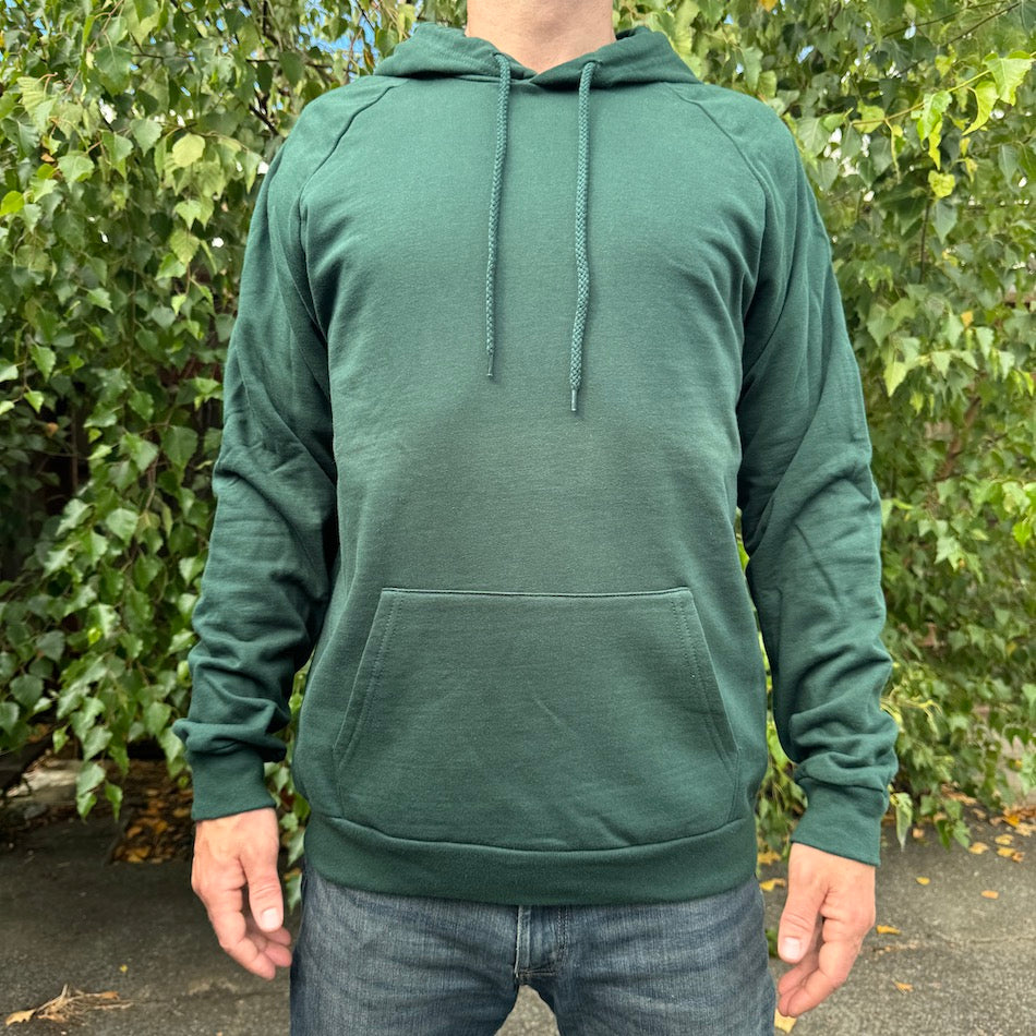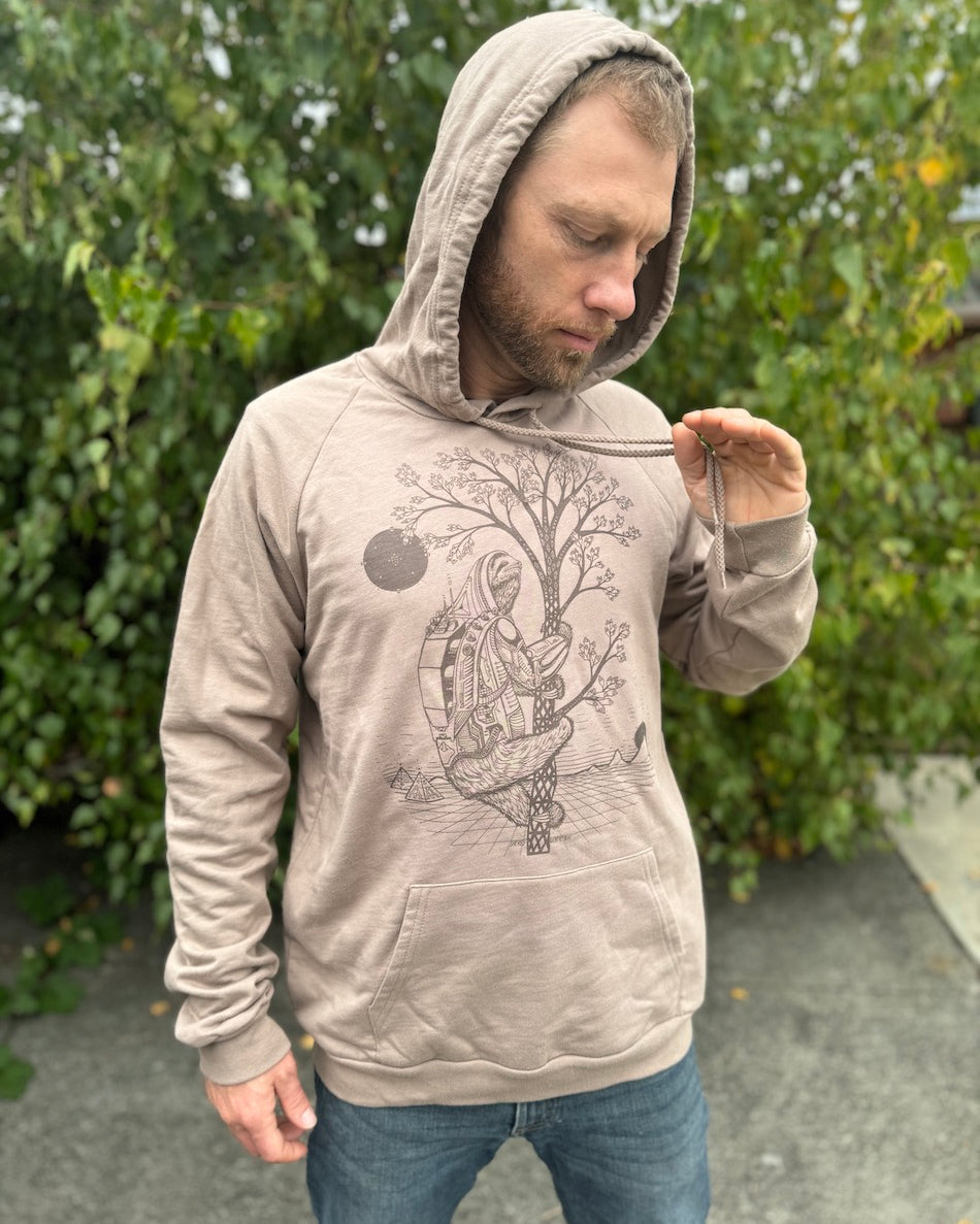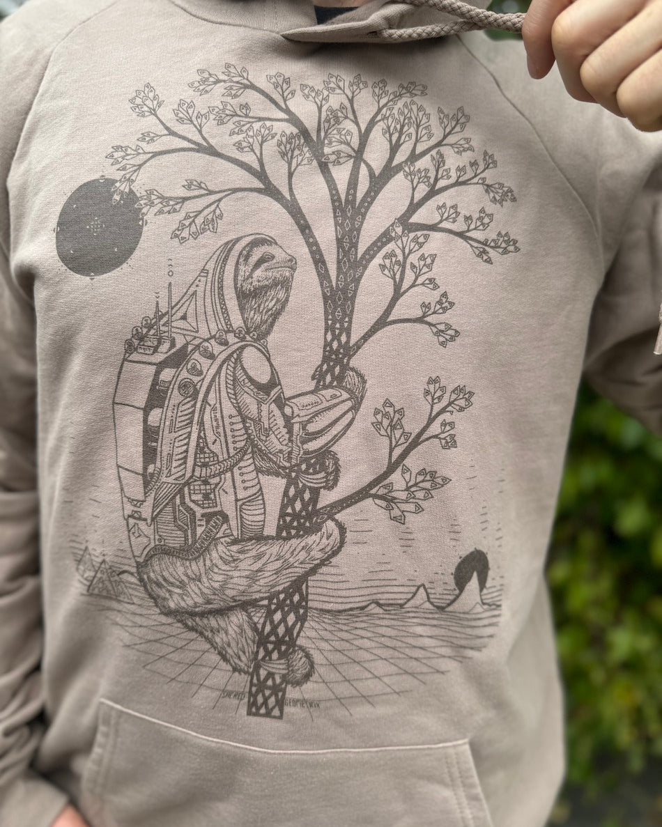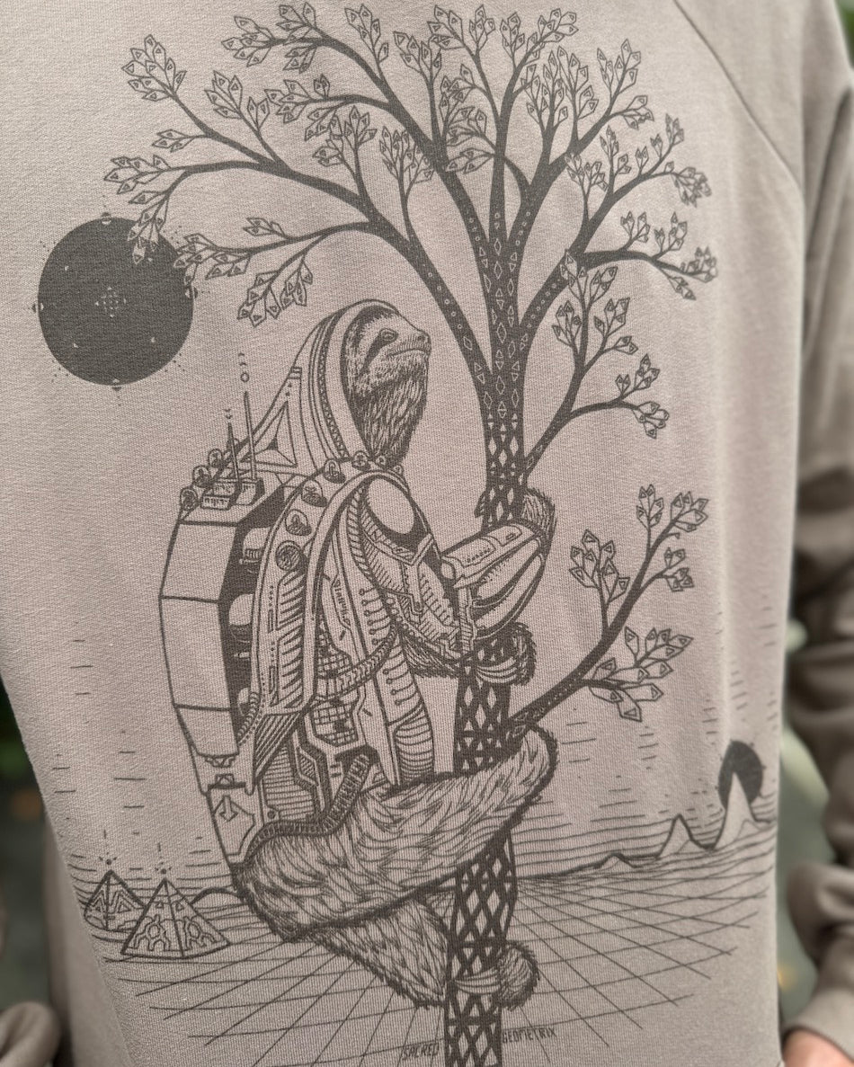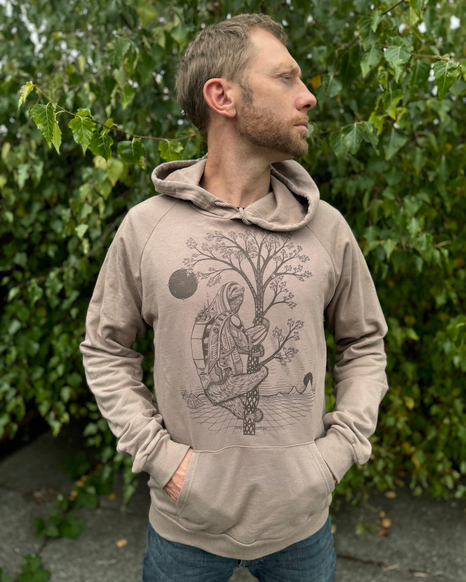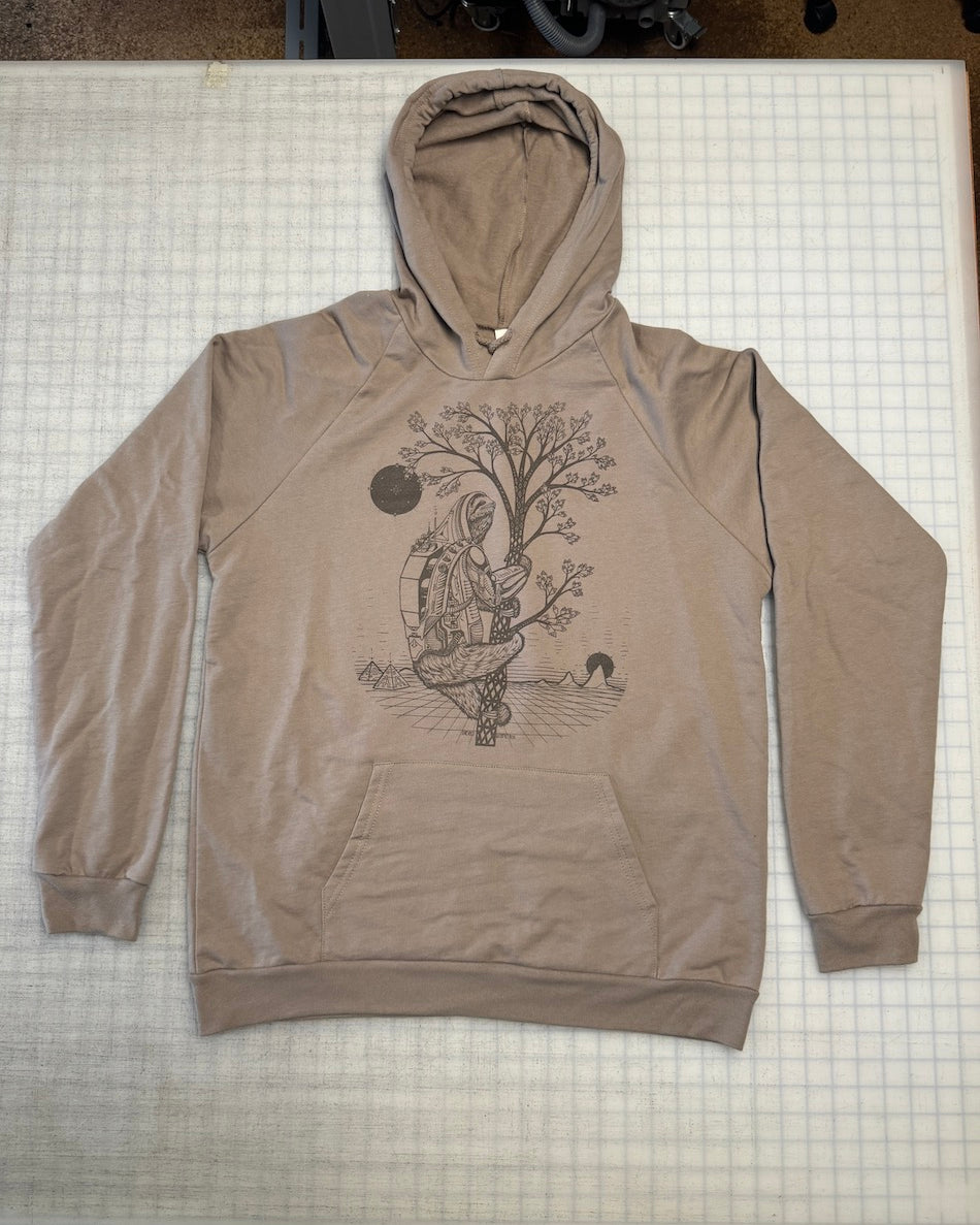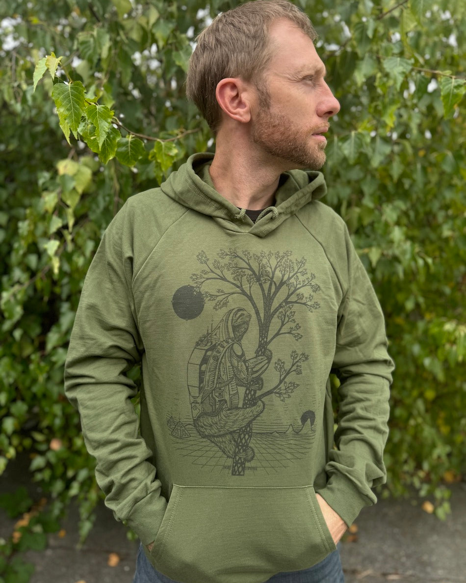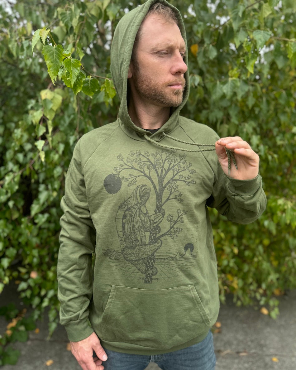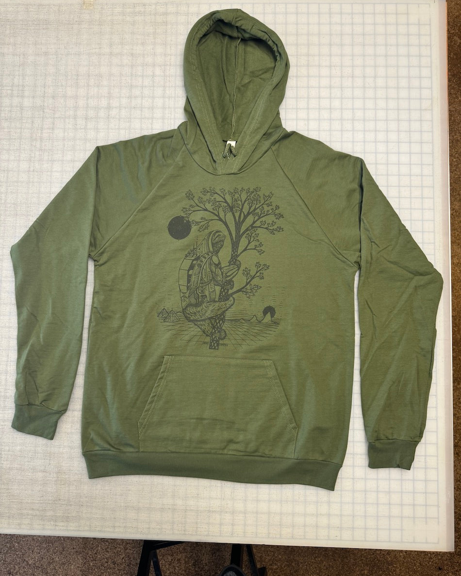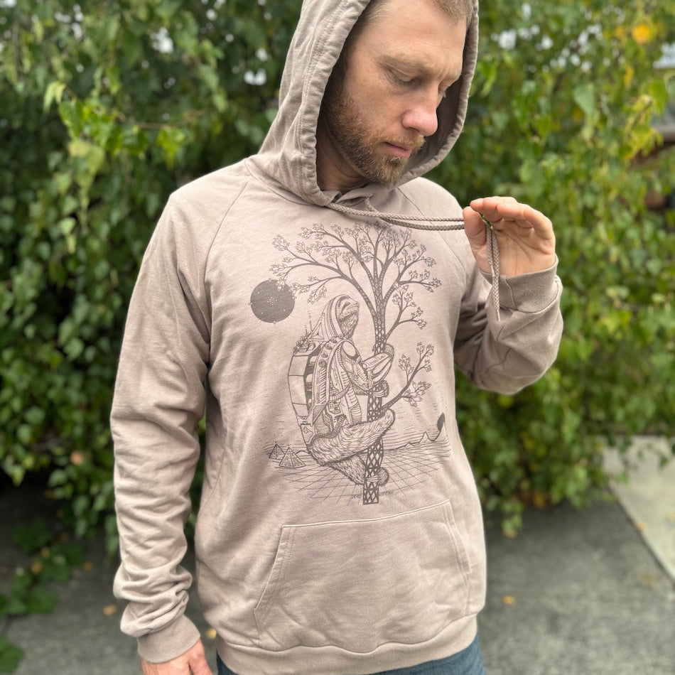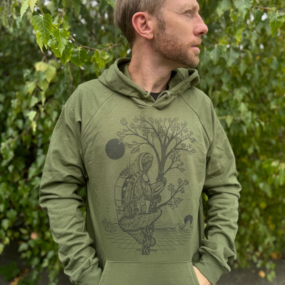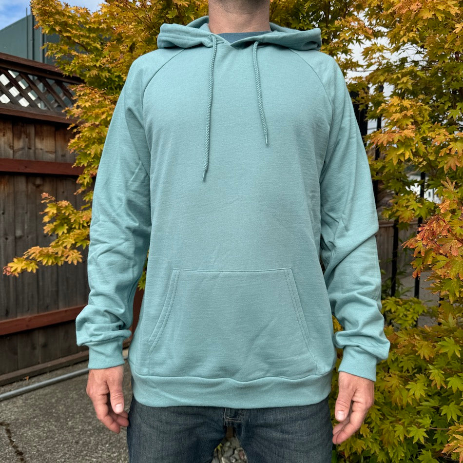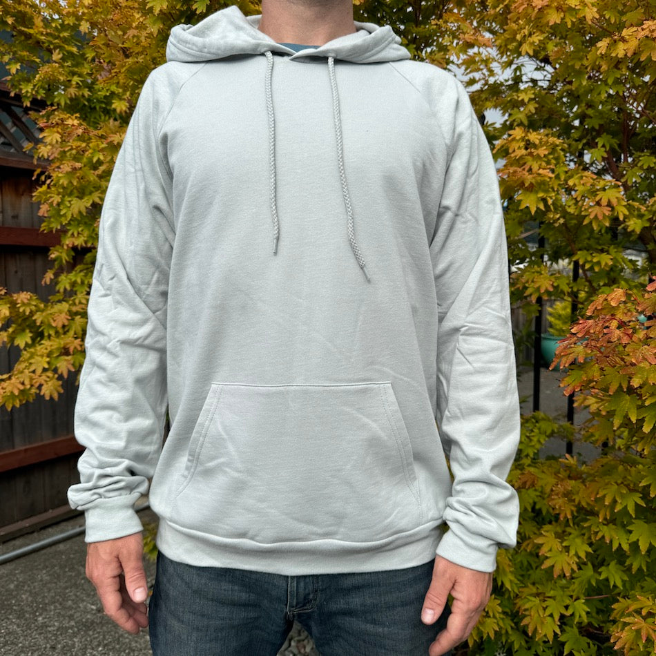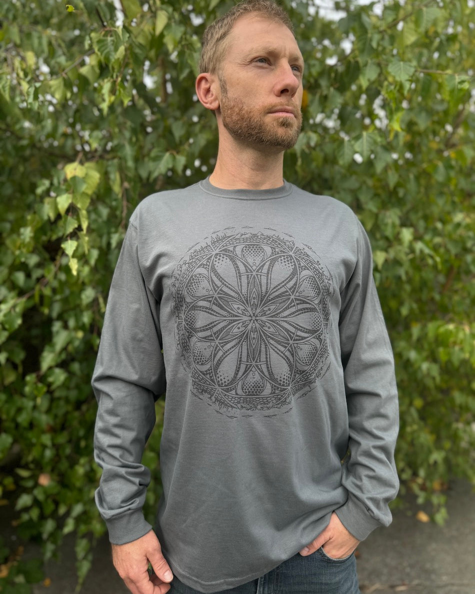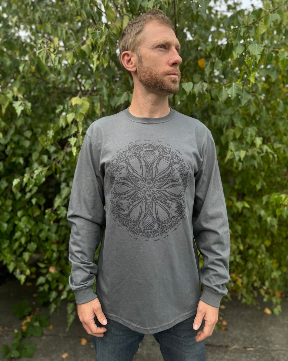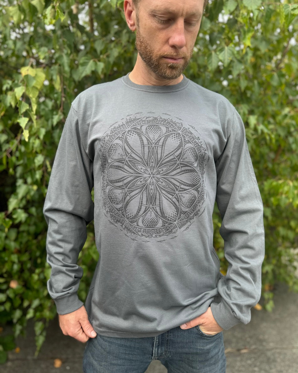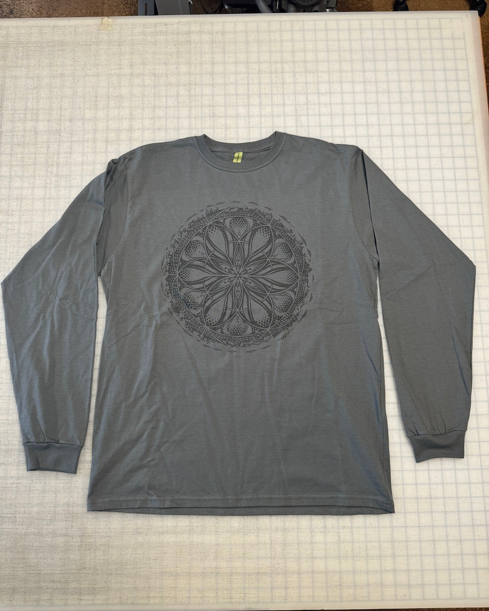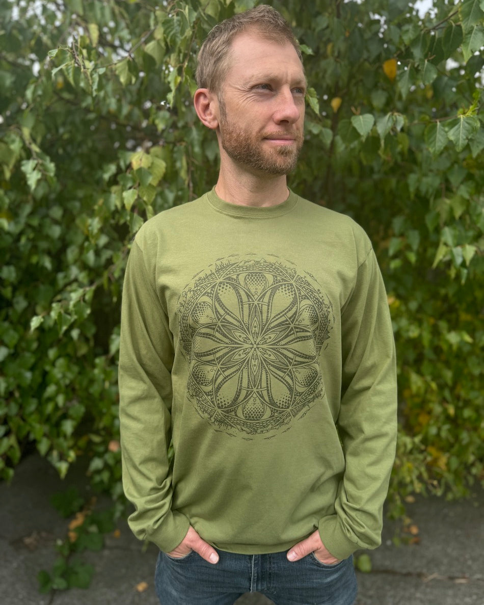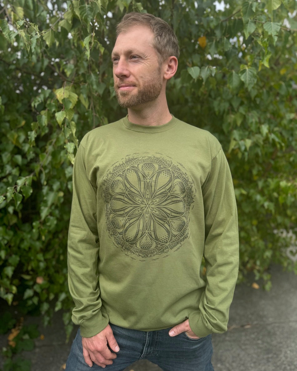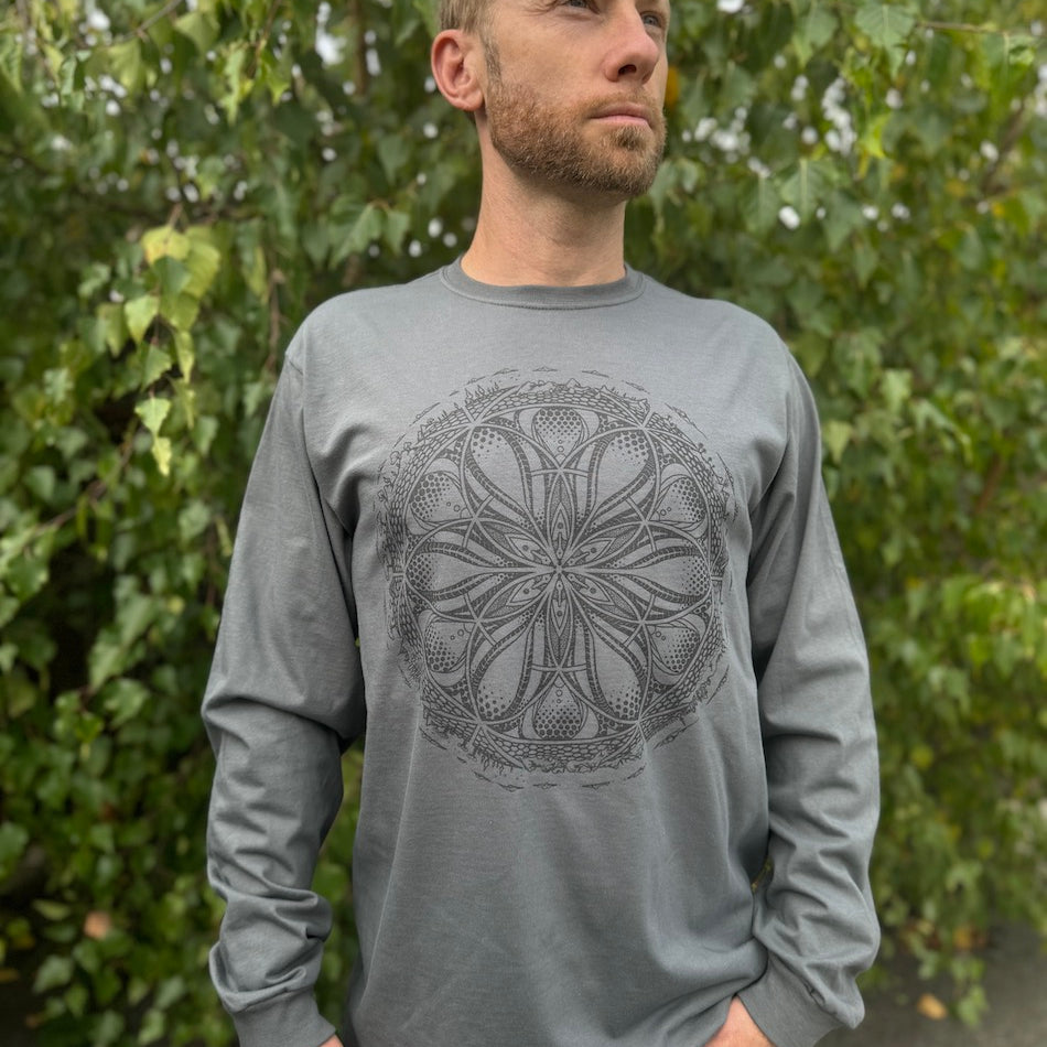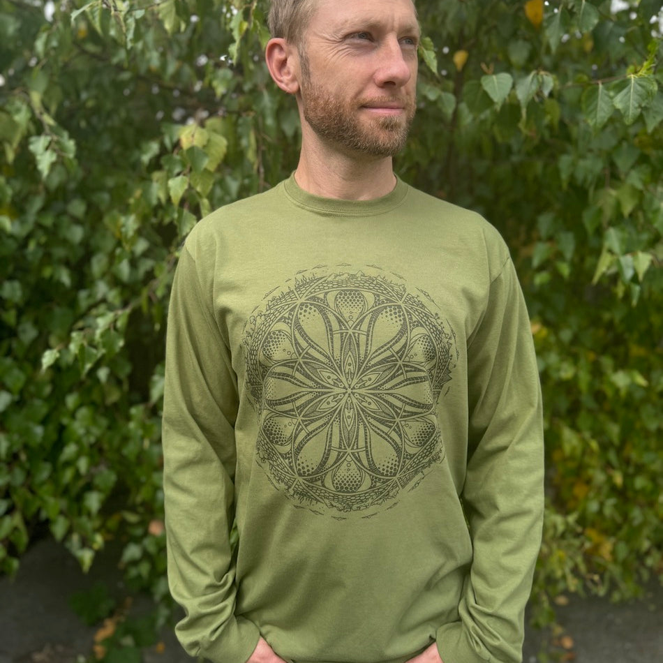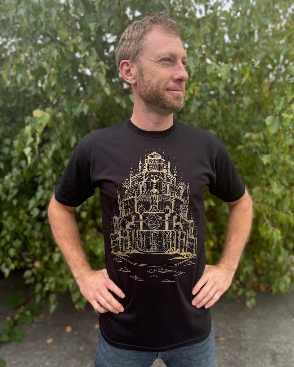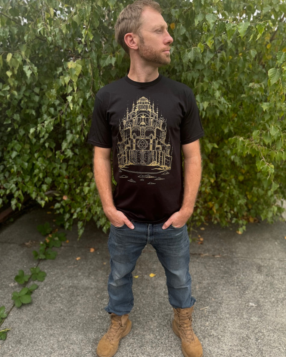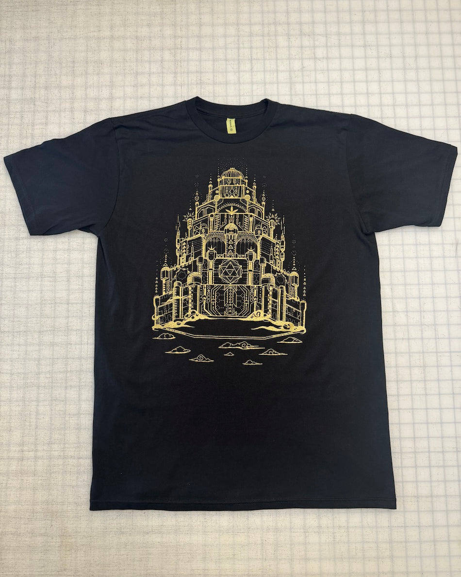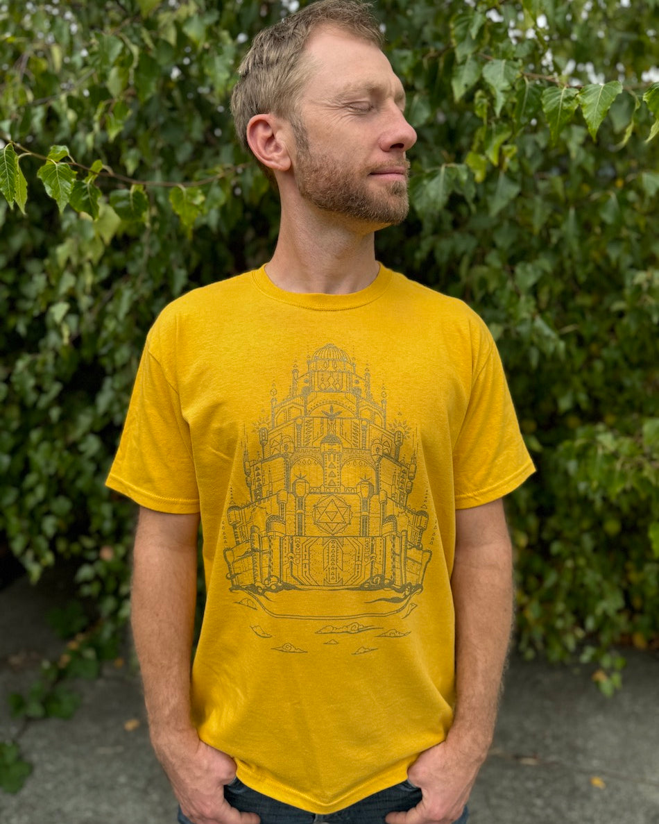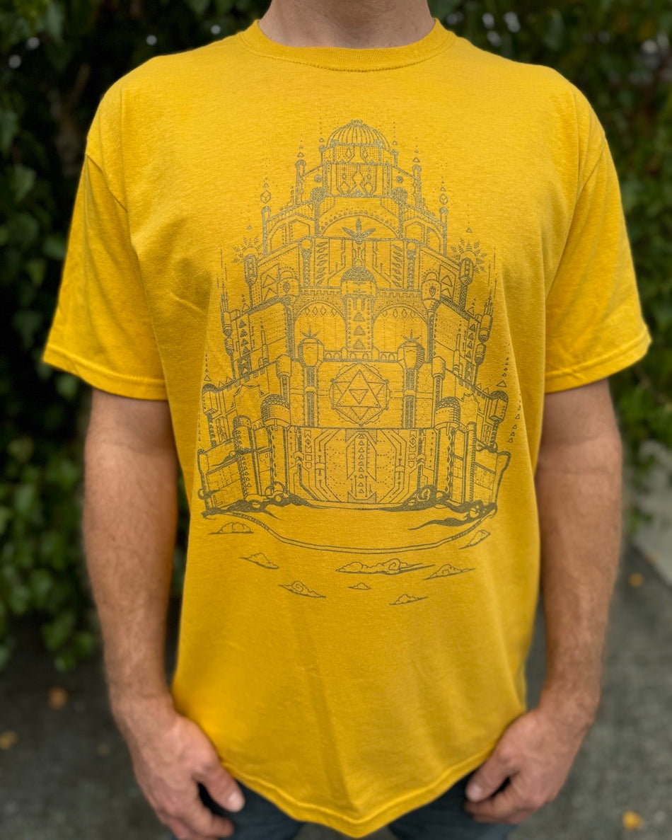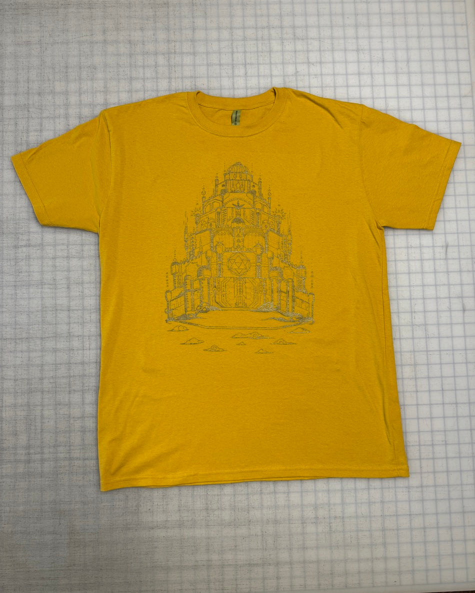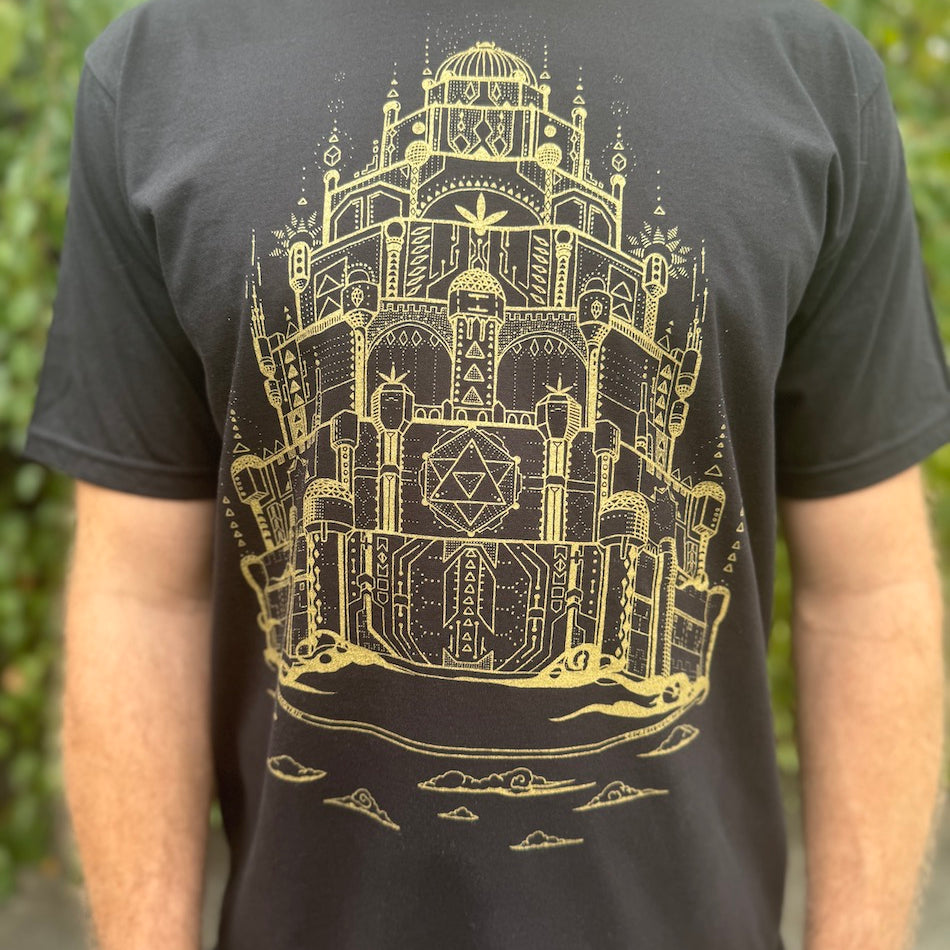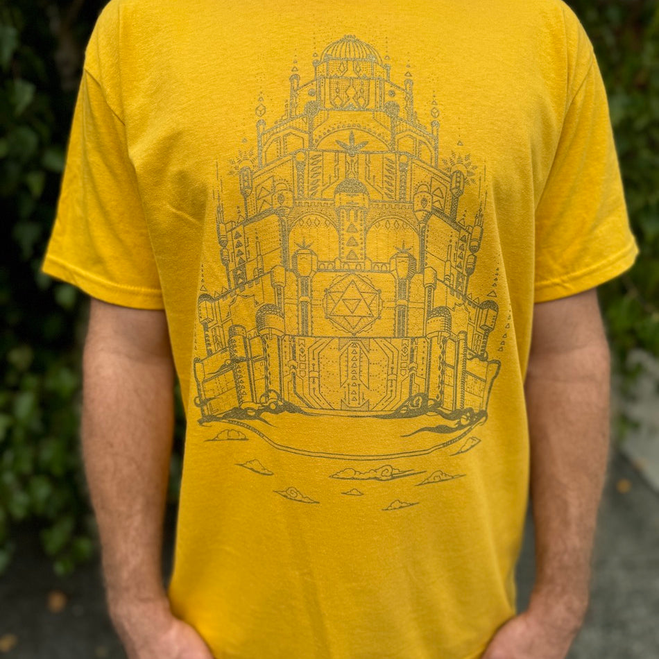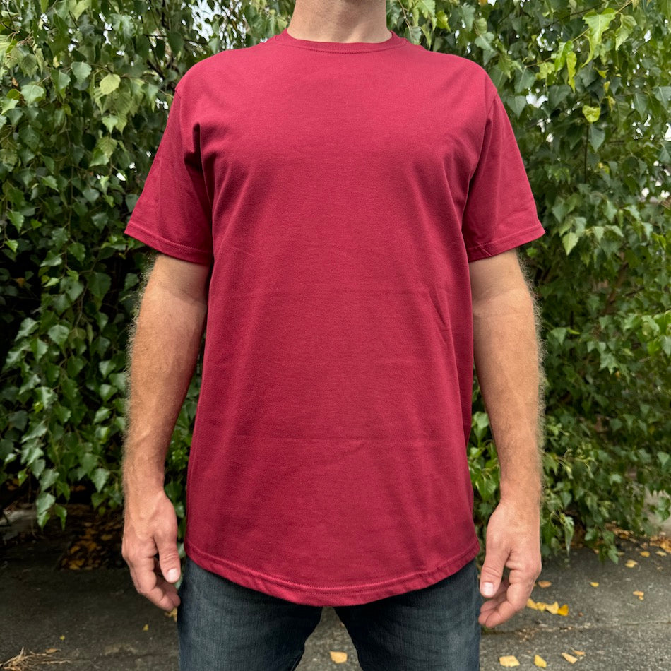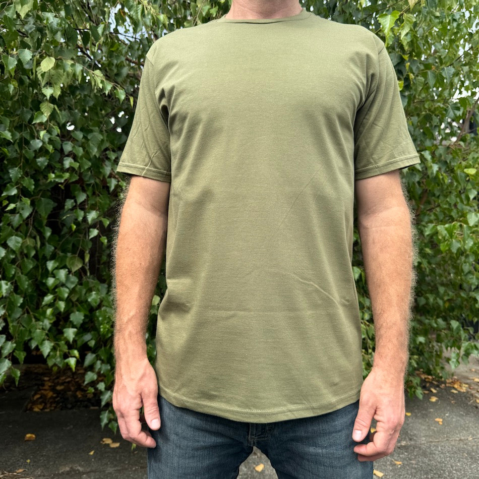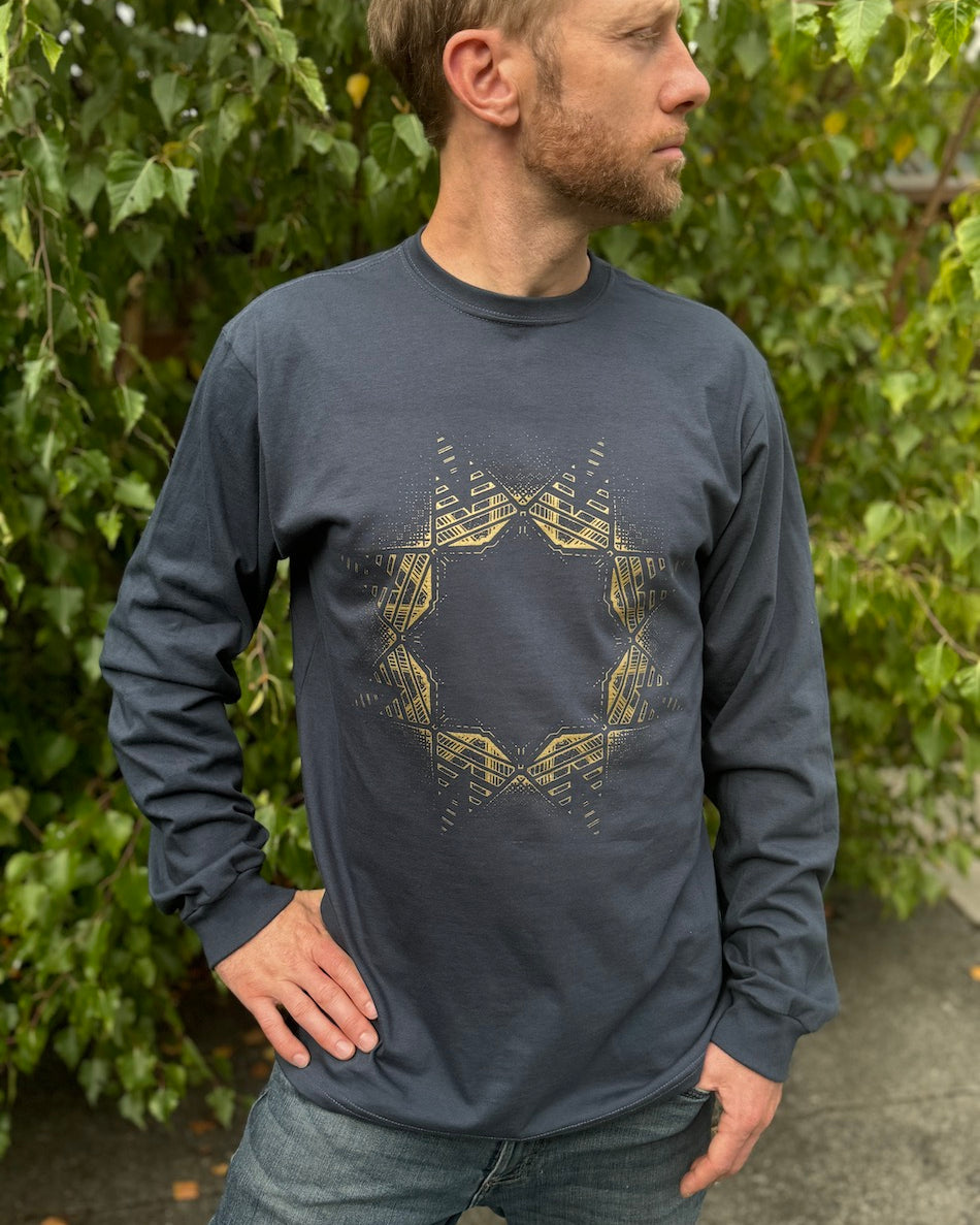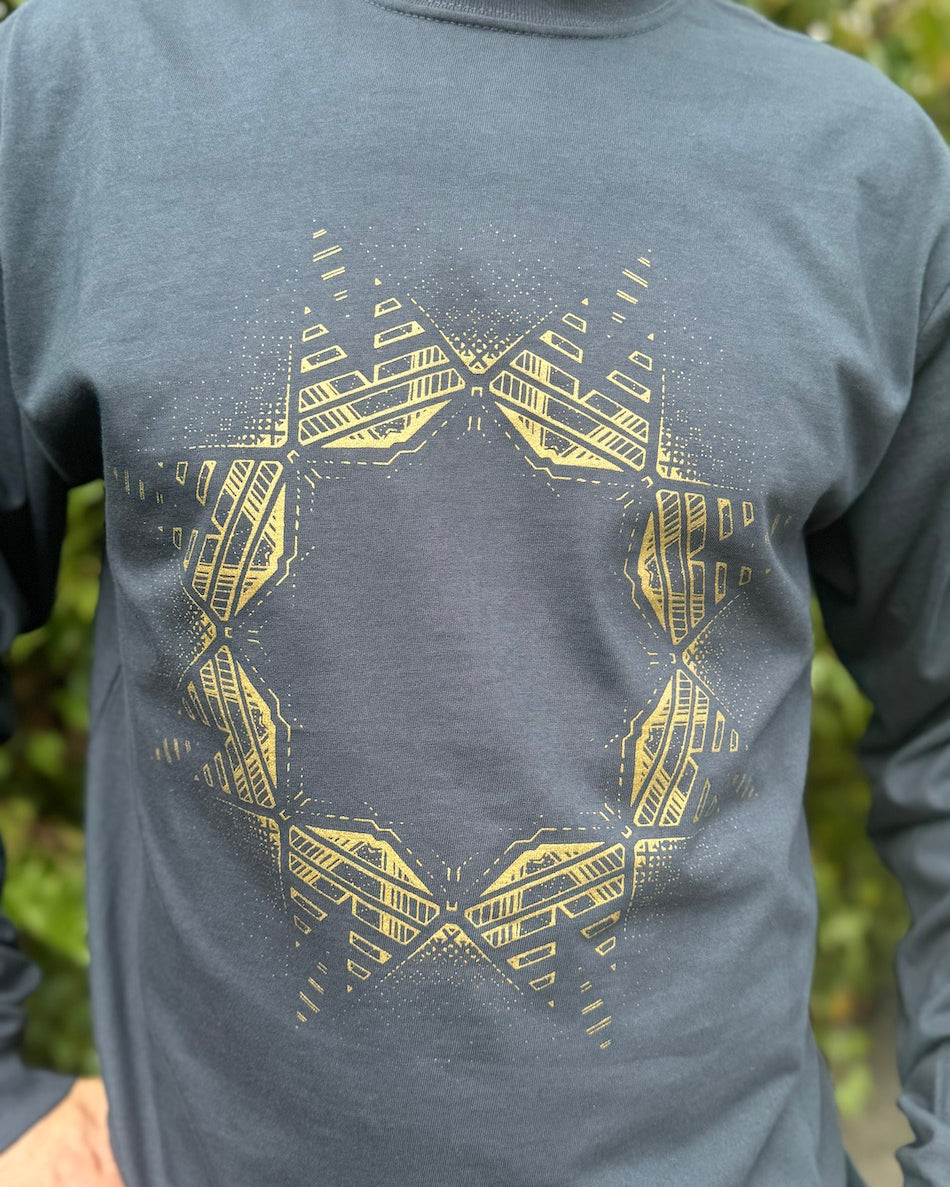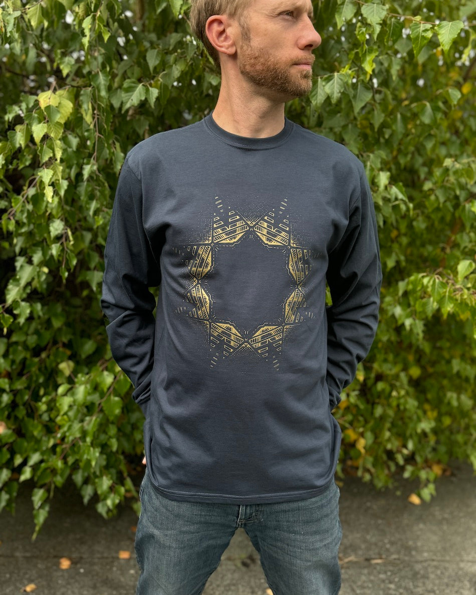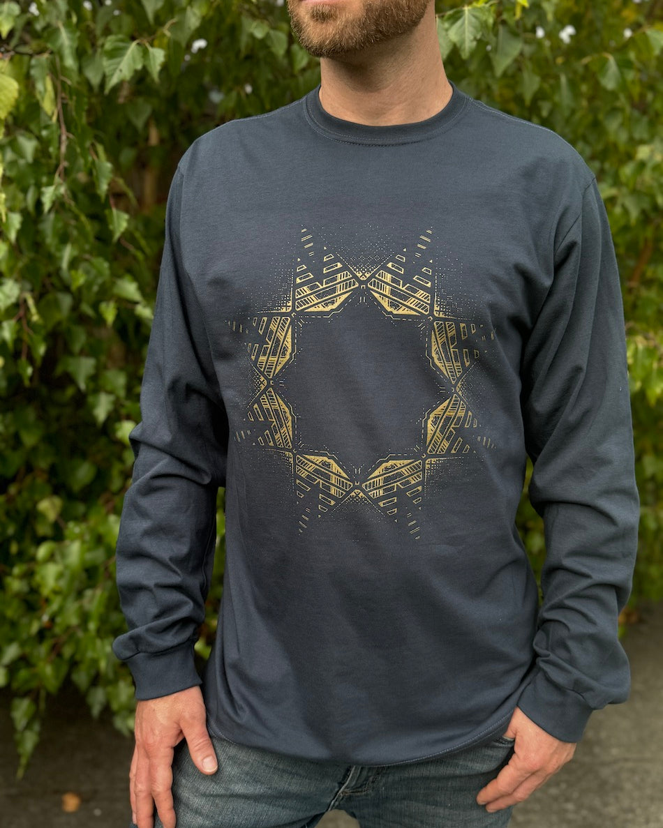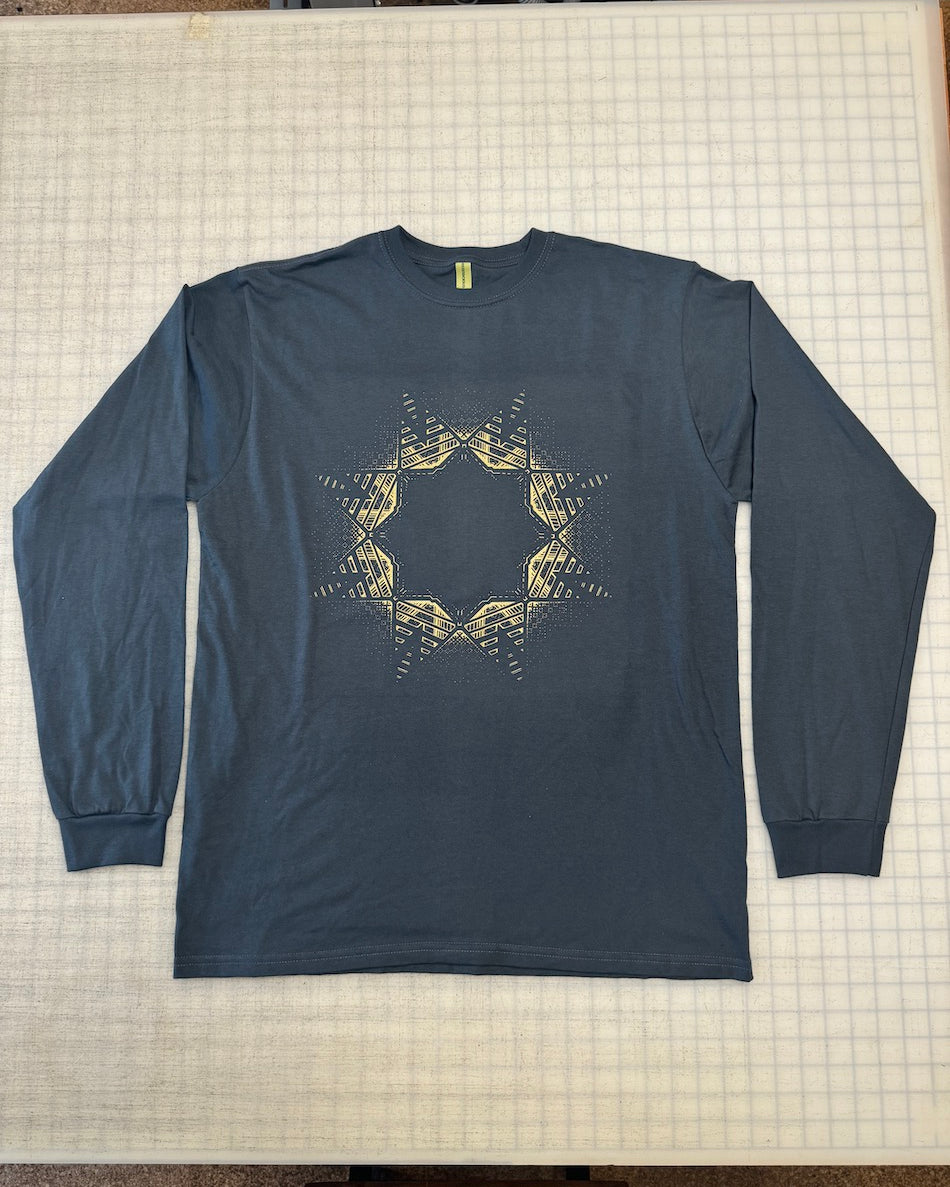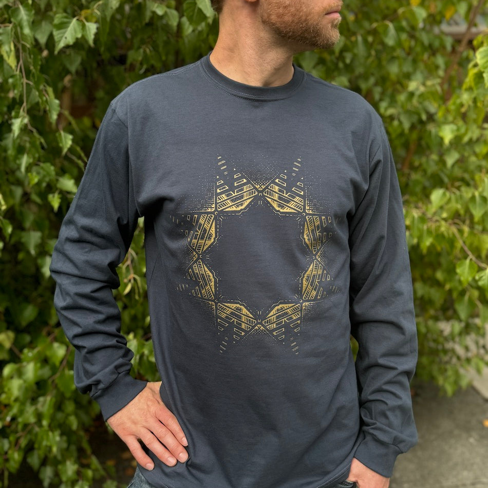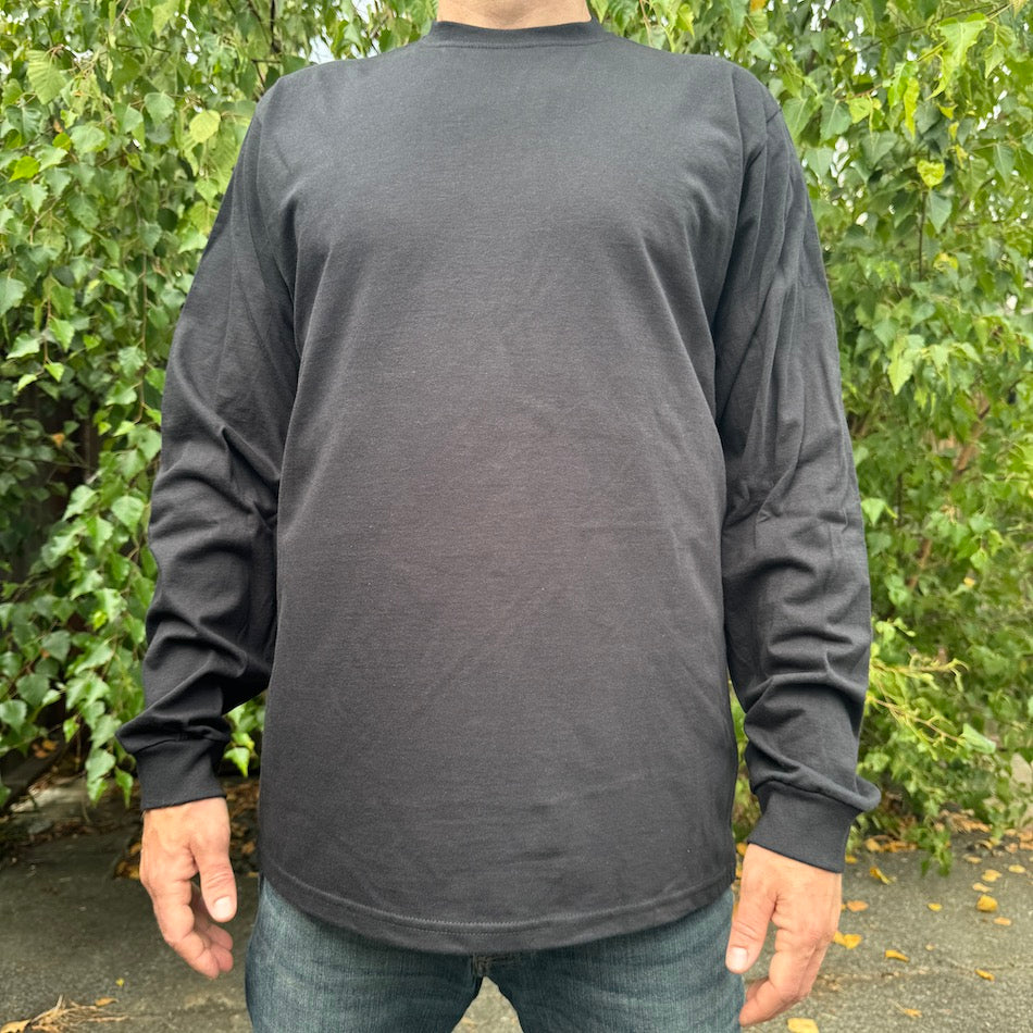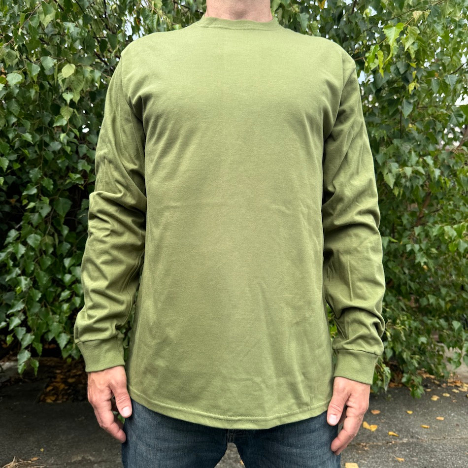


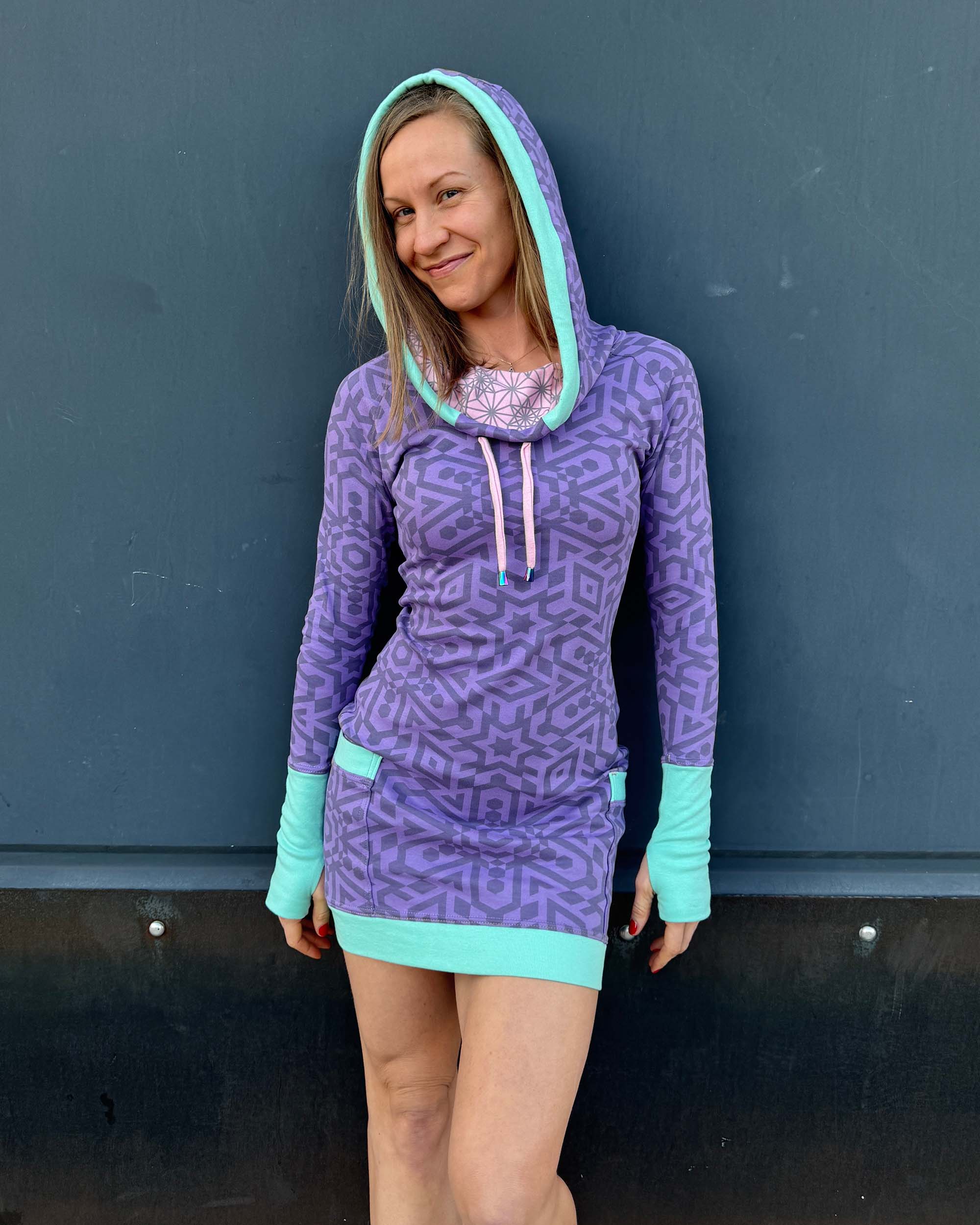
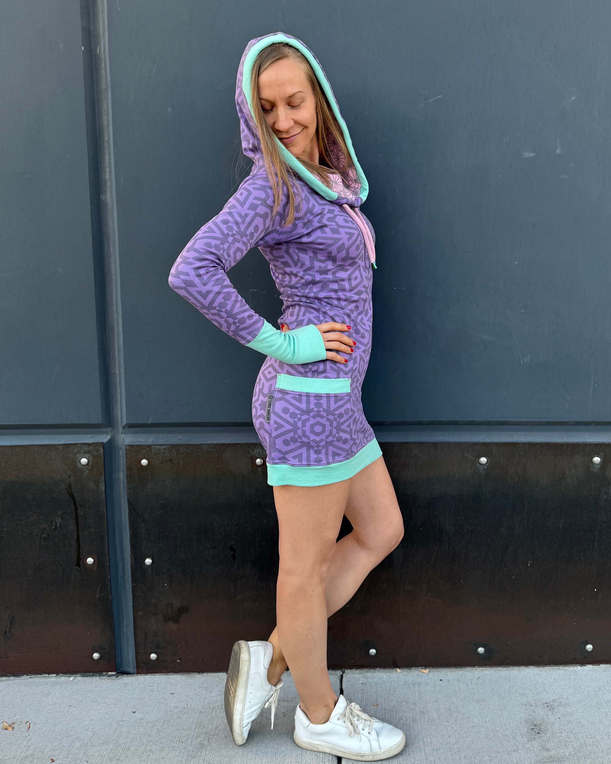
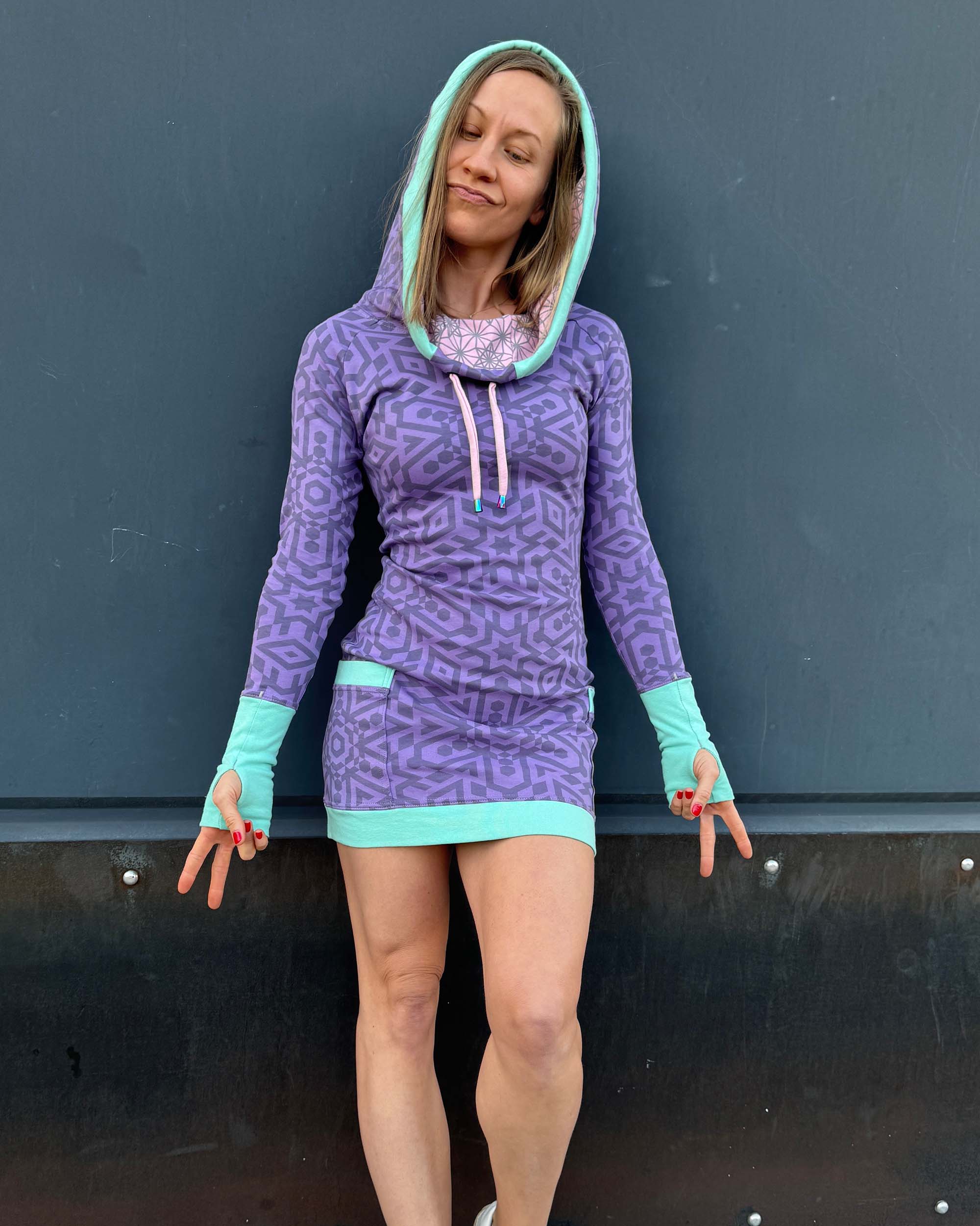


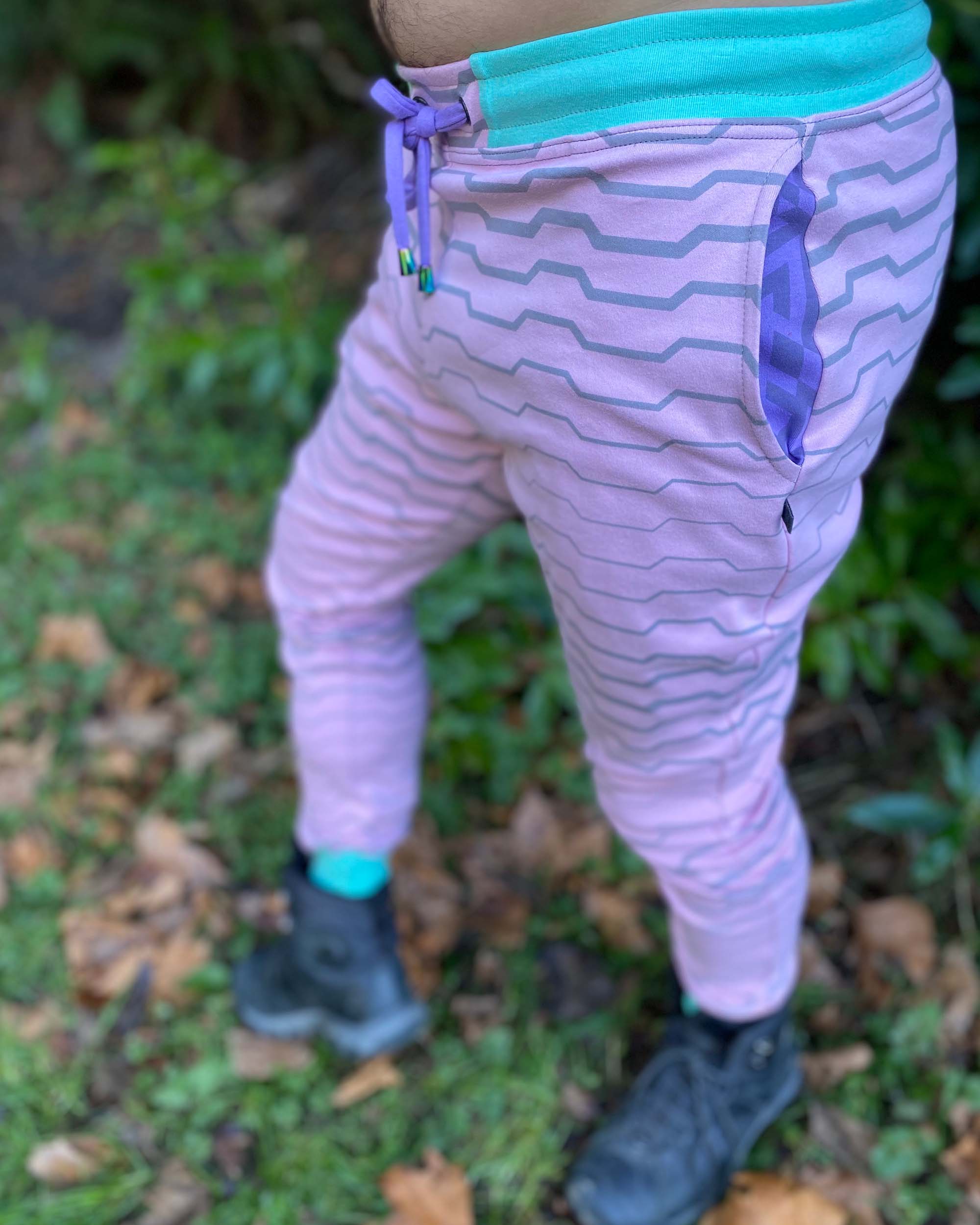


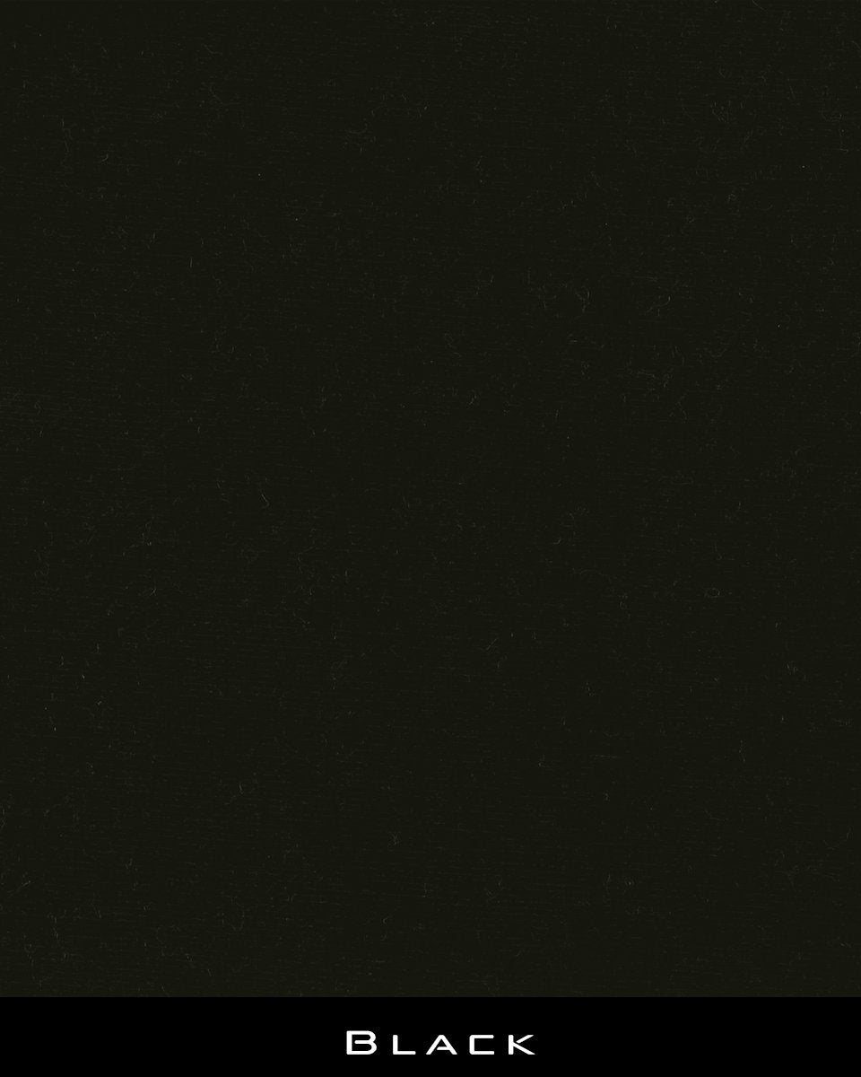
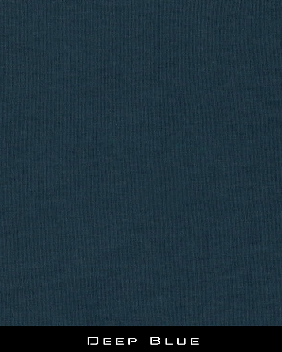
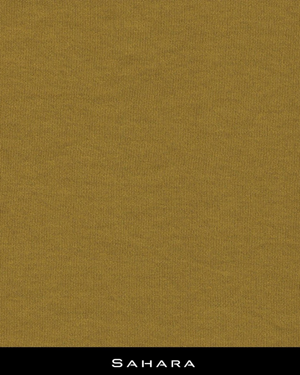
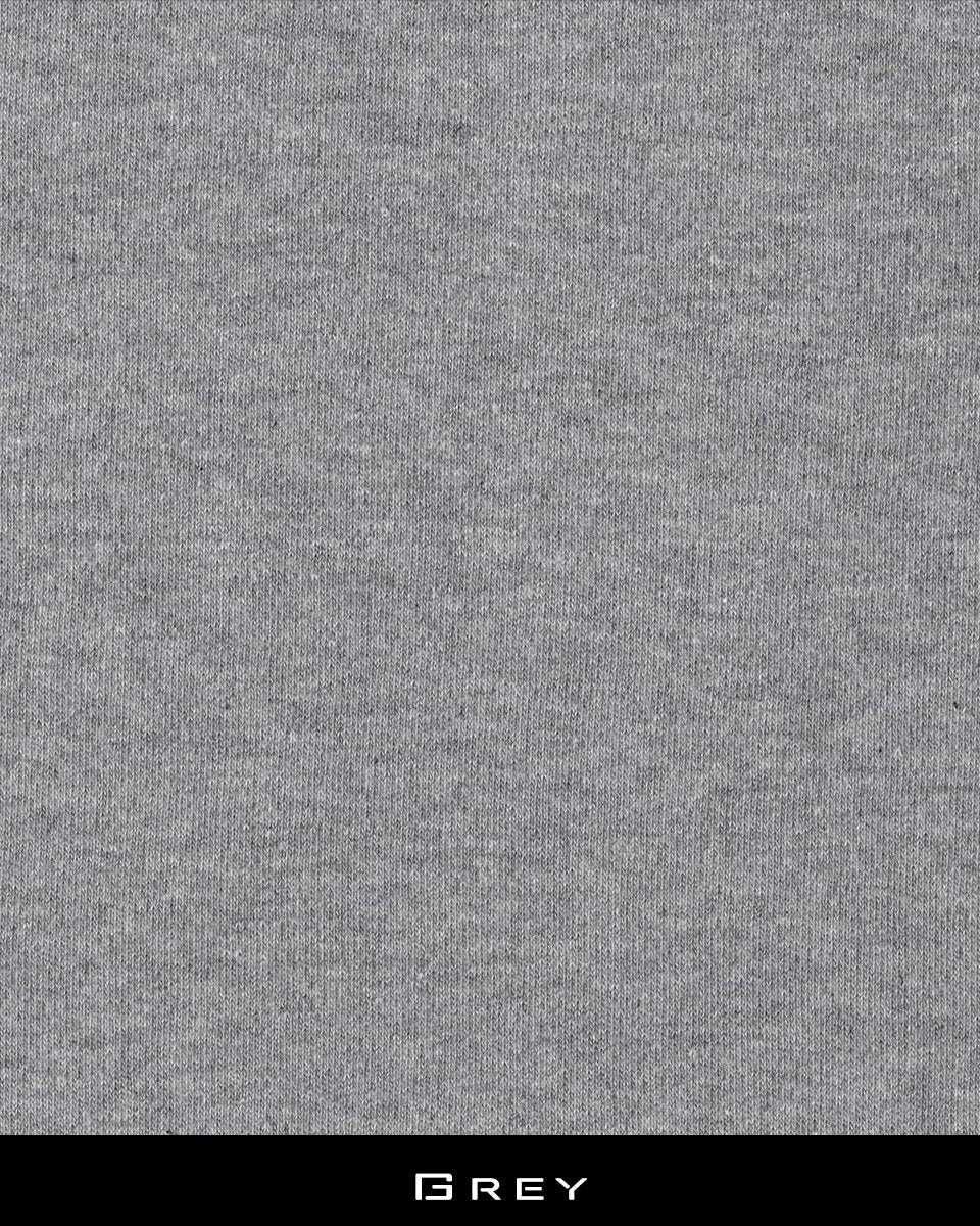
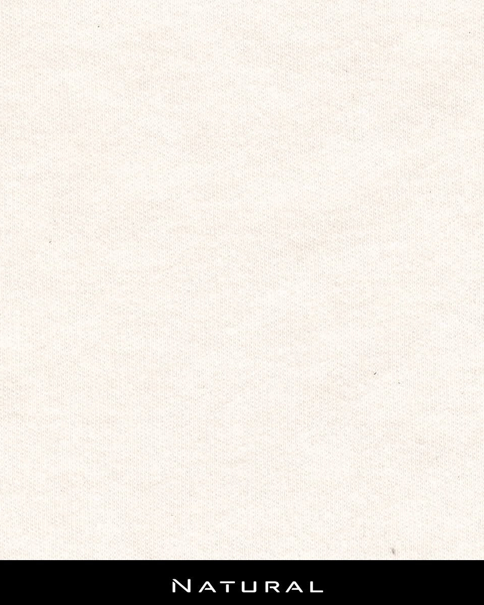


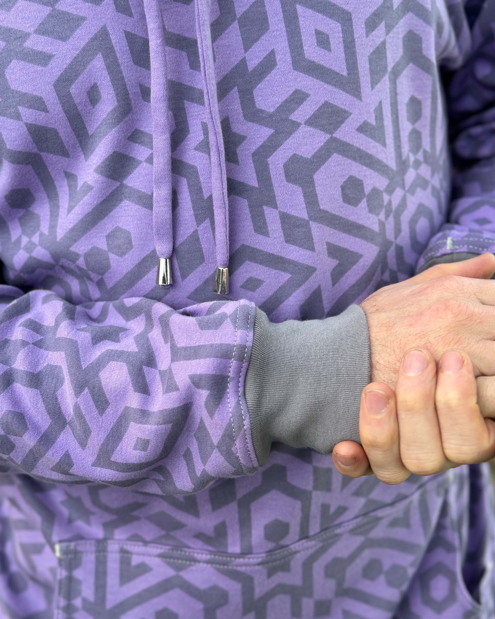
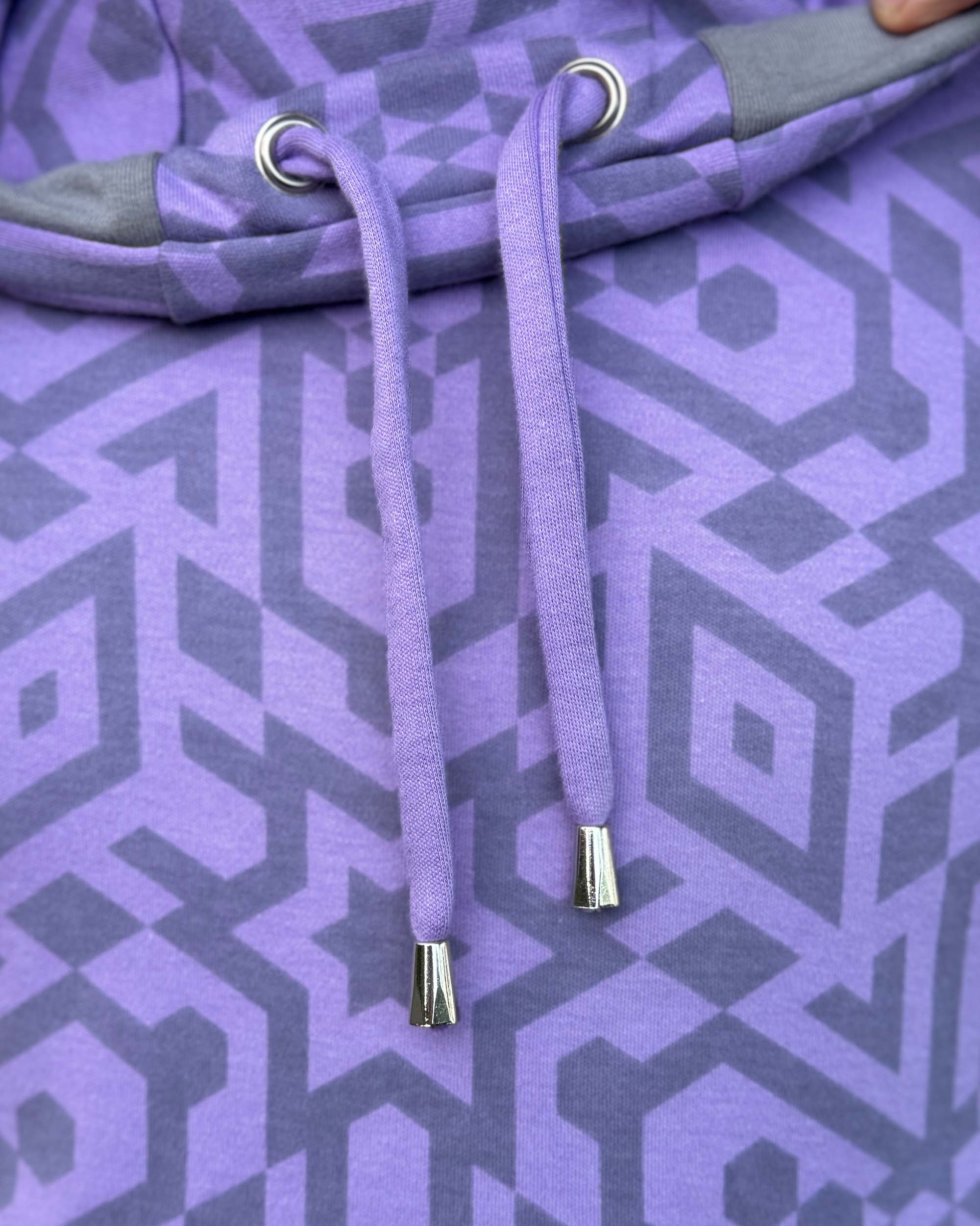
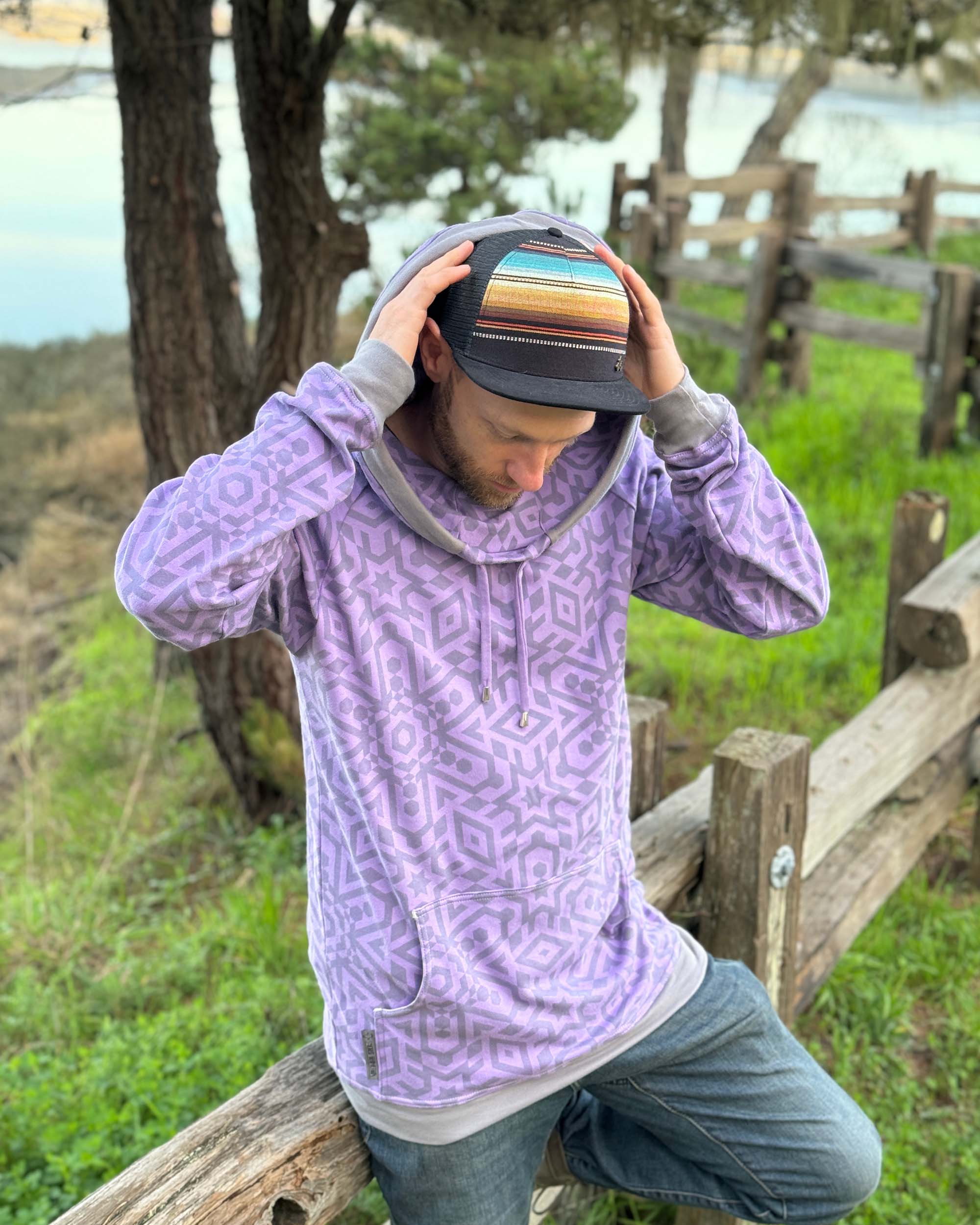
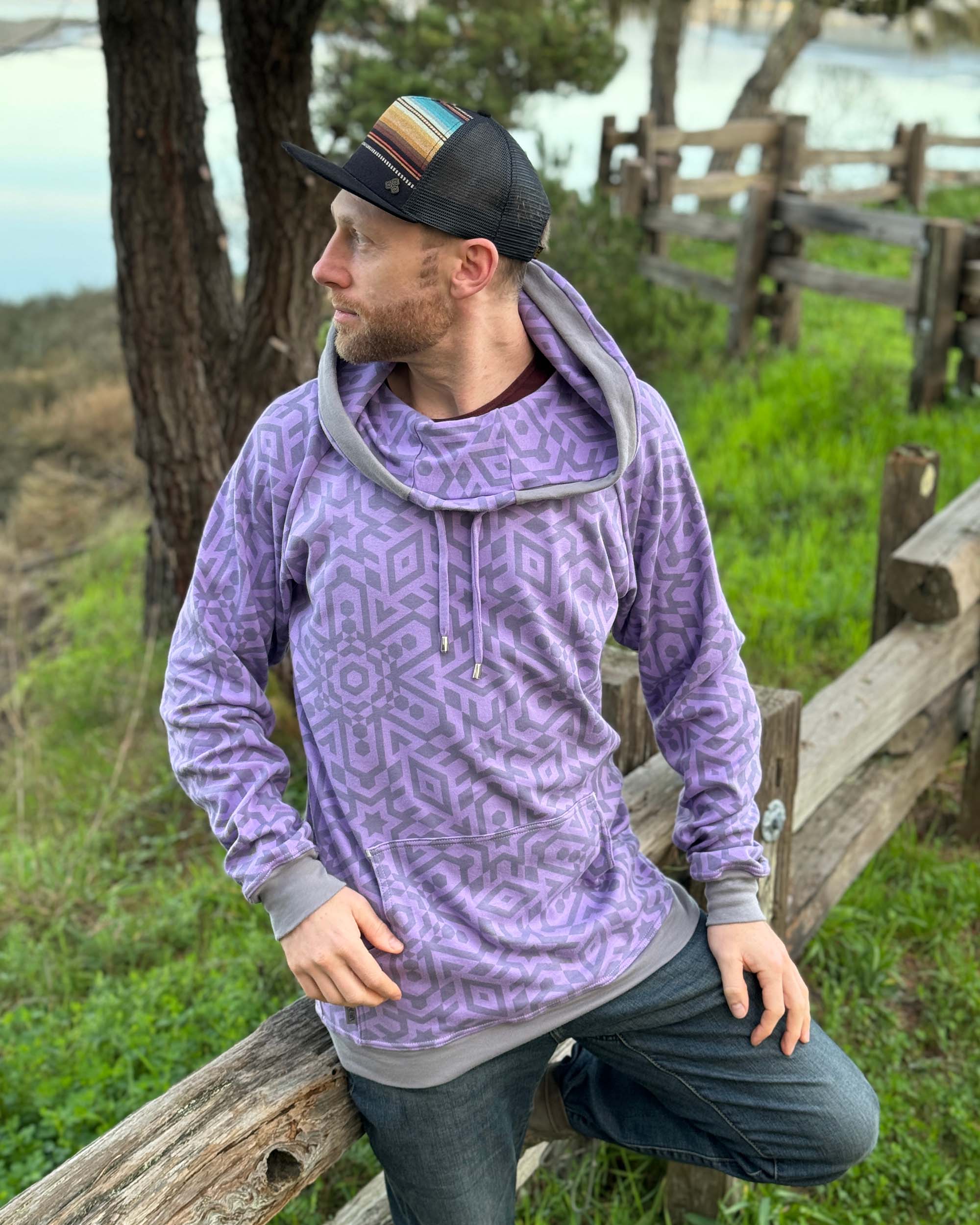


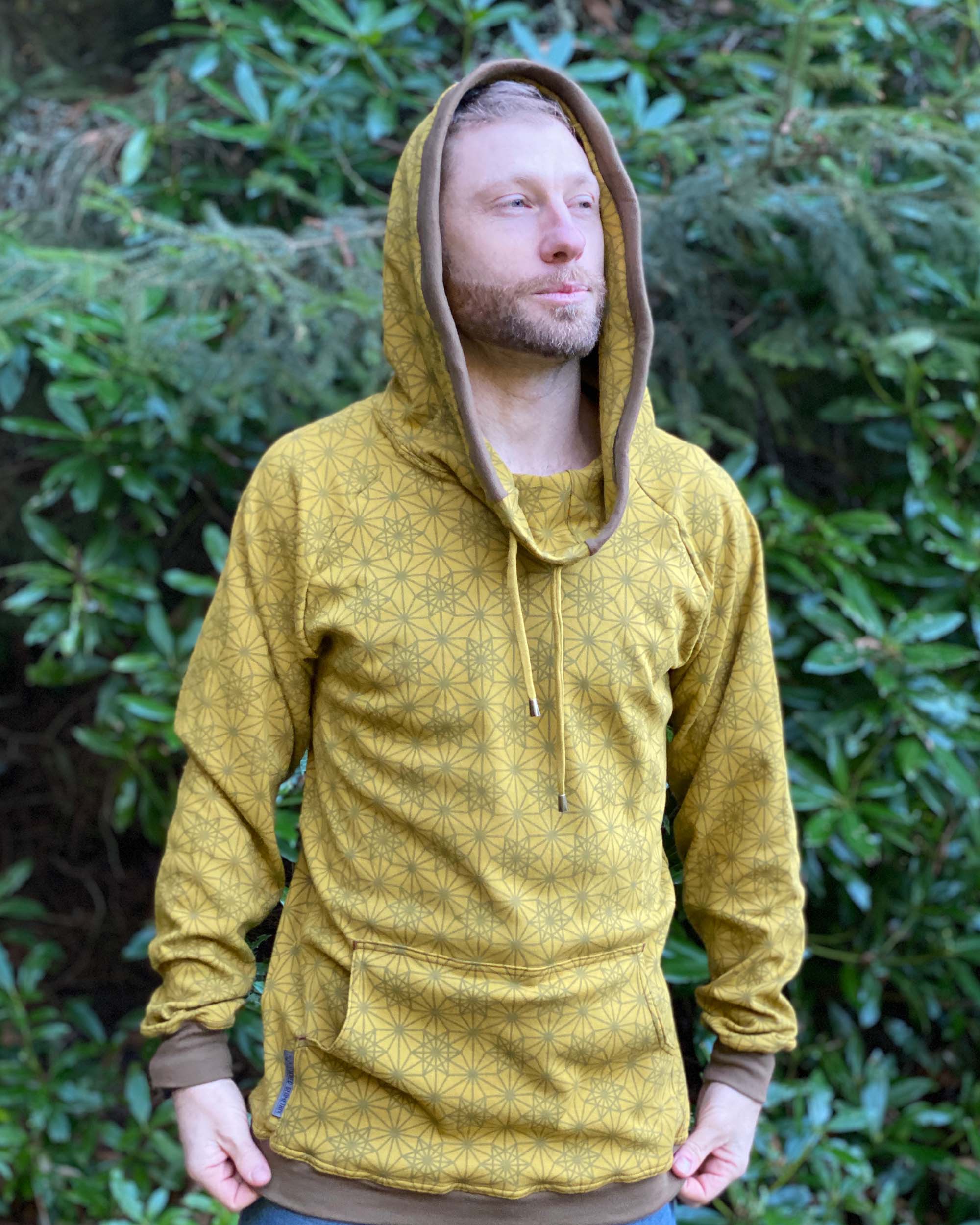


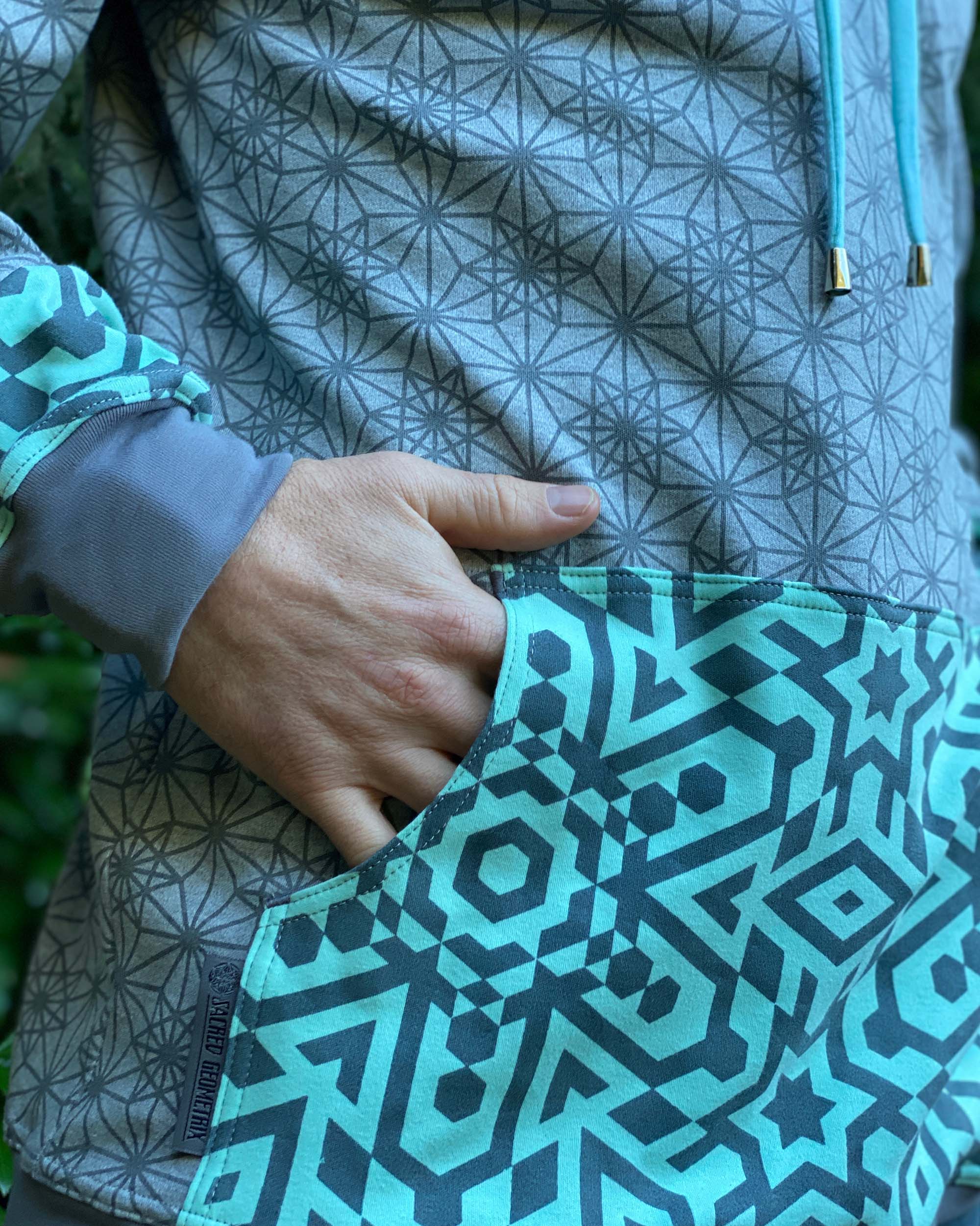


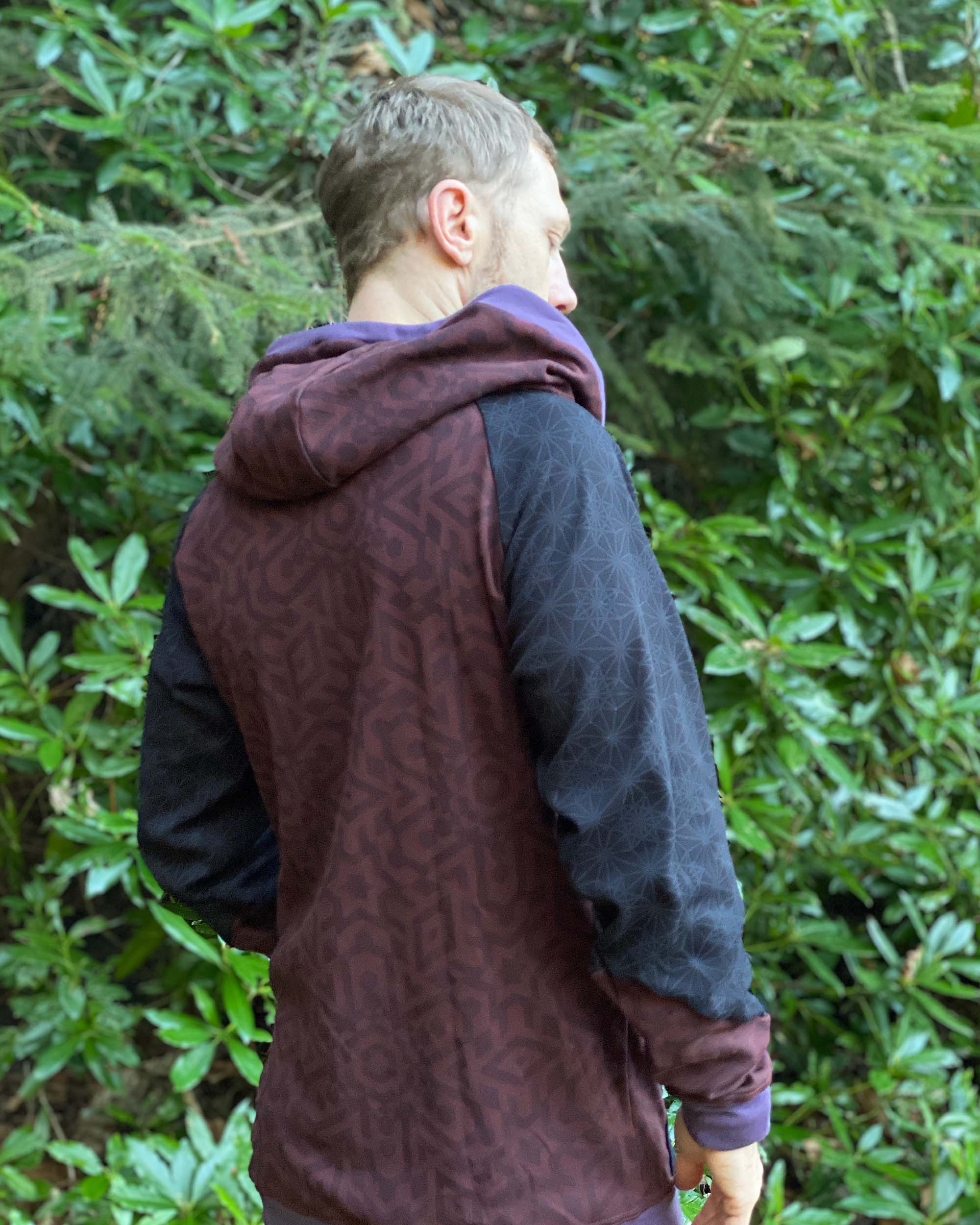

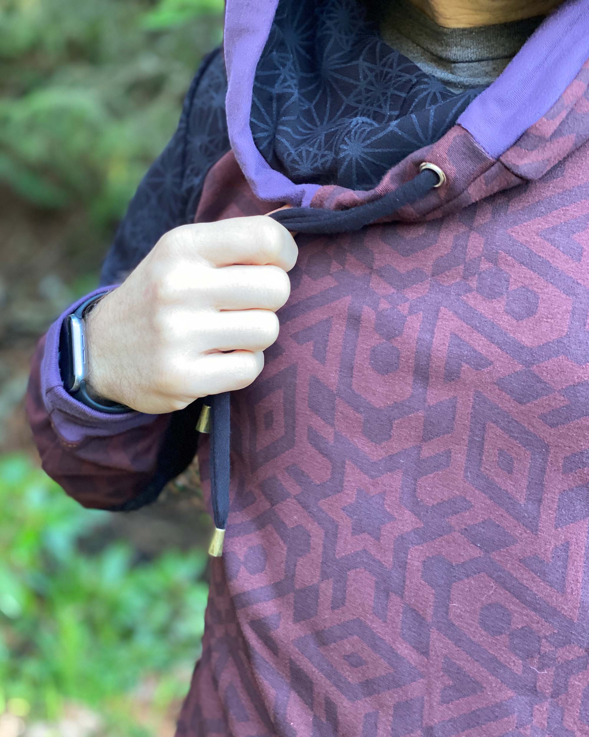

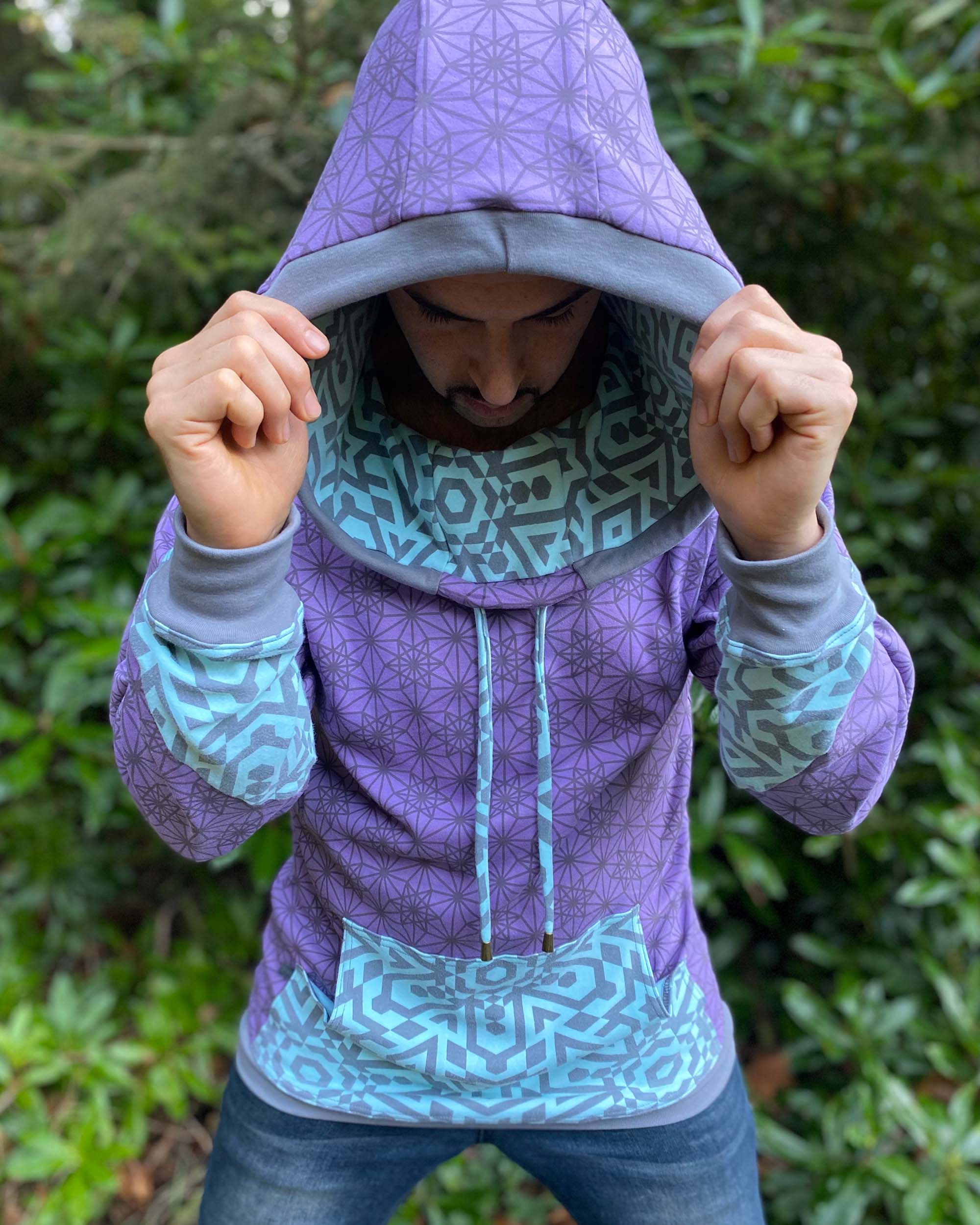
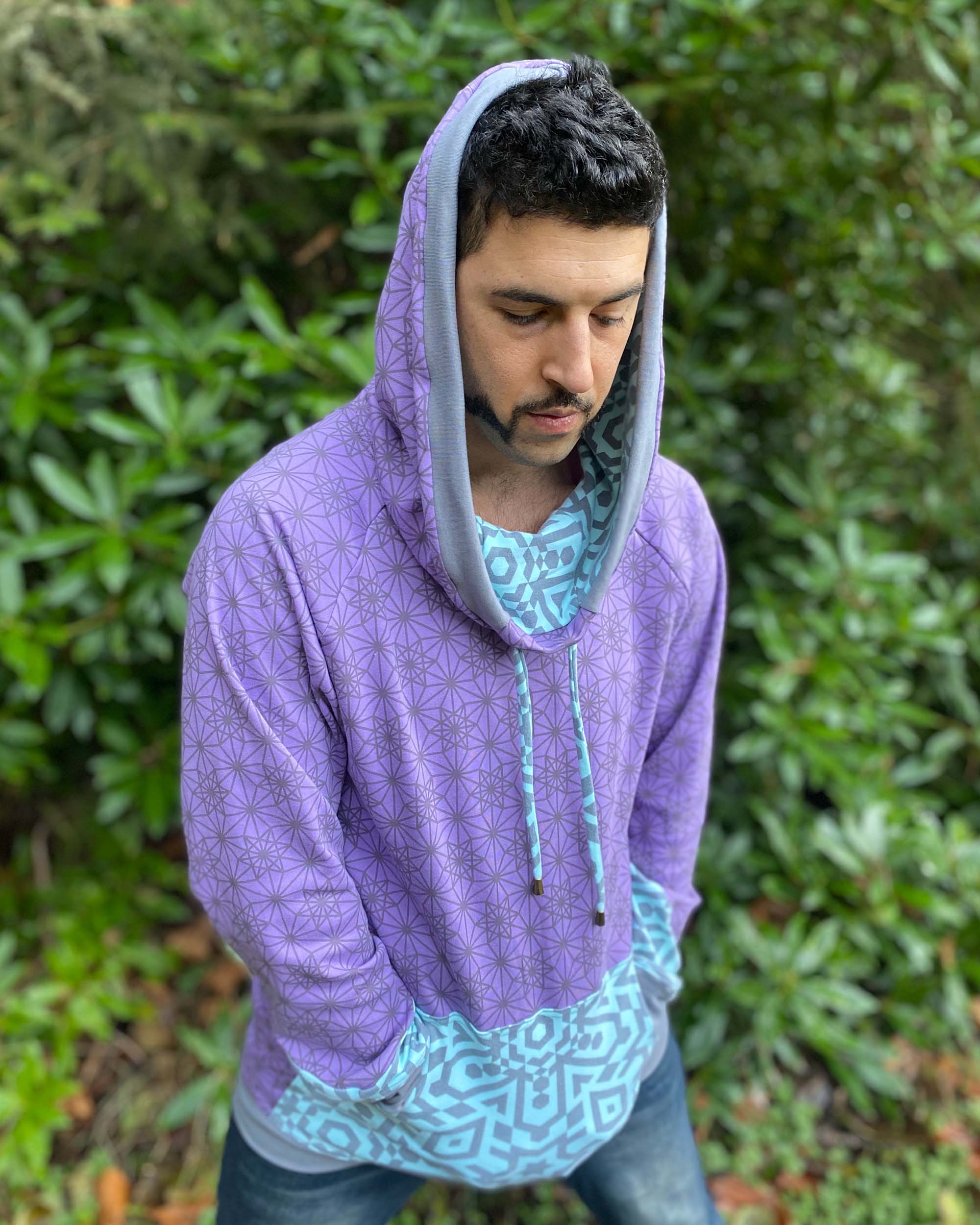


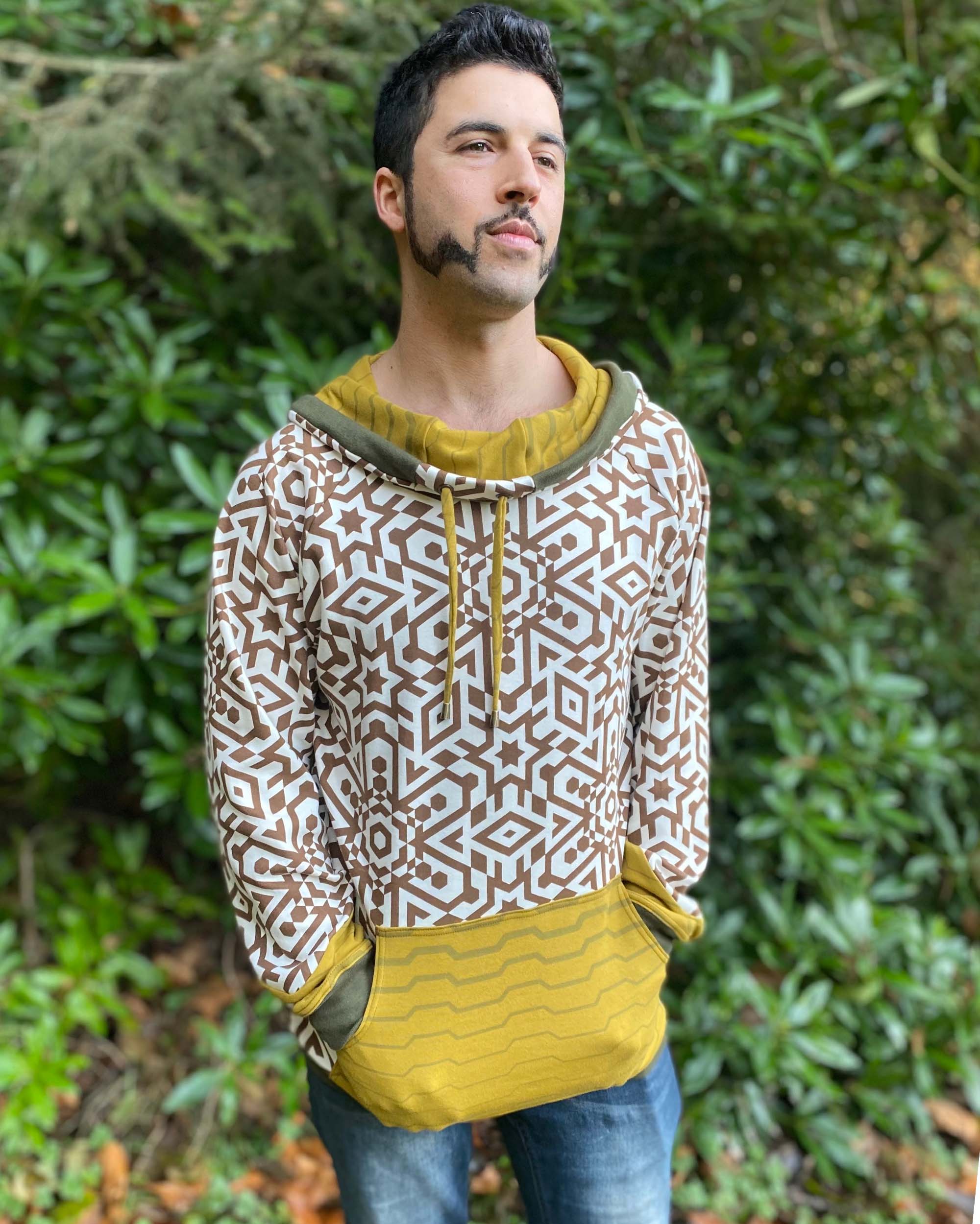
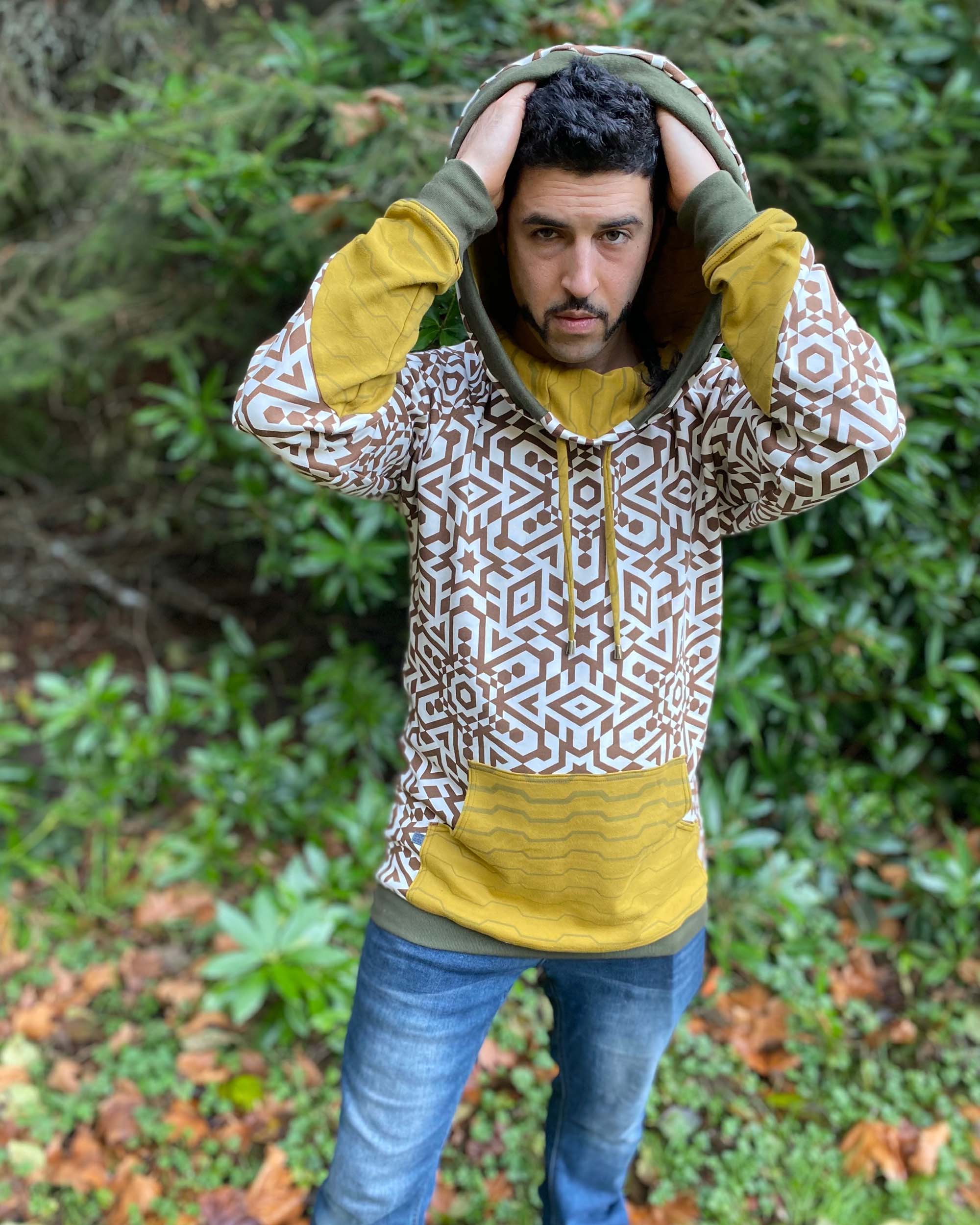
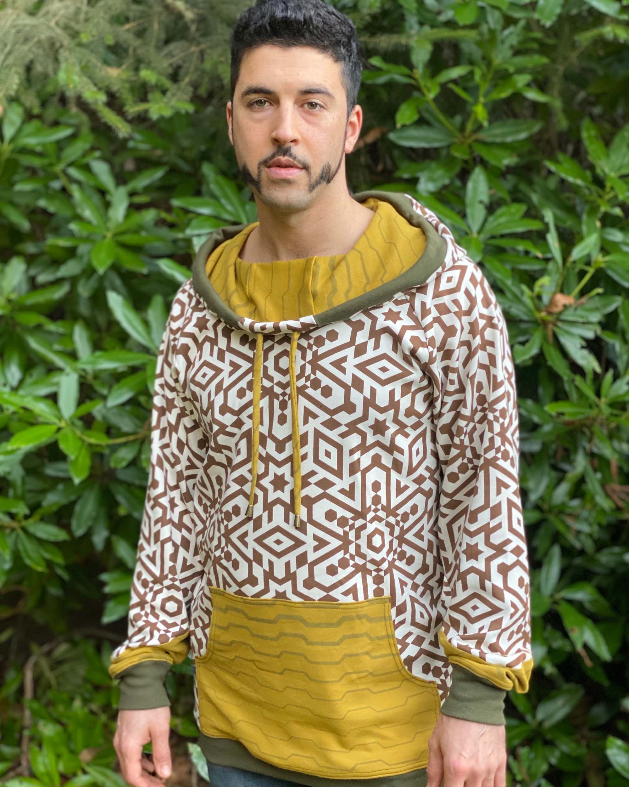
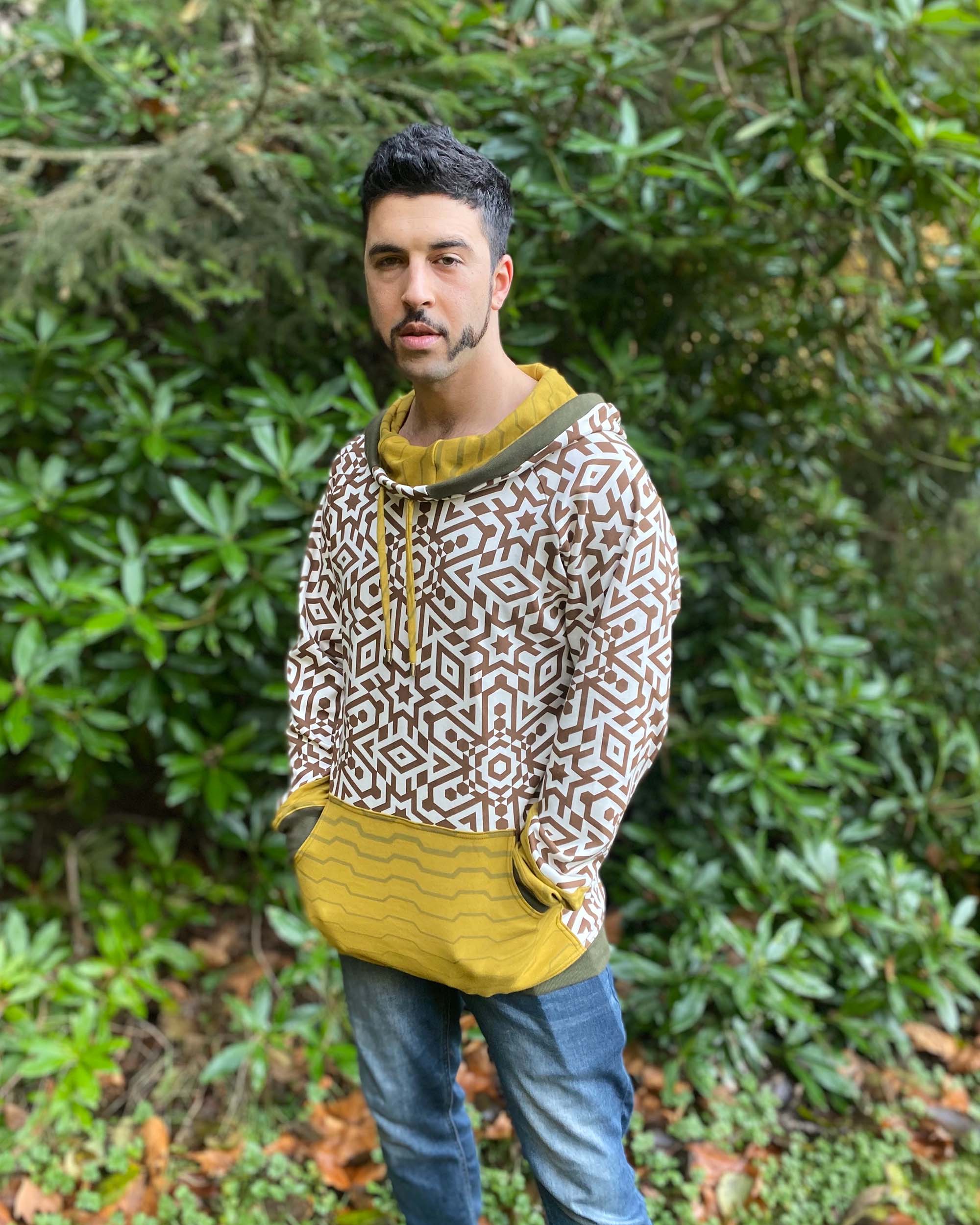
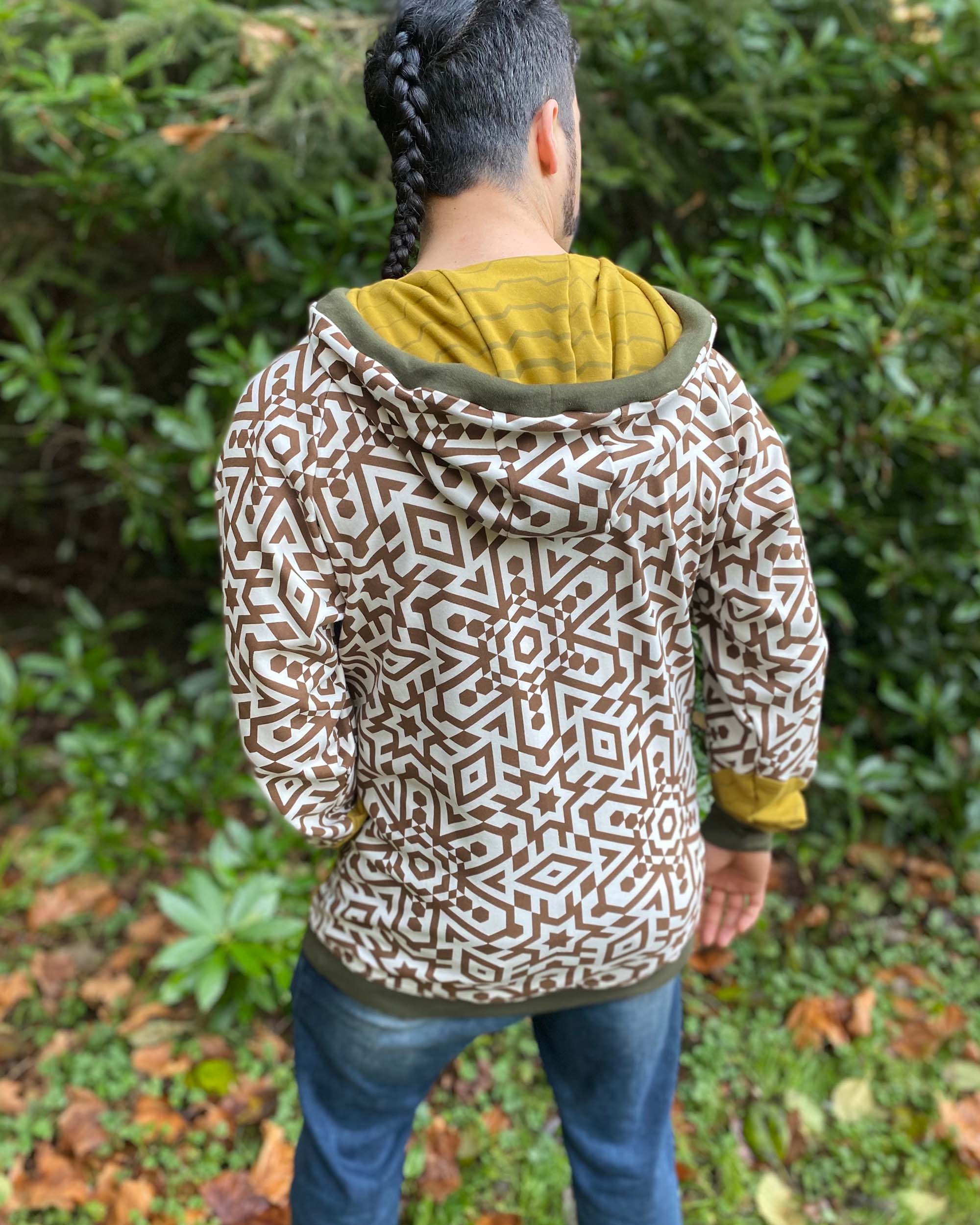
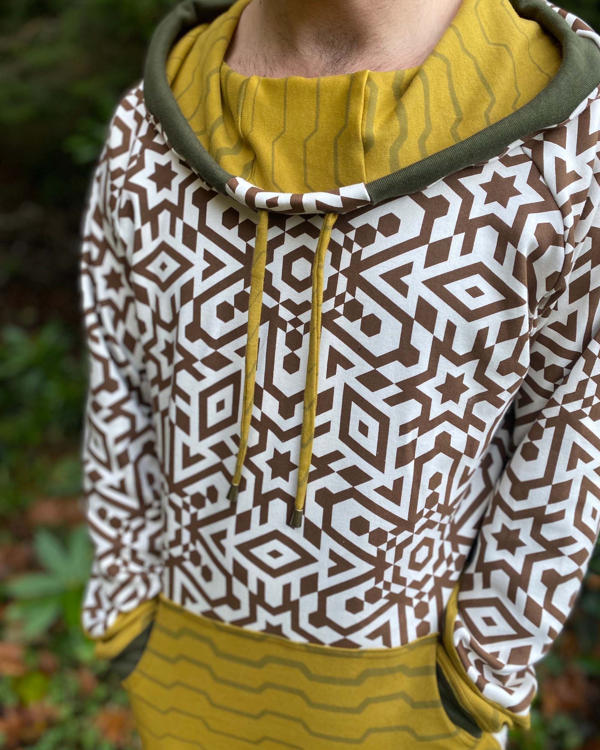
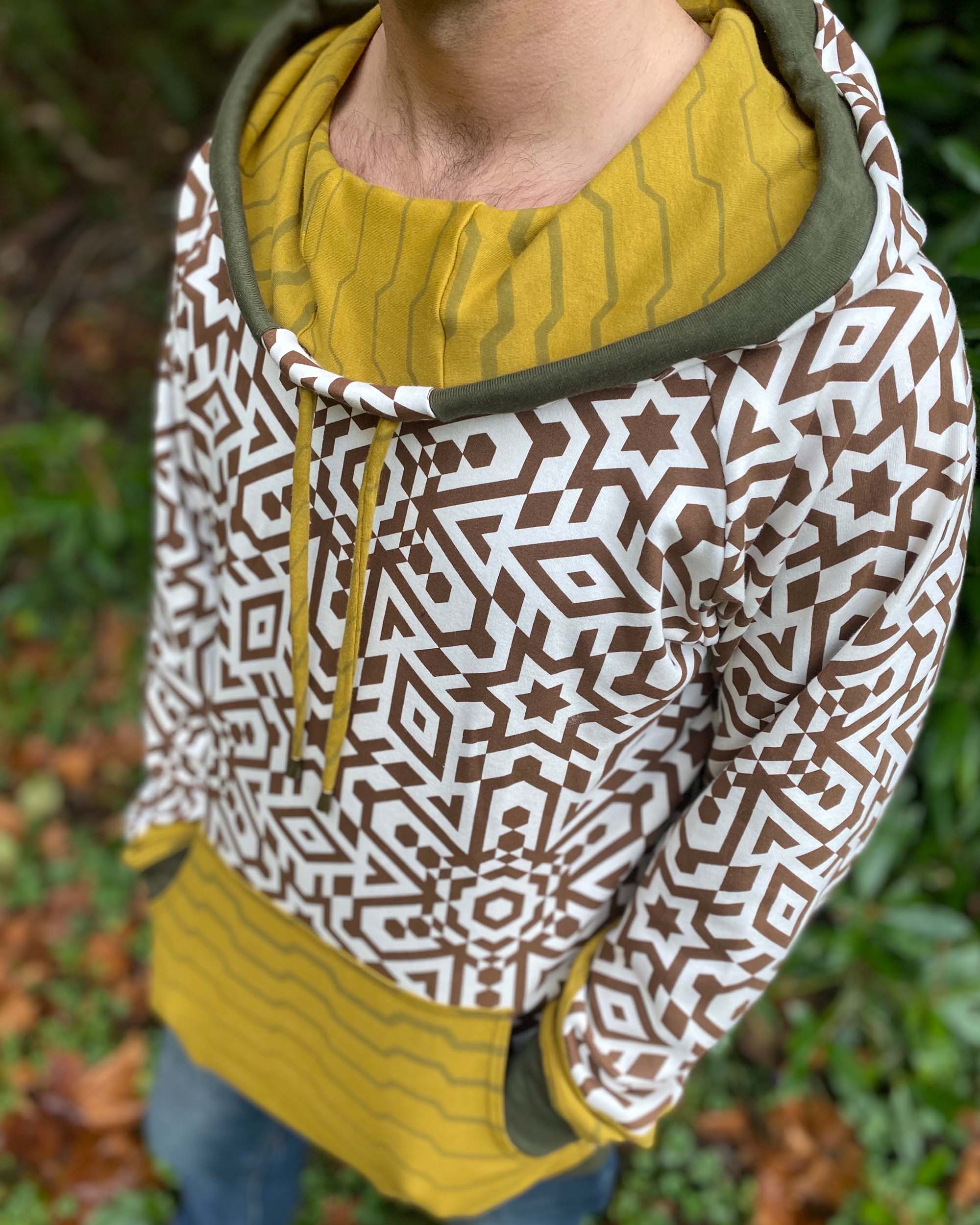
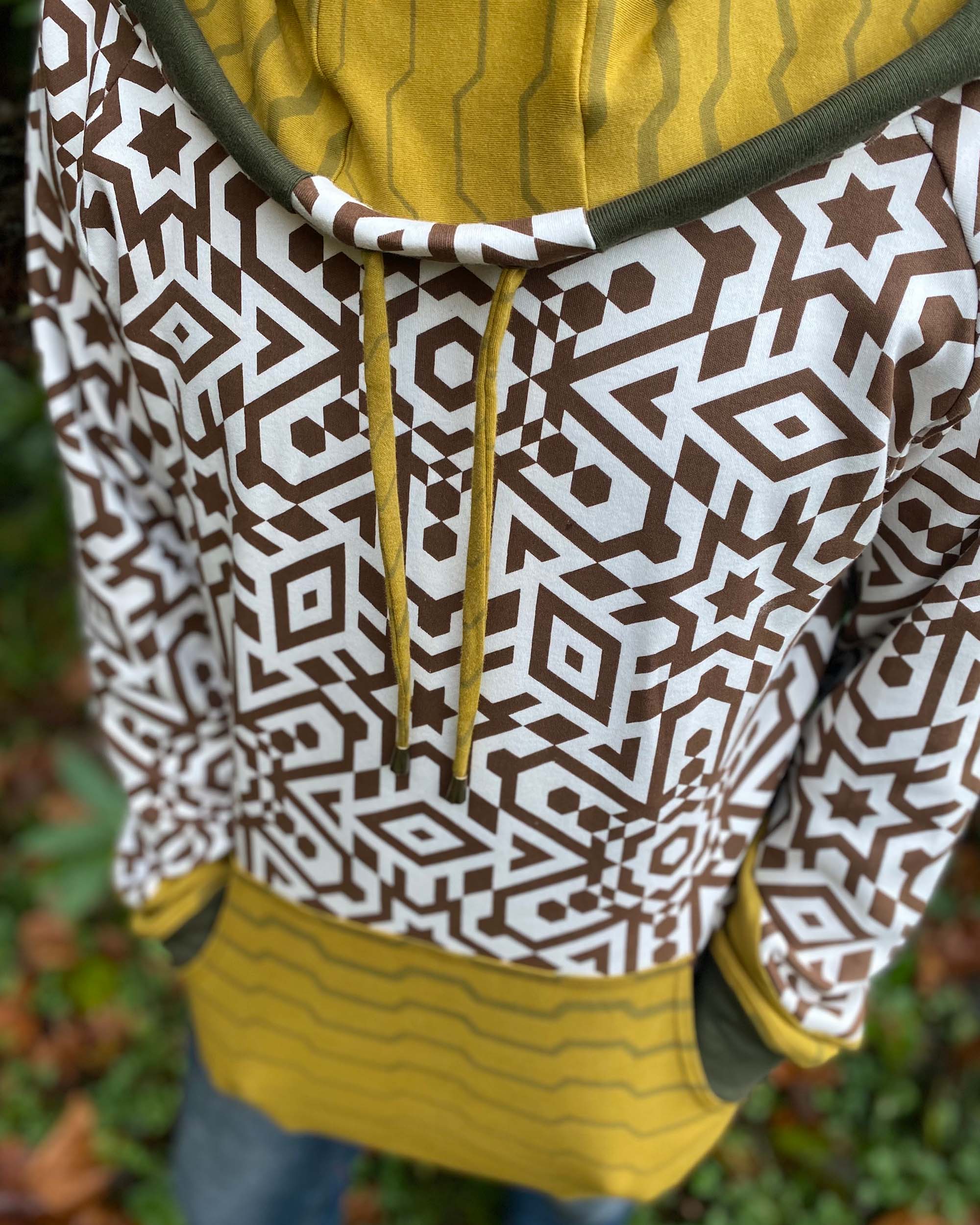
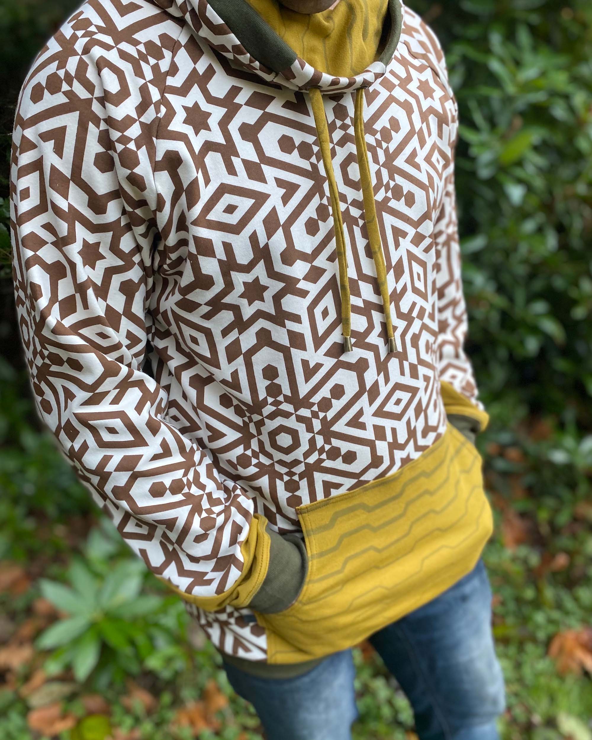
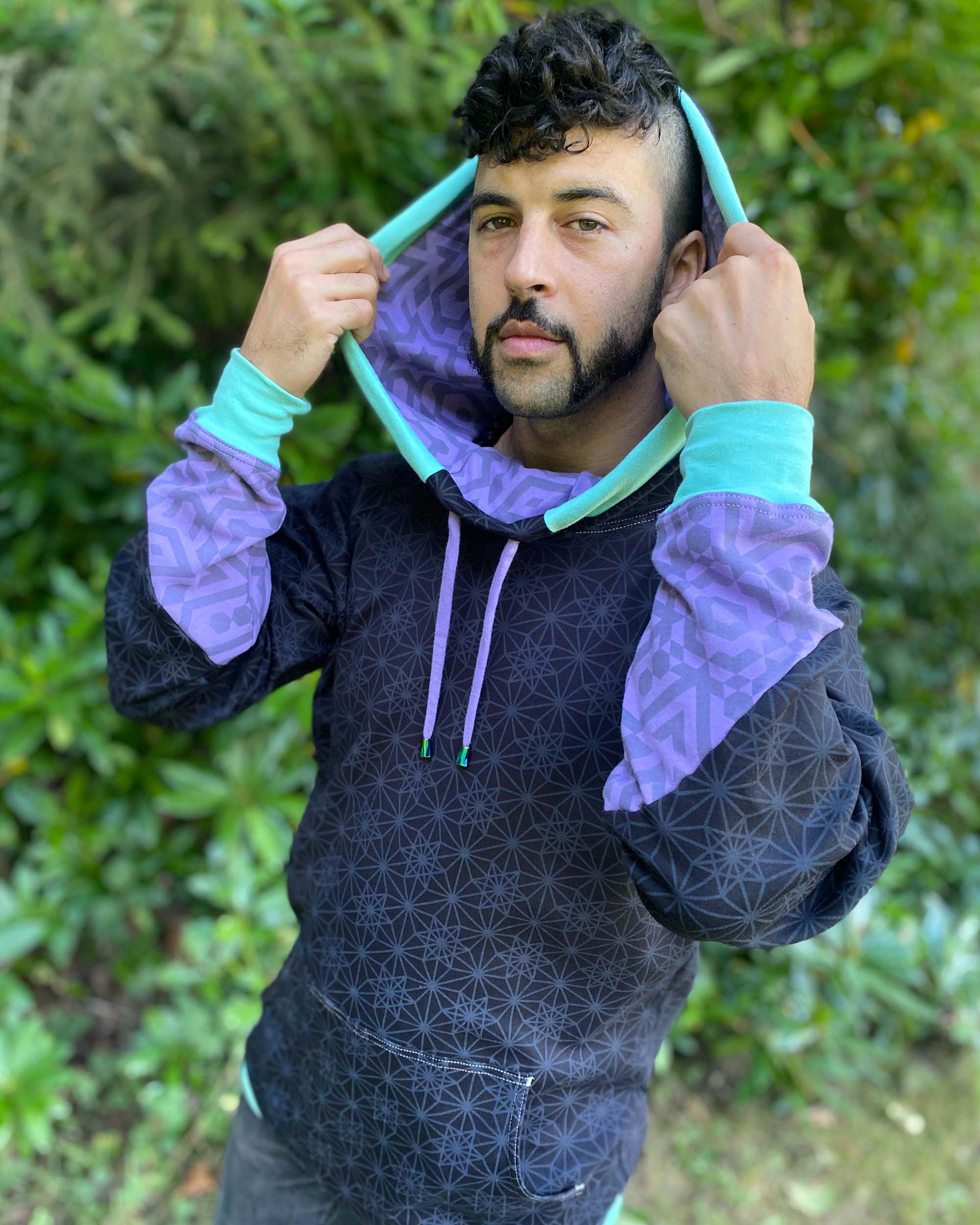
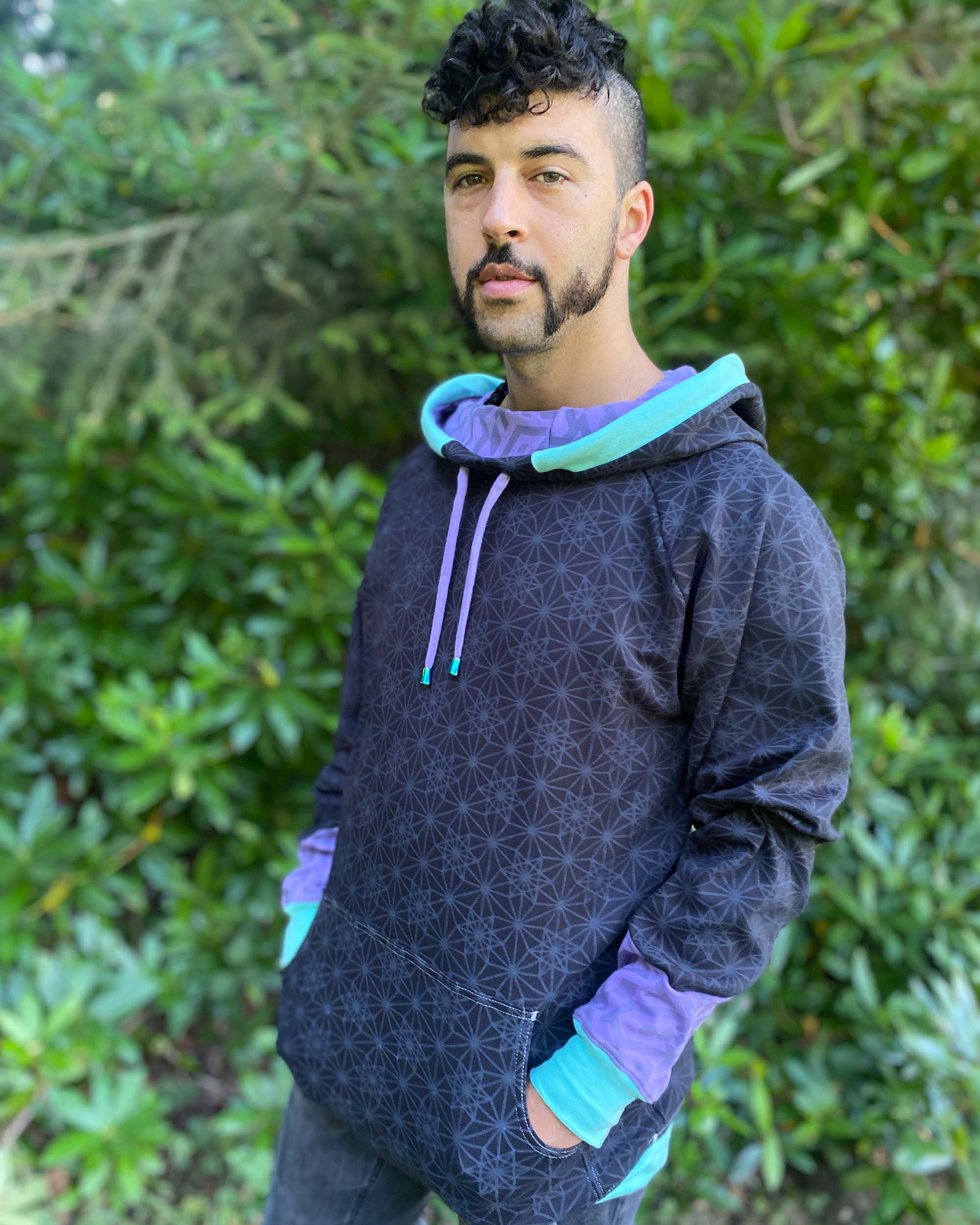
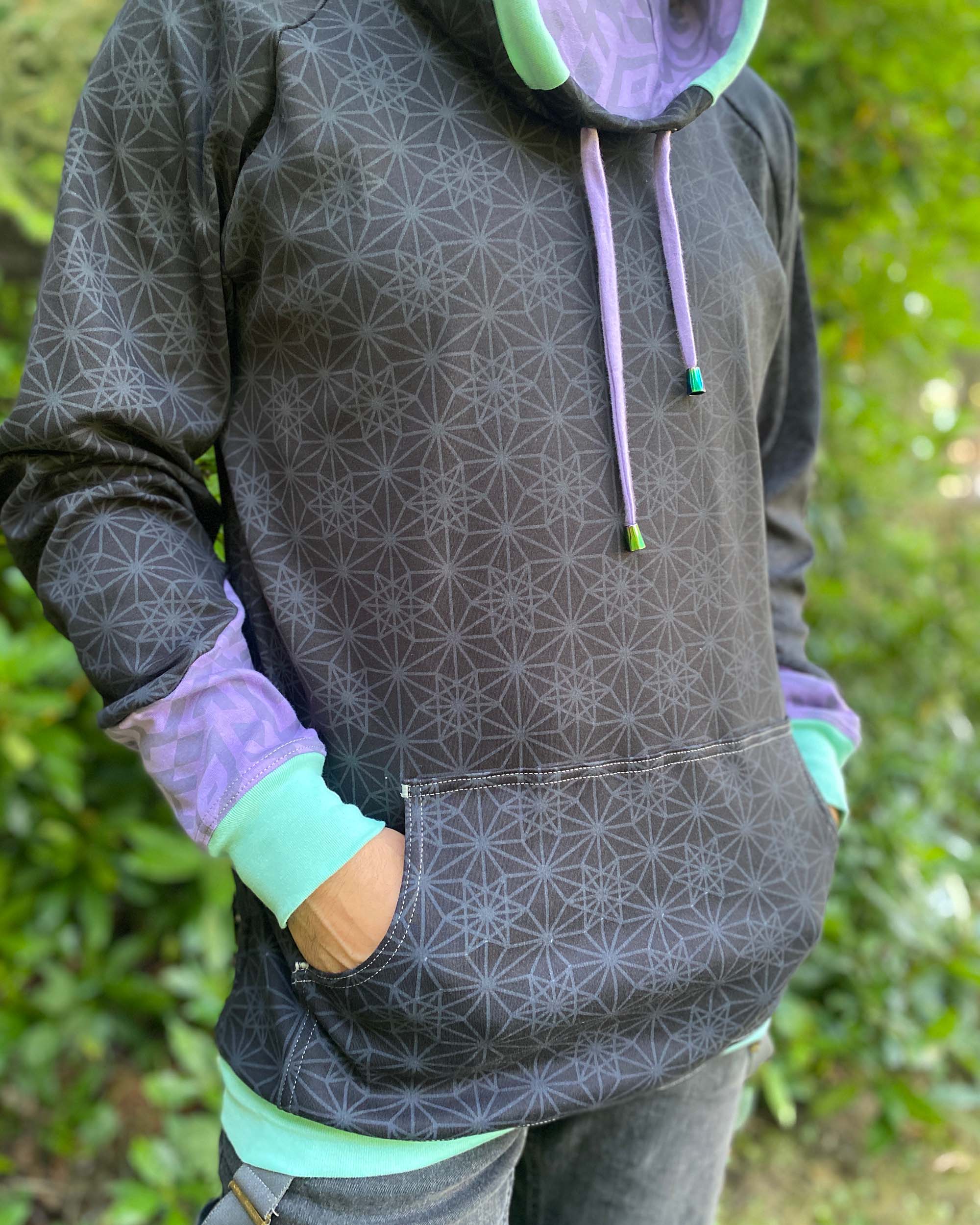


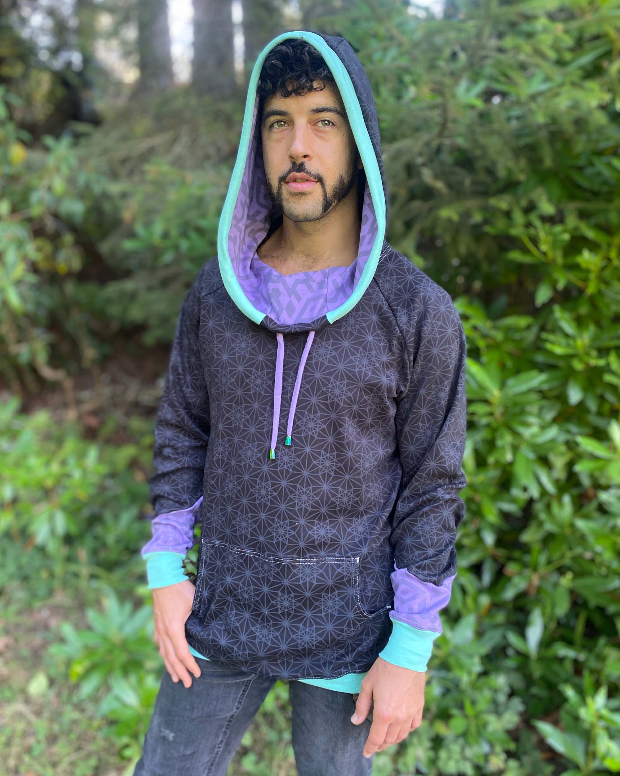

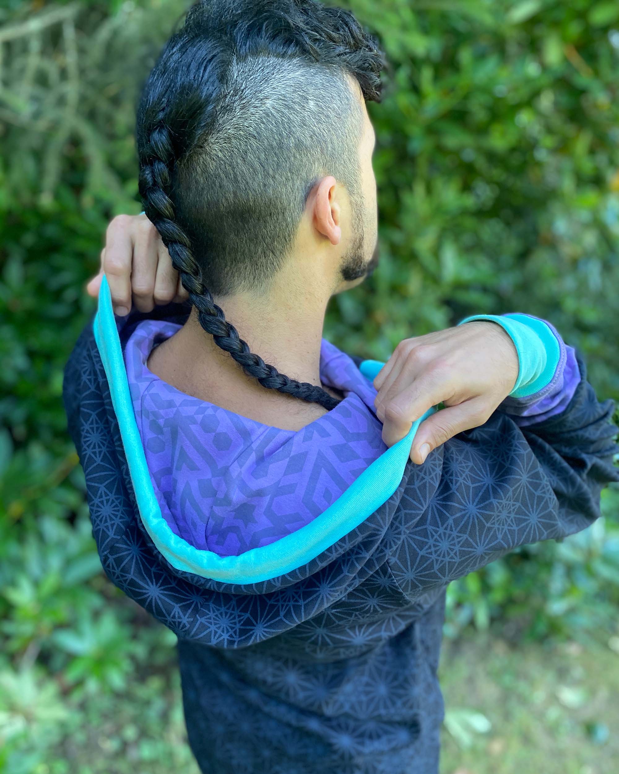
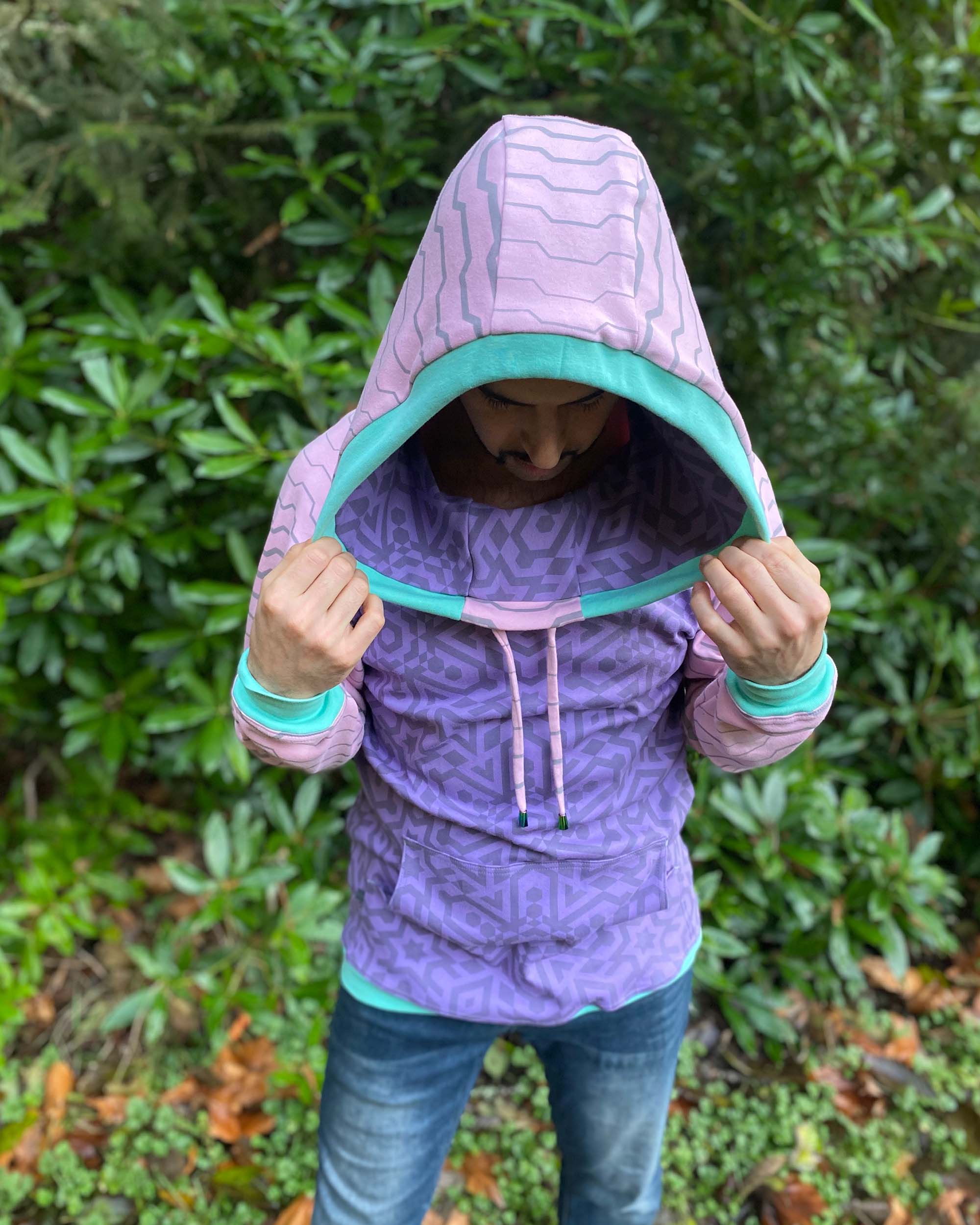


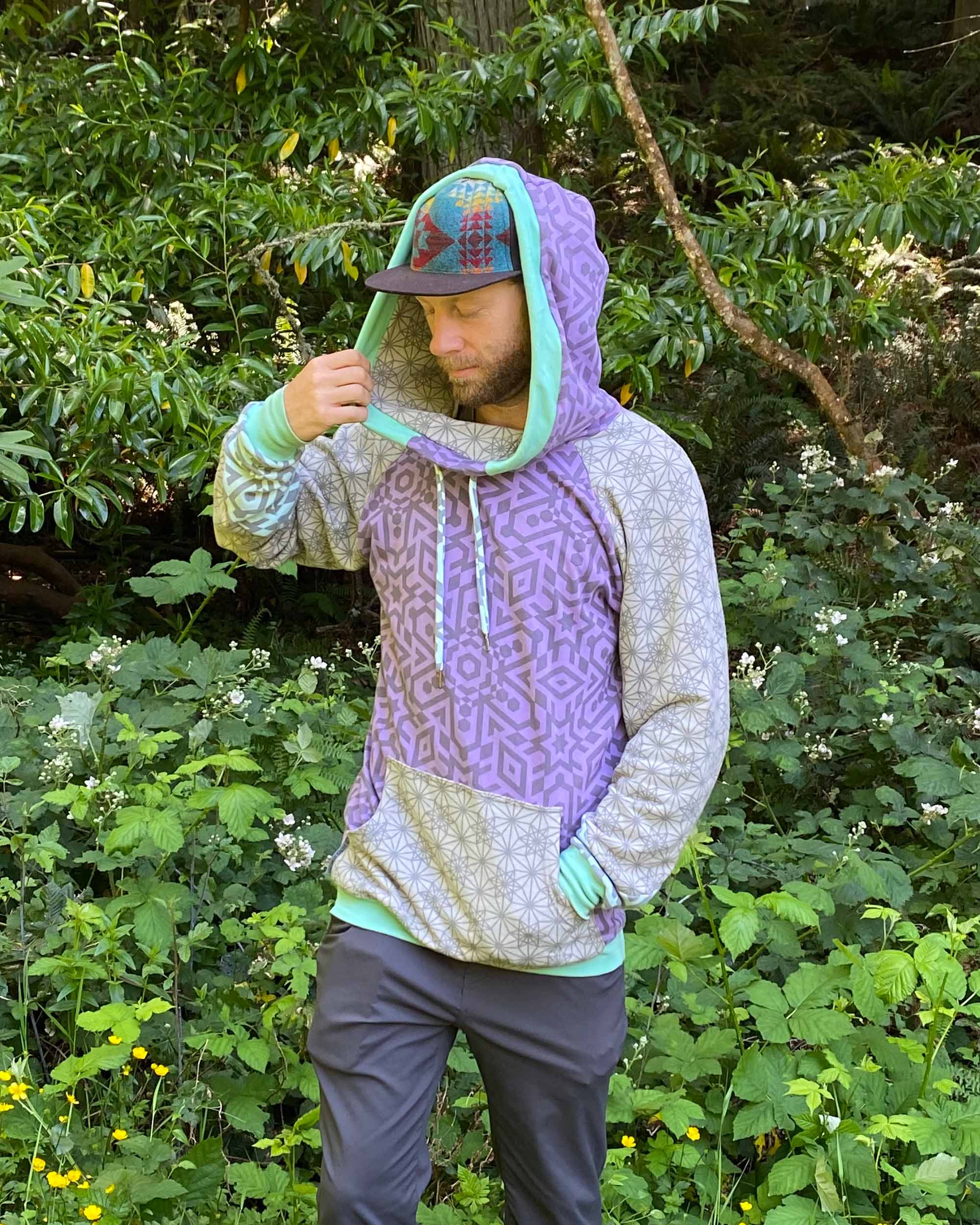

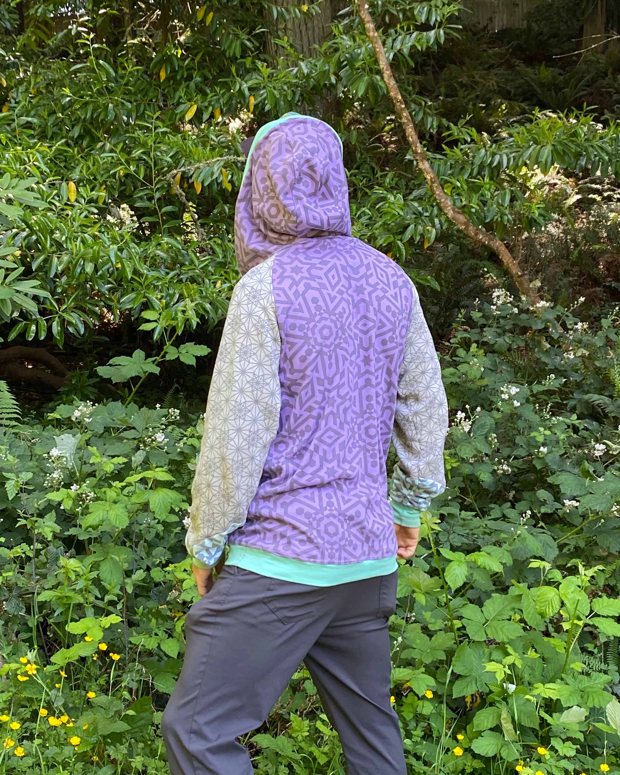


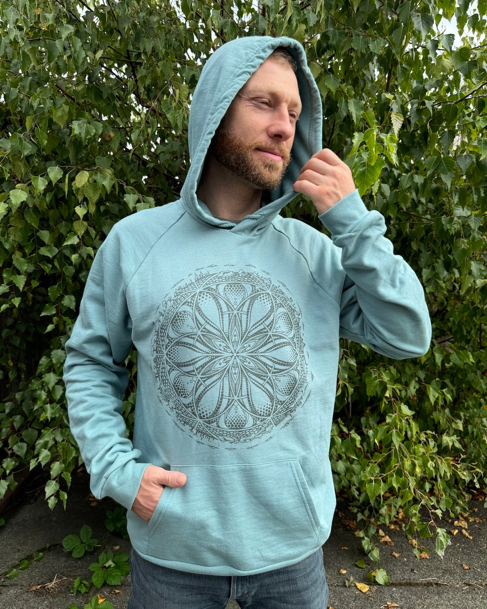
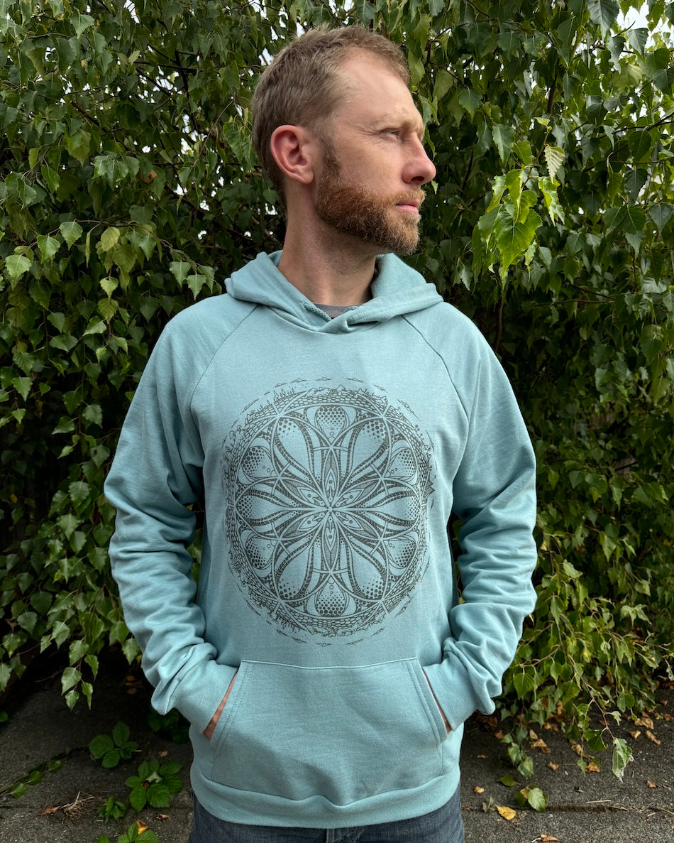
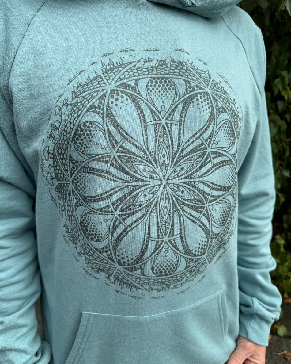
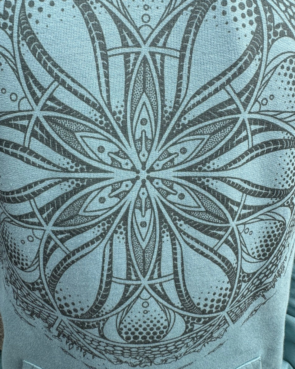
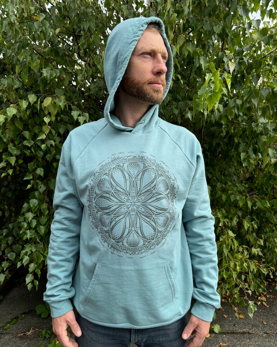
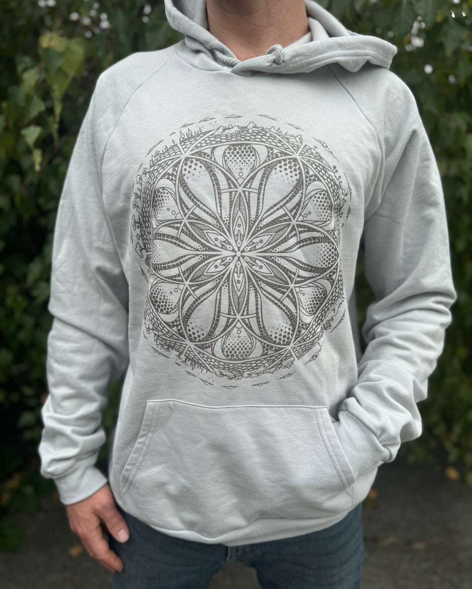
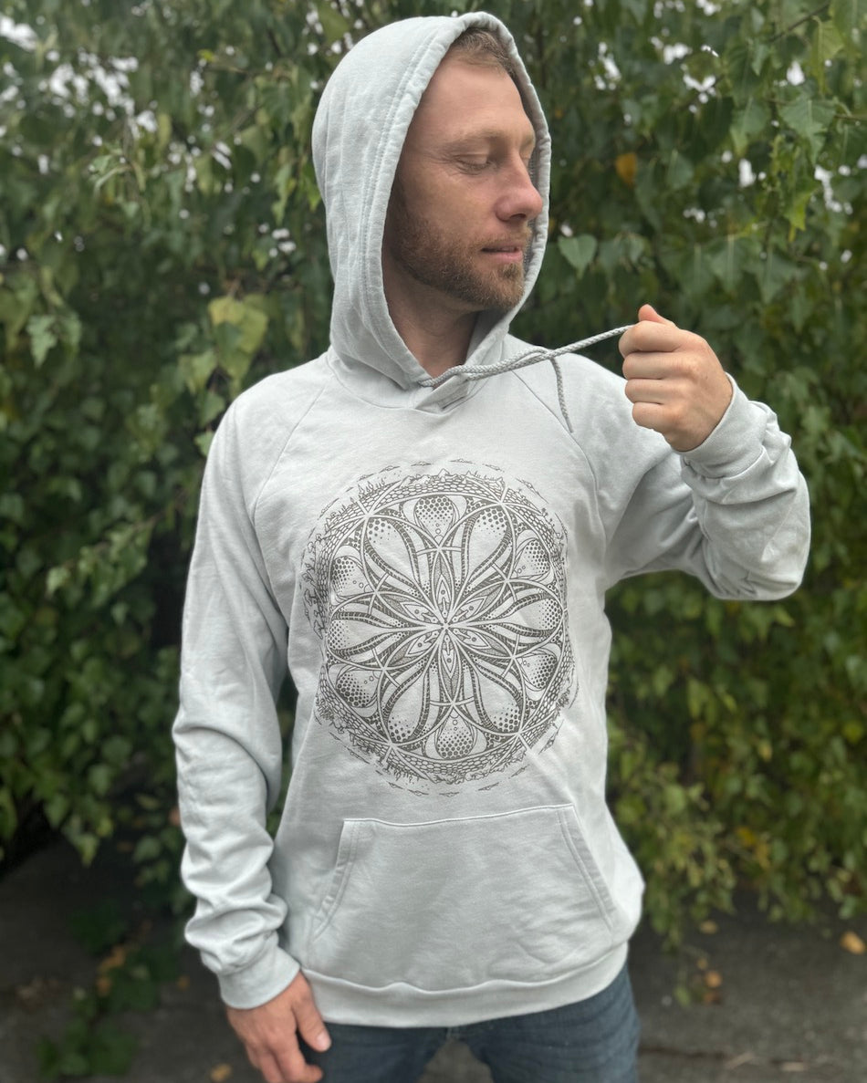
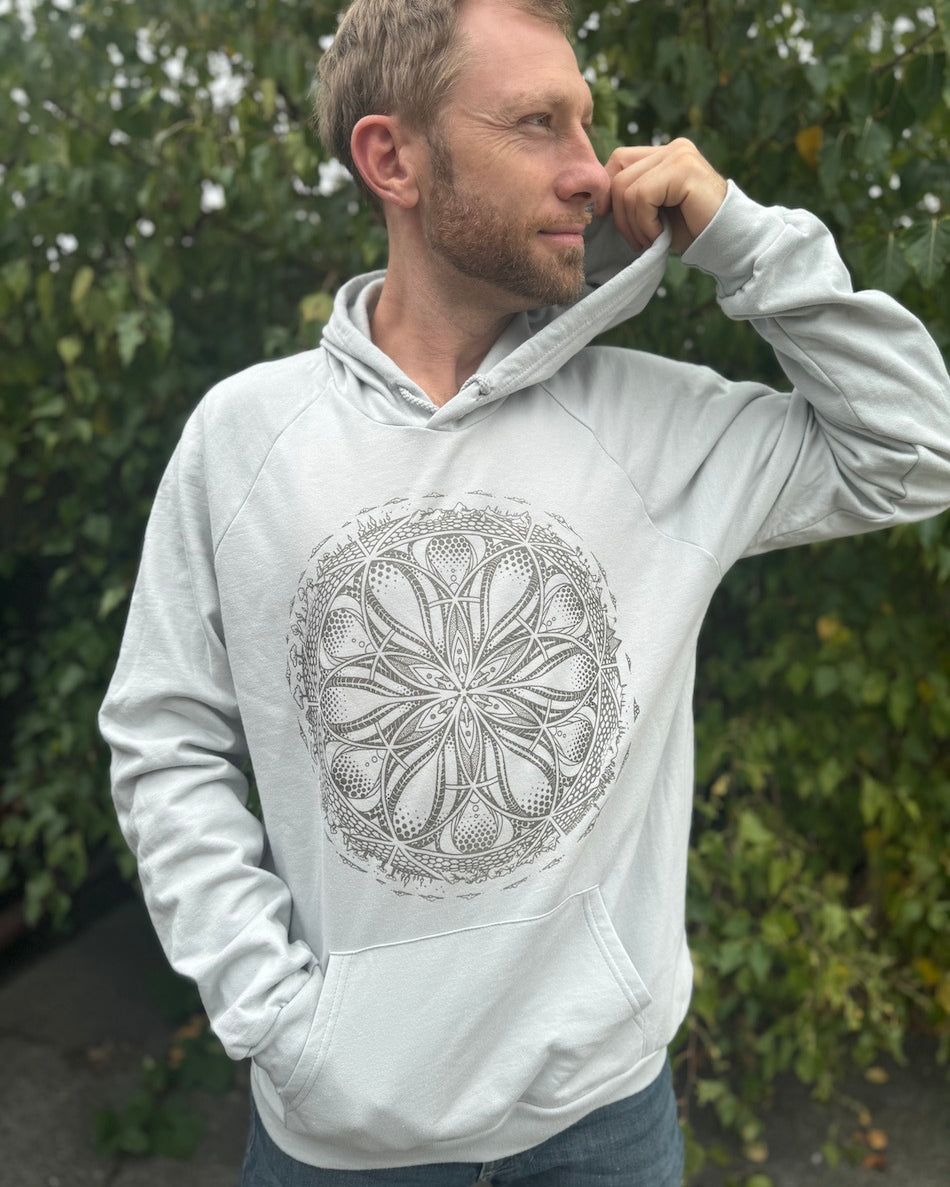
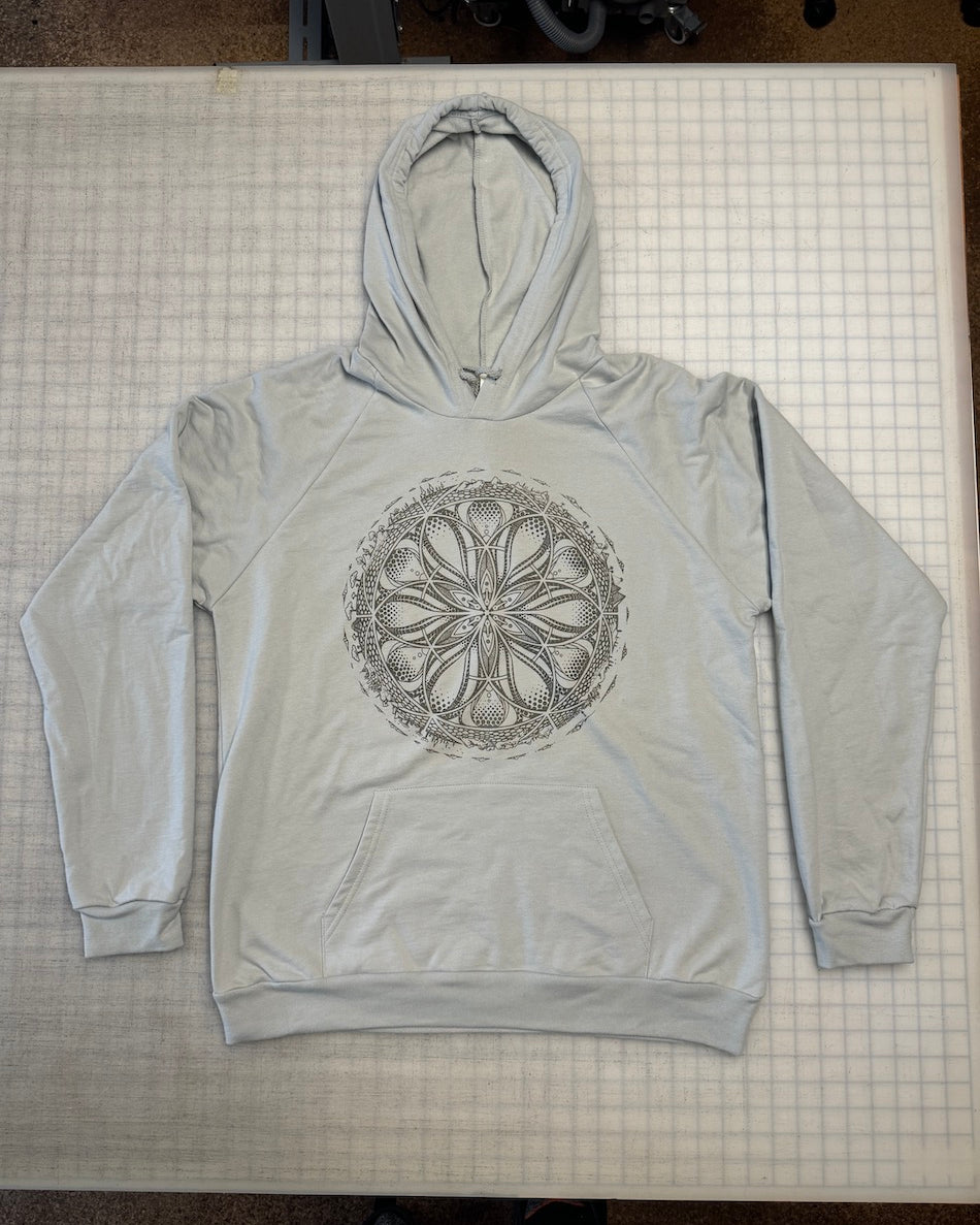
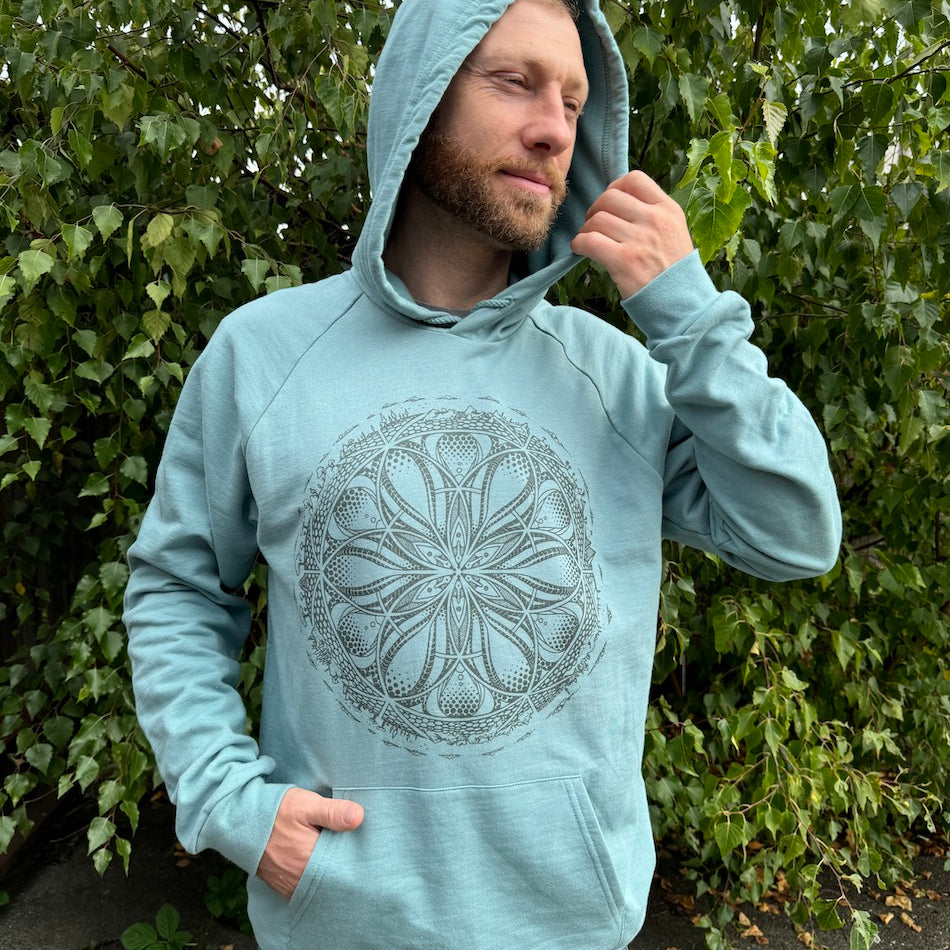
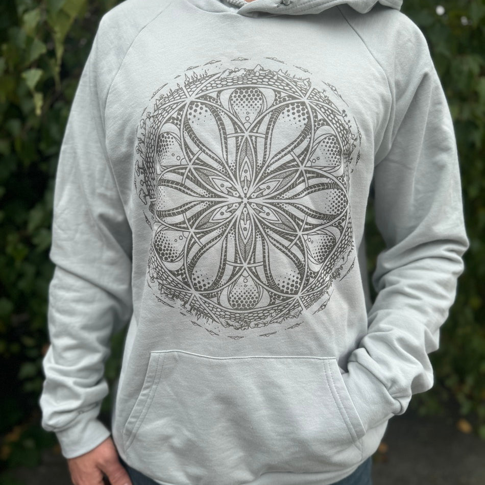
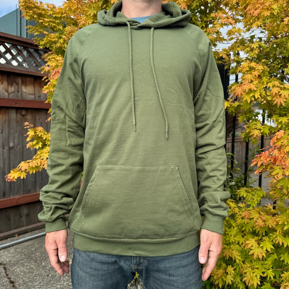
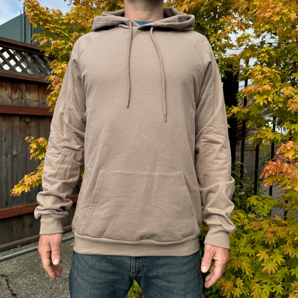
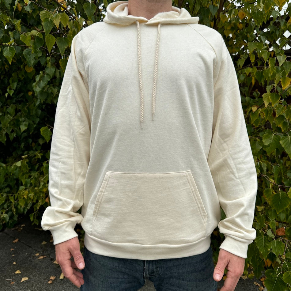


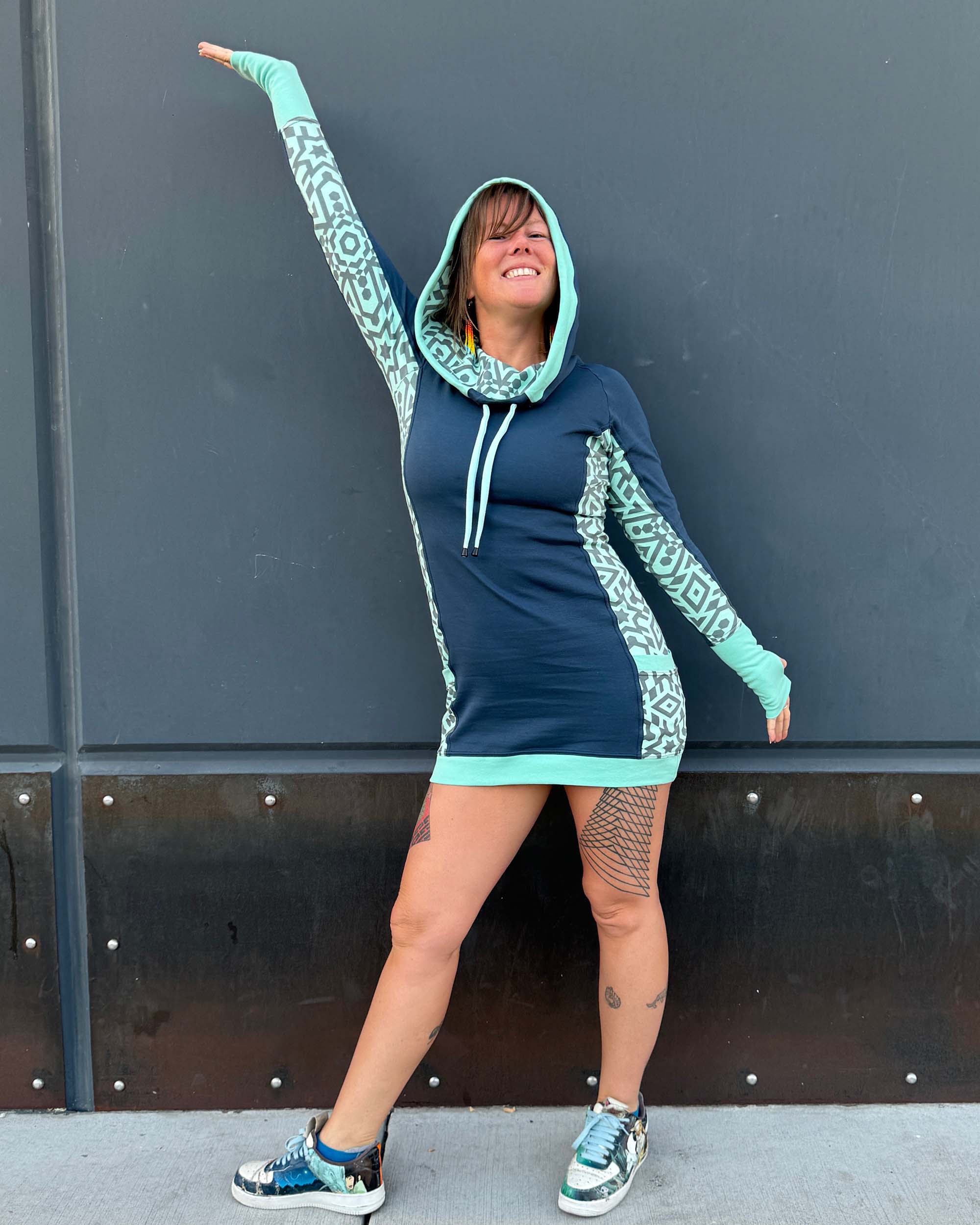
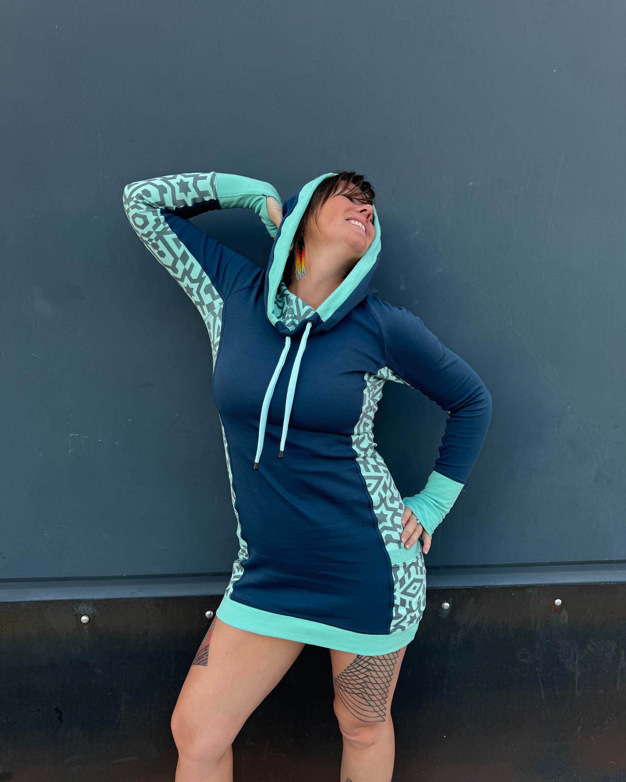
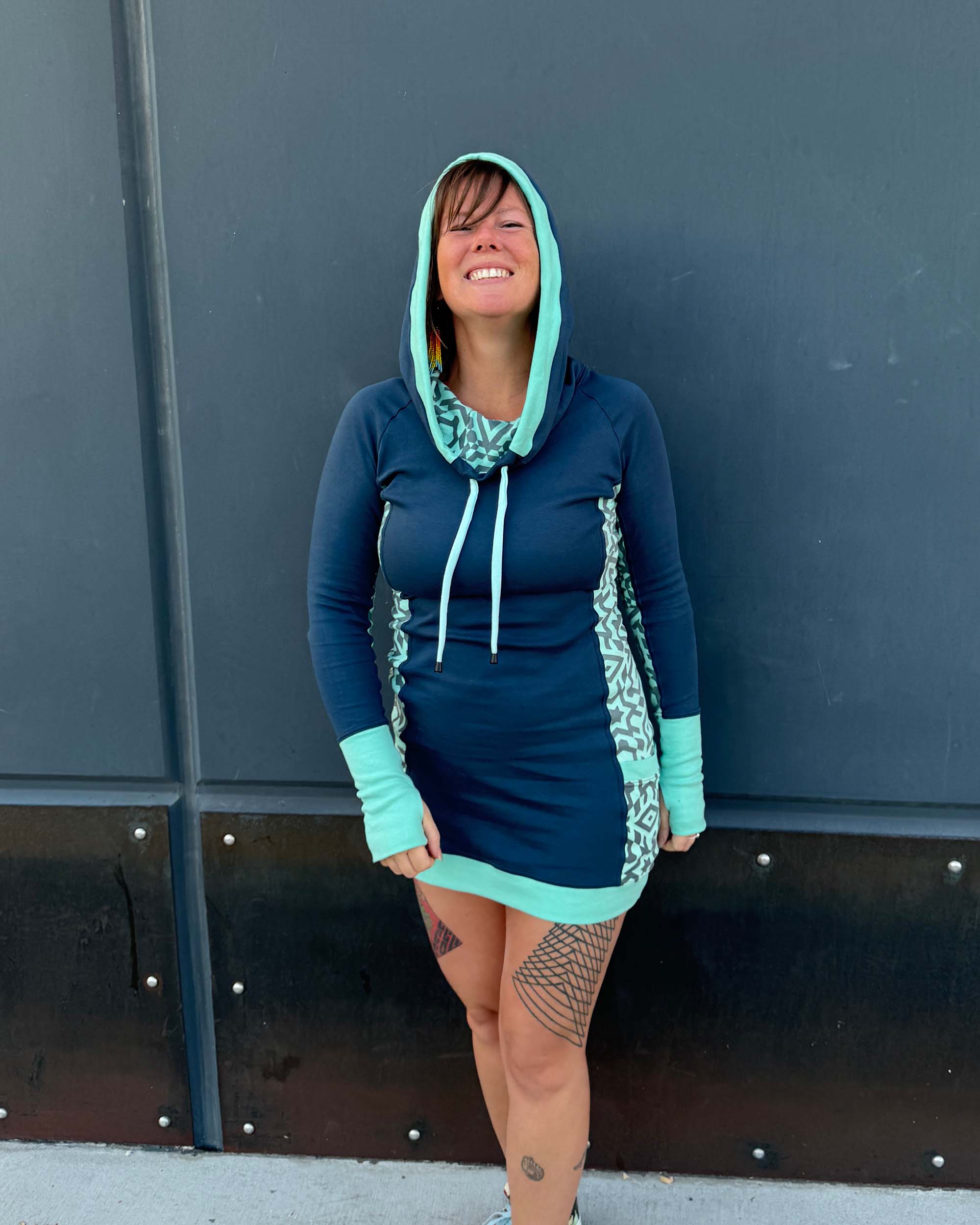


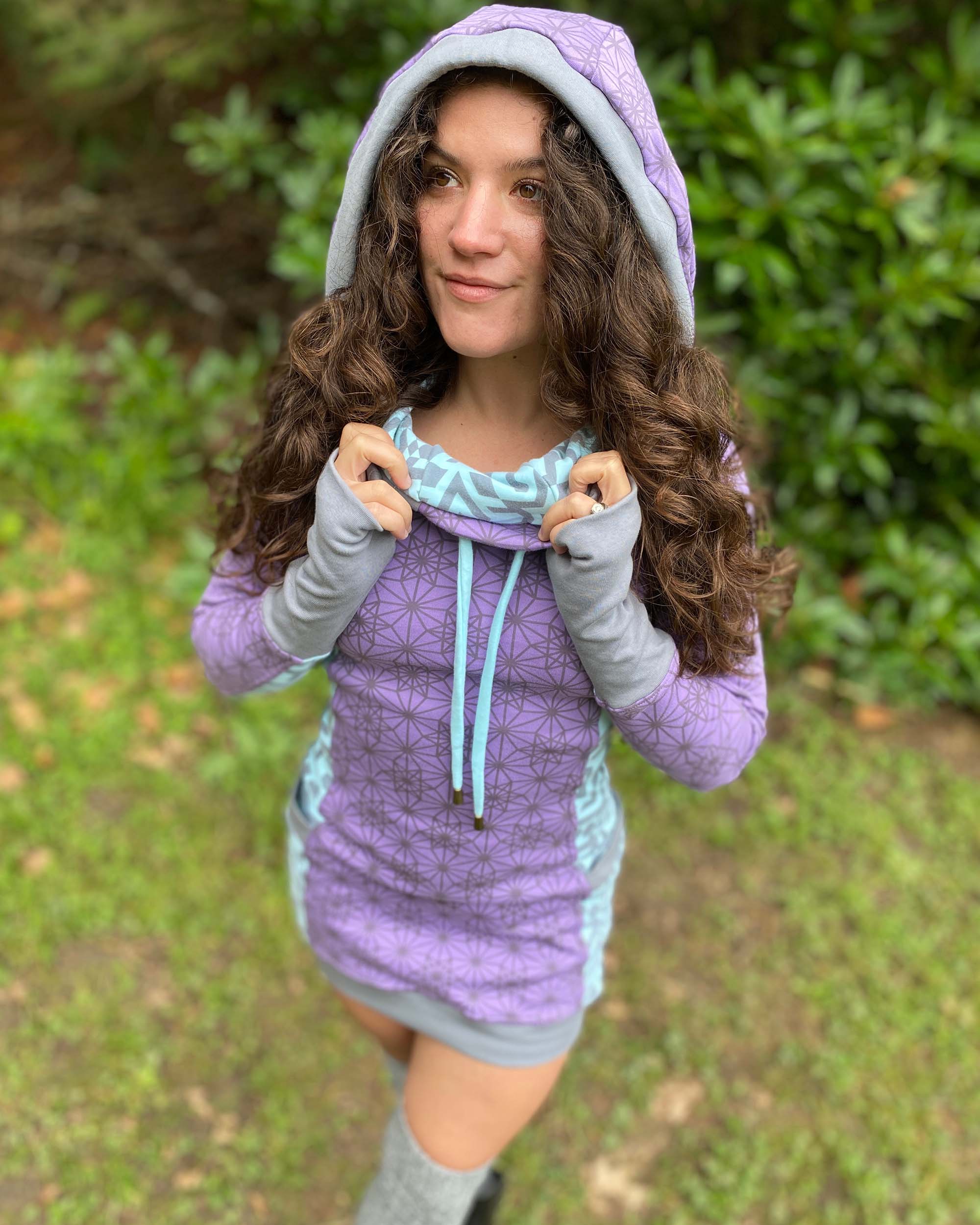
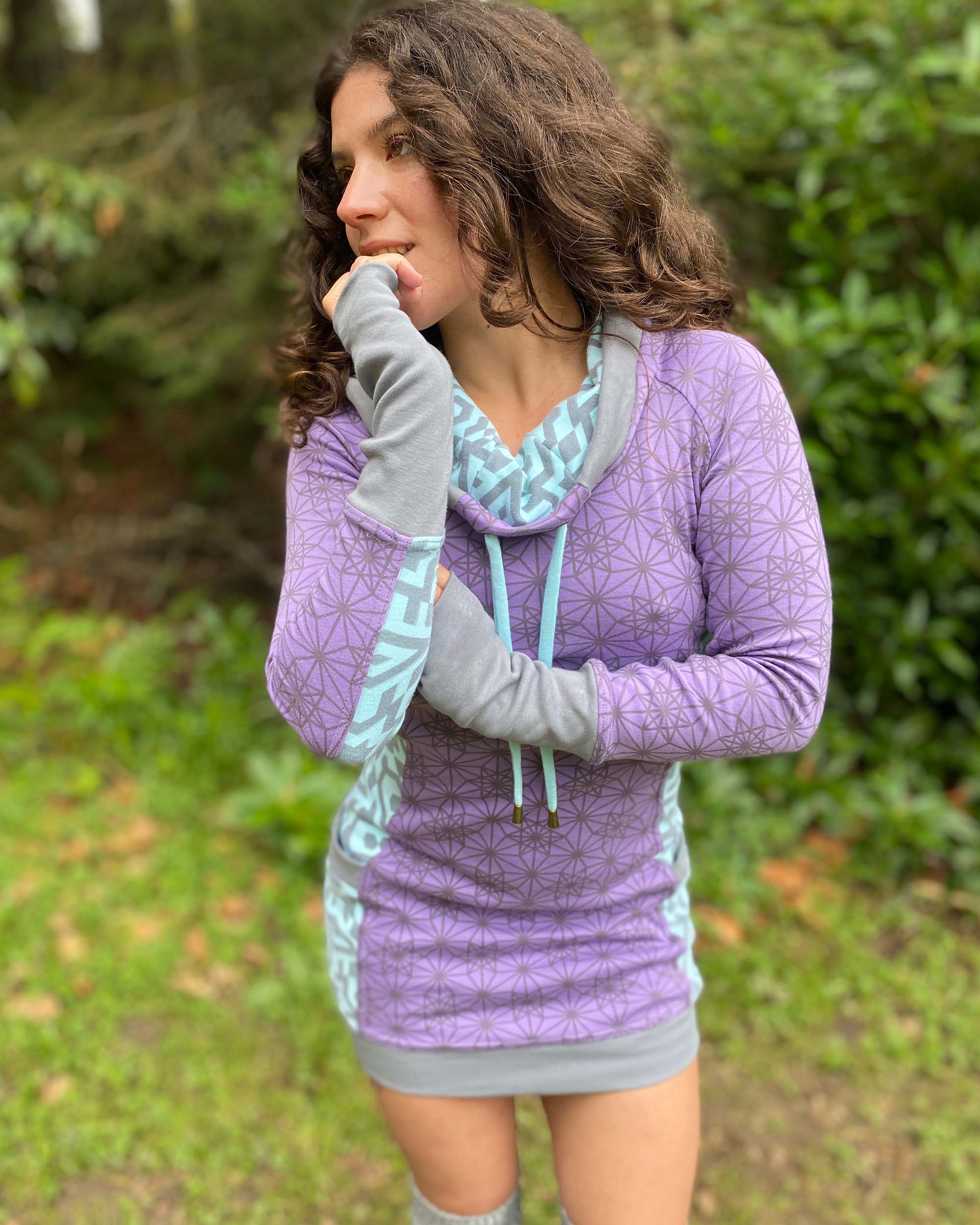
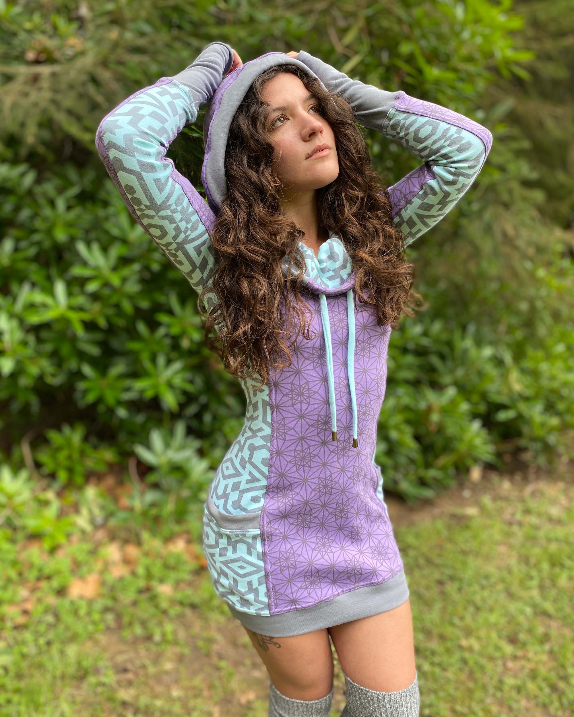
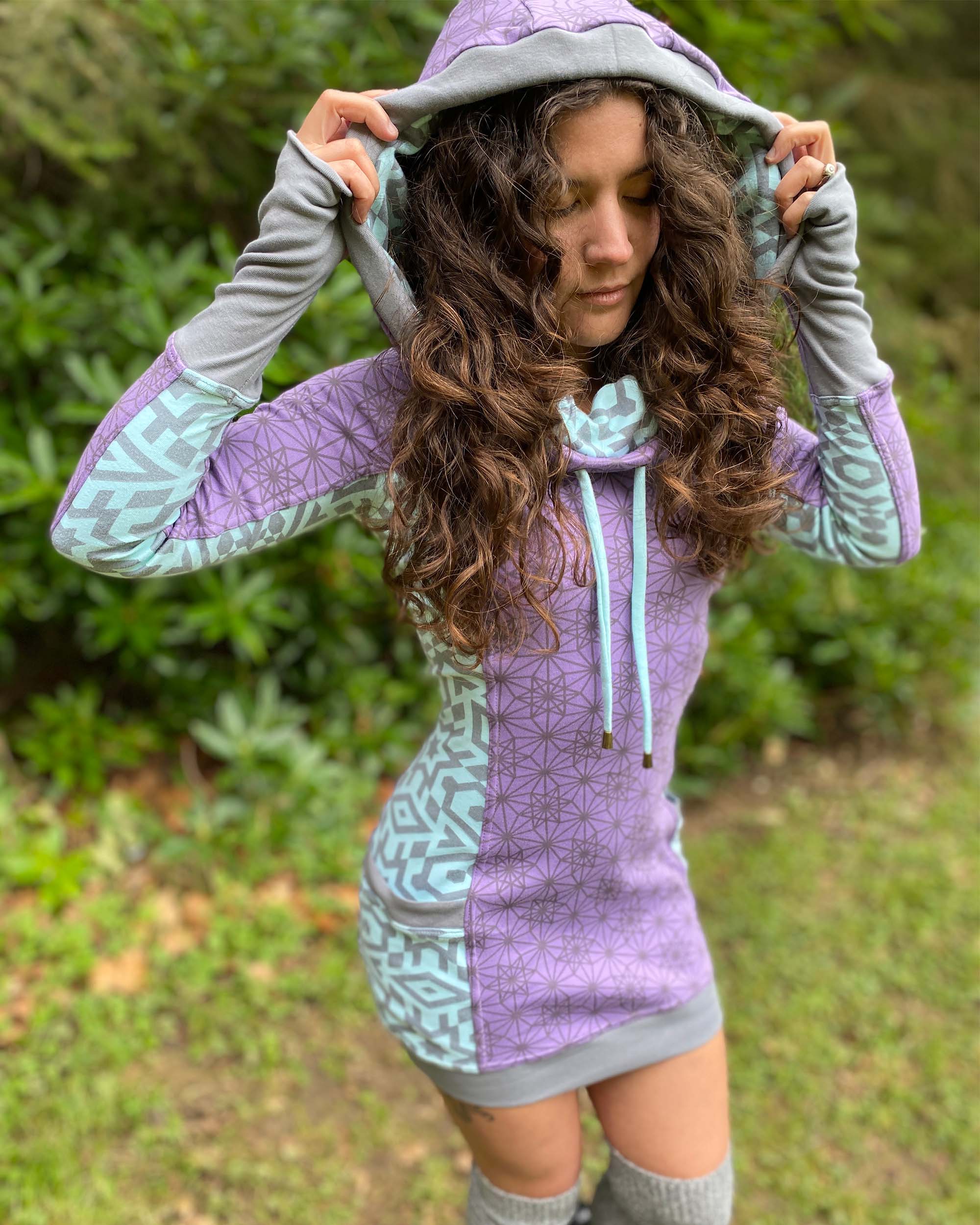
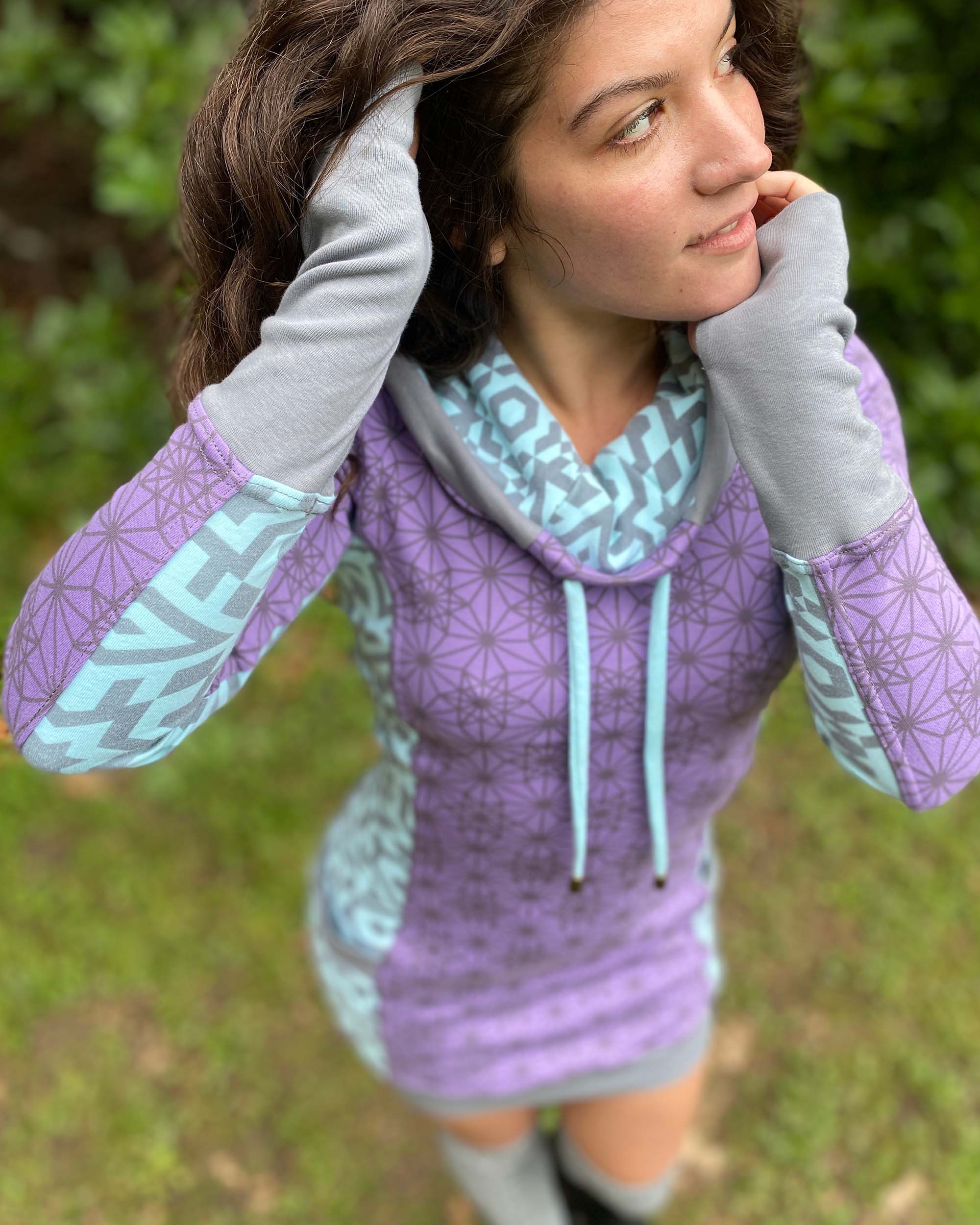


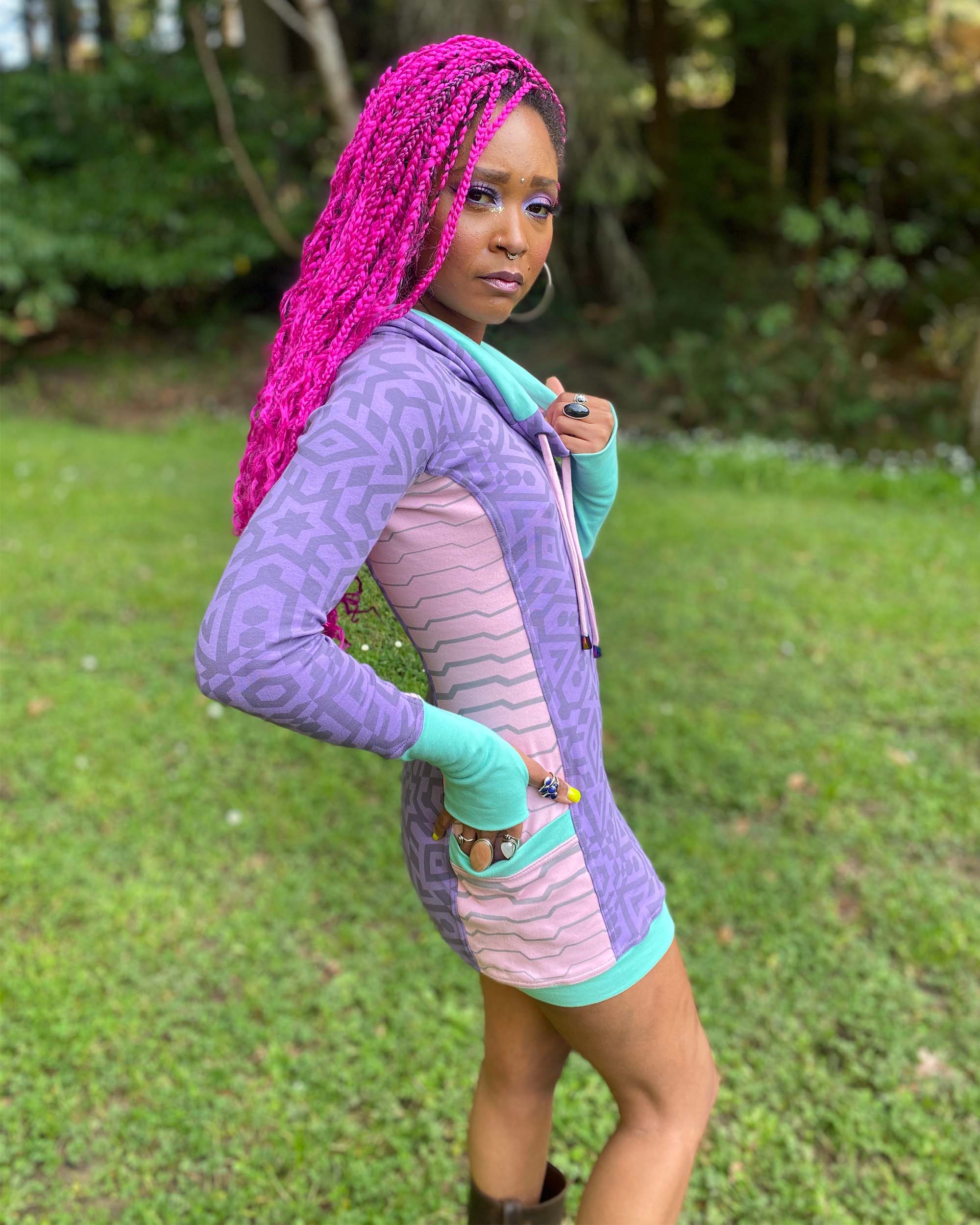
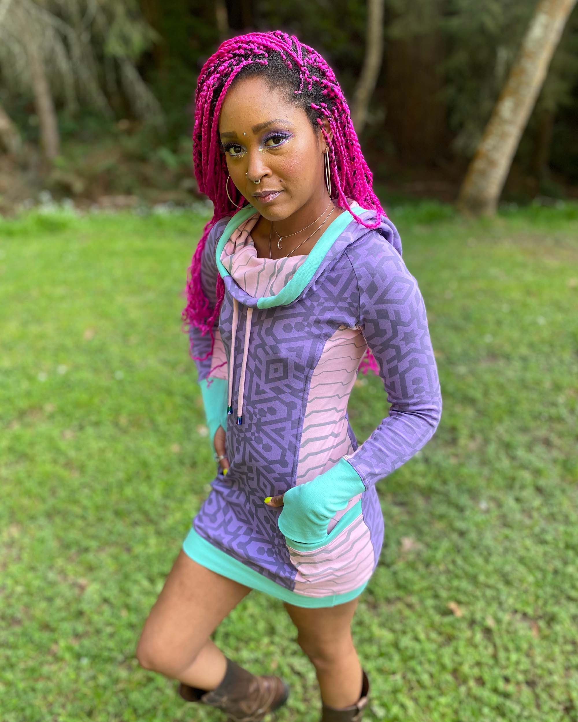
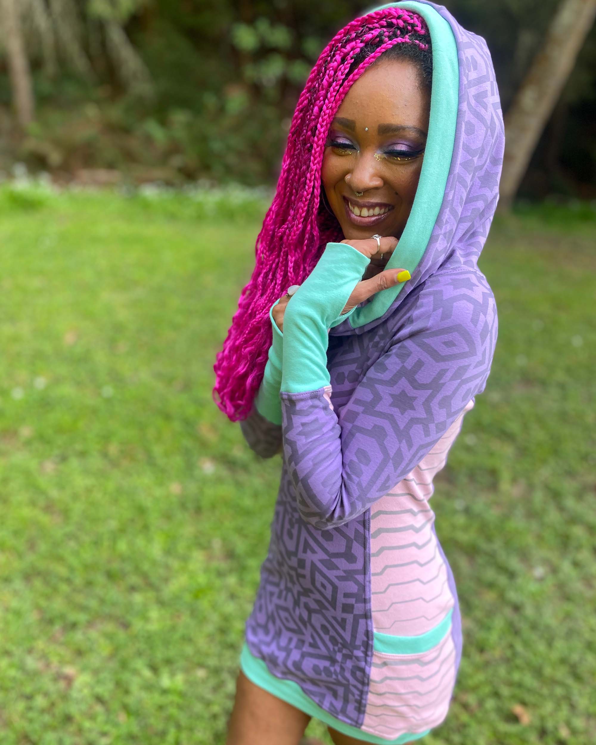


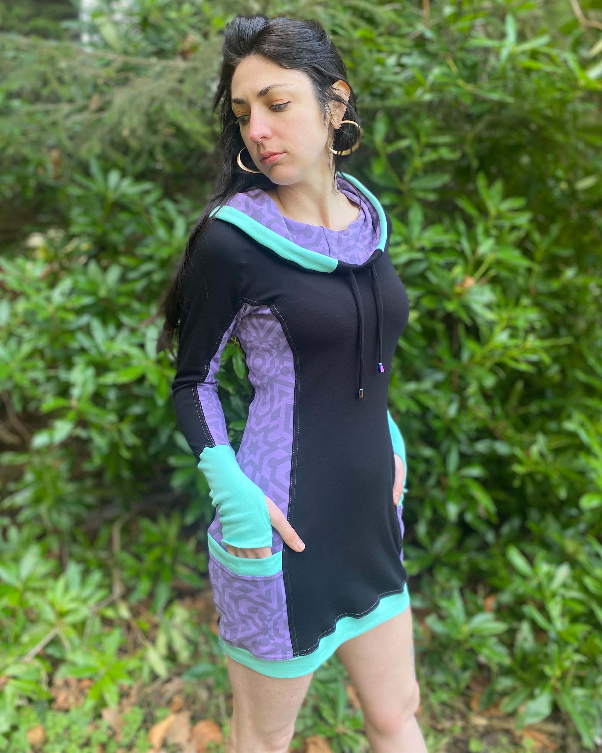


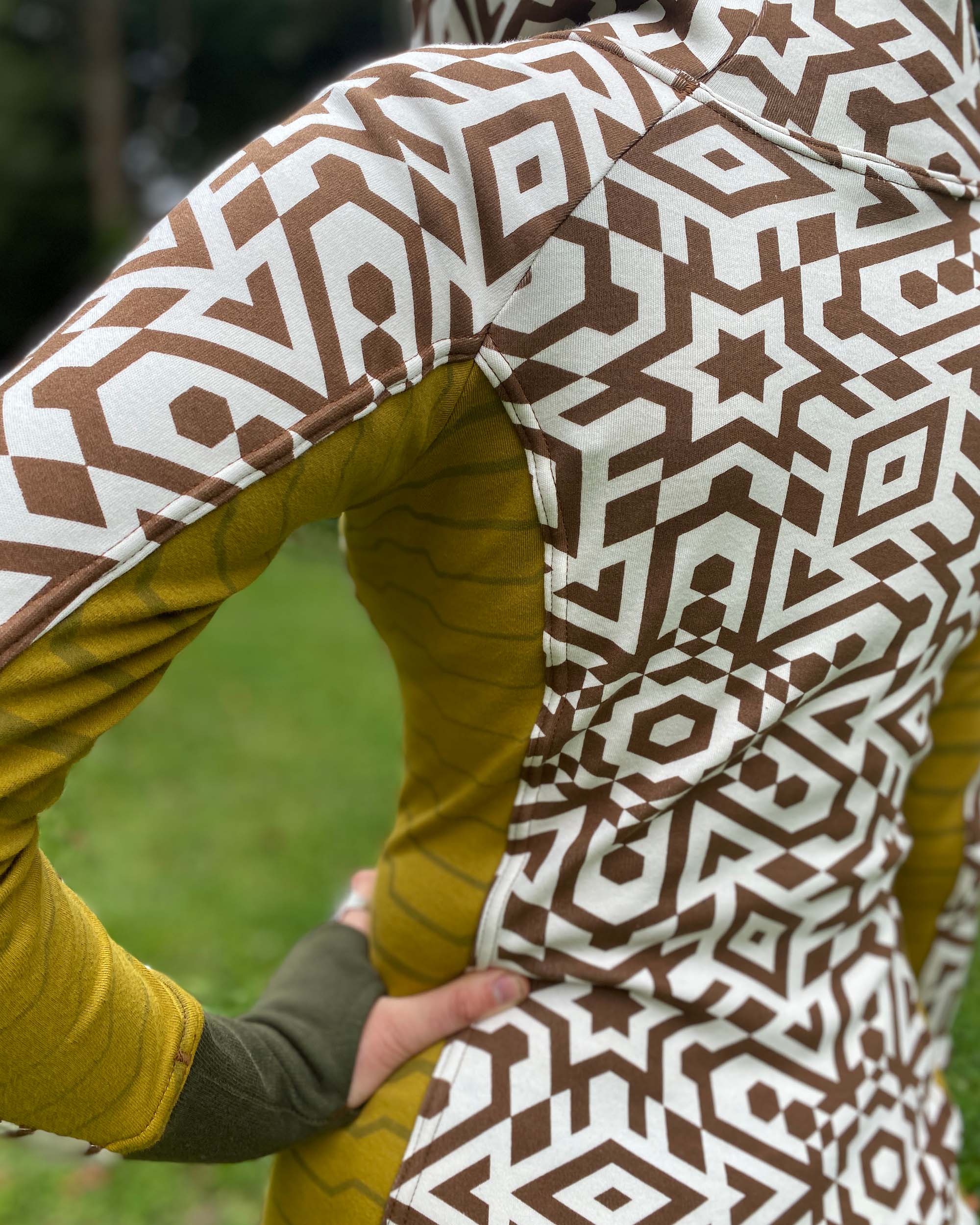
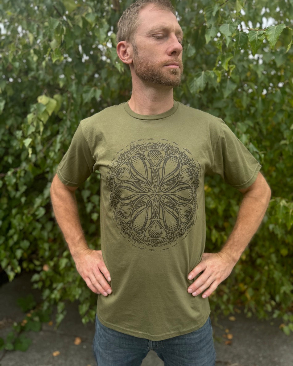
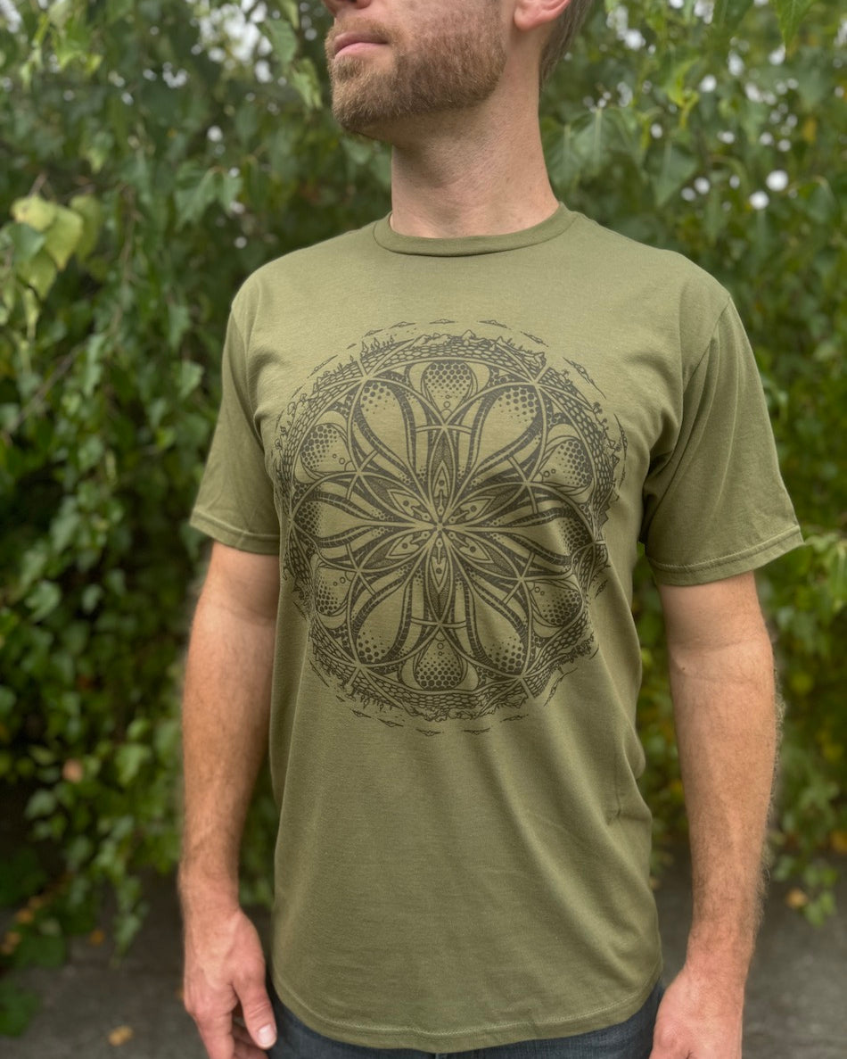
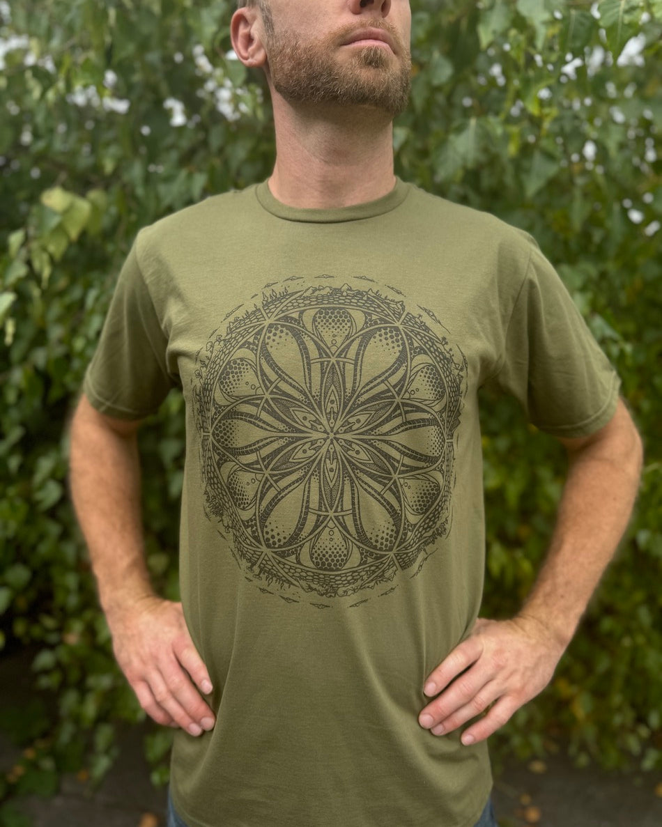
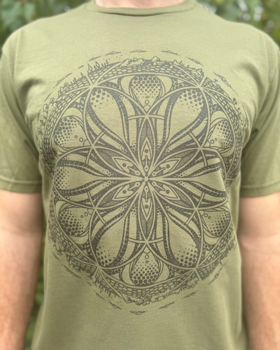
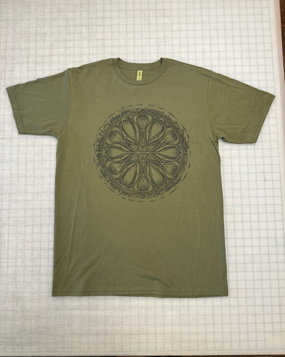
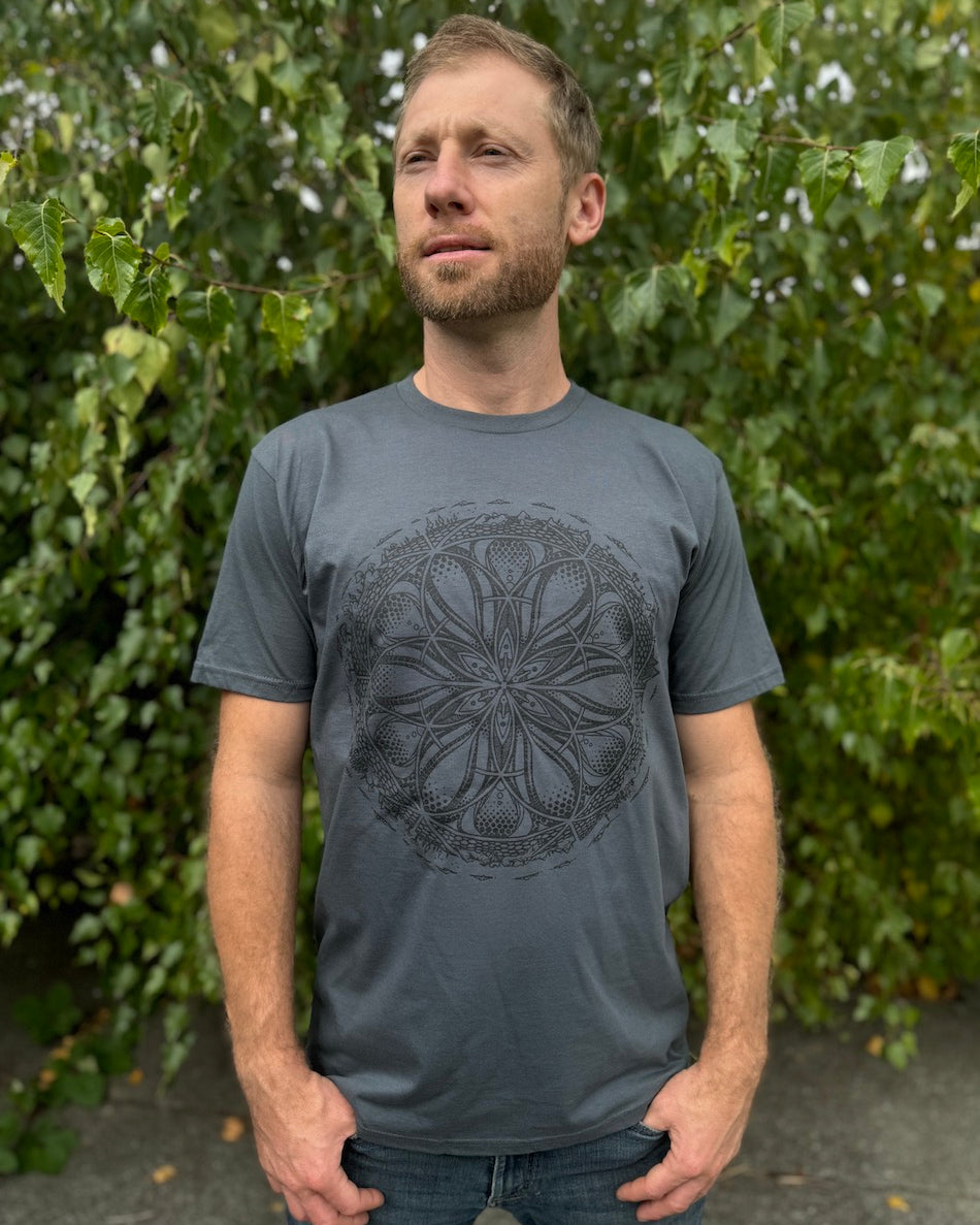
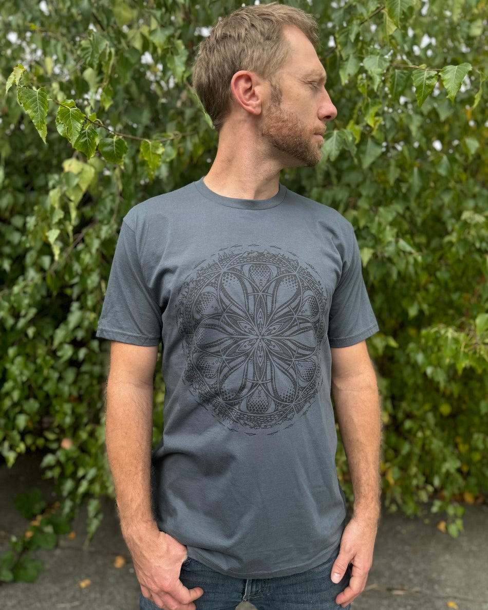
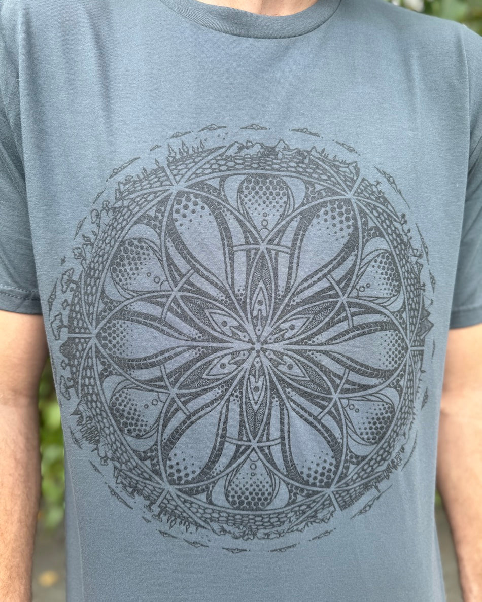
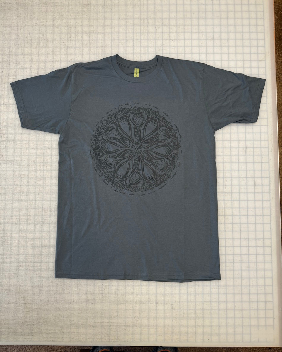
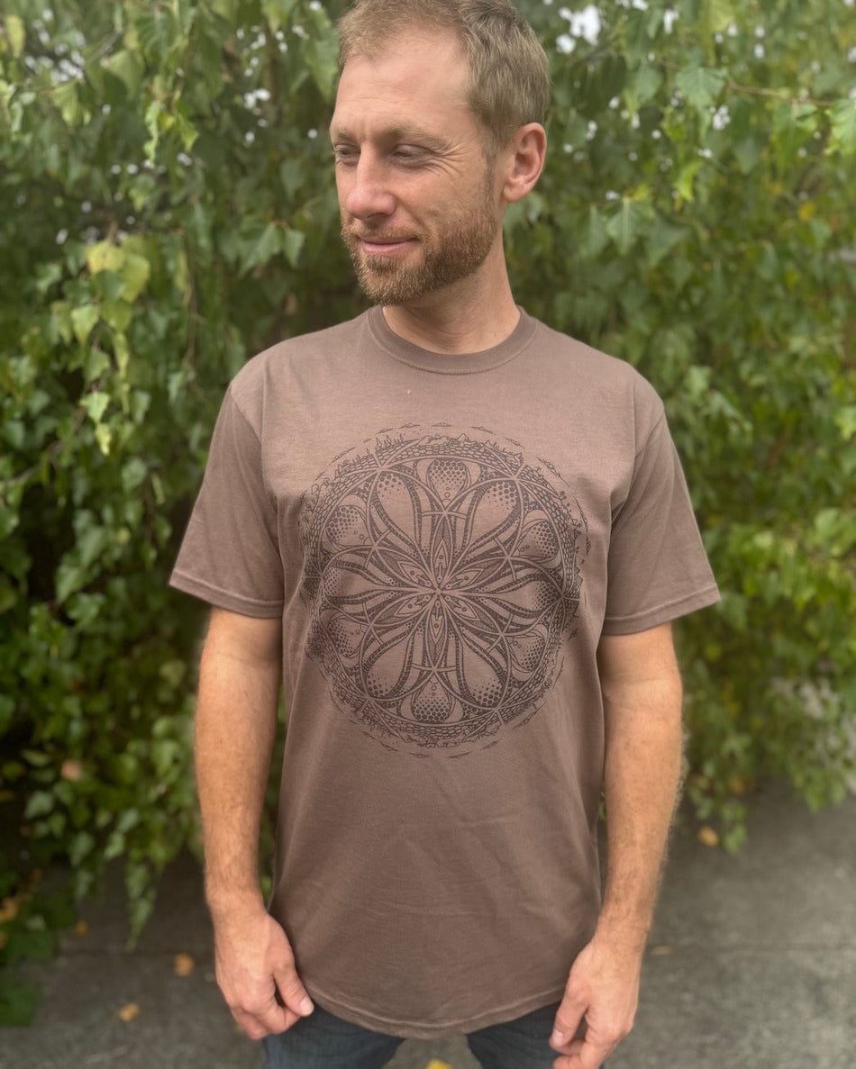
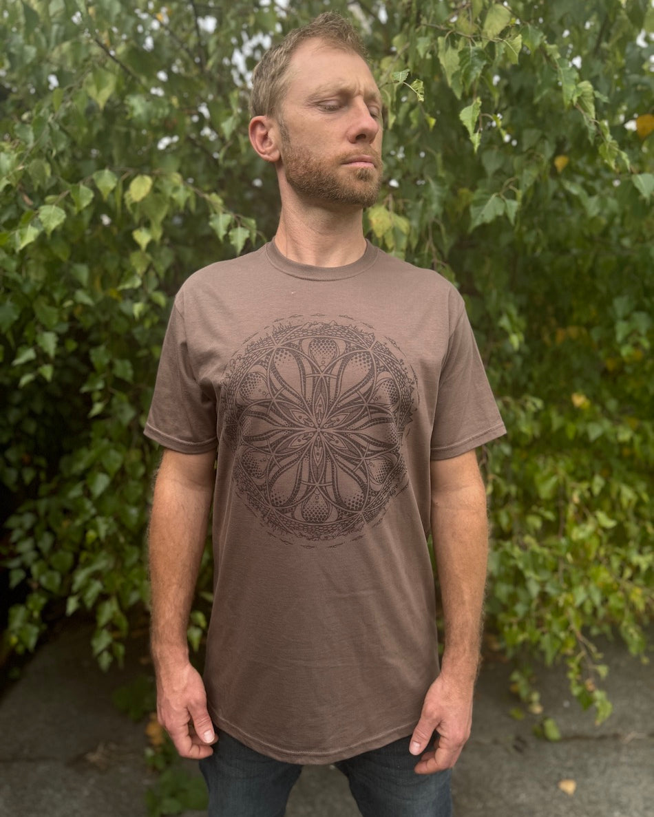
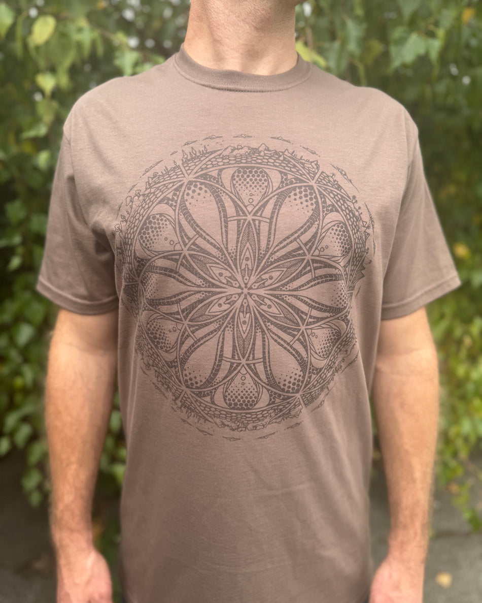
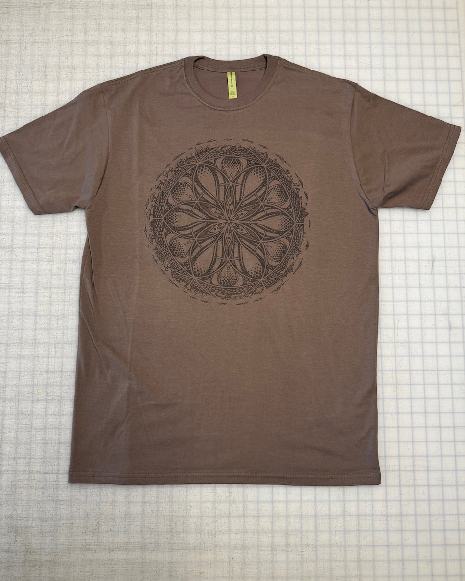
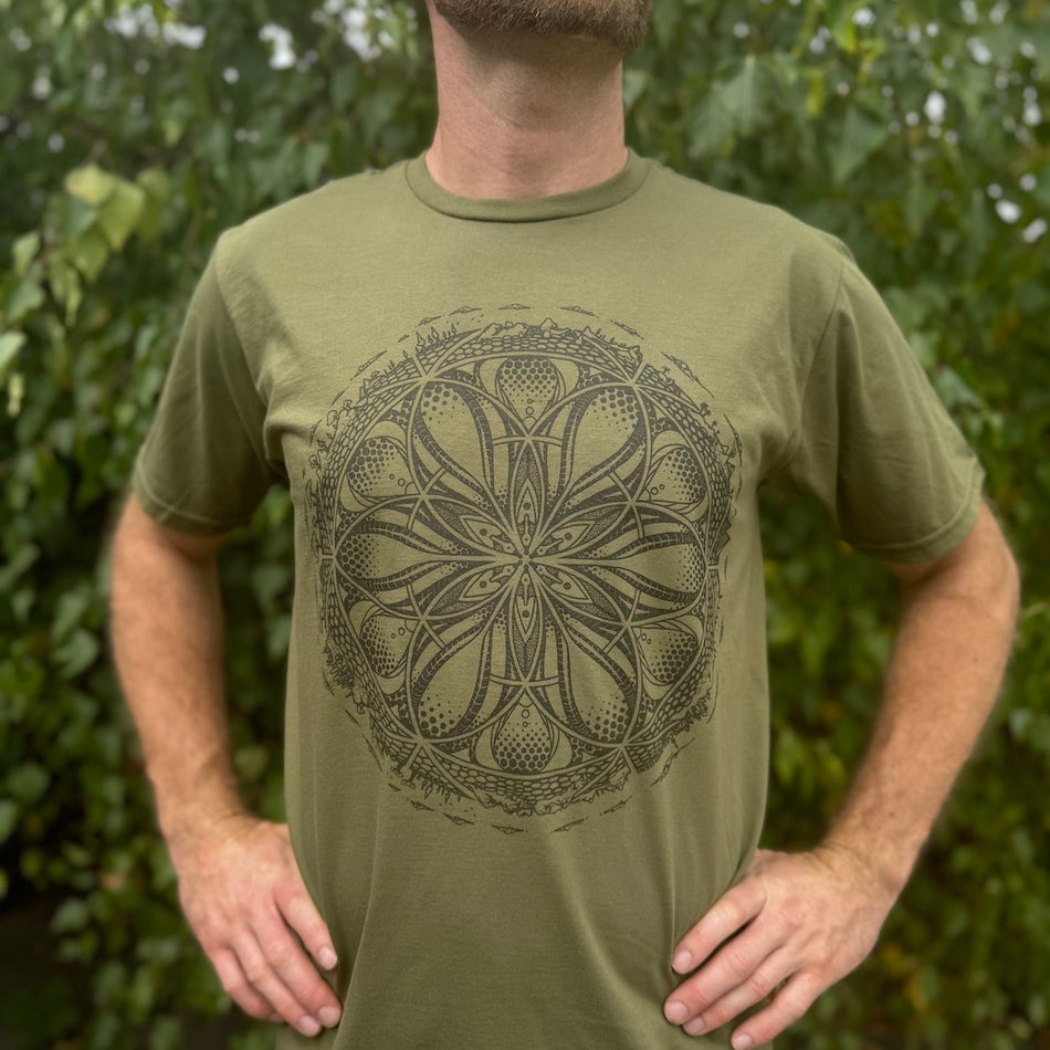
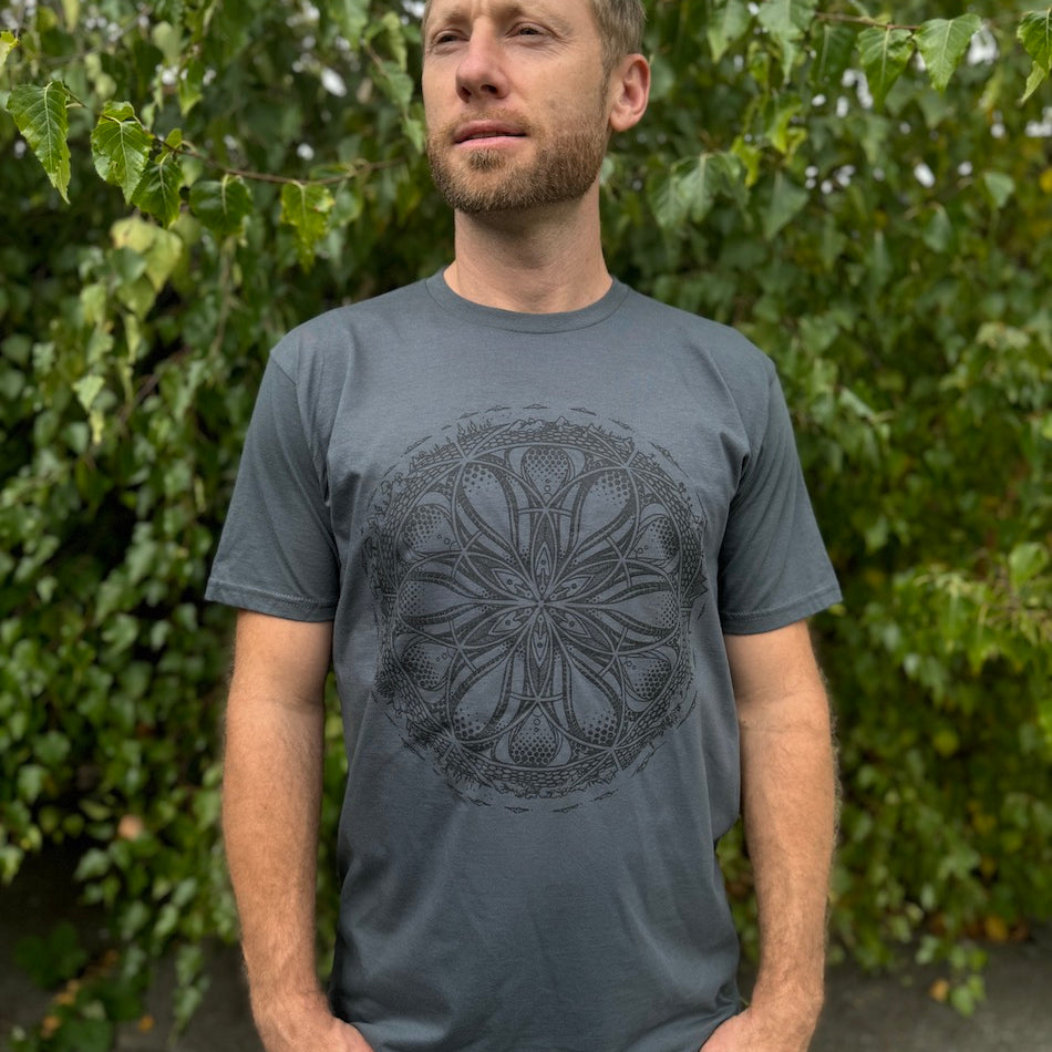
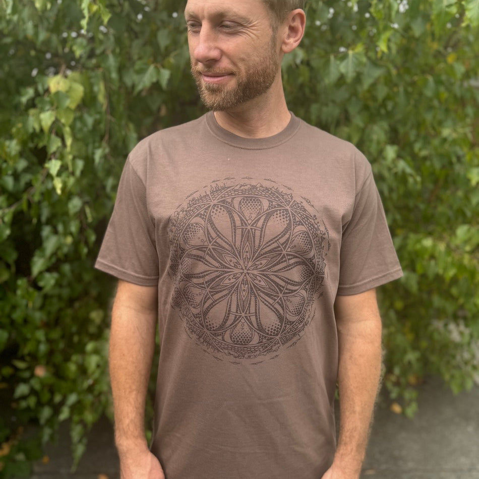
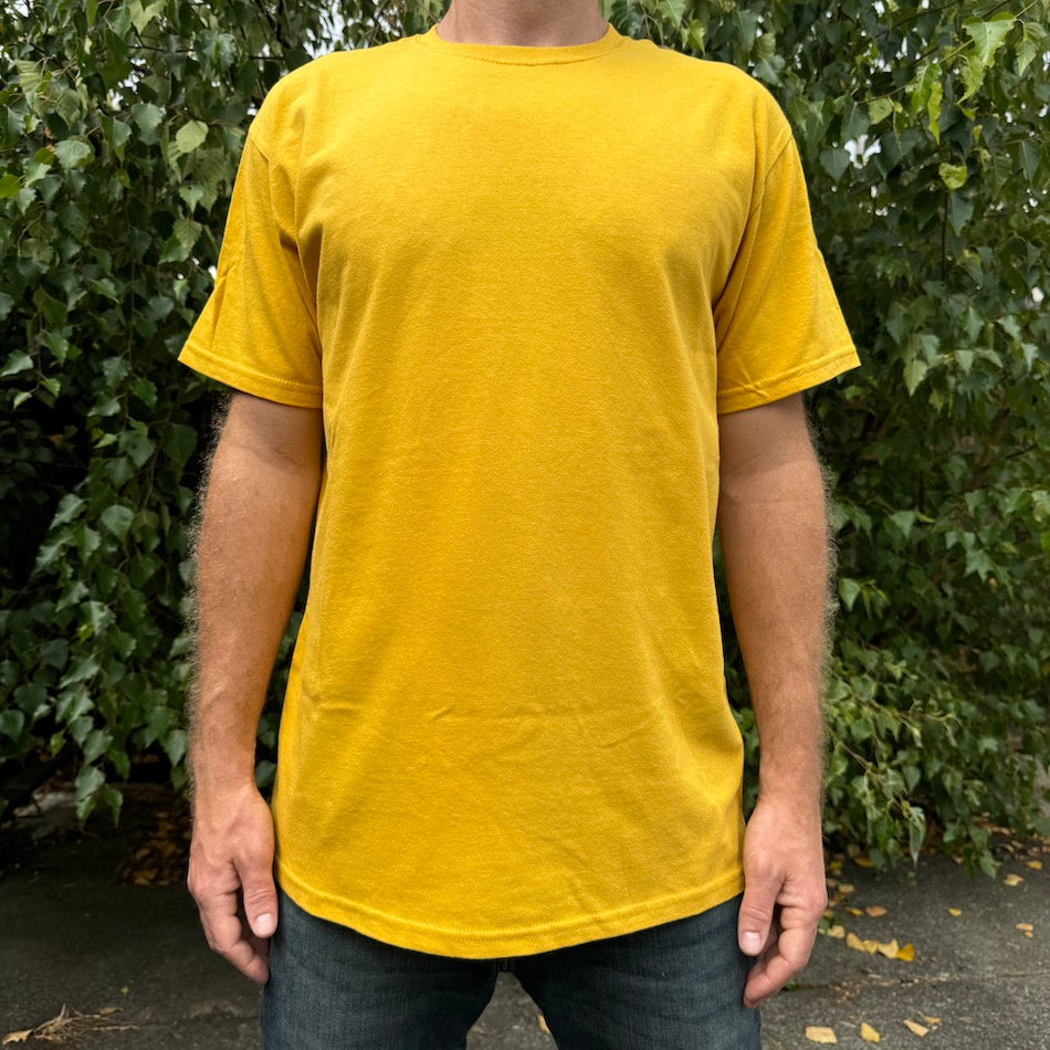
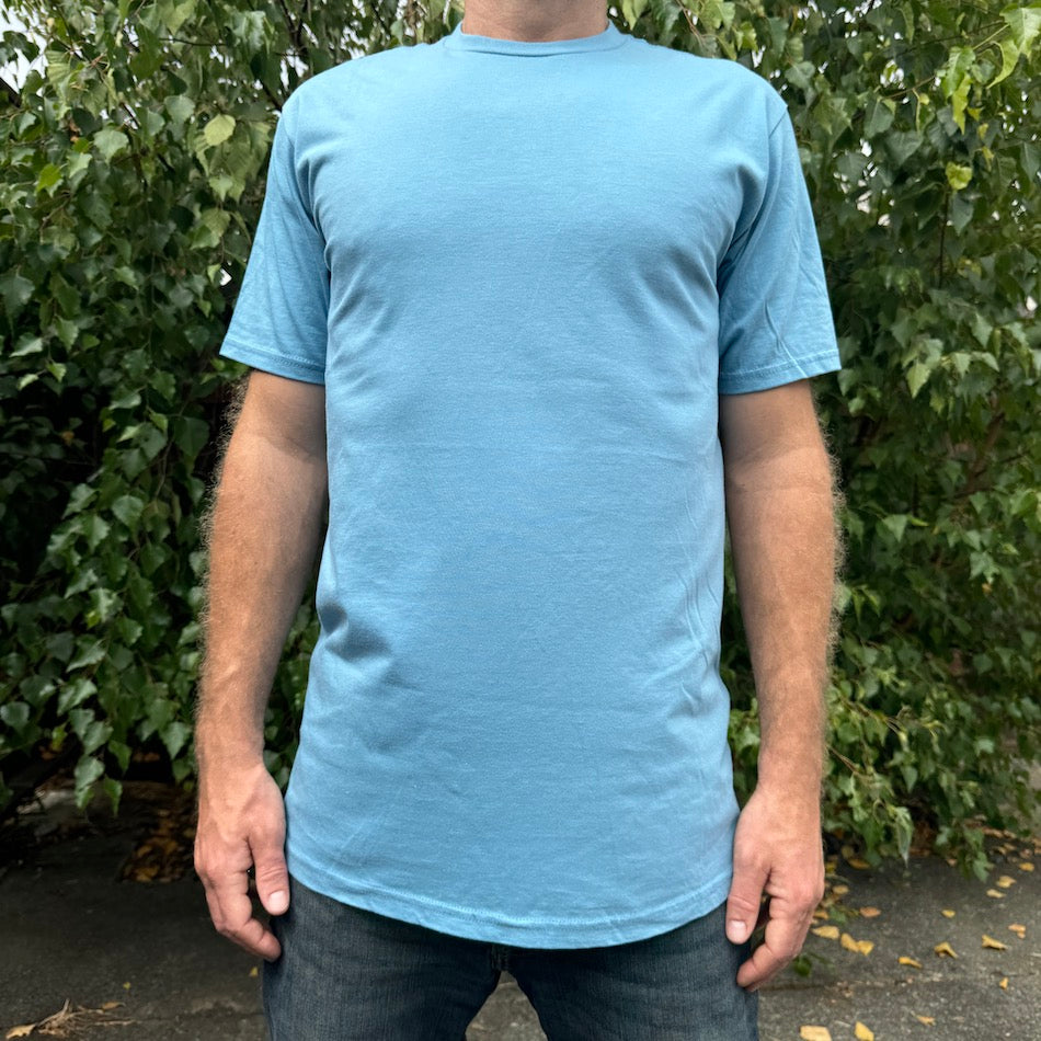
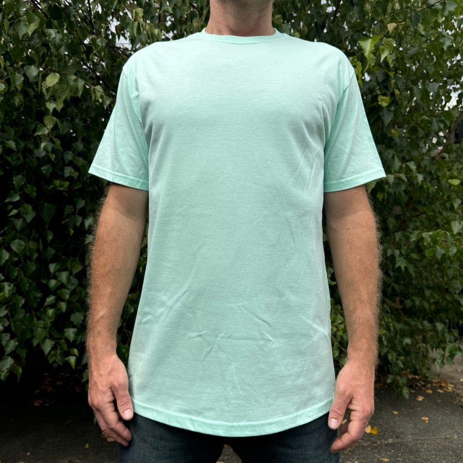


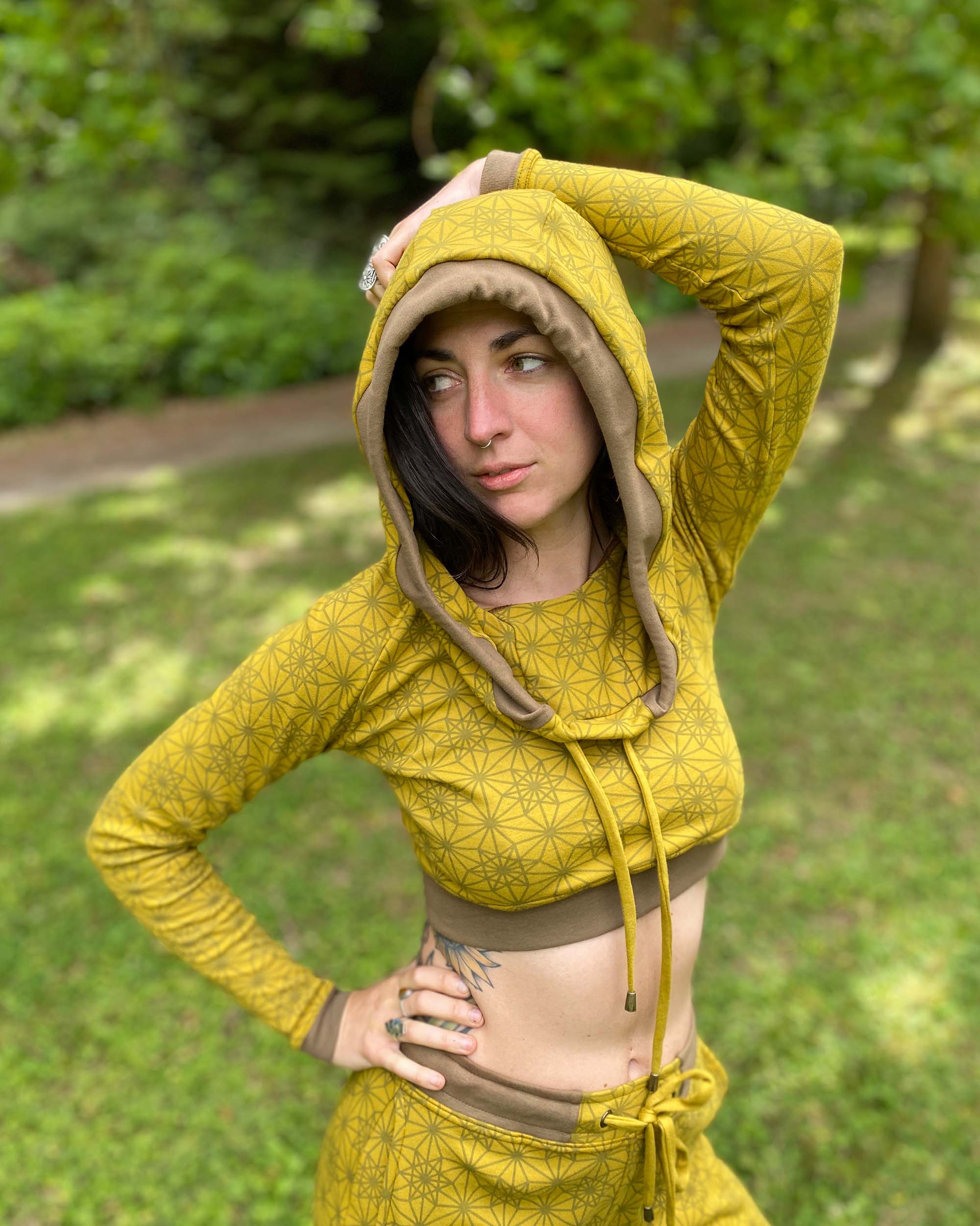


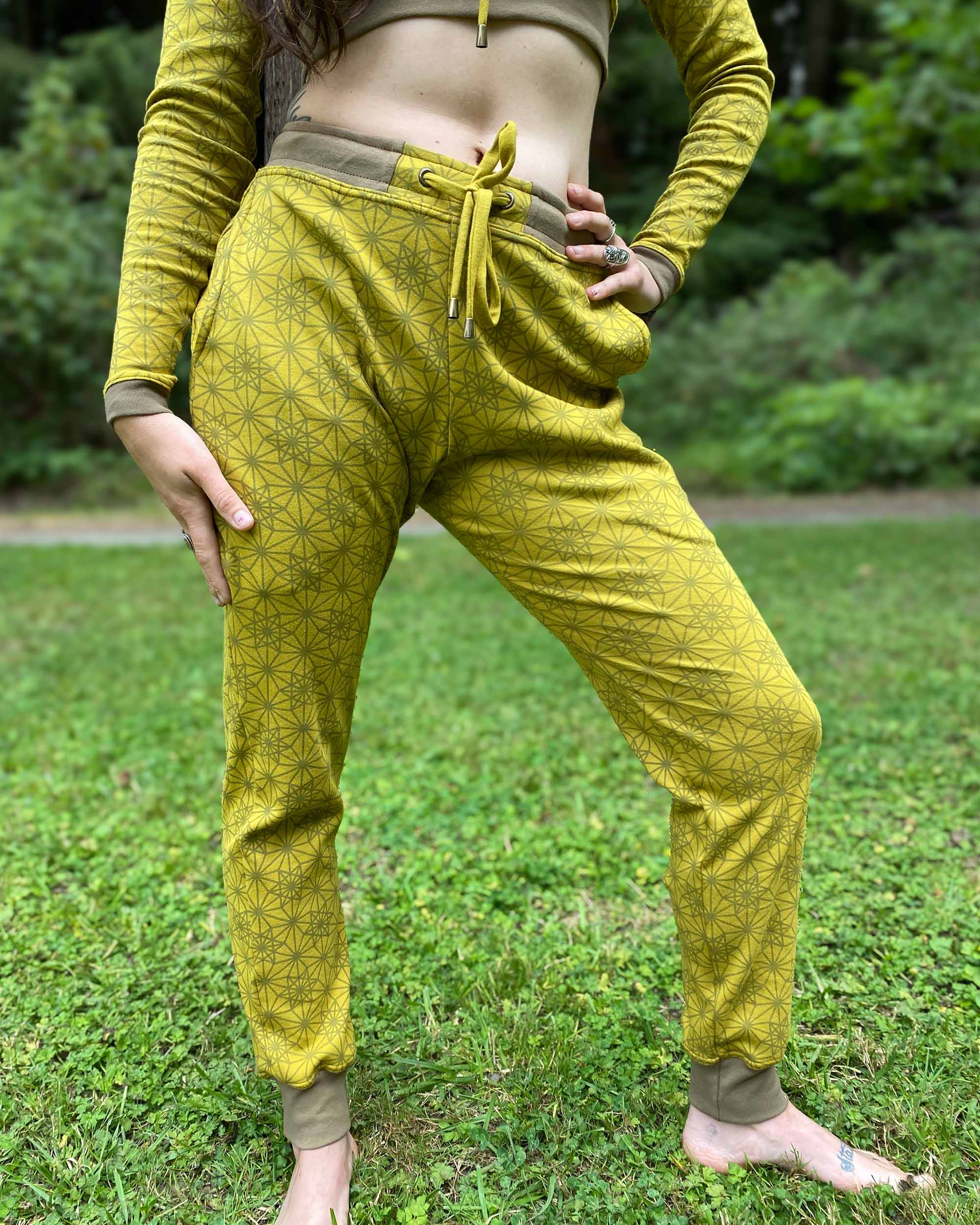


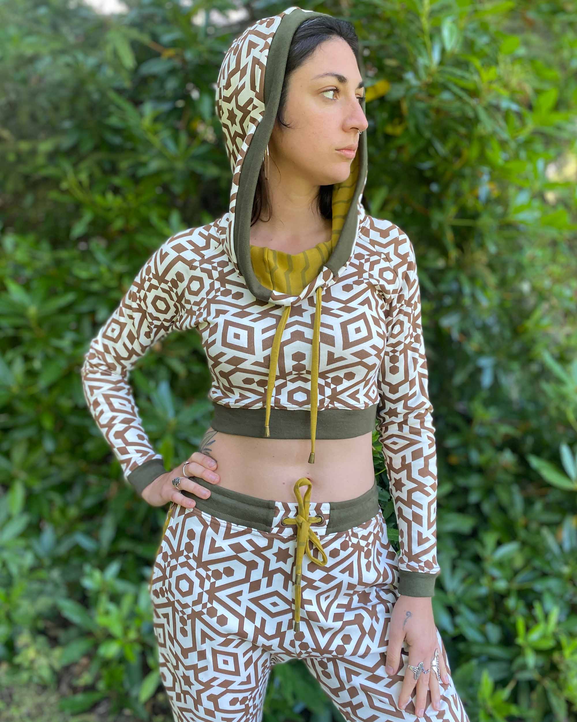
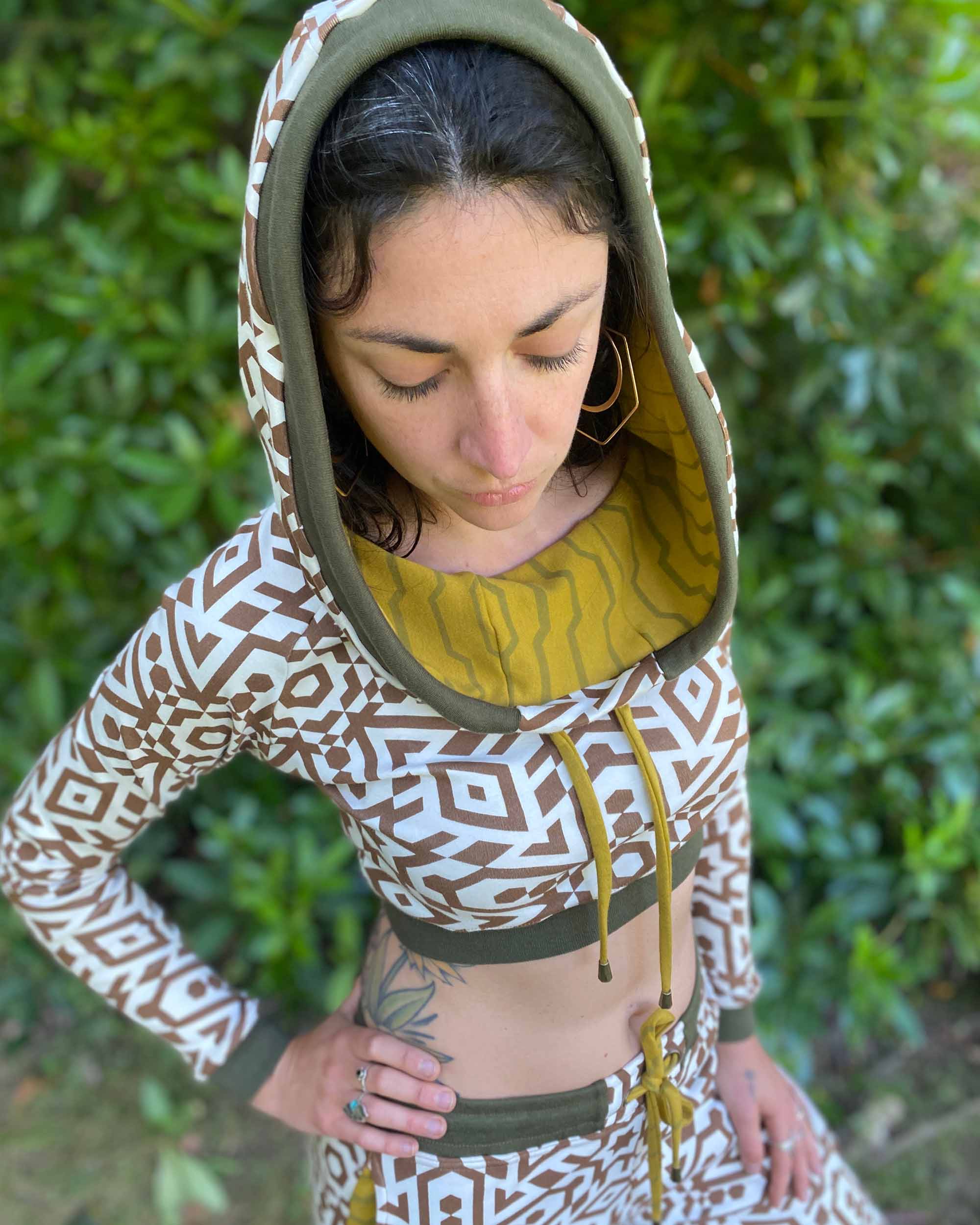
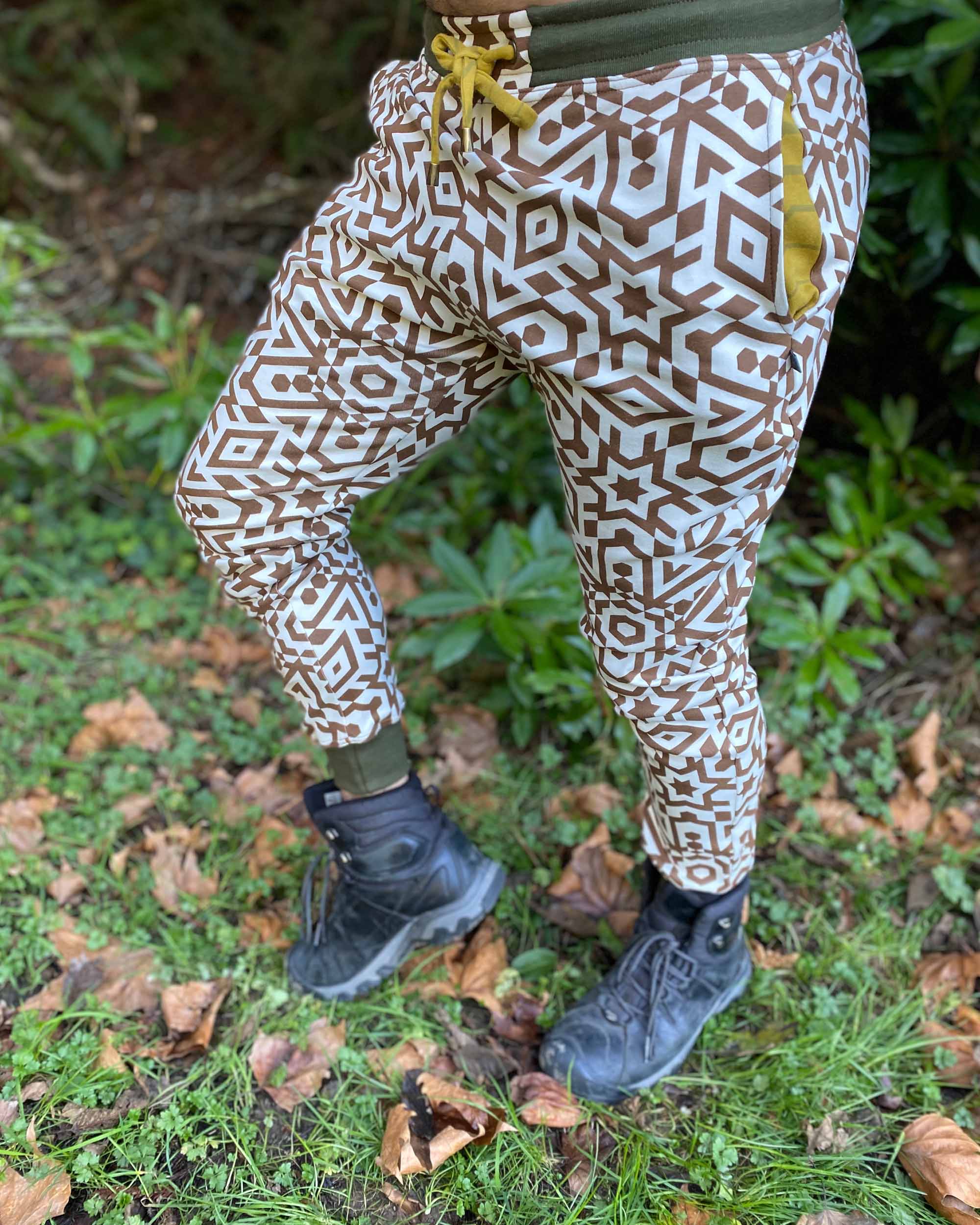
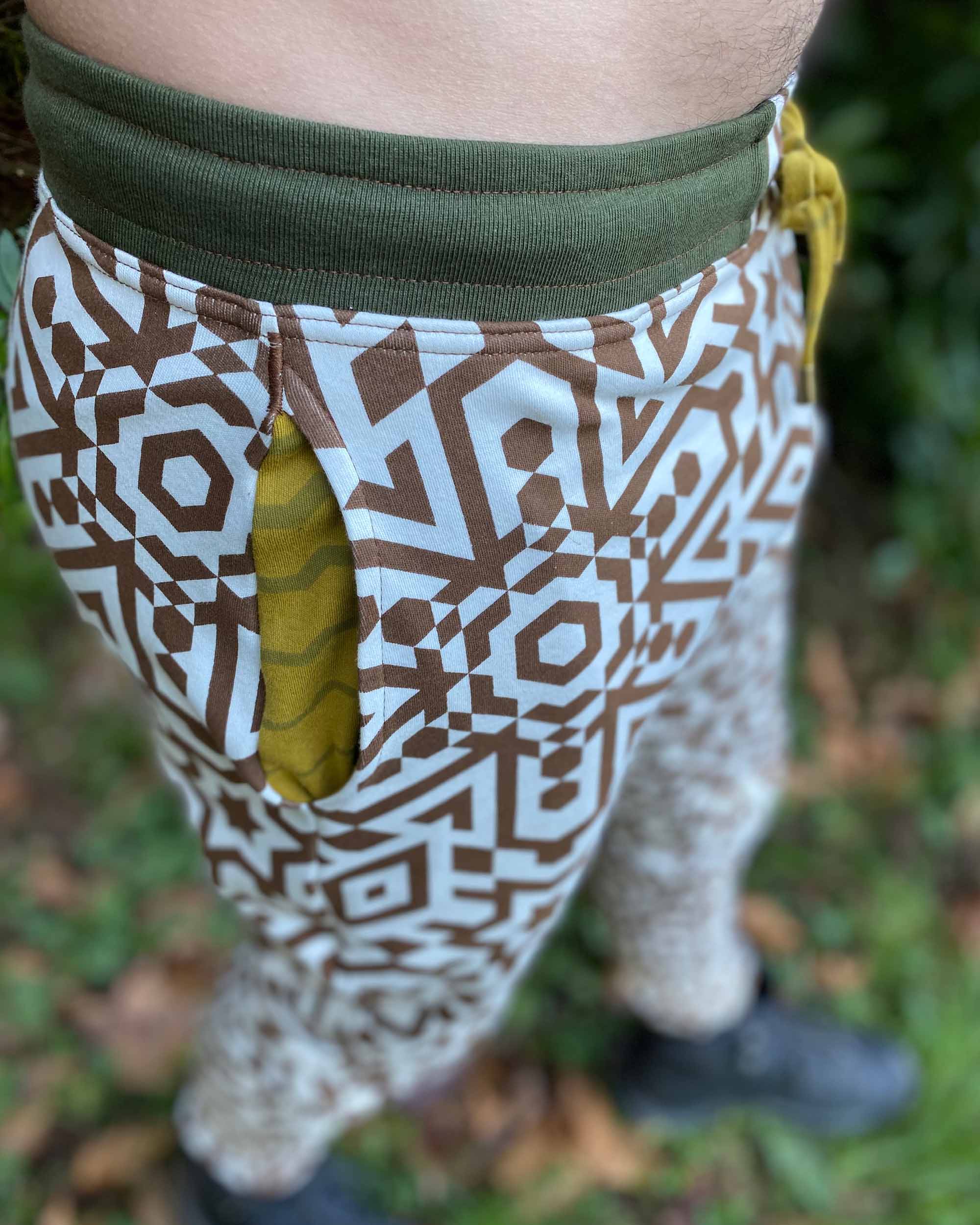


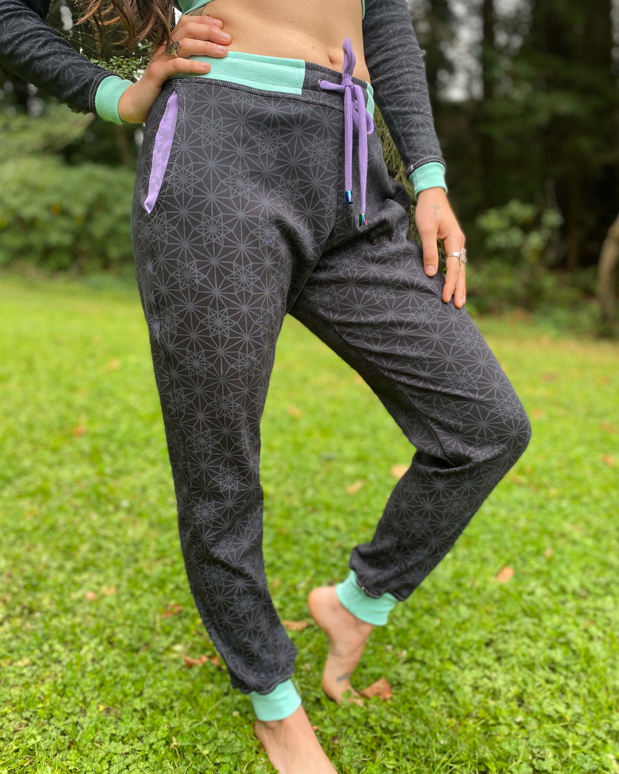


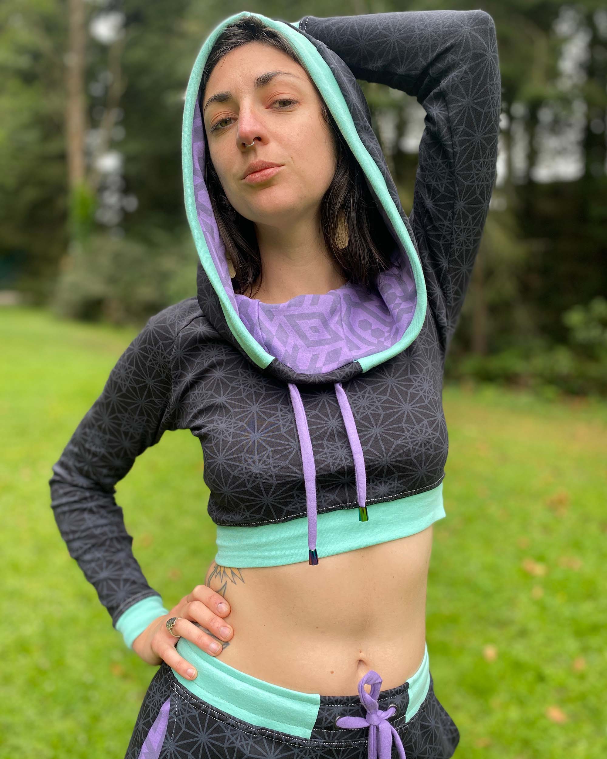
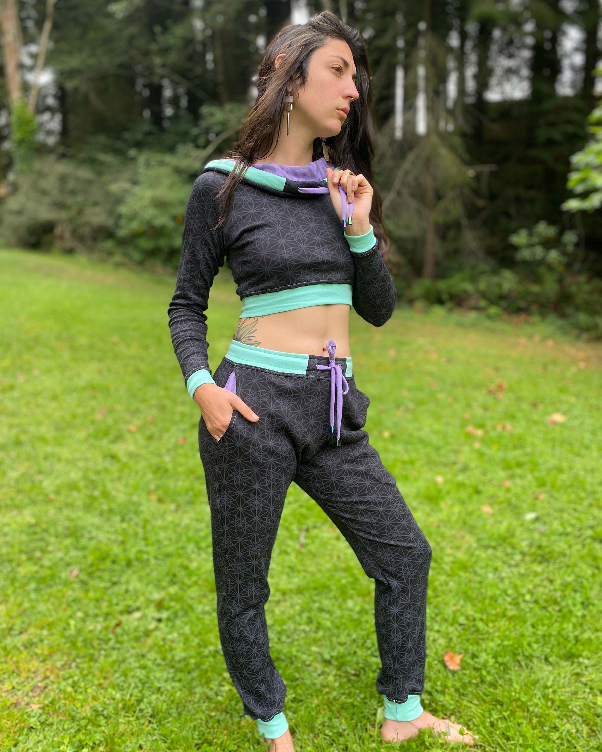


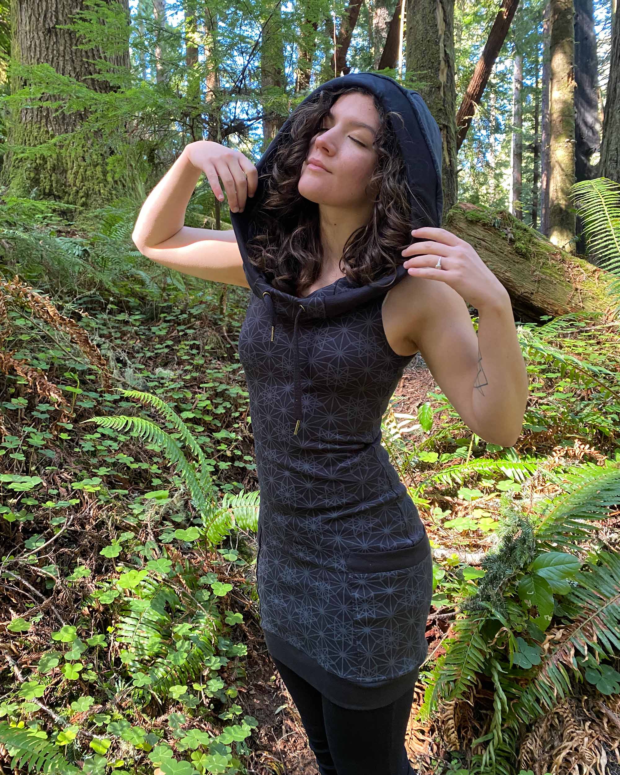
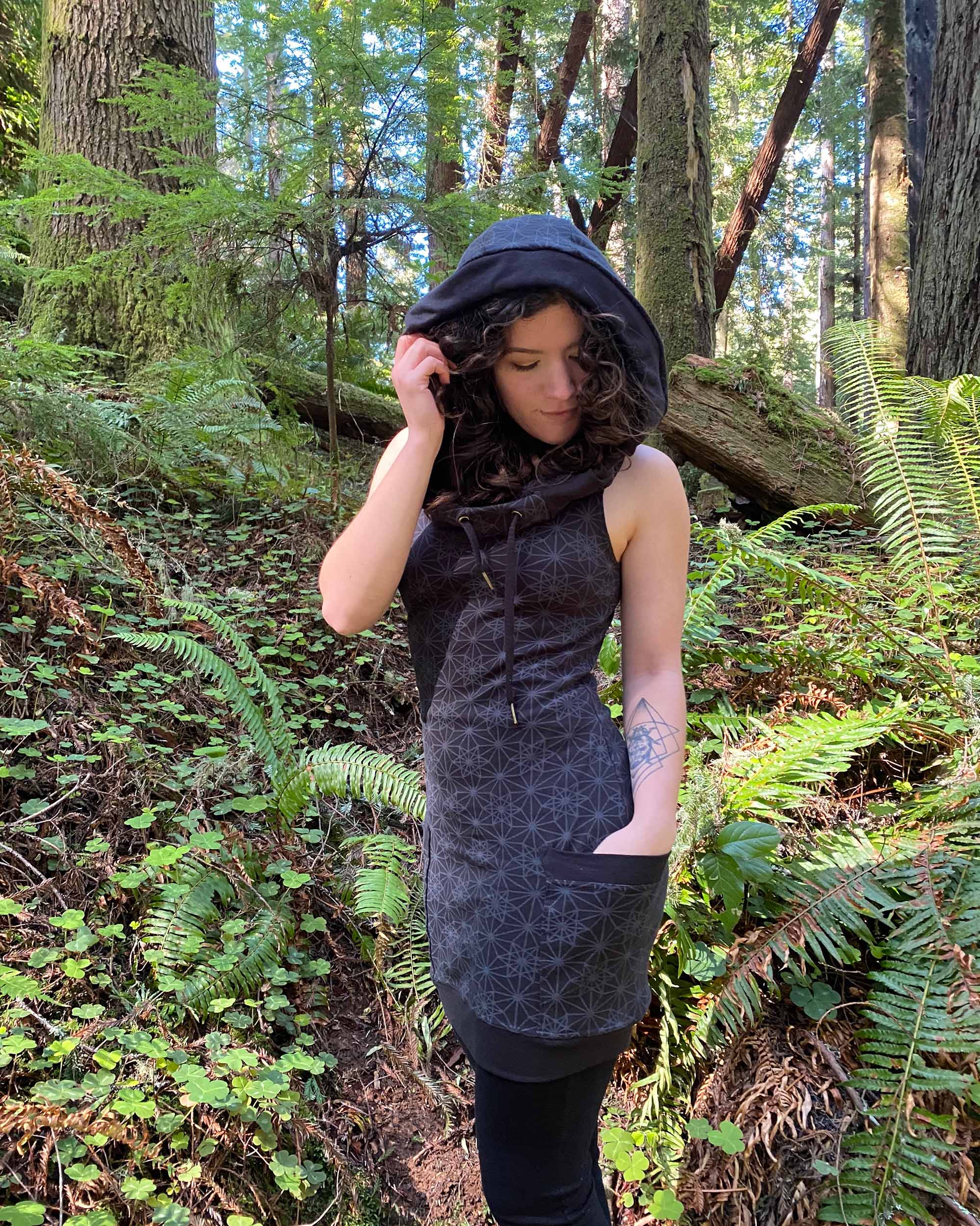

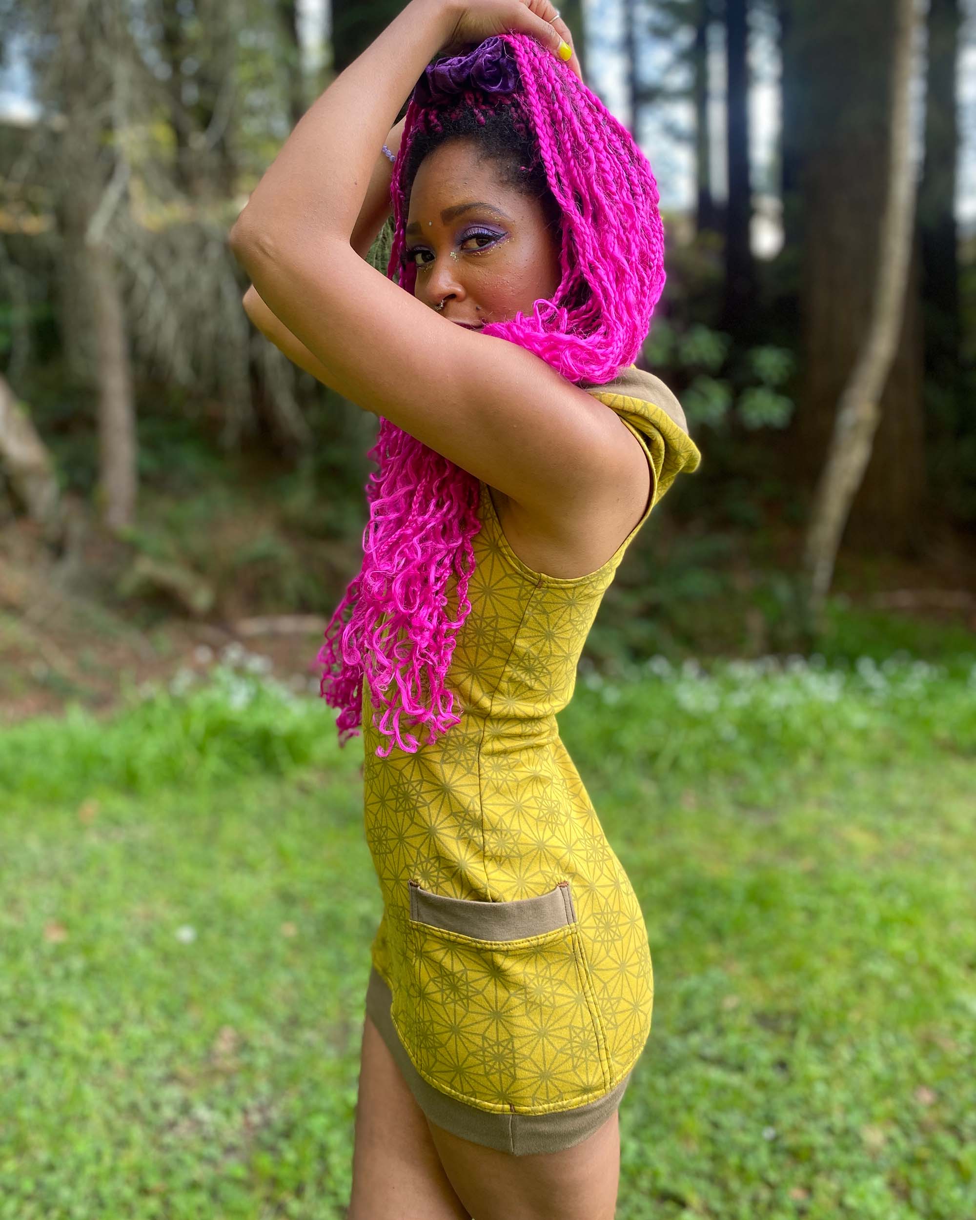
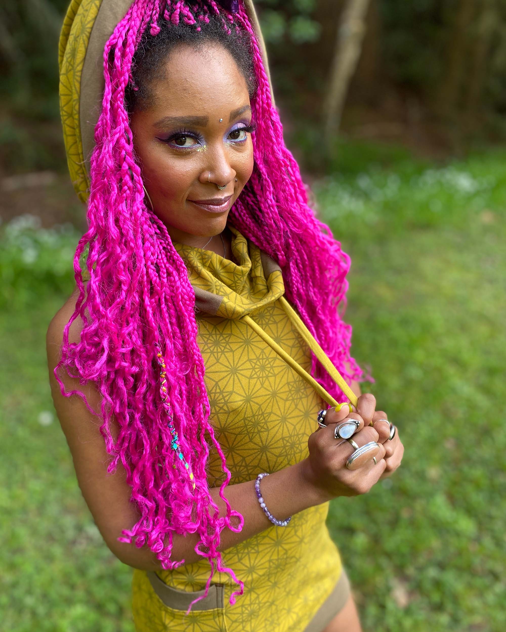
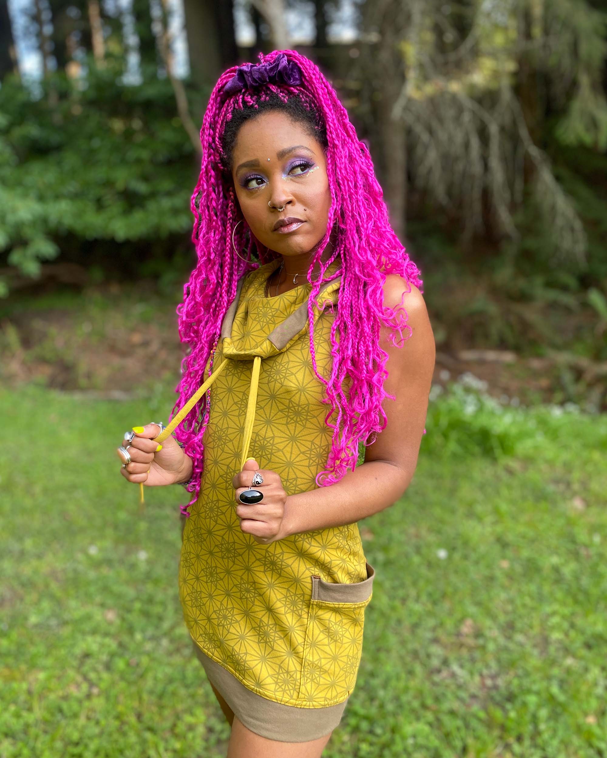
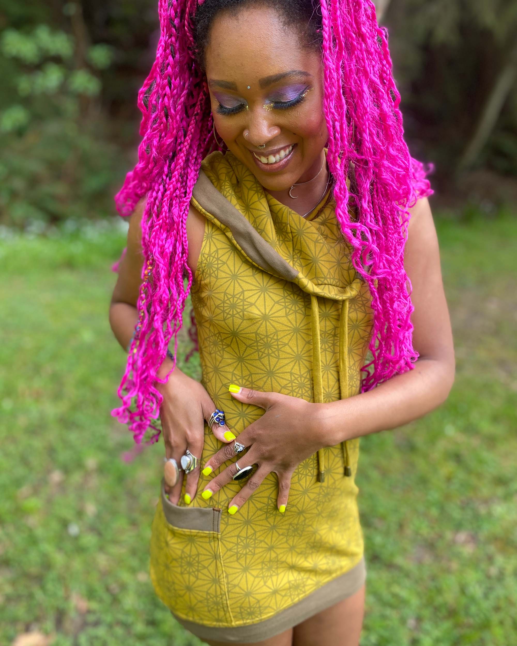
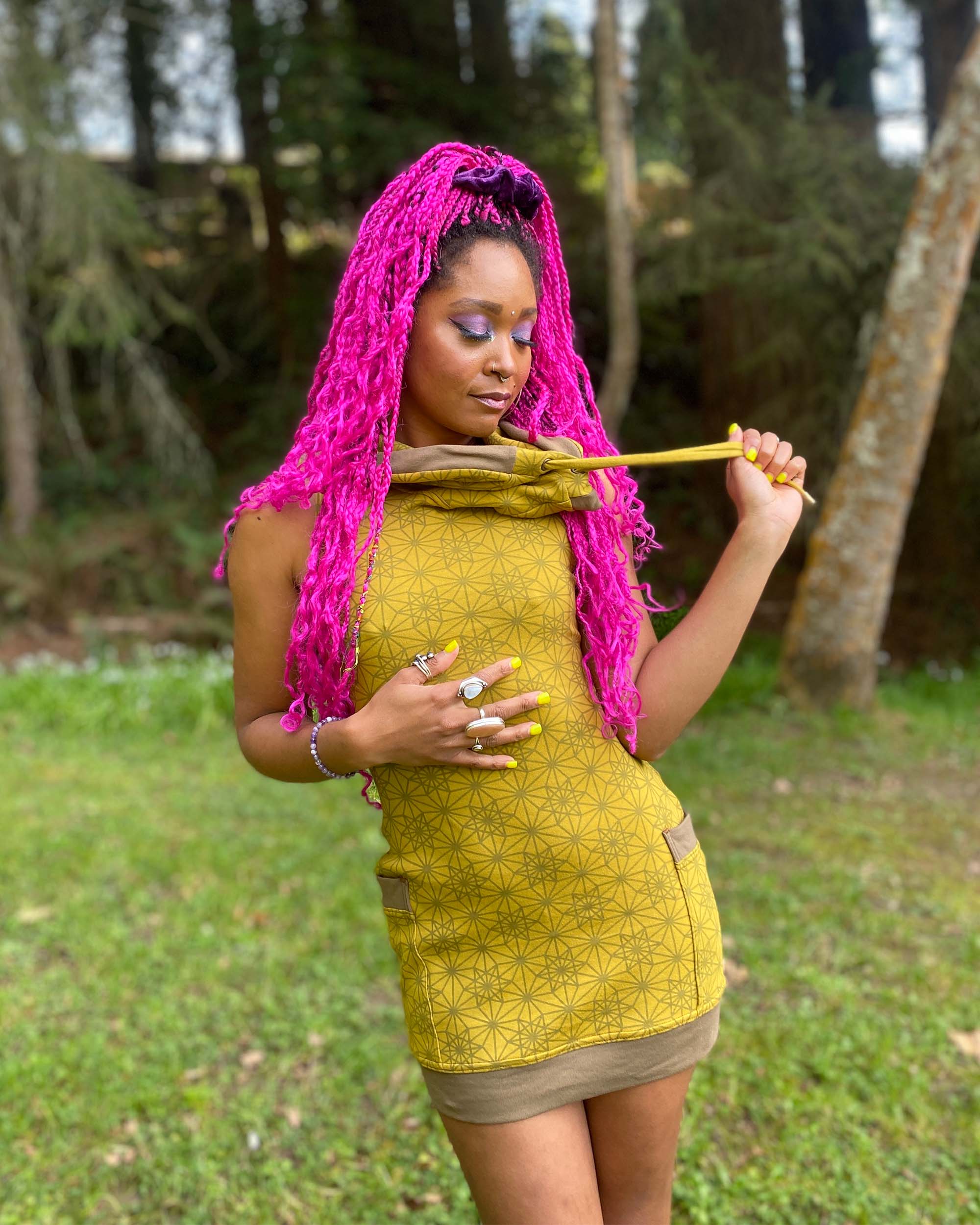
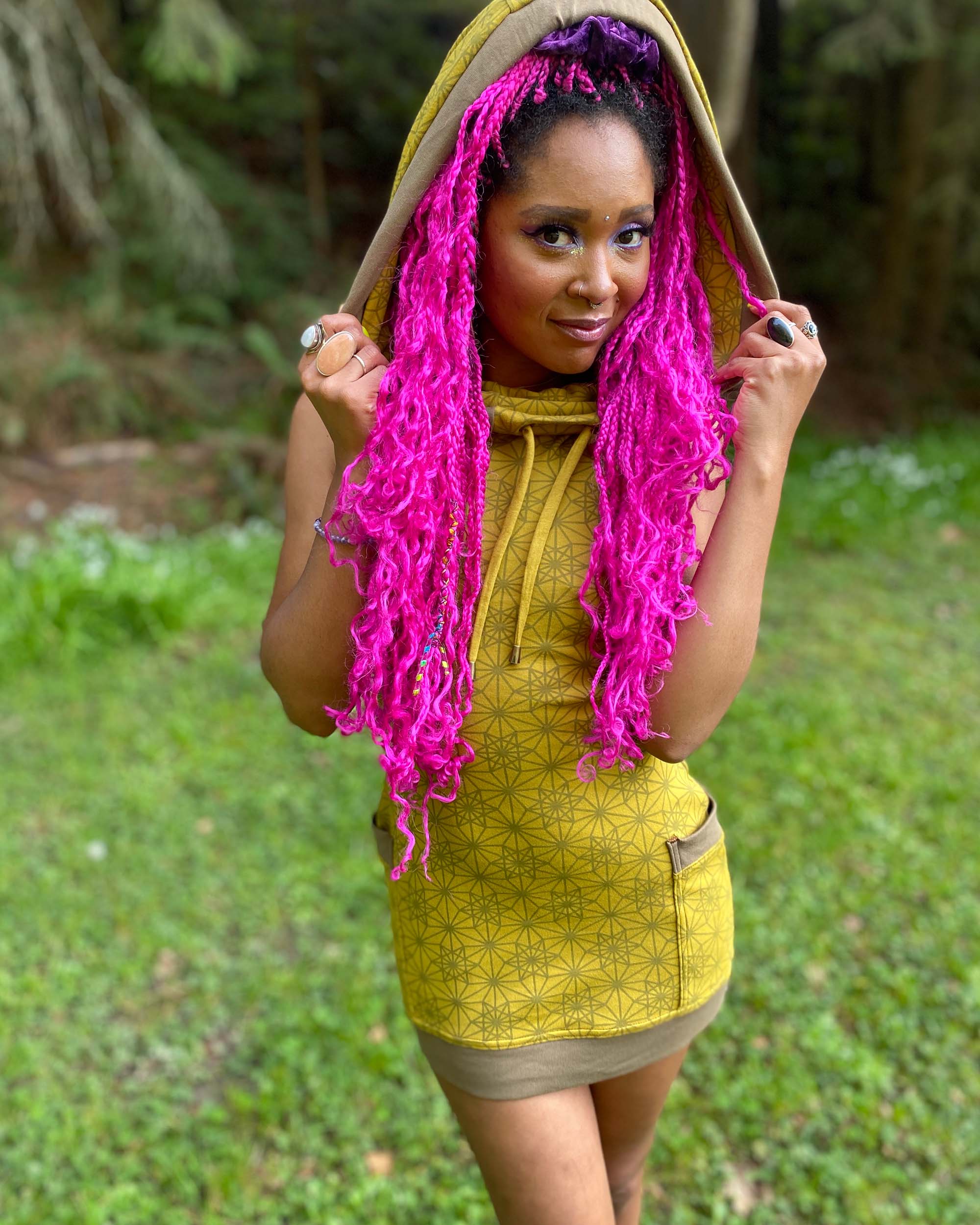


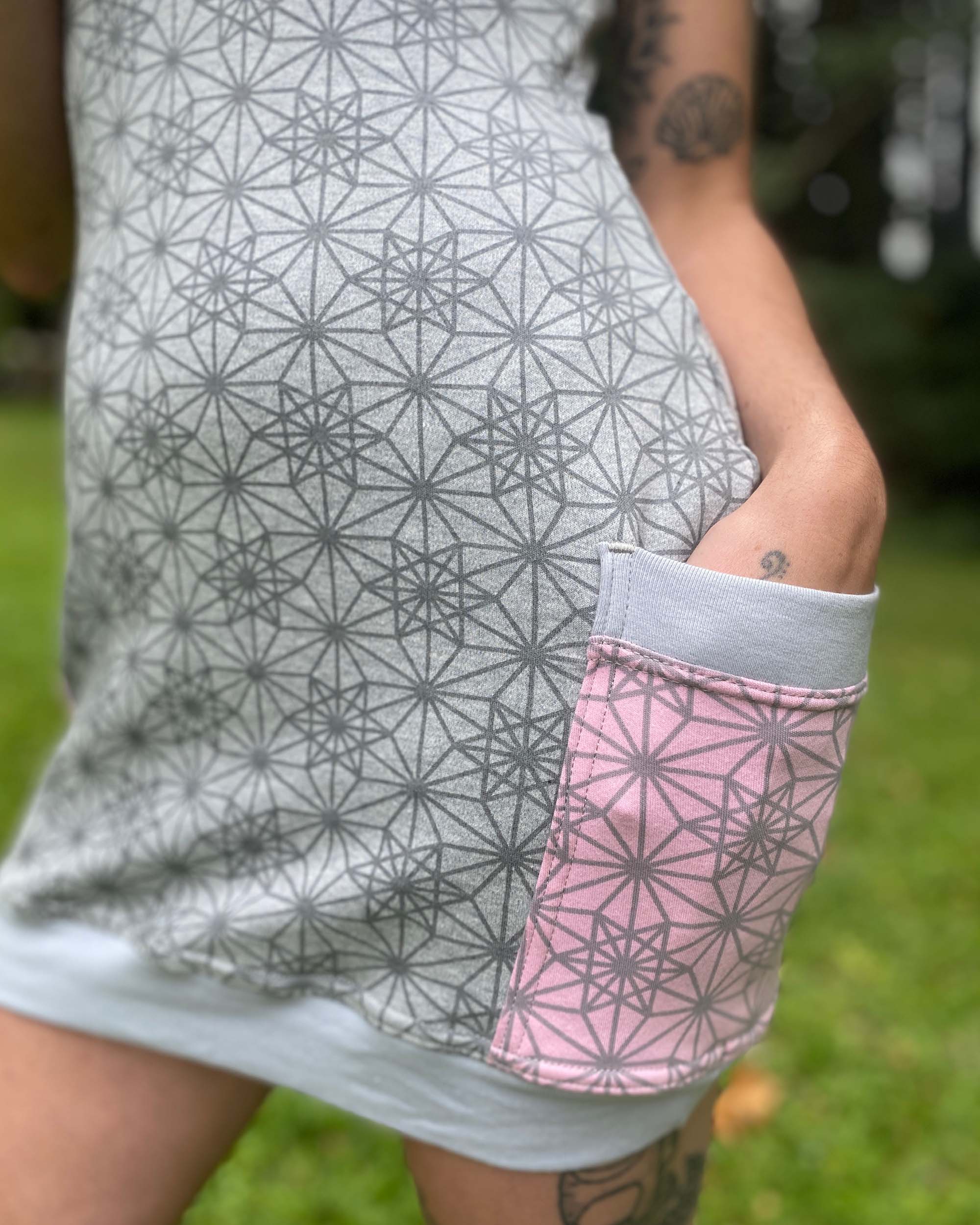


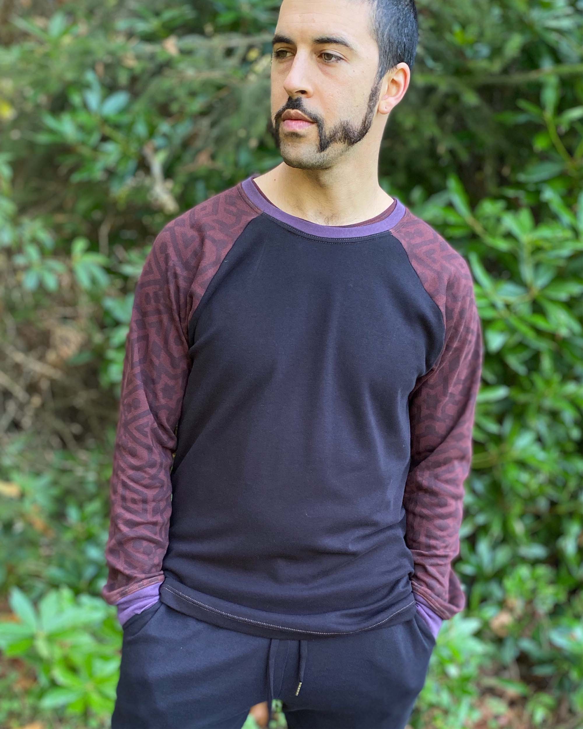
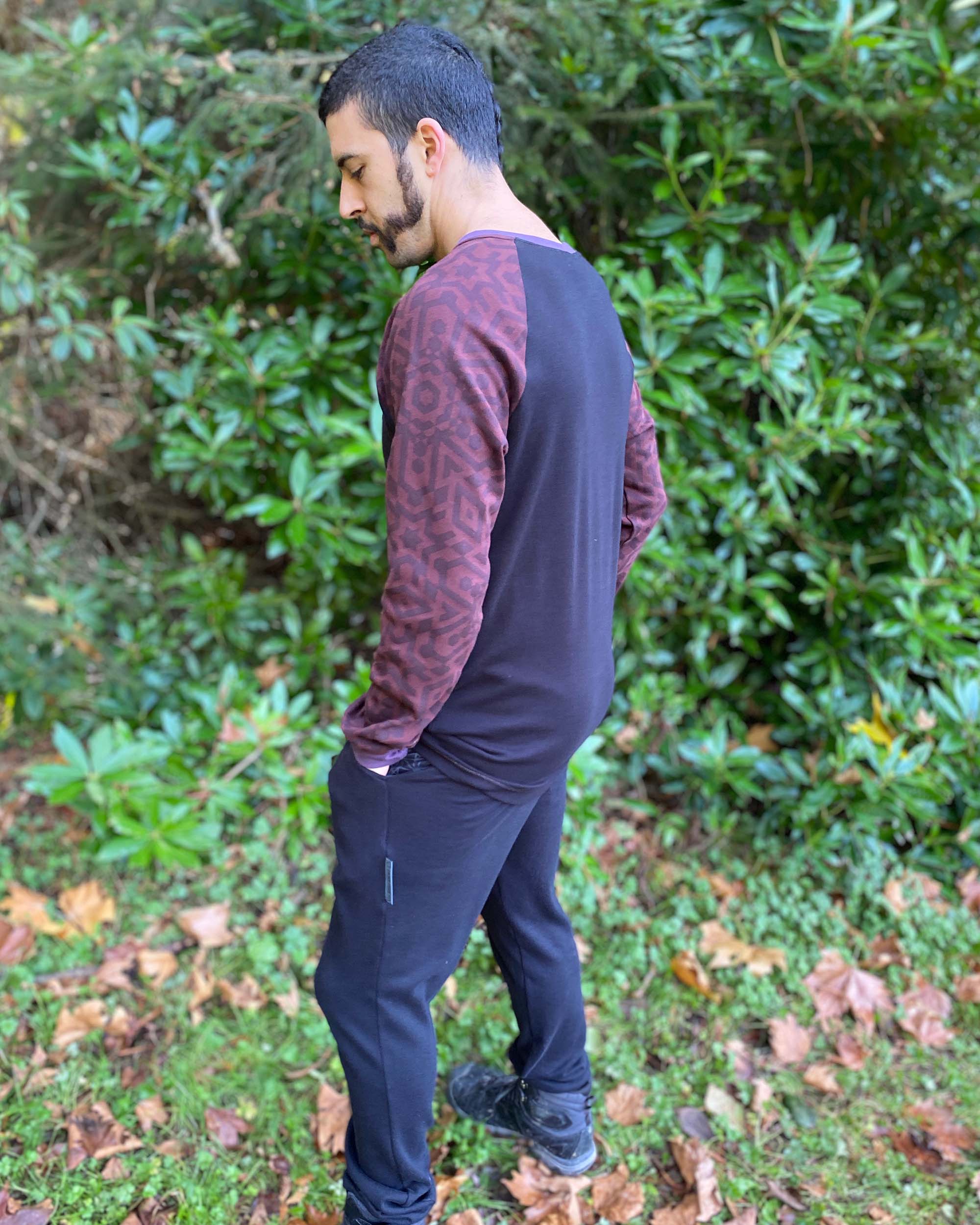
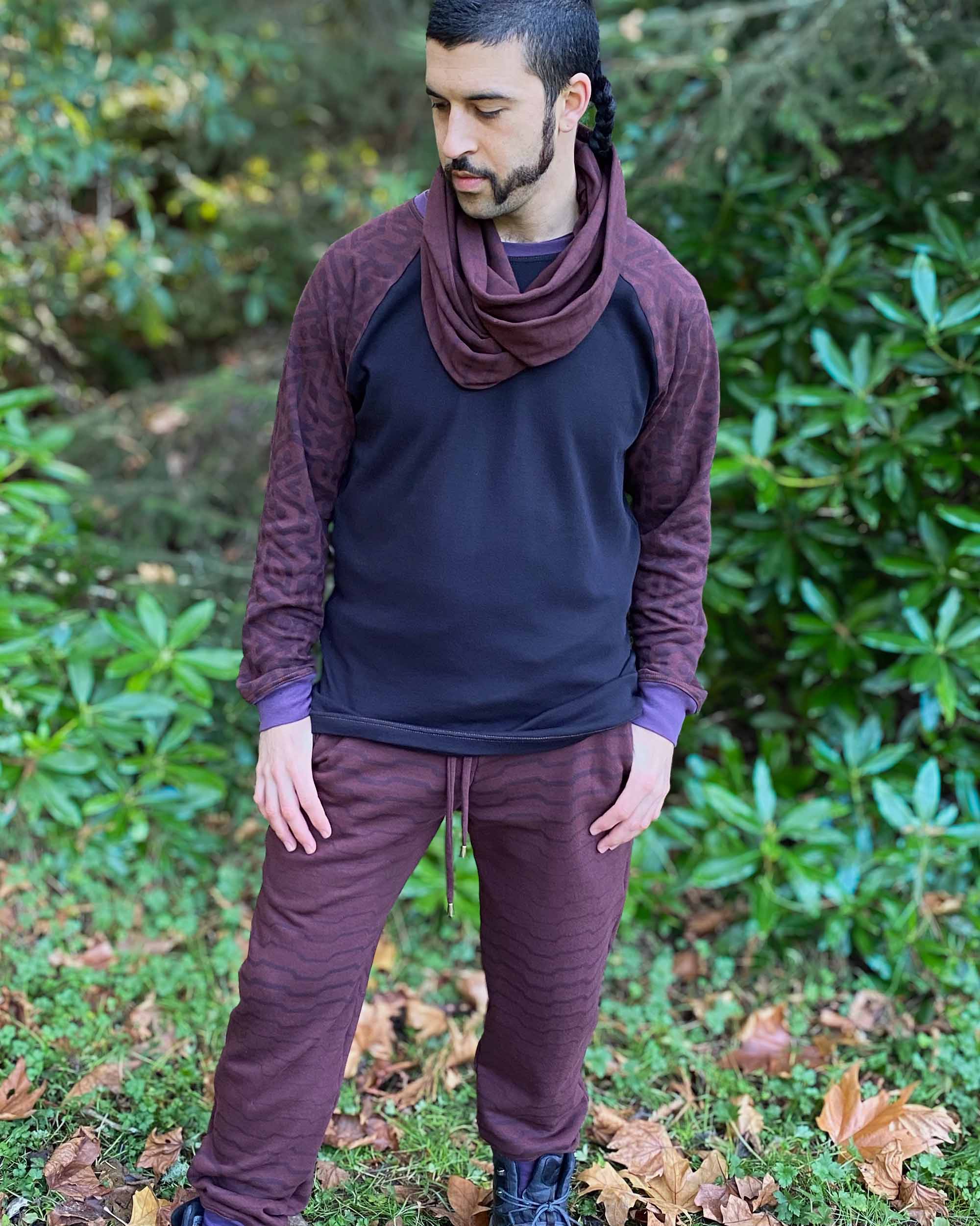
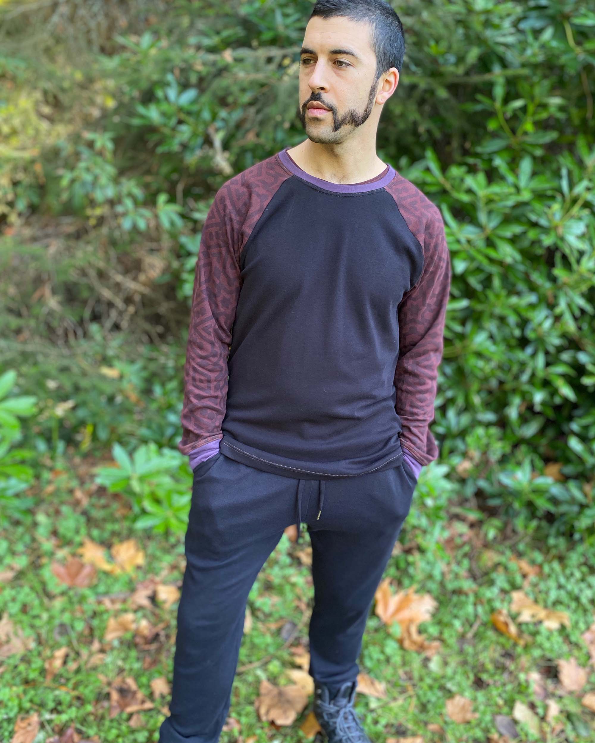
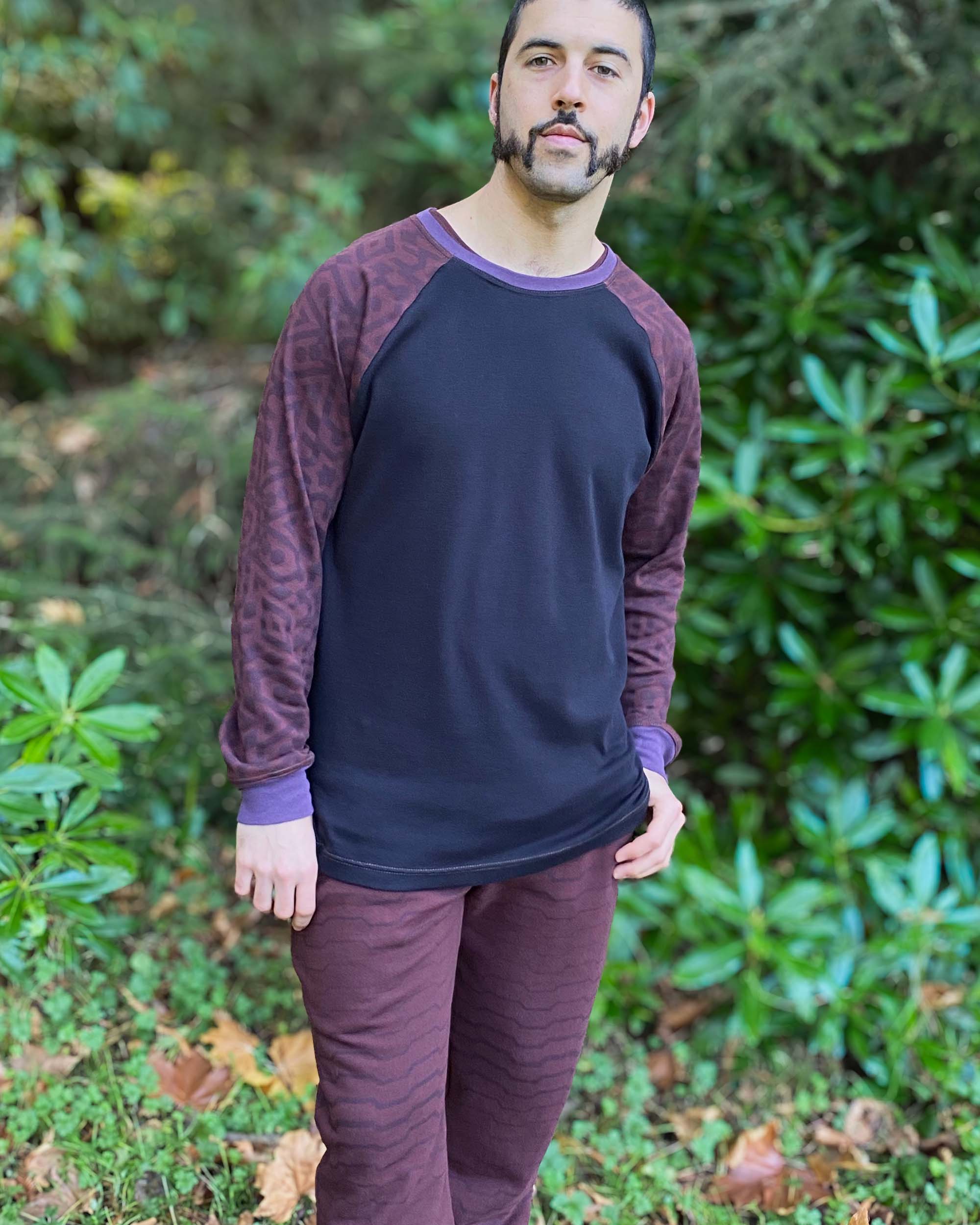

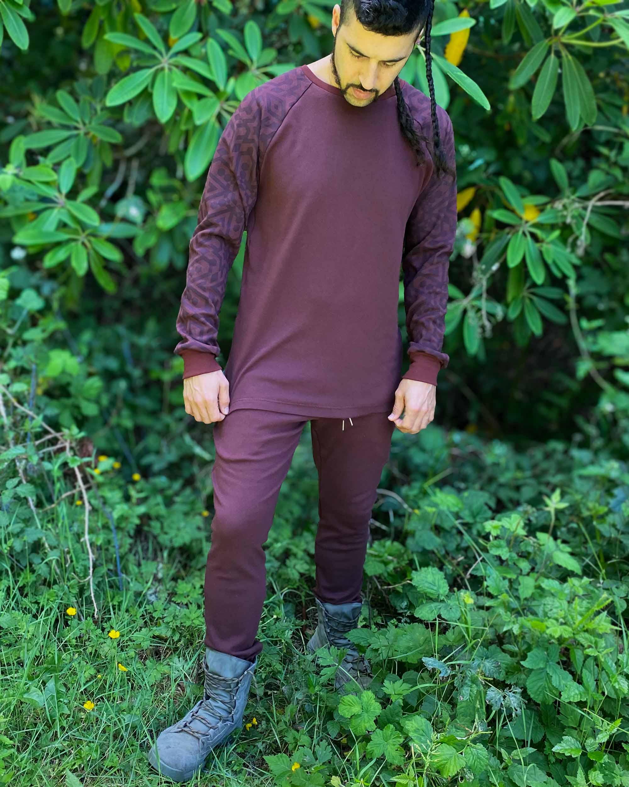
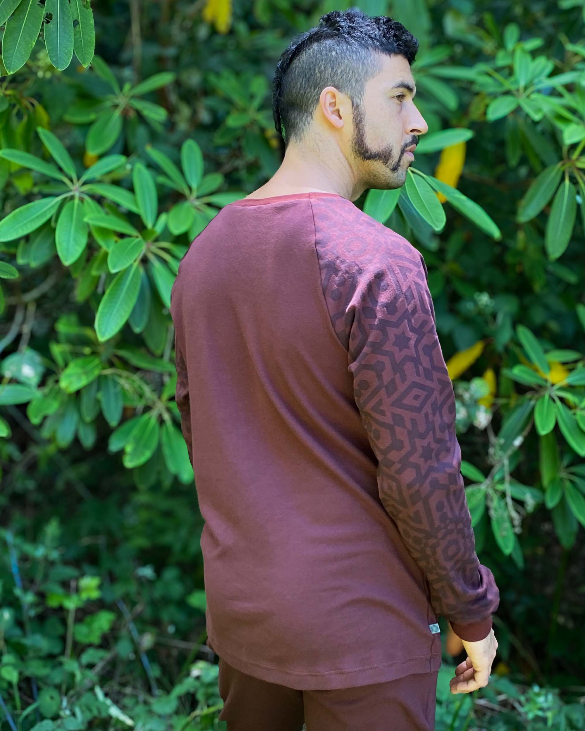
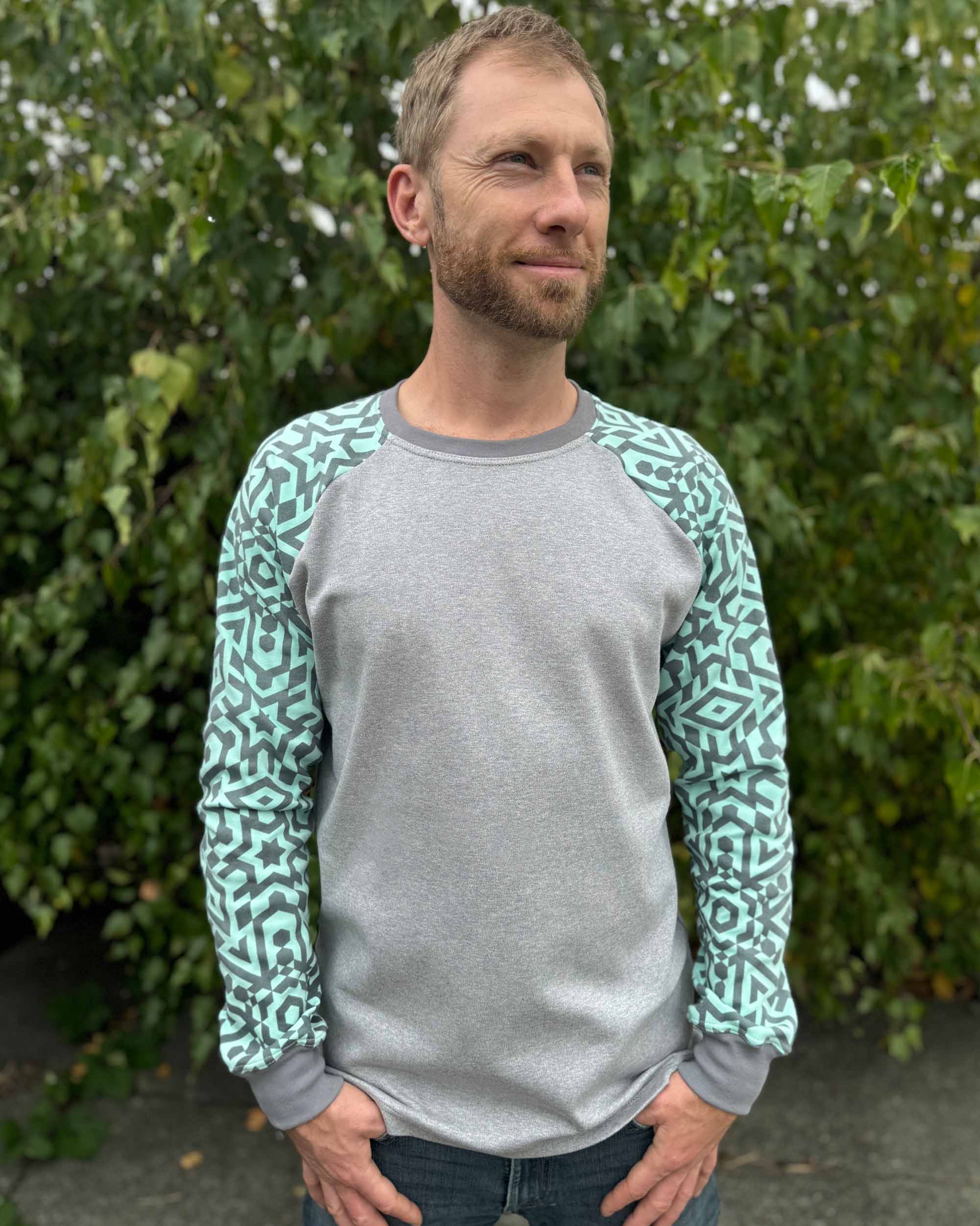
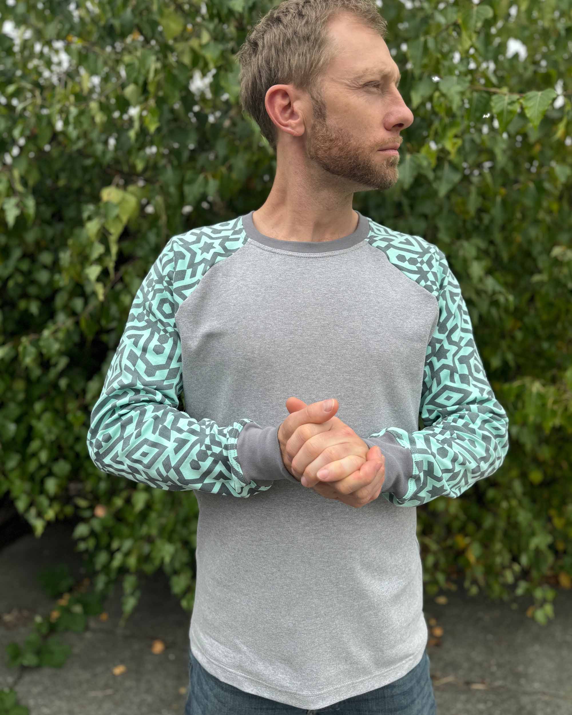
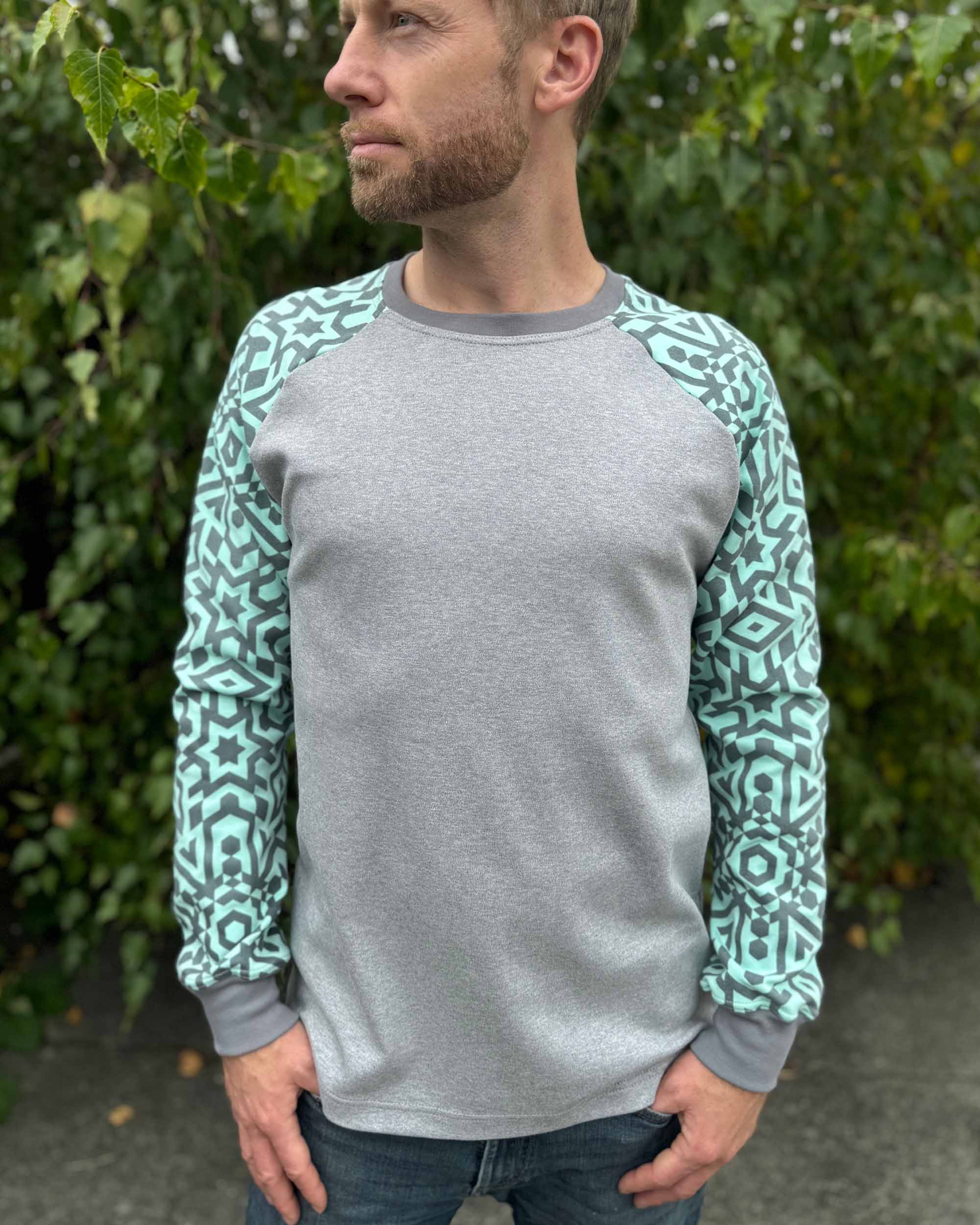
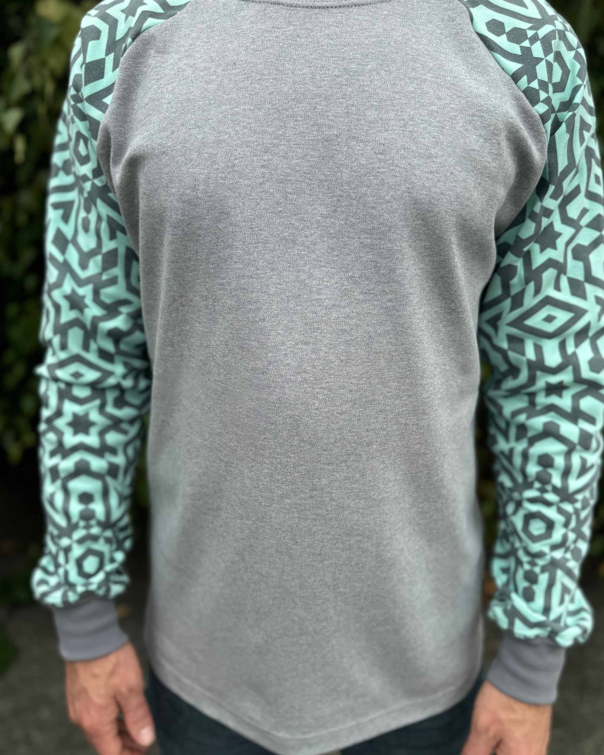
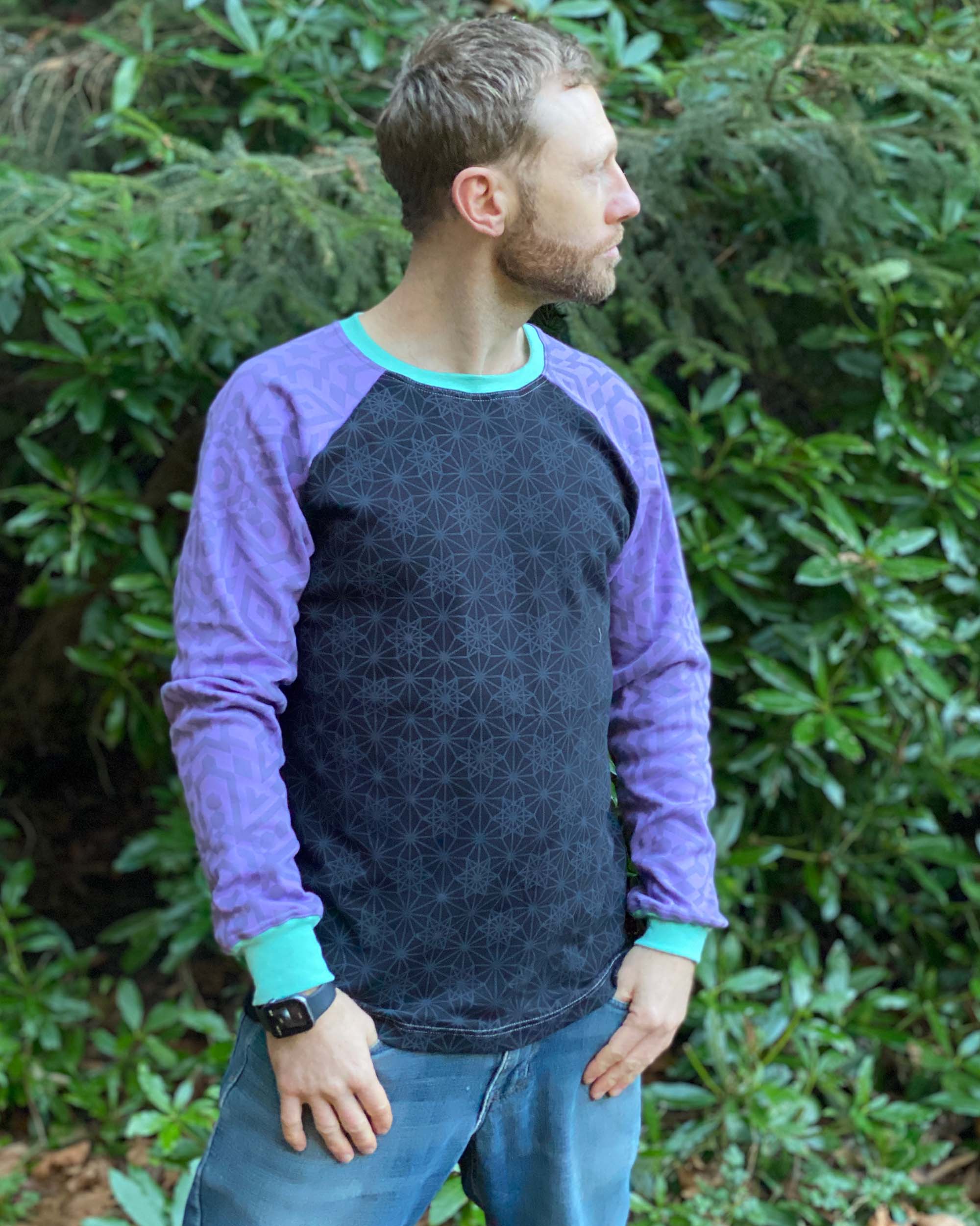
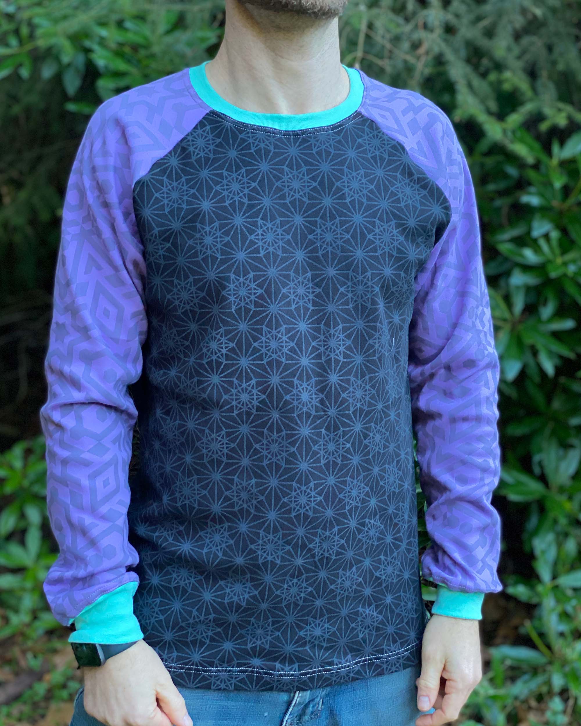
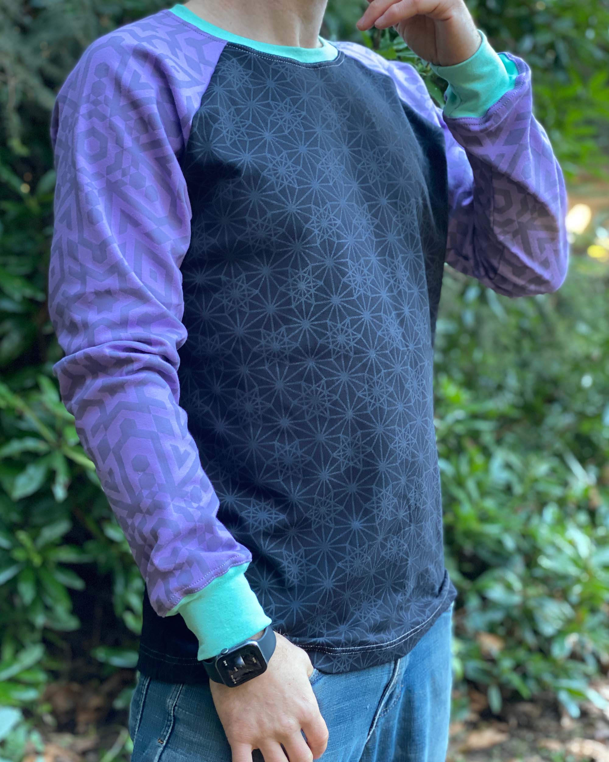
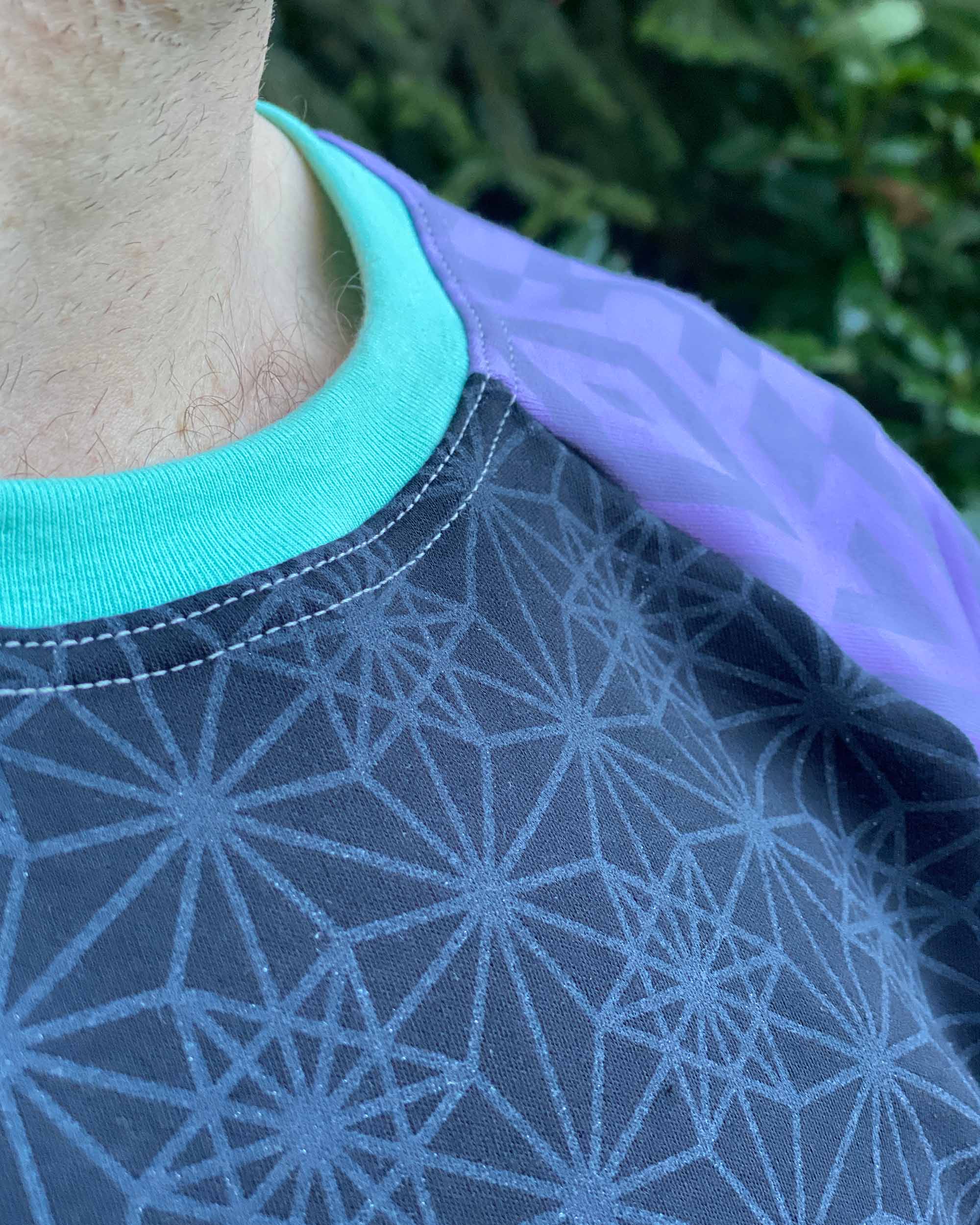
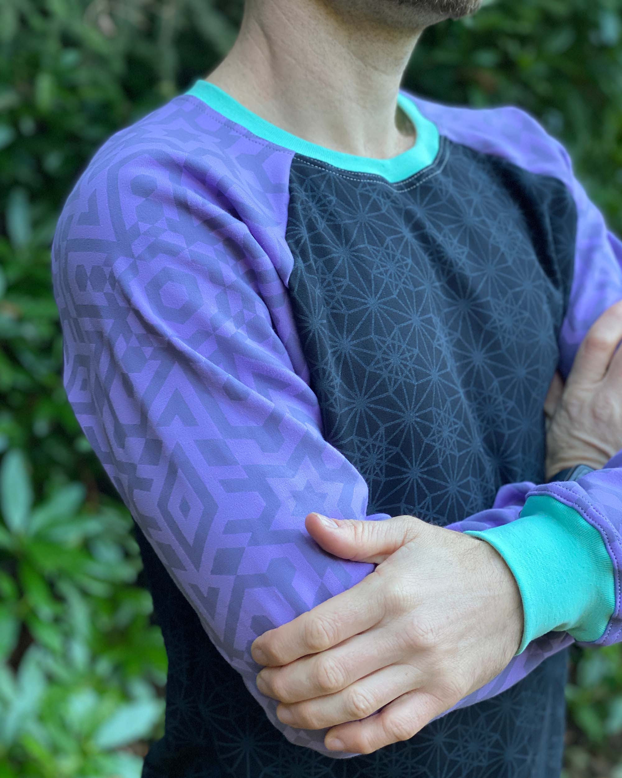
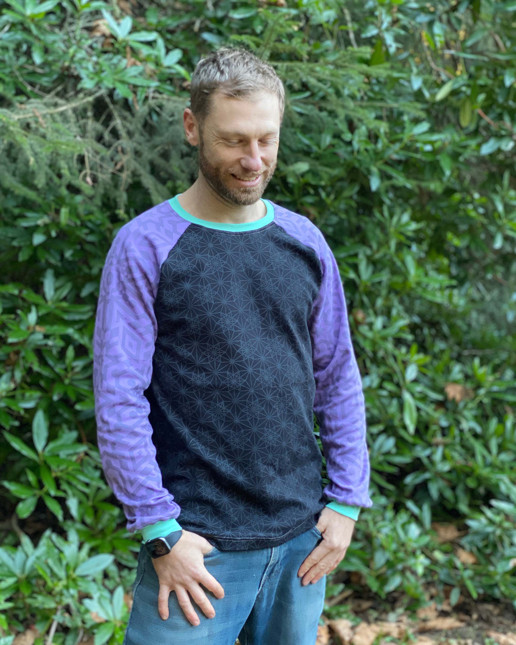
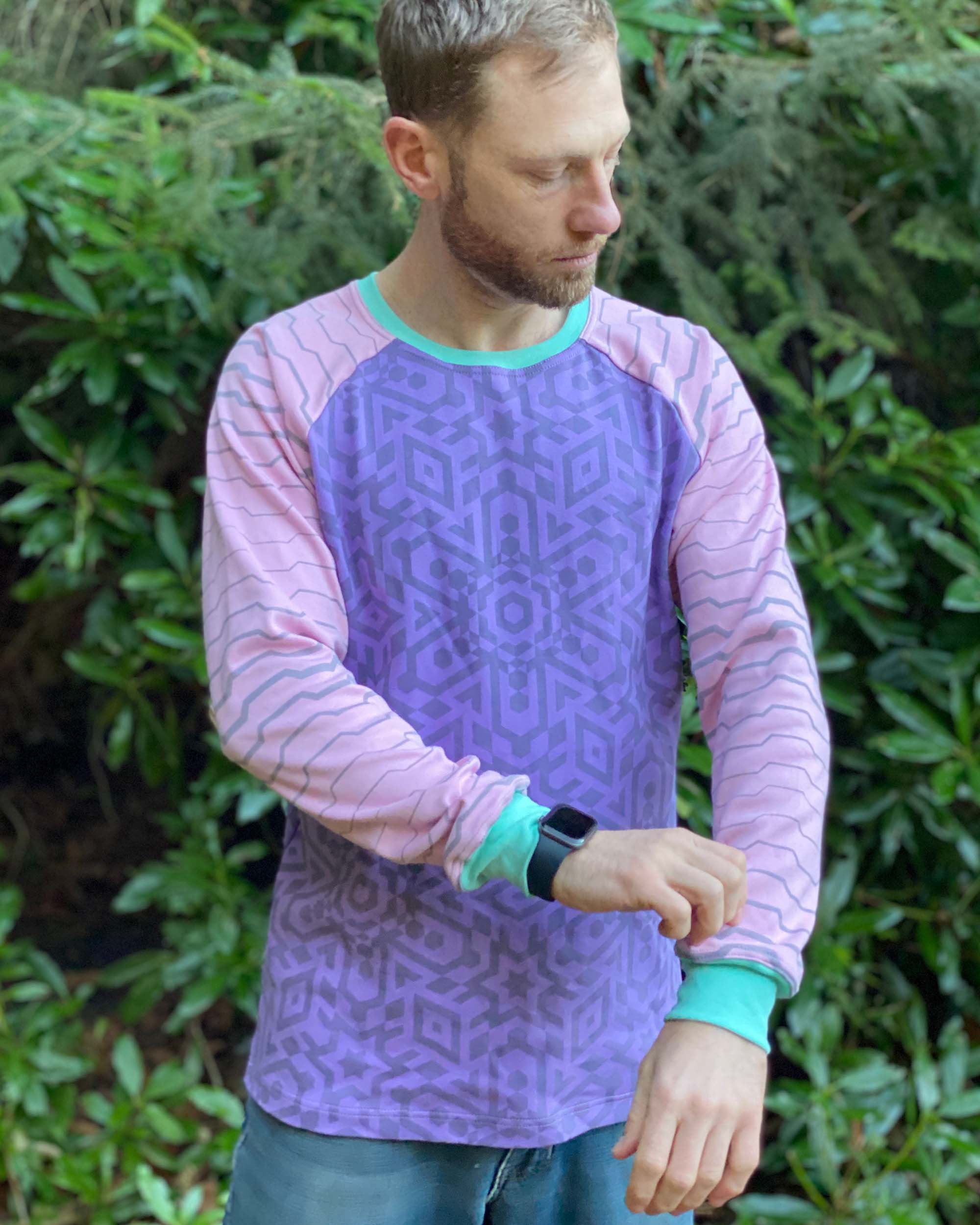
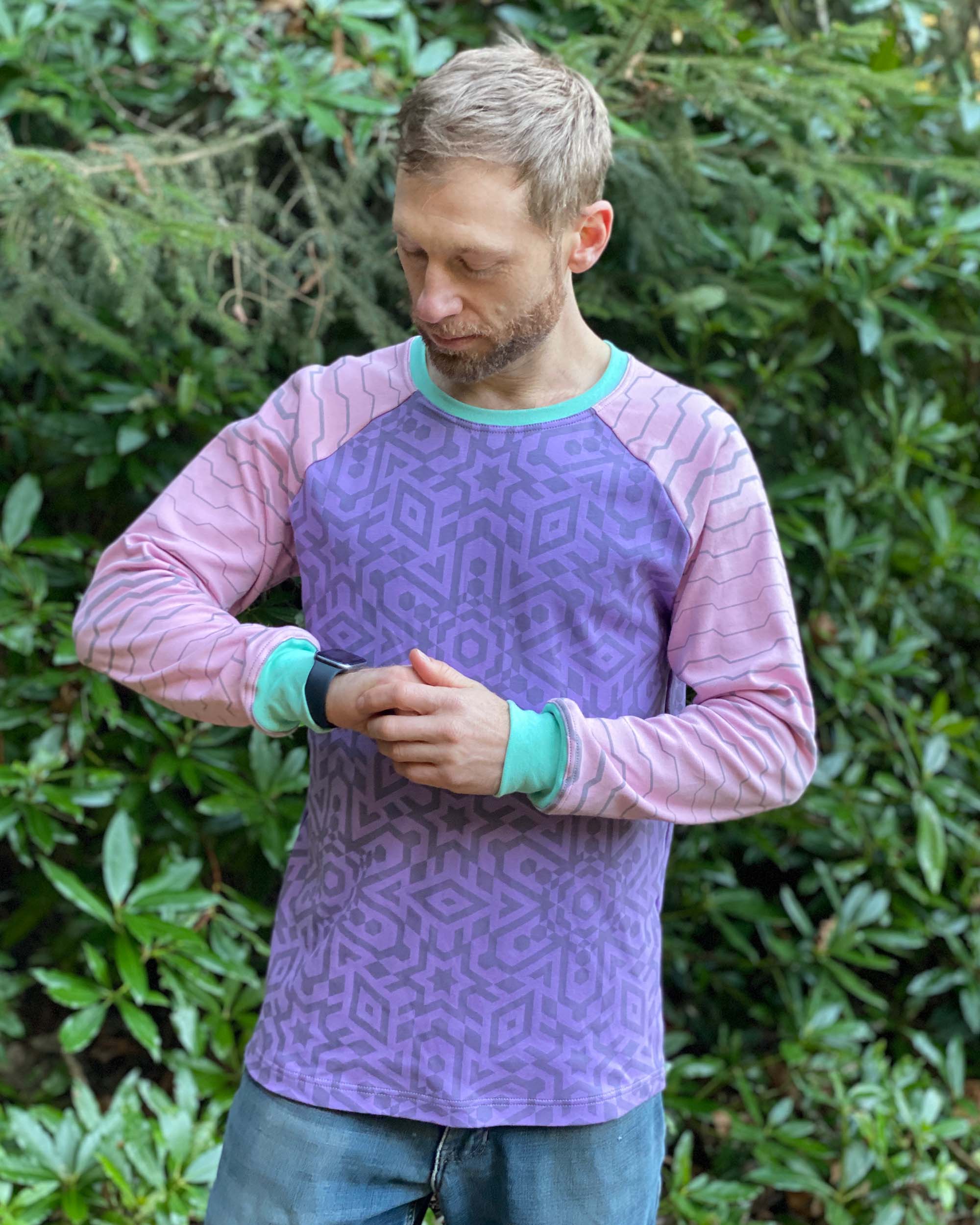
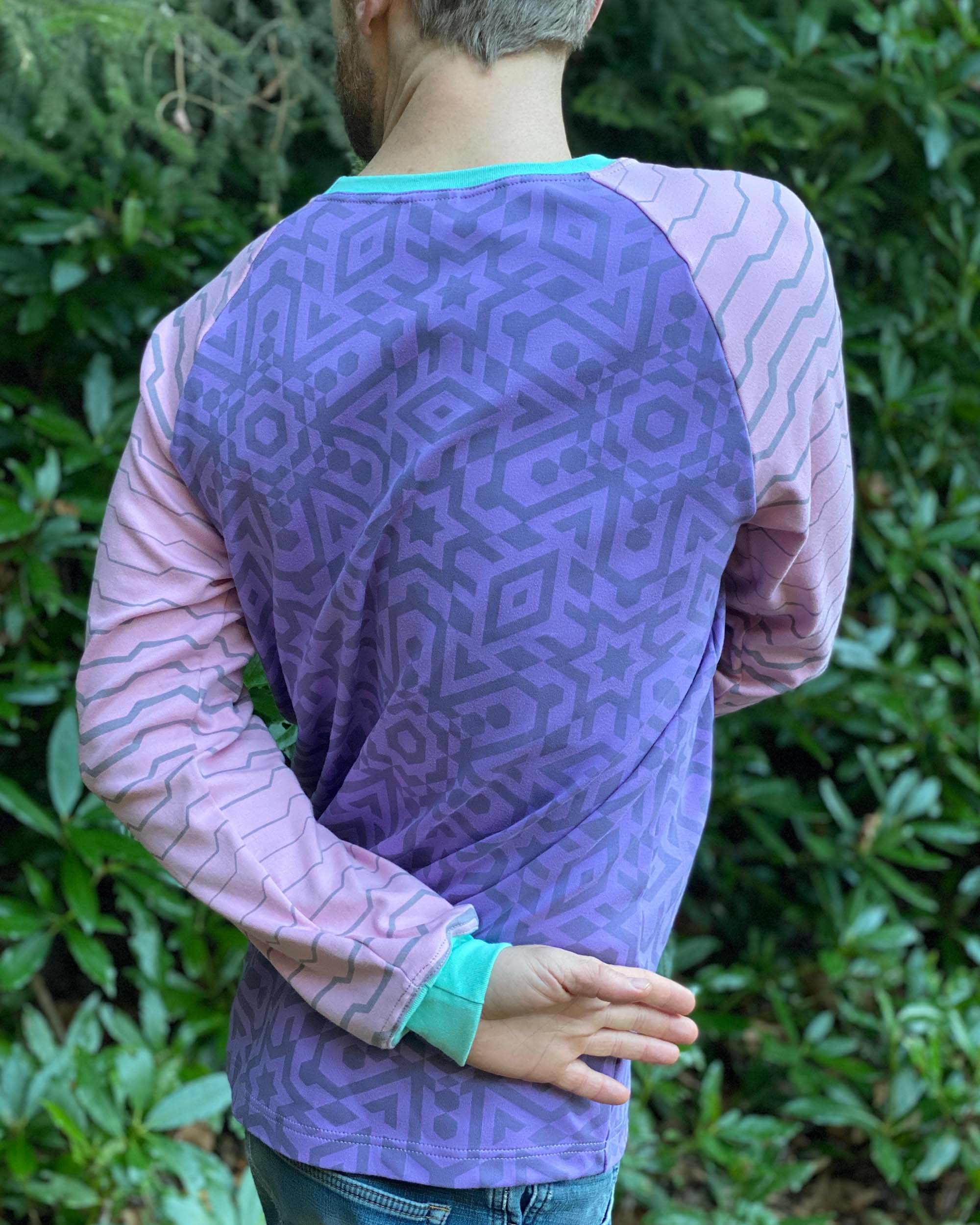
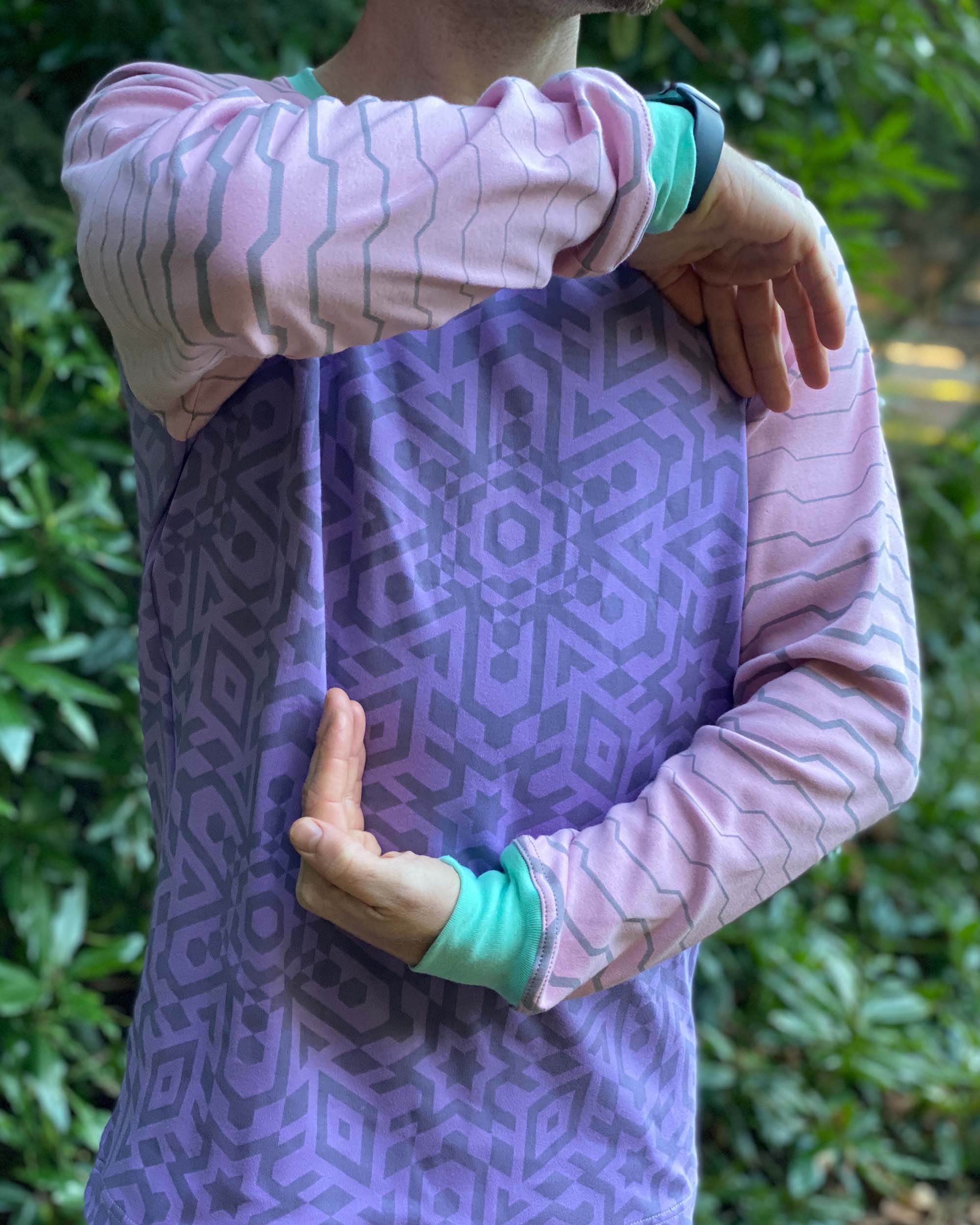

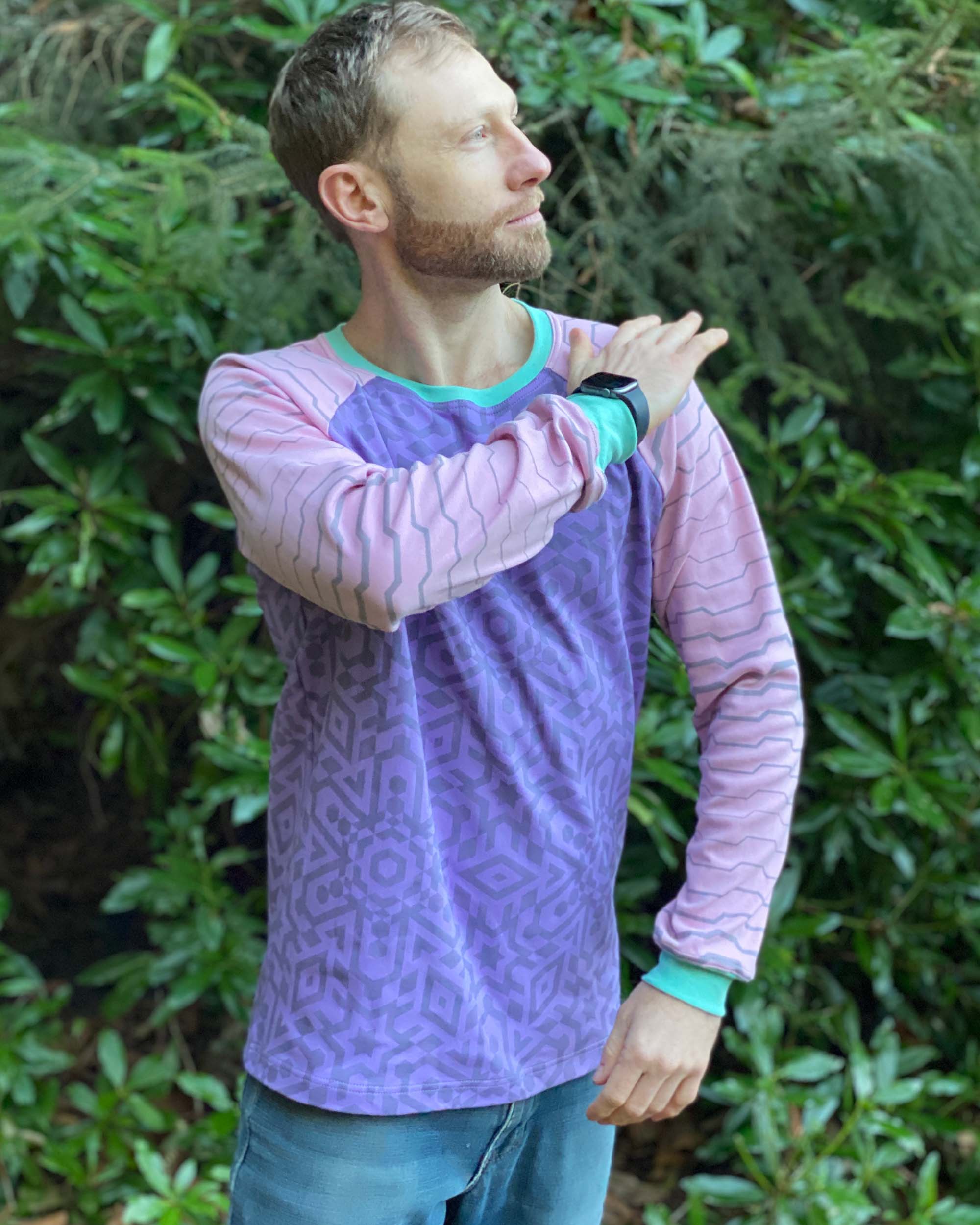

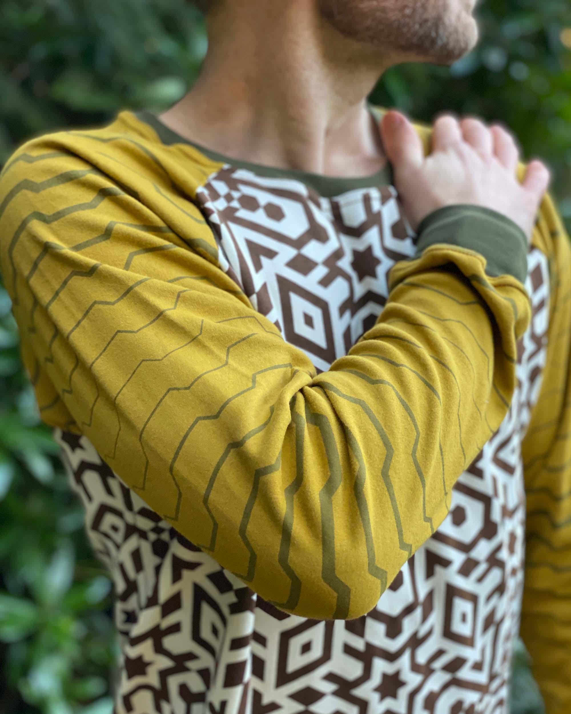
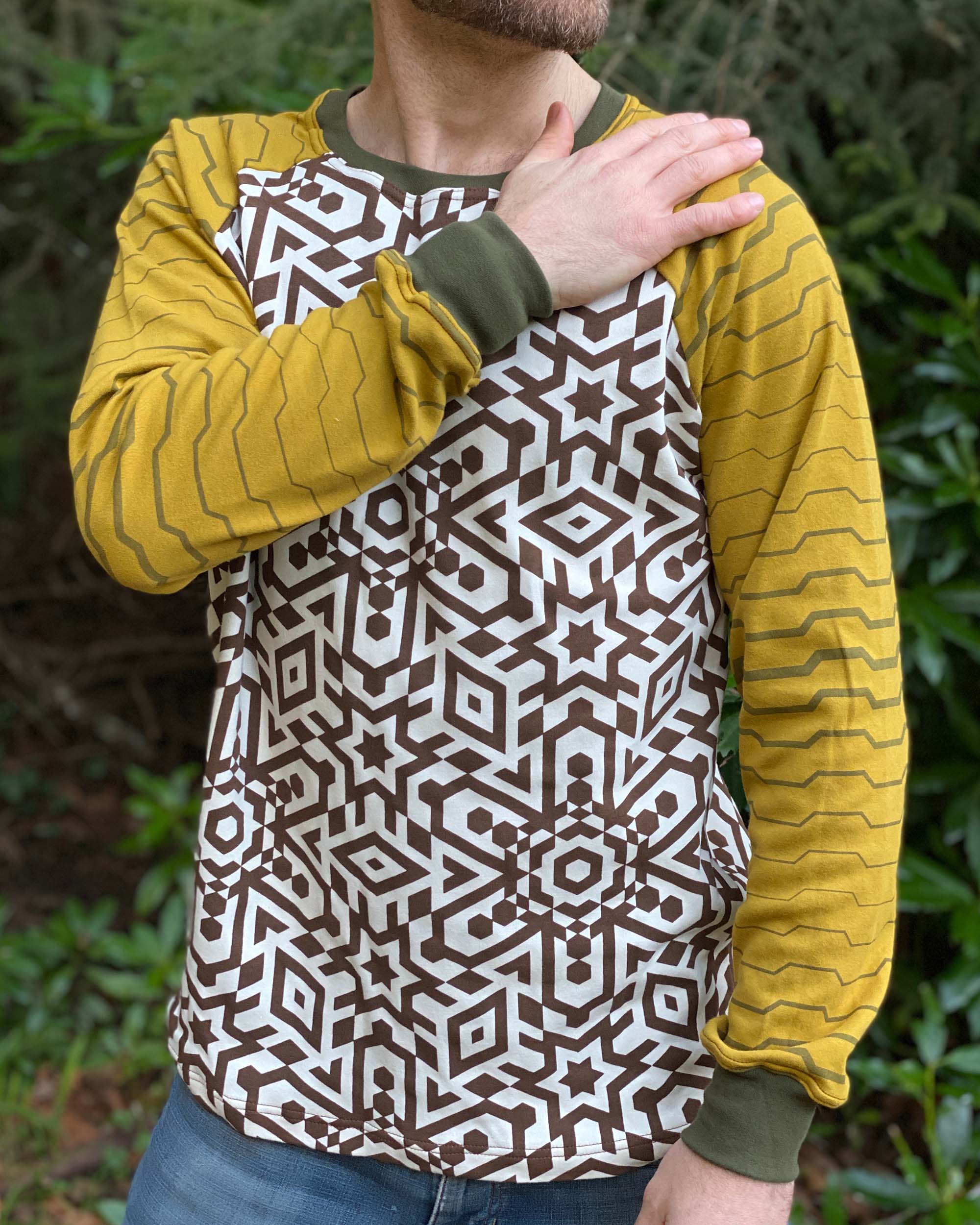
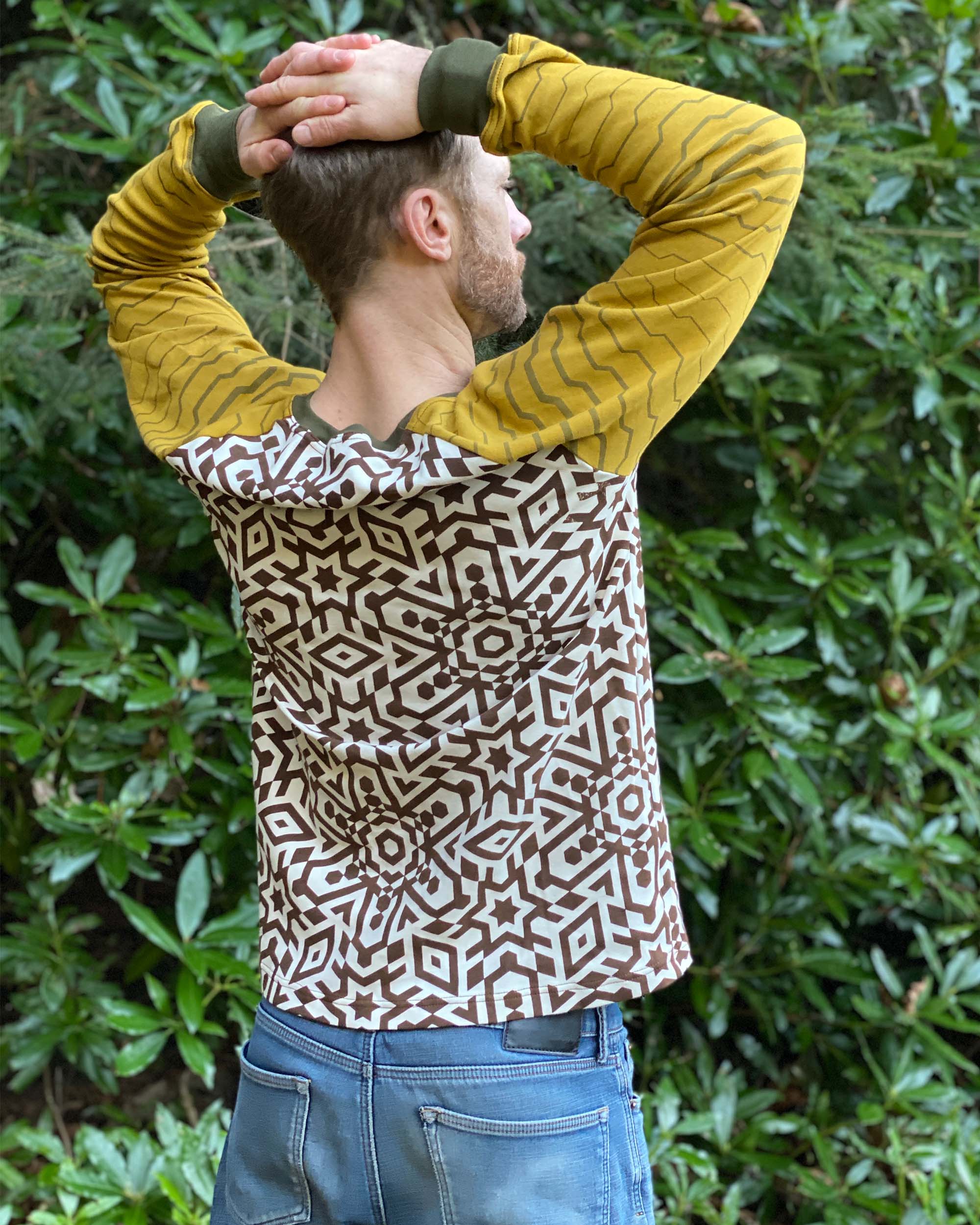


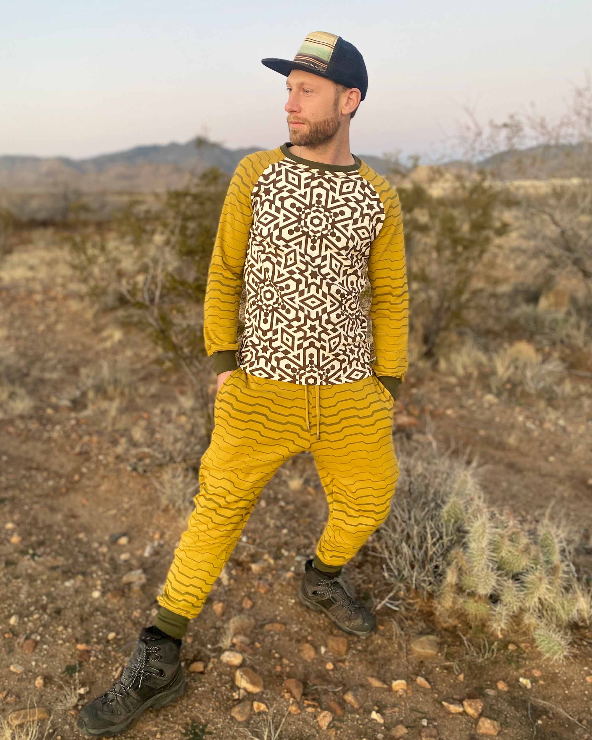

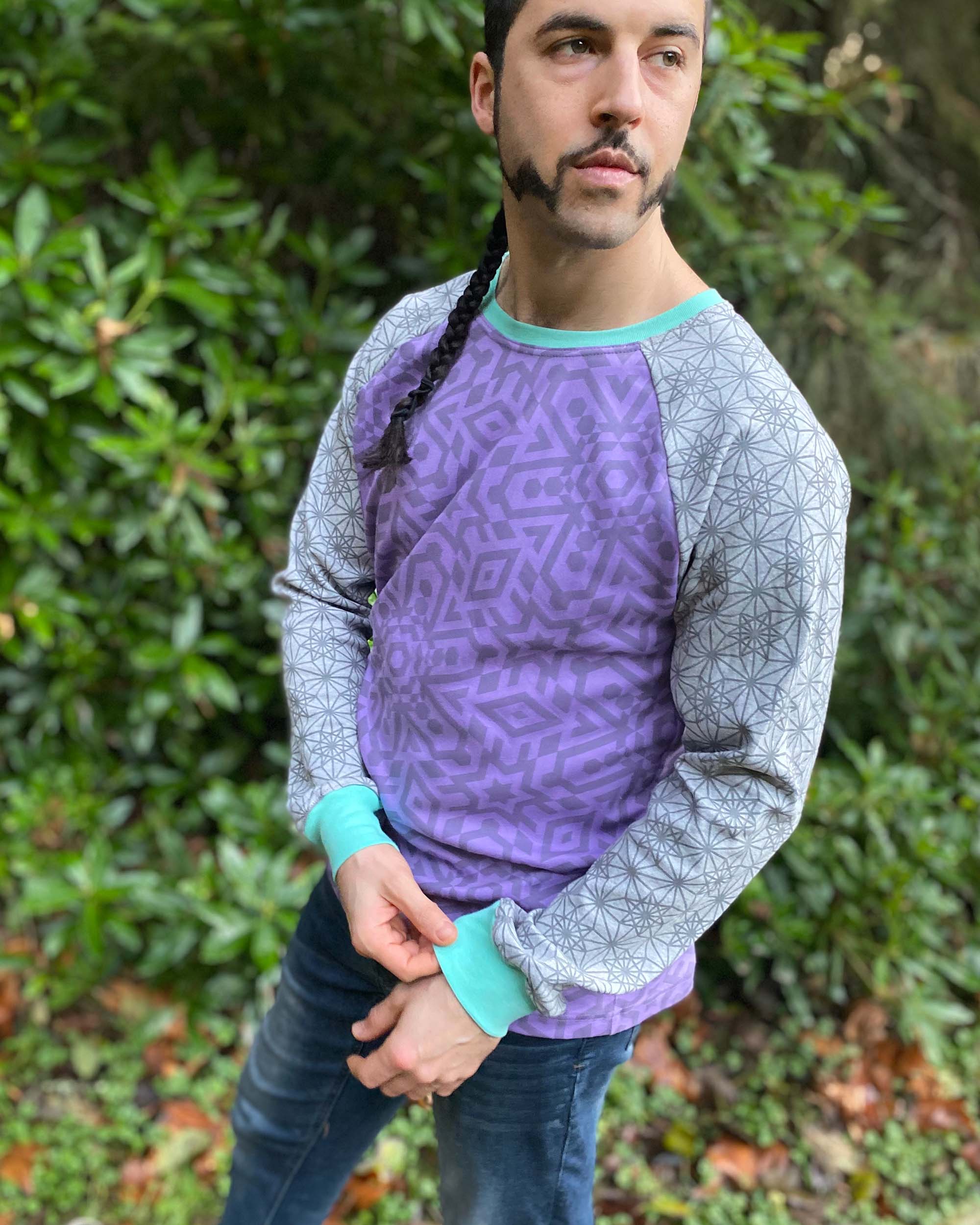
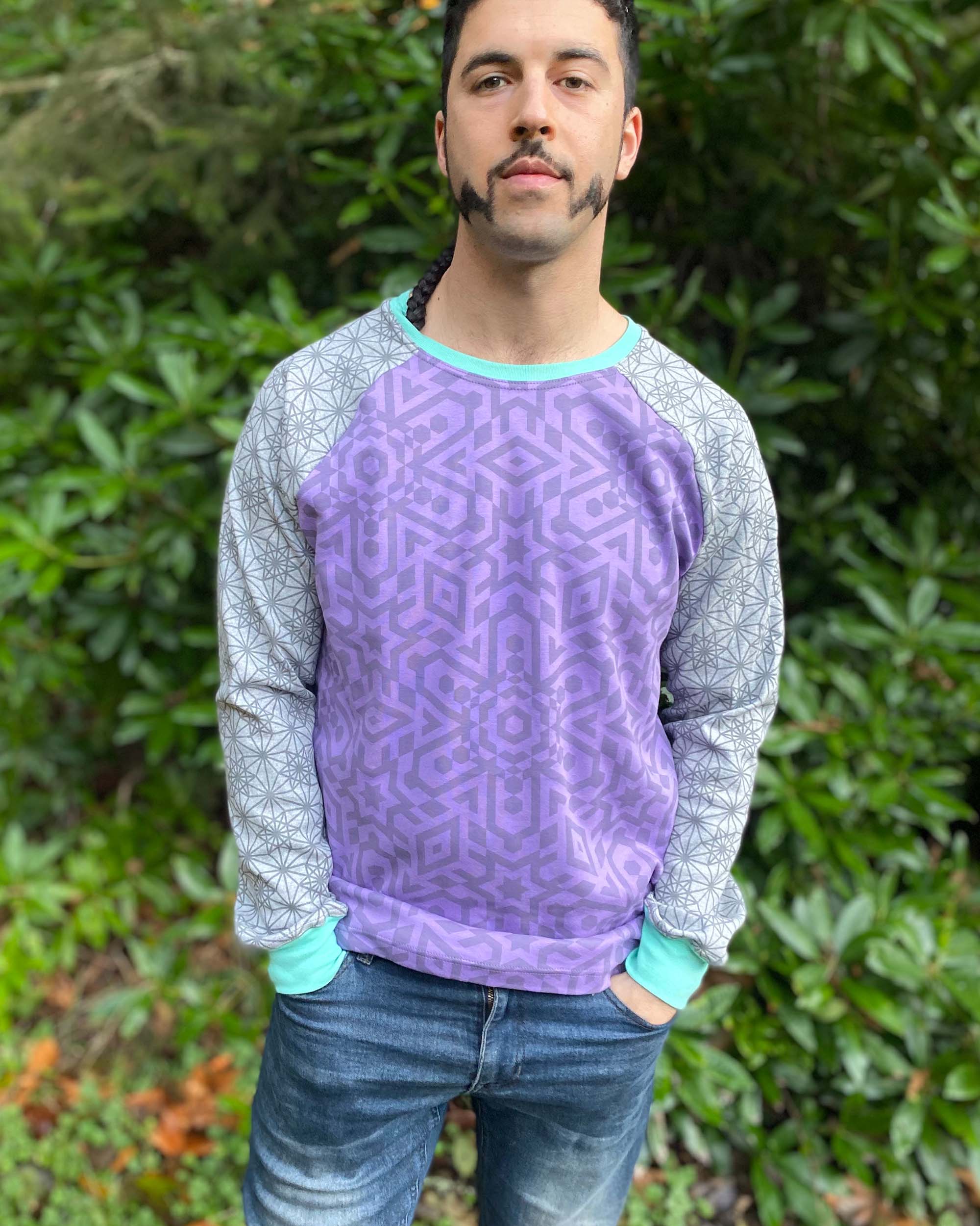
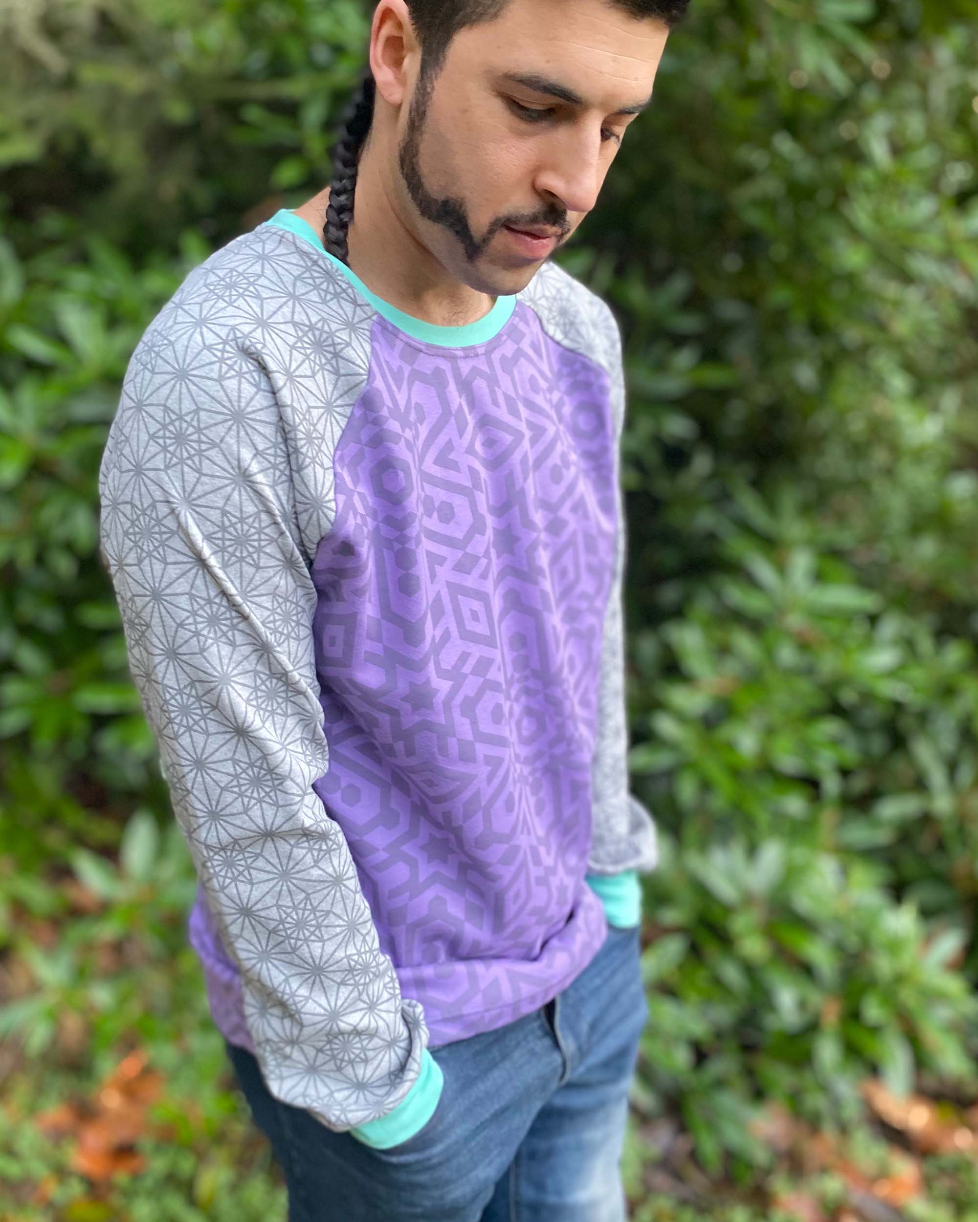
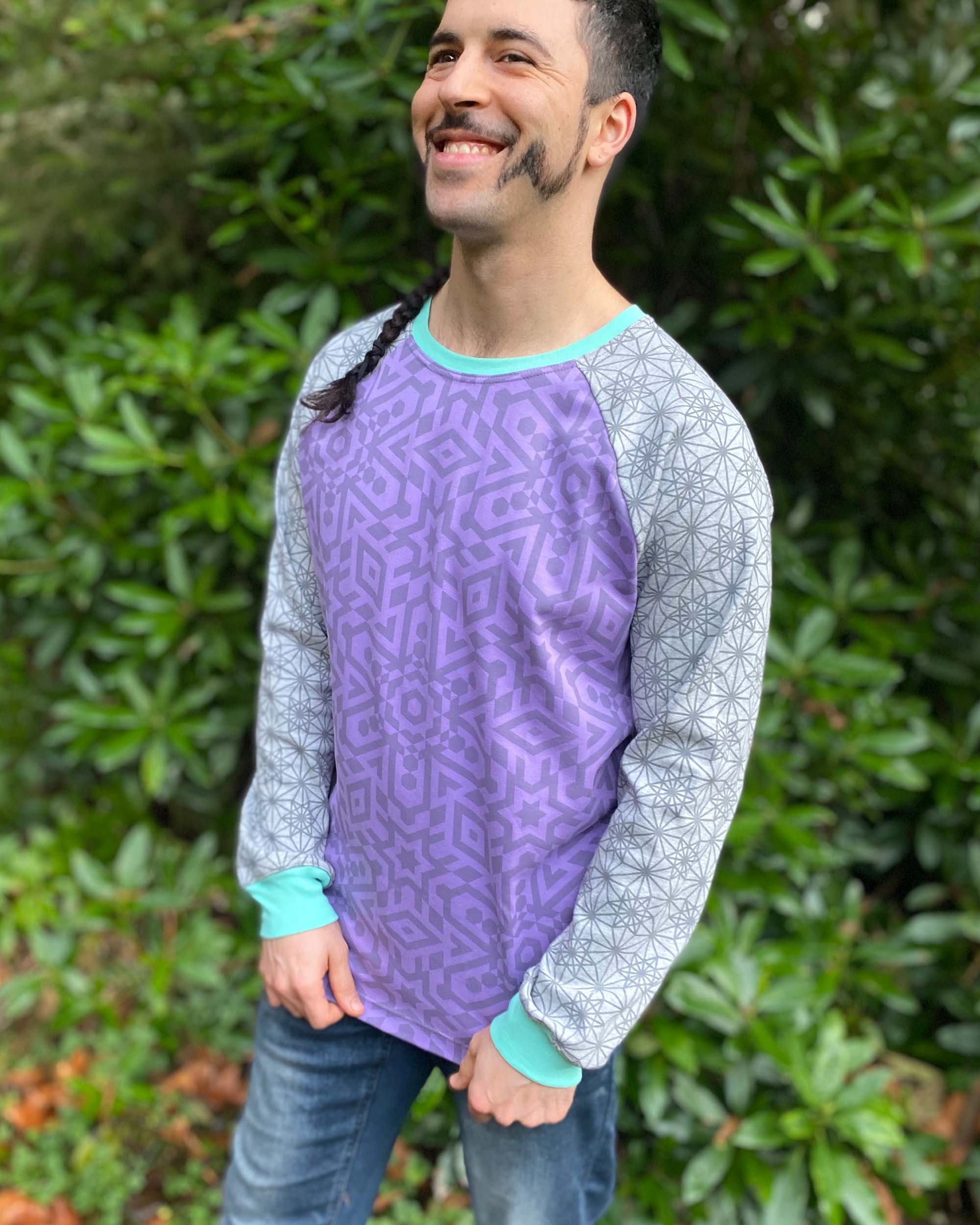
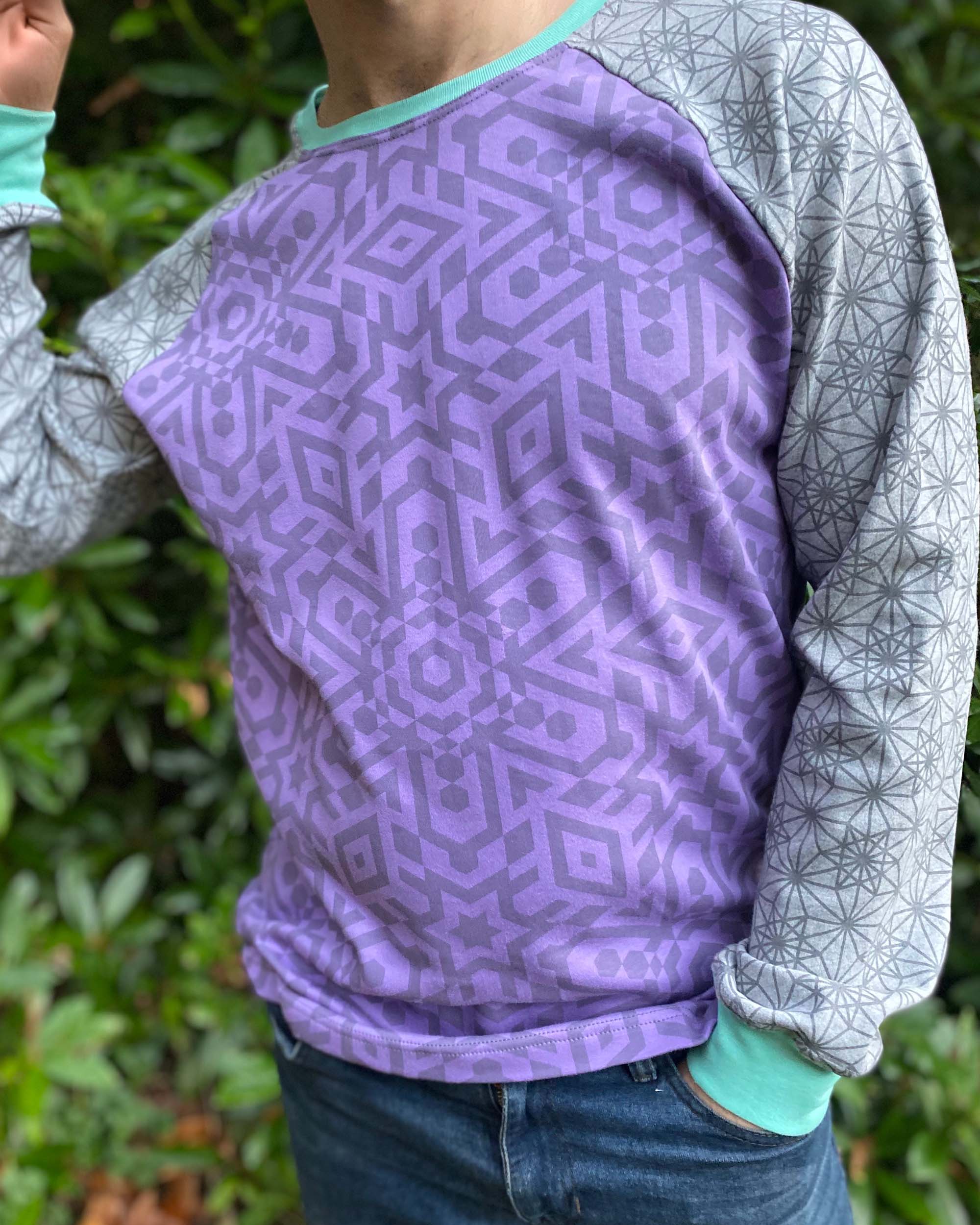
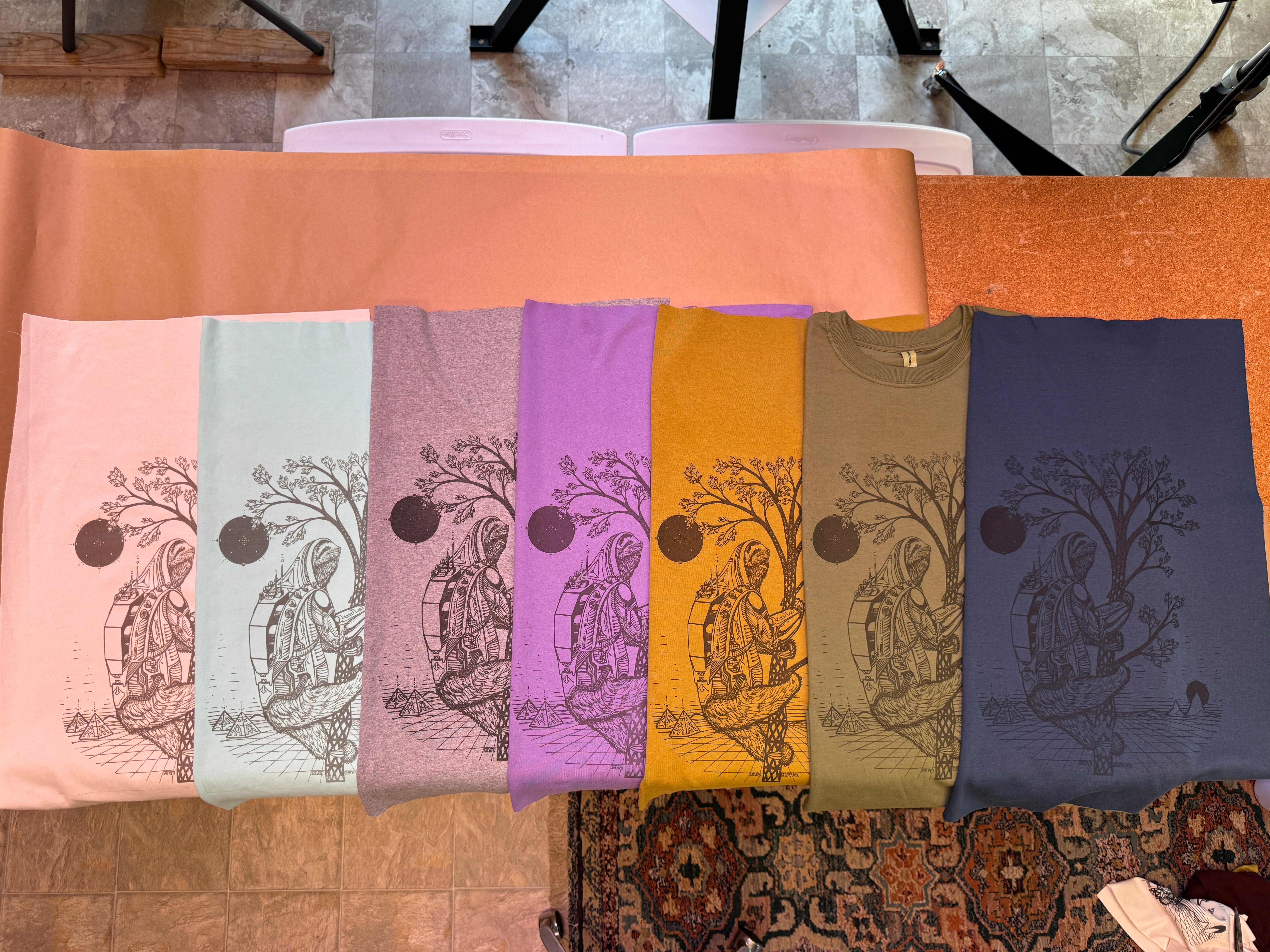
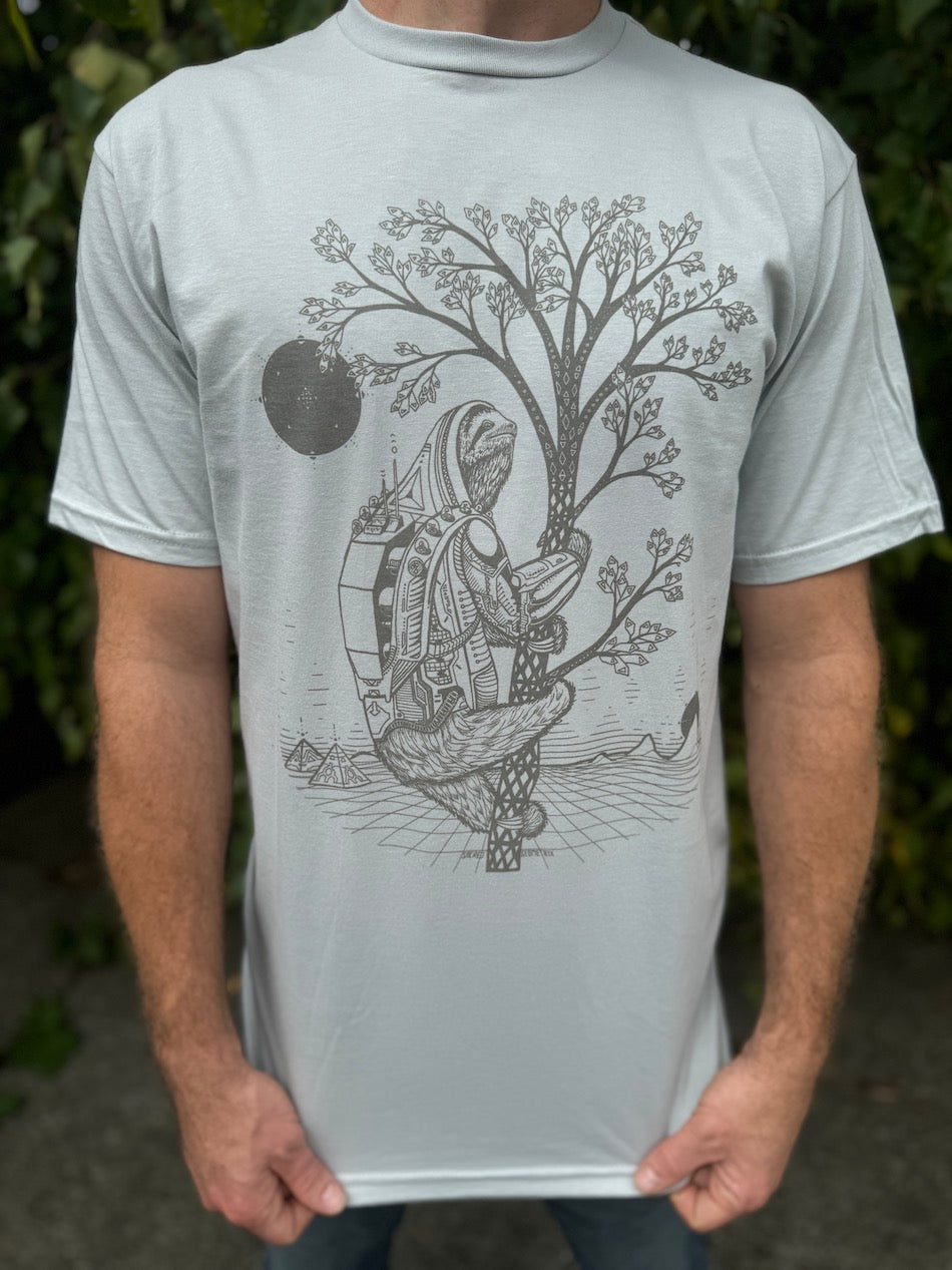
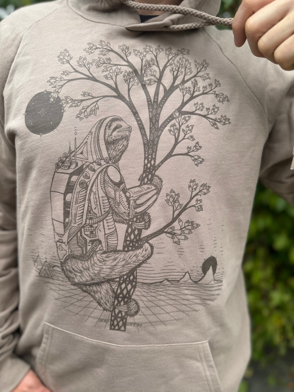
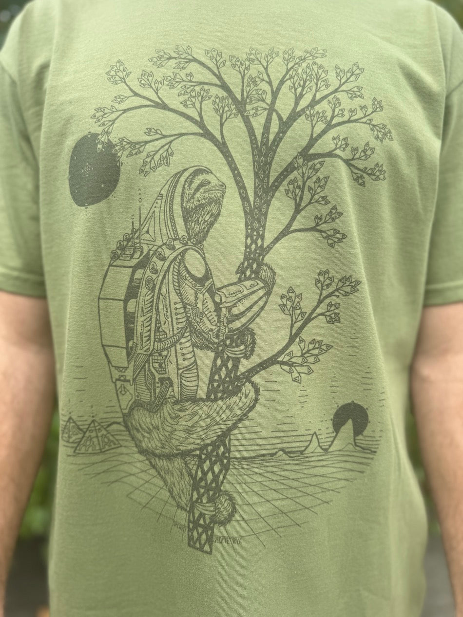
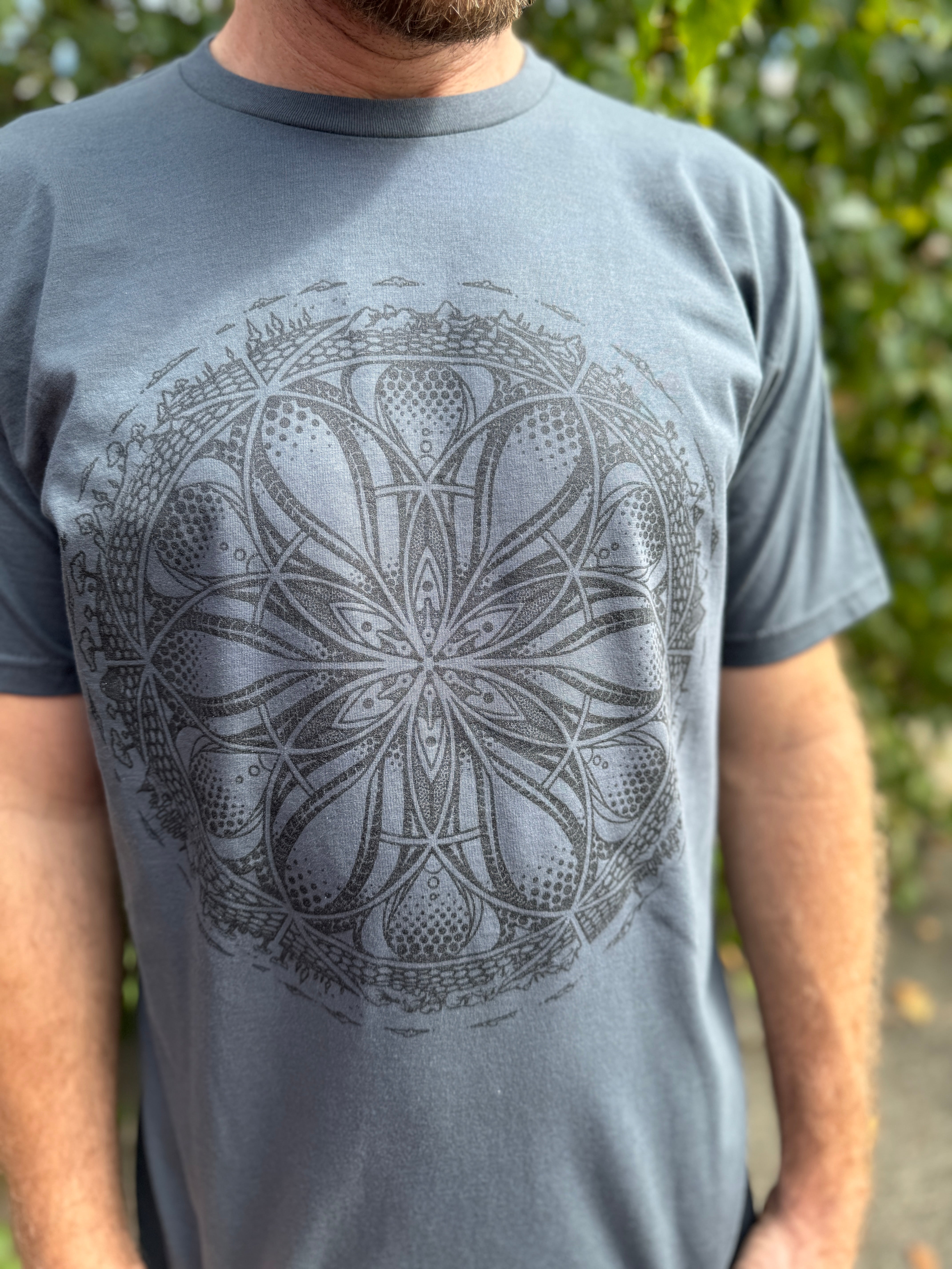
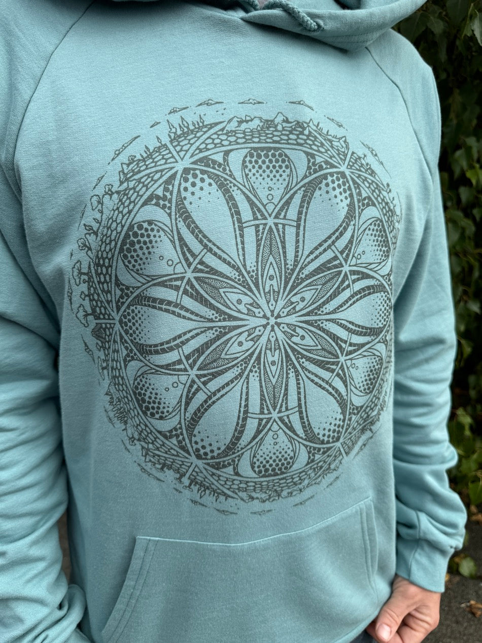
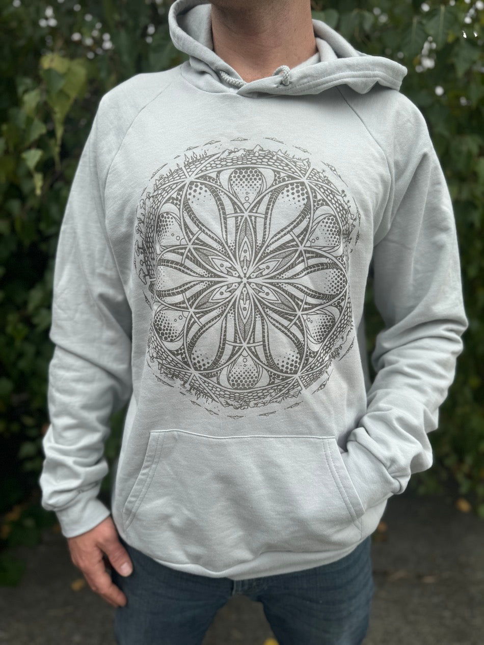
How Our Artwork Looks Using Tone on Tone Inks
Every print feels like it belongs to the garment it is printed on. The artwork will naturally blend with the color of the fabric it is printed on, appearing as a slightly darker tone of that garment color.
Below are some examples of how our Tone on Tone prints will appear on our different colored fabrics:
FAQ's
Does it look good printed on any garment color?
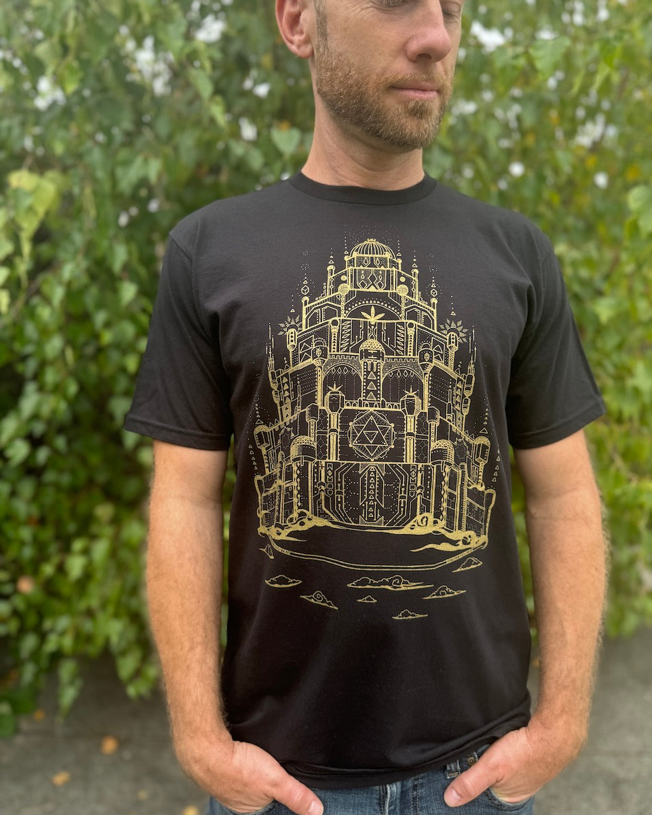
Tone on Tone prints turn out the great with all garments unless they are extremely dark colors.
Why does the design look grey on really light colored fabrics?
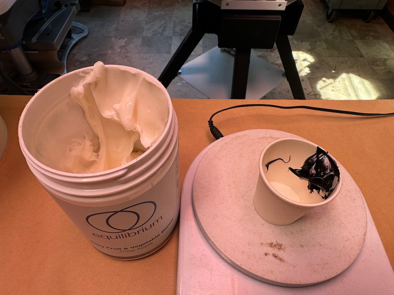
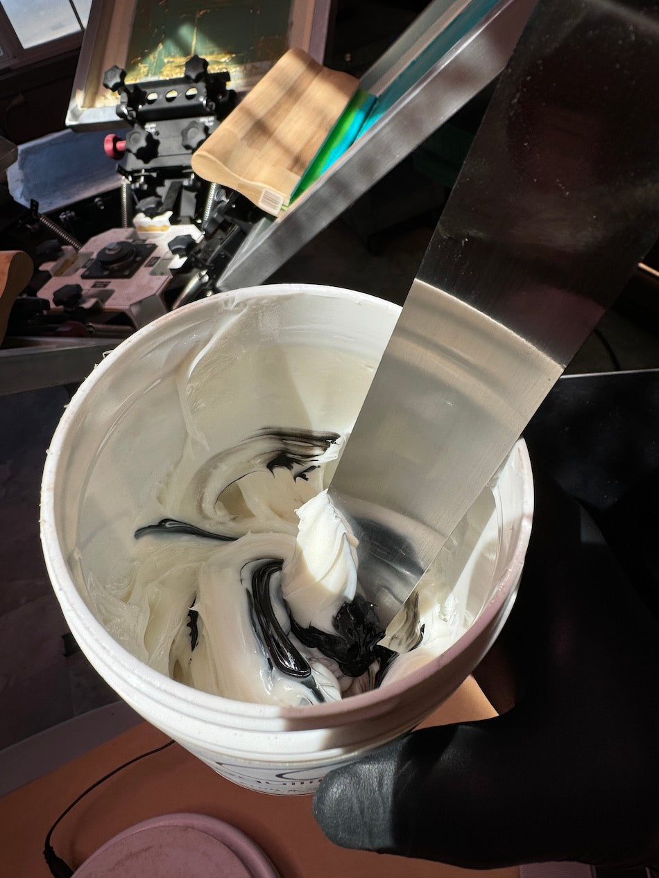
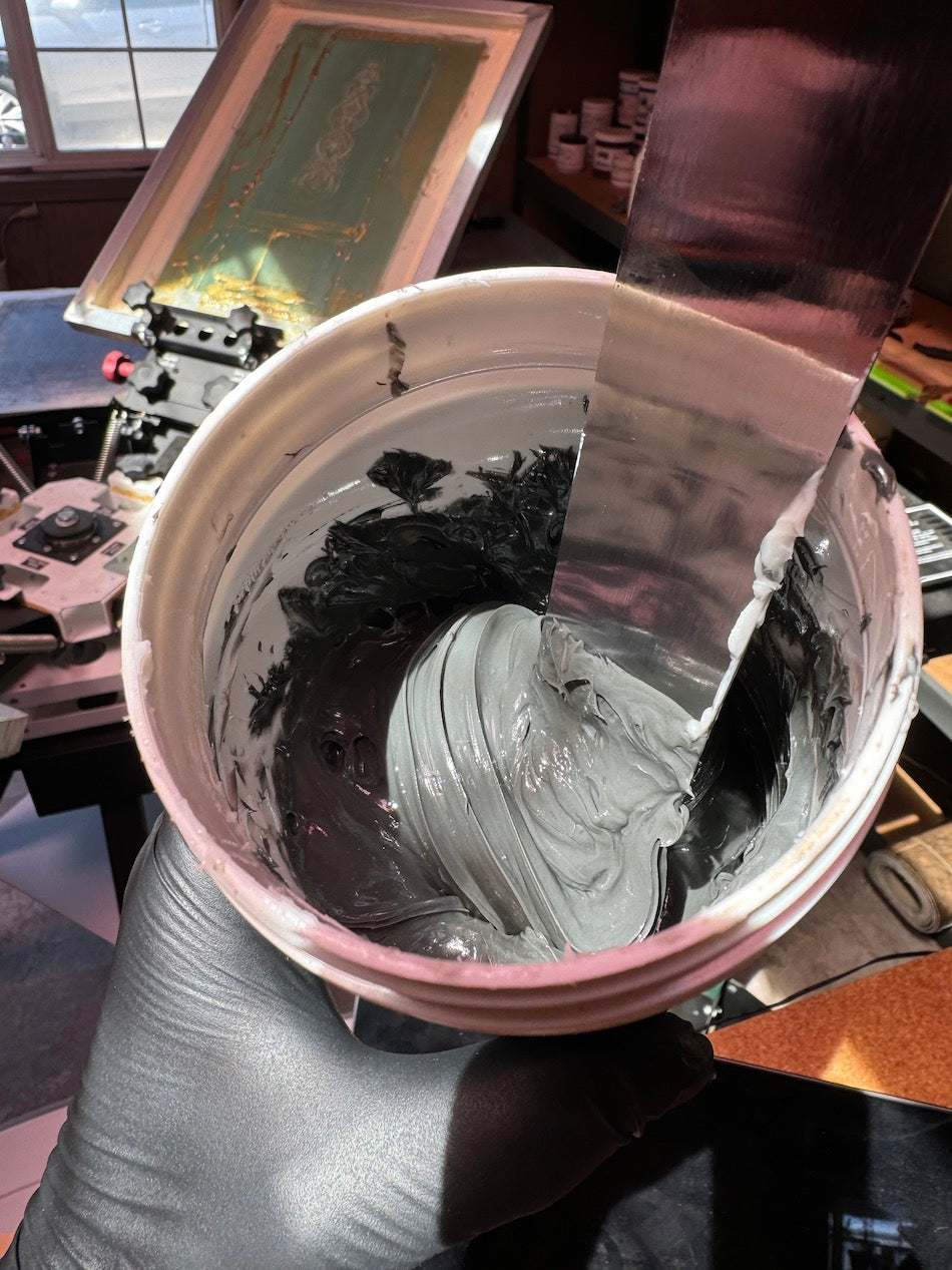
Tone on Tone ink is made by adding a small amount of black ink to a clear base. For example if the garment color is very light, like a soft pink or light blue, it may appear more grey (rather than blue or pink).
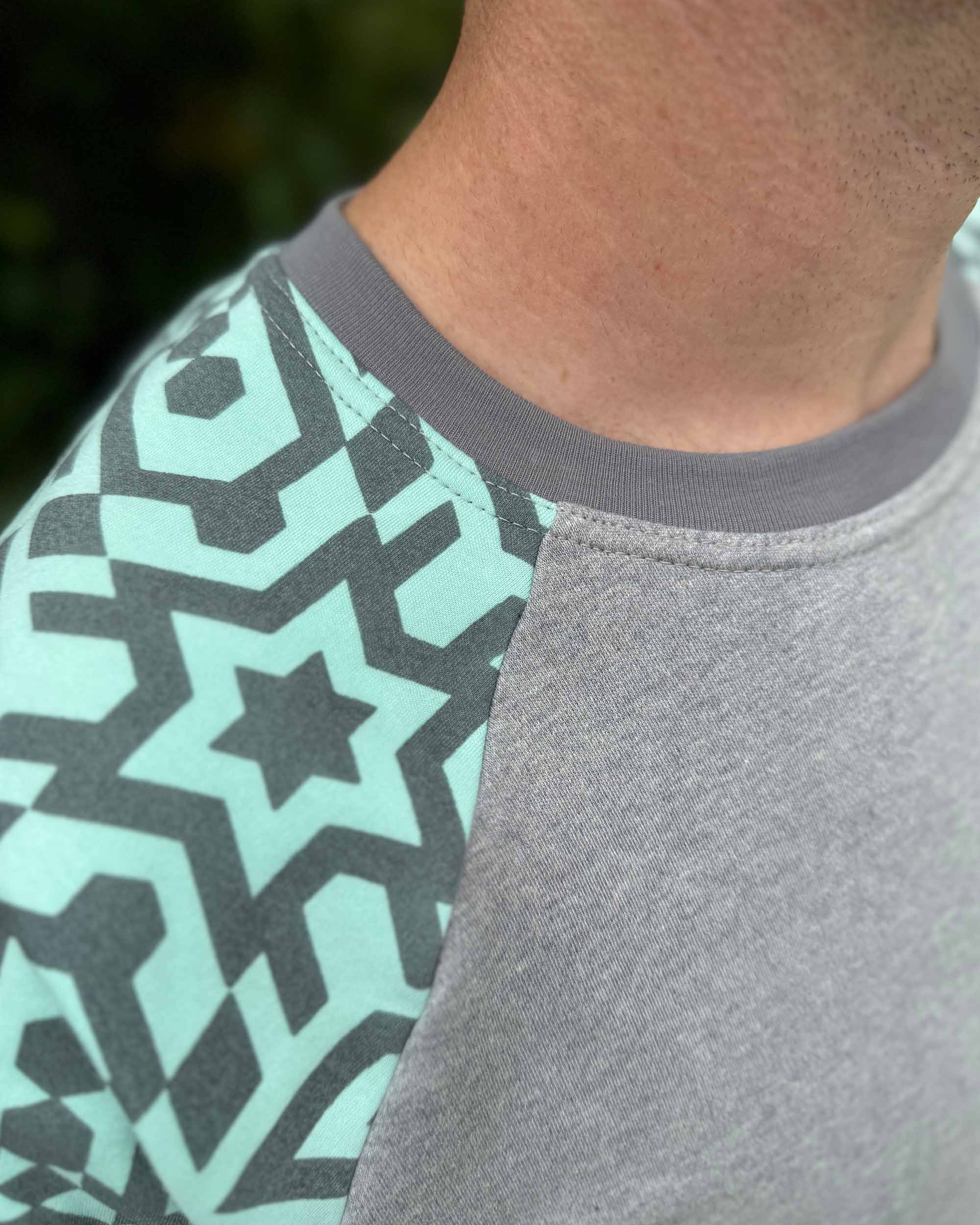
How do I know if the garment was printed in the Tone on Tone style?
Beneath the garment Color Options - will read Ink Color: Tone on Tone.
Additionally this will be designated in the Description Tab, under Ink Color: Tone on Tone.